(Archive) Advertising District / Dump-Place
-
 19-April 07
-
 Cocoa
Offline
Here's another picture of me experimenting with architecture. I haven't done anything on the actual park that I want to show.
Cocoa
Offline
Here's another picture of me experimenting with architecture. I haven't done anything on the actual park that I want to show.
I really need feedback, it would be helpful for me to develop my style. -
 nin
Offline
I think the little 1/8 brick pieces are a bit much, kinda just thrown in to get more detail. From my experiences, I've found that less is more, I always seem to get a better look without just random pieces.
nin
Offline
I think the little 1/8 brick pieces are a bit much, kinda just thrown in to get more detail. From my experiences, I've found that less is more, I always seem to get a better look without just random pieces. -
 Splitvision
Offline
First of I think the arch is perhaps 2 or 3 height units too high. It doesn't really flow for me, mostly due to there being one tower having four courners and another having 8 (or something like that). I'm not a fan of the deep blue details either. And one last thing: I dislike that all the windows are on the same level. I'd put a window on the brown brick wall (on the square tower). Sorry for coming down so hard on you
Splitvision
Offline
First of I think the arch is perhaps 2 or 3 height units too high. It doesn't really flow for me, mostly due to there being one tower having four courners and another having 8 (or something like that). I'm not a fan of the deep blue details either. And one last thing: I dislike that all the windows are on the same level. I'd put a window on the brown brick wall (on the square tower). Sorry for coming down so hard on you But I like what you're going for, I think that it could turn into a really good building if you tweak it a bit.
-
 J K
Offline
But for experimenting with architecture that looks beautiful.
J K
Offline
But for experimenting with architecture that looks beautiful.
When you and fr3ak get some more work released you guys will be on my radar too! -
 6000000flags
Offline
The arch is a bit high imo, but otherwise this will look pretty cool when finished.
6000000flags
Offline
The arch is a bit high imo, but otherwise this will look pretty cool when finished. -

FullMetal Offline
I'm not digging the purple. Maybe lighten it up a bit?
Other than that, it looks great. -
 SSSammy
Offline
SSSammy
Offline

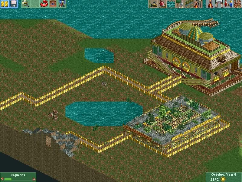
(L) CONCEPT DRAWINGS (L)
i got a good feeling about this particular park.
all comments greatly apreiciated. -
Cocoa
Offline
You know what to do with scenery pieces to make nice detailed buildings, its just that your buildings are just ugly to me- the colors, the overgrown foliage, the extra large windows, that long indoor balcony thing, and I'm not really sure what else, I just don't like it.
-
 Comet
Offline
Why are the windows black and blue
Comet
Offline
Why are the windows black and blue
Also why are there two of the same signs hung right next to each other
Anyway, the structures nice, but the details could be touched up, and you definitely could use some flowers -
J K
Offline
You gotta be careful with the contrast of jagged walls and diagonal walls. It just seems like a very forced structure.
I also don't know the purpose of the building? Its good filler architecture but I wanna see more clarity.
After that the dirt path isn't nice with the other type as its a shape that follows the structure of the building. If you put the path variation around the fountain with a north,south,east,west effect it would be nicer.
Just pushing you for better things buddy because its clear you have talent. -
nin
Offline
Darken the roof color, it looks like a floor that you forgot to put walls around.
Also, the porch (?) on the second floor wraps around a bit too much, making everything on thre right off-center. -
 In:Cities
Offline
that ladder is unsupported.
In:Cities
Offline
that ladder is unsupported.
the supports are overkill, and need to be different colors.
as of now, they blend in with the track at times, and it doesnt flow well.
layout is decent i guess.
is the catwalk supposed to float in the air magically? -

disneylhand Offline
^It has supports. But I don't see the point of the two on the left because they're broken by another part of the ride.
-disneylhand -
 Jaguar
Offline
Jaguar
Offline
the supports are overkill
Yeah, but most compact steel coasters usually are packed with supports, they aren't meant to be the best looking coasters. -
 Lowenaldo
Offline
i think your biggest problem is always trying to jusitfy the comments so you dont have to change anything. listen to the critisim, it normally WILL make your park better, you should try it sometime.
Lowenaldo
Offline
i think your biggest problem is always trying to jusitfy the comments so you dont have to change anything. listen to the critisim, it normally WILL make your park better, you should try it sometime.


Tags
- No Tags