(Archive) Advertising District / Dump-Place
-
 19-April 07
-
 turbin3
Offline
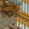
Imo it would look better, if the sides of the building would be higher.
But the tower structure is really impressive, I like it.
-

 Cornshot
Offline
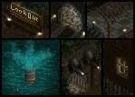
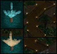
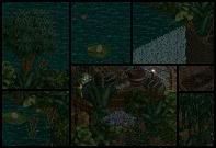
Been working on a tutorial for editing screens to make them look like they were taken at nightEdited by Cornshot, 21 June 2010 - 10:49 PM.
-

 That Guy
Offline
What's been keeping me occupied after changing to W7, copying my saves, and fixing problems with the stupid screenshots and trainers.
...And that's also what will keep my occupied through NCS depression. This'll almost definitely be my next park... -

 RCTCA
Offline


Been working on a tutorial for editing screens to make them look like they were taken at night
Heh.
Reminds me of the old Fantasy Fotos. Anyone remember those?
http://members.cox.net/skyman/
~RCTCA -

Colorado-Fan Offline
That's amazing Turbin3. I think the path could have another color. Would look much better imo. -

 Casimir
Offline
that looks pretty awesome. but I think with another path texture, it could be even better.
EDIT: damn >__>Edited by Casimir, 22 June 2010 - 12:23 PM.
-

 Louis!
Offline
I think the custom path needs an edging to it. Currently it just stops and looks weird.
 -

 Liampie
Offline
The fountain is too wide.
I love the fences, they really work in this area. The only thing that would make them look better is adding a few (skinny!) pine trees.
-

 magmoormaster
Offline
I'm really not understanding the little indent in the path, just below the fountain. It would look much better without it, IMO.
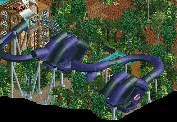
A final pic of the Ripper:
Edited by magmoormaster, 22 June 2010 - 03:23 PM.
-

 Casimir
Offline
nope, it breaks up the the uniformity of the path pretty well.
I'd say leave it like it is.
Pretty nice coaster, magmoor! I like the supports. But maybe you should try to do the foliage above in little clusters, it just looks more natural, imo
 Tags
Tags
- No Tags
