(Archive) Advertising District / Dump-Place
-
 19-April 07
-
 John
Offline
Another little something...
John
Offline
Another little something...
I went back and redid a lot of the other screen after I posted it and three attempts later, I'm finally satisfied with it. Thanks for the feedback.
-
 Austin55
Offline
It has a very sci-fi "hey lets build a huge industrial factory in the middle of a planets ecosystem" sort of look.
Austin55
Offline
It has a very sci-fi "hey lets build a huge industrial factory in the middle of a planets ecosystem" sort of look.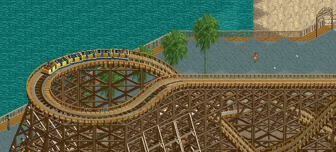
may aswell show that.
Damnit, I reached my photobucket storage limit... -
 Jaguar
Offline
Jaguar
Offline
Jag: Although I think the ride was a neat idea, it is composed really badly and the scenery is terrible. There are stone blocks jutting up everywhere with meager foliage, the background of trees/blue is stacked on itself so there are floating trees, the snake is a bad scenery piece, and the gray fences around the track just kill any atmosphere you could have had.
Well for a short period of time, I tried my best... -
Austin55
Offline
^Sortoff?
 inspired by it atleast.
At first I was surprised you recognized it so fast, the I remembered your location haha.
No swimming unless a lifegaurd is on active duty -
 StormRunnerFan
Offline
Some very interesting stuff on here.
StormRunnerFan
Offline
Some very interesting stuff on here.
Very interesting indeed.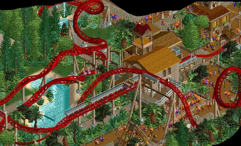
Something of mine for all to see.
- Storm
Edit: picture changed -
Jaguar
Offline
^I'll say
Anyways, yours is no different, and it looks great so far, you are good at designing intamins. -
Jaguar
Offline
^Lol sorry, it is hard to tell the difference between manufacturers unless you pay attention to a good layout.
-
 ACEfanatic02
Offline
ACEfanatic02
Offline
Box track and possibly not noticing the train? Don't be a dick, dude.Jag how did you think that was Intamin?
Nokia: Needs Life™. Ditch the deco pieces on the pink roof, they make it look awkward. Maybe some vines on that trellis?
-ACE -
 J K
Offline
Nokia I think the deco pieces work really well. Love the poles joining from one side to another, it really helps the theme.
J K
Offline
Nokia I think the deco pieces work really well. Love the poles joining from one side to another, it really helps the theme. -
 Turtle
Offline
That's really good Nokia, lovely atmosphere, simple but effective.
Turtle
Offline
That's really good Nokia, lovely atmosphere, simple but effective.
John, this looks amazing man, can't wait to see more! Normally big grey buildings don't do it for me, but the contrast with the foliage and pink coaster works well.
Storm, really interesting coaster, great colours, think you could extend the sand a bit further back from the shore of that lake, and maybe only one path type wouldn't make it seem so busy? -
 SSSammy
Offline
storm please please please fade the sand out. like, sand, brown dirt, muddy grass, grass. i promise it will look so much better. otherwise, really erally good.
SSSammy
Offline
storm please please please fade the sand out. like, sand, brown dirt, muddy grass, grass. i promise it will look so much better. otherwise, really erally good.
nokia, that's pretty. hurry up and finish something. -
 Louis!
Offline
Sorry storm, I dislike that, I think the layout lacks a bit of thought, I don't like how there are 3 inversions right after each other.
Louis!
Offline
Sorry storm, I dislike that, I think the layout lacks a bit of thought, I don't like how there are 3 inversions right after each other.
Nokia that is awesome, a few more details here and there and it will be perfect.


Tags
- No Tags