(Archive) Advertising District / Dump-Place
-
 19-April 07
-
 disneylandian192
Offline
disneylandian192
Offline
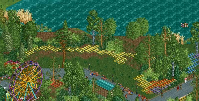
The blue/yellow combo made the coaster pop out, to stand by it's own. The viewer focused more/first on the ride before anything else. The purple/yellow makes the coaster blend well, and while it's easier on the eyes it loses the 'pop' that the blue had.
I'd suggest sorting minor color problems like the teal blue alongside the pool. I understand why its there, but it just keeps standing out in a bad way to me. (This is referring to the border of the pool, not the actual lining of the track in it.)
Thanks Nin. The teal border is actually from the water object, not the art-deco object which is completely grey. If I add another art-deco piece above the existing one the water object glitches, so this was the only way unfortunately. I am torn between the blue and burgundy myself. One gives the coaster more presence and can be applicable to the theme, while the burgundy is easier on the eyes but is not applicable to the theme. I'm debating the two, and once the map is done and I have some testers check it out, I'll get a better idea of what works. -
 T.N.T.
Offline
It feels crammed on the right-side of the screen, and a bit empty on the left. And the colours on the coaster feel pale in comparison to the bright umbrellas (or vice-versa).
T.N.T.
Offline
It feels crammed on the right-side of the screen, and a bit empty on the left. And the colours on the coaster feel pale in comparison to the bright umbrellas (or vice-versa).
Maybe it's just the screen's angle that's bugging me... -
 pierrot
Offline
Austin55 : In my opinion. coaster color is sweet
pierrot
Offline
Austin55 : In my opinion. coaster color is sweet
SF structure
too abstract.
I don't know what is this

-
 Evil WME
Offline
Austin, either flip those colors (coaster <> umbrella), or try something softer for the umbrella stands. looks nice other than that!
Evil WME
Offline
Austin, either flip those colors (coaster <> umbrella), or try something softer for the umbrella stands. looks nice other than that! -
Louis!
Offline
pierrot, thats really nice. Reminds me of Assault on Gamma Gamma from H2H5.
and Austin, I cant see the image
-
Dotrobot
Offline
Dotrobot : your work alwalys special, but concepts is too confused

* I solve Ip error.
what? i haven't shown a screen o.o. this was directed towards jag i believe.


Tags
- No Tags