(Archive) Advertising District / Dump-Place
-
 19-April 07
-
 rct2_tom
Offline
After not playing the game for almost 1.5 year, I started playing again. I'm thinking about turning it into a design but I just want your opinion on the lay-out since I've never been good at lay-outs (I feel pretty good about this one). So please comment
rct2_tom
Offline
After not playing the game for almost 1.5 year, I started playing again. I'm thinking about turning it into a design but I just want your opinion on the lay-out since I've never been good at lay-outs (I feel pretty good about this one). So please comment (and yes I need to raise the track a little

-
 Liampie
Offline
The turn after the lifthill is weird, if you're not going to add some good theming (a cliff might look good there, btw) I'd redo the turn. Make it more spectacular.
Liampie
Offline
The turn after the lifthill is weird, if you're not going to add some good theming (a cliff might look good there, btw) I'd redo the turn. Make it more spectacular.
The turns in the station area look really cool; hard to theme though... -
 ChillerHockey33
Offline
Wow, JDP I never thought you would do NCSO. I'm kinda disappointed (bc honestly I dont care for NCSO parks), but what you have looks good.
ChillerHockey33
Offline
Wow, JDP I never thought you would do NCSO. I'm kinda disappointed (bc honestly I dont care for NCSO parks), but what you have looks good. -
 robbie92
Offline
JDP, not gonna lie... You're almost better at NCSO than normal CSO work. WOW!
robbie92
Offline
JDP, not gonna lie... You're almost better at NCSO than normal CSO work. WOW!
Oh, and Split, if that's Balder, which I'm assuming it is, you need 6 seaters, not 4 seaters. -
 In:Cities
Offline
casimir and split, those are two gorgeous screens.
In:Cities
Offline
casimir and split, those are two gorgeous screens.
i dont see what is so messy about your screen casimir, as i think it looks pretty clean and pleasing to the eye.
split, your execution of the golf games is perfect. absolutely love it.
jdp, its nice, but i cant say i like the colors too much. regardless, i'd like to see you continue and finish another solid project. -
 Splitvision
Offline
Thanks all, and robbie thanks for the heads-up regarding the trains, been looking around on lisebergs official website aswell as wikipedia for information on how they should look but found nothing, I'll gonna go change that right away.
Splitvision
Offline
Thanks all, and robbie thanks for the heads-up regarding the trains, been looking around on lisebergs official website aswell as wikipedia for information on how they should look but found nothing, I'll gonna go change that right away. -
 BelgianGuy
Offline
Ok been working on this pretty much all the time,
BelgianGuy
Offline
Ok been working on this pretty much all the time,
Its not far enough to start a topic but I hope this'll get some good replies
All feedback is welcome.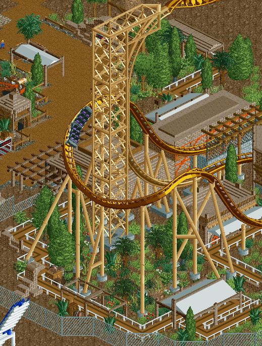
note: a little unfinished around the edges. -
 pierrot
Offline
Honestly, this screen is bad for me but don’t hold it against me.
pierrot
Offline
Honestly, this screen is bad for me but don’t hold it against me.
coaster itself is impressive. but foilage is kinda messy and queuing line is not-matching with others -
BelgianGuy
Offline
the foliage I get and I'm working on it, but what do you mean about the queue?
wrong colour or so? -
 Comet
Offline
I agree, the whole thing just seems a bit messy
Comet
Offline
I agree, the whole thing just seems a bit messy
Anyway, damn the dump-place is addicting
-
Liampie
Offline
@BelgianGuy: The queue looks horrible indeed... It's the textureless brown and the white fences. I'd use invisible path and pathblocks. I like the foliage, grass and grass/mud as groundtextures would make it better though. Coaster looks awesome.
@Comet: We all know I've never really liked your work... but this is different. Finally.
Usually I would say 'too much brown', but I think it makes sense here. My only complaint is the coastline, it's too geometrical. Smoothen it with foliage!
Great job!


Tags
- No Tags