RCT Discussion / Your RCT Logos
-
 12-September 09
-
 Fr3ak
Offline
I love the World Showcase logo,
Fr3ak
Offline
I love the World Showcase logo,
great thing!
It's a really great composition. The text is the only really small let-down,
as it looks a little flat and not catchy enough.
9/10

-
 J K
Offline
I really like that as well actually.
J K
Offline
I really like that as well actually.
8.2/10
Thanks for the comments guys I actually think world showcase is a bit sloppy. I'll be sure to post some more soon. -
 Cocoa
Offline
i much prefer your zippos logo, xophe.
Cocoa
Offline
i much prefer your zippos logo, xophe.
btw, how is xophe pronounced? i find myself thinking ex-o-fee but is it zoe-fee?Edited by Cocoa, 14 September 2009 - 07:24 PM.
-
 Xophe
Offline
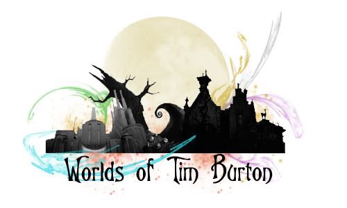
Love the Tim Burton logo JK!
Xophe
Offline
Love the Tim Burton logo JK!
Cocoa, it's pronounced 'zoff'. It's complicated haha. It's like how Christmas is shortened to Xmas, Christophe® became Xophe, with the x pronounced as a z like xylophone. Seemed like a good idea about 5 years ago haha! -
 Gwazi
Offline
thanks for the clarification Xophe. i'd always been saying "zo-fee" in my head when reading your name.
Gwazi
Offline
thanks for the clarification Xophe. i'd always been saying "zo-fee" in my head when reading your name. -
![][ntamin22%s's Photo](https://www.nedesigns.com/uploads/profile/photo-thumb-221.png?_r=1520300638) ][ntamin22
Offline
][ntamin22
Offline


plus a few more, mostly some obviously-live-traced stuff I'm not all that happy with. -
J K
Offline

This logo reminds me of Terra mitica which is a very very good thing. I love how it feels like a spanish chain would make this logo. Sounds wierd but its true.
][intamin, your very talented with logos. Hurricanes one is my favourite obviously!
-
 Liampie
Offline
Really? I can't tell if you're being sarcastic or not. The execution sucks for sure...
Liampie
Offline
Really? I can't tell if you're being sarcastic or not. The execution sucks for sure...
Thanks, anyway. I'm trying new ones soon, this time with better execution I hope.


Tags
- No Tags