(Archive) Advertising District / Cyder Hill Theme Park
-
 27-October 09
-
 Louis!
Offline
Am I missingh something? Where is the resemblance? It looks completely different. Ok fair enough a little bit of the structure is similar and also the weird colour scheme could be linked but seriously? Is it now a crime to build something that has a similar structure to something else?
Louis!
Offline
Am I missingh something? Where is the resemblance? It looks completely different. Ok fair enough a little bit of the structure is similar and also the weird colour scheme could be linked but seriously? Is it now a crime to build something that has a similar structure to something else?
I guess I should cancel my stadium project because RCTNW's already built several so everyone would have seen it before and it would just be a pure copy of his work.
Get real sammy. -
 Levis
Offline
Imo the problem with all these realistic parks is they all look like each other. so goliath don't listen to people complaining about it. you build what you want, its about having fun with the game.
Levis
Offline
Imo the problem with all these realistic parks is they all look like each other. so goliath don't listen to people complaining about it. you build what you want, its about having fun with the game. -
 Cena
Offline
Cena
Offline
Yeah sure, but then don't post it, that is where the trouble starts with people complaining about copying etc.Imo the problem with all these realistic parks is they all look like each other. so goliath don't listen to people complaining about it. you build what you want, its about having fun with the game.
If he wants he can copy all of my work, but then don't advertise it. -
Louis!
Offline
I'll just quote myself but be a bit more specific.
Is it now a crime to build something that has a similar structure to something else?
I guess I should cancel my stadium project because RCTNW's already built several so everyone would have seen it before and it would just be a pure copy of his work. -
 JJ
Offline
To be honest Sammmy, the only bit that resembles zippo's is the colours. Nothing else, if anything this is inspired by it not copied, obviously you are so caught up with trying to find which park Goliath copied from next..
JJ
Offline
To be honest Sammmy, the only bit that resembles zippo's is the colours. Nothing else, if anything this is inspired by it not copied, obviously you are so caught up with trying to find which park Goliath copied from next.. -
 rK_
Offline
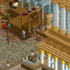
its quite nice, loving the colors but as a whole its just a block... needs more depth an style, its a good start, maybe a porch on the side or perhaps a balcony?
rK_
Offline
its quite nice, loving the colors but as a whole its just a block... needs more depth an style, its a good start, maybe a porch on the side or perhaps a balcony? -
 nin
Offline
it seems that you started building it, realized it was looking pretty good, and stuck with the exact look in order to not mess up what you had. The building is so repetitive that I lose interest in it thinking that if i saw one side, then everything would (and is) the same.
nin
Offline
it seems that you started building it, realized it was looking pretty good, and stuck with the exact look in order to not mess up what you had. The building is so repetitive that I lose interest in it thinking that if i saw one side, then everything would (and is) the same. -
 geewhzz
Offline
the flowerboxes are overkill. only put them on the building with the brown roof and the square windows
geewhzz
Offline
the flowerboxes are overkill. only put them on the building with the brown roof and the square windows -
 J K
Offline
Other then what gee mentioned it is really nice and I think the overdetailed look works really well.
J K
Offline
Other then what gee mentioned it is really nice and I think the overdetailed look works really well. -
 Dark_Horse
Offline
Whoa, is that supposed to be one building, or two? Either way, you need to do something about the roof color. For one, make it all the same color, or for two buildings, use the chocolate shade of brown or something closer to black.
Dark_Horse
Offline
Whoa, is that supposed to be one building, or two? Either way, you need to do something about the roof color. For one, make it all the same color, or for two buildings, use the chocolate shade of brown or something closer to black. -
Dark_Horse
Offline
Maybe it's just my horrible eyesight, but I'm immediately drawn to the contrast in the roof color. In that case...I'd suggest changing the roof to a brown or just experimenting with different colors.
-
 SSSammy
Offline
theres really too many windows.
SSSammy
Offline
theres really too many windows.
break that up abit, and add in maybe some more woodwork inbetween each floor, and your onto a winner. -
 hulkpower25
Offline
Amazing Work on the buildings, still you will need to change some things on the buildings like add some depth by adding a balcony or different sections.
hulkpower25
Offline
Amazing Work on the buildings, still you will need to change some things on the buildings like add some depth by adding a balcony or different sections. -
 tdub96
Offline
Really likin the flower beds in the windows, overall id give it a 9/10. A balcony or two and youre looking at a perfect screen
tdub96
Offline
Really likin the flower beds in the windows, overall id give it a 9/10. A balcony or two and youre looking at a perfect screen -
Alpengeistfan1
Offline
I think there are too many windows and flower boxes, but the other parts of the building look really nice.


Tags
- No Tags