(Archive) Advertising District / Starpointe
-
 16-February 10
-
 BelgianGuy
Offline
@louis, that's what I am missing from this screen, it's void of any atmosphere for me, it looks sterile still, maybe land elevation and some secondary path type would help this?
BelgianGuy
Offline
@louis, that's what I am missing from this screen, it's void of any atmosphere for me, it looks sterile still, maybe land elevation and some secondary path type would help this? -
 highroll3r
Offline
^certainly, land elevation is the only thing you havnt worked on in the screen progress. i stress this frequently.
highroll3r
Offline
^certainly, land elevation is the only thing you havnt worked on in the screen progress. i stress this frequently. -
 ScOtLaNdS_FiNeSt
Offline
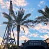
Yes more landscaping needs to be done, There is to much grey also ... Don't get me wrong its a very good screen but you could make it better with different colours and take away the large fence and put the smaller one.
ScOtLaNdS_FiNeSt
Offline
Yes more landscaping needs to be done, There is to much grey also ... Don't get me wrong its a very good screen but you could make it better with different colours and take away the large fence and put the smaller one. -
 K0NG
Offline
Yeah...the fence is too 'intimidating' for a theme park. Too tall and it looks more like a retaining fence for a prison than for an amusement park. Also, the planter is just wrong....ruins any path flow and runs guests right into the footers. I'd remove it and create small, individual 'planters' that tightly surround each of the support/footer areas.
K0NG
Offline
Yeah...the fence is too 'intimidating' for a theme park. Too tall and it looks more like a retaining fence for a prison than for an amusement park. Also, the planter is just wrong....ruins any path flow and runs guests right into the footers. I'd remove it and create small, individual 'planters' that tightly surround each of the support/footer areas. -
 CedarPoint6
Offline
The height of the fence is fine for a park. At least 8ft. is necessary for a ride-restricted area. The angled pieces aren't though. That makes it look too barbed-wirey almost. The best way around it is to soften the edge with plants and bushes. That will make a world of difference.
CedarPoint6
Offline
The height of the fence is fine for a park. At least 8ft. is necessary for a ride-restricted area. The angled pieces aren't though. That makes it look too barbed-wirey almost. The best way around it is to soften the edge with plants and bushes. That will make a world of difference. -
 BC(rct2)
Offline
I can't wait for this park! The pictures are so good! I love tha starpointe speedway! =D
BC(rct2)
Offline
I can't wait for this park! The pictures are so good! I love tha starpointe speedway! =D -
 Liampie
Offline
I like the compactness. I'm not liking the foliage, but I assume it's not finished yet.
Liampie
Offline
I like the compactness. I'm not liking the foliage, but I assume it's not finished yet. -
 robbie92
Offline
I like that, except for the random bush in the blocked-off area. Also, not a huge fan of the queue fences.
robbie92
Offline
I like that, except for the random bush in the blocked-off area. Also, not a huge fan of the queue fences. -

RMM Offline

looks pretty but its just dead. it extremely boring. nothing jumps. i think that's the problem with 'extreme realism'. going in with that mindset almost limits the potential. lets see some landscaping, some elevation changes, some water, some kind of landscape integration. it lacks atmosphere. -
BelgianGuy
Offline
I'll echo louis, it needs more texture or something to break up the monotone colour pattern
-
 posix
Offline
posix
Offline
I agree completely.looks pretty but its just dead. it extremely boring. nothing jumps. i think that's the problem with 'extreme realism'. going in with that mindset almost limits the potential. lets see some landscaping, some elevation changes, some water, some kind of landscape integration. it lacks atmosphere.
-
BelgianGuy
Offline
I'd say make the Q path also a little more flowing, like you can use the quarter tile roof texture pieces to make it have small diagonal corners will make the paths more flowing, also try and make a better fence, it looks nothing like it schould sorry, also the colours of the fence could use some more imagination
-
highroll3r
Offline
i agree with RMM too. youre work is great but ive never seen any real landscaping in your screens.
-
 coasterfreak101
Offline
Change the queue fences (the low ones between paths) and I think it's a winner!
coasterfreak101
Offline
Change the queue fences (the low ones between paths) and I think it's a winner!


Tags
- No Tags