(Archive) Advertising District / Glaubensunwilligkeit
-
 15-January 11
-
 Dimi
Offline
Cheers again! I really appreciate your reactions.
Dimi
Offline
Cheers again! I really appreciate your reactions.
RMM: you're absolutely right, I will.
Liampie: I tried other colours (bordeaux-red, indigo, lila,...) but none of them looked better than the grey. I think the grey fits well anyways.
Cocoa: I'm sorry to hear that. I'm not uninspired at all, but I can fully understand you don't like the architecture... it's still a little experimenting for me.
Also thanks for the information about the banners.
This mine coaster is called Schirmerinnerungen. I tried something different than what I'm used to do, I hope you'll like it.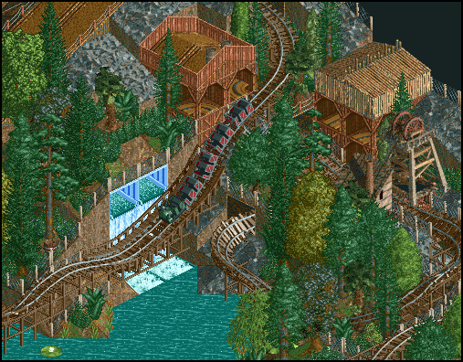
You already know the log flume Fehlleistungen, this is another shot from the station and the plaza.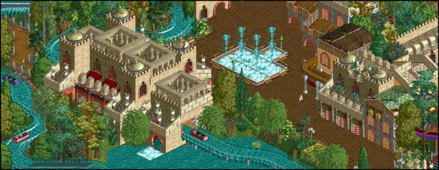
-
 Louis!
Offline
First screen is really nice.
Louis!
Offline
First screen is really nice.
Second seems to be like the first few, objects used with no real purpose. -
 pierrot
Offline
Striking
pierrot
Offline
Striking
first screen is definitely your best screen ever (in LL). really atmospheric and foliage is fucking beautiful, I adore that.
my only problem is using ghost train for window, kinda stand out. -
 posix
Offline
I actually like the second screen much better. Why did you put Ghost trains in the wooden walls? Looks a bit strange to me.
posix
Offline
I actually like the second screen much better. Why did you put Ghost trains in the wooden walls? Looks a bit strange to me.
The way how you've done the waterfall is intriguing. Don't remember seeing any coming out of a mountain like that. -
 Cocoa
Offline
Yah I would put paths instead of ghost trains. and the second screen still looks like a jumble to me, I can't tell what theme you are going for and there are so many strange objects.
Cocoa
Offline
Yah I would put paths instead of ghost trains. and the second screen still looks like a jumble to me, I can't tell what theme you are going for and there are so many strange objects. -
Dimi
Offline
Cheers for the comments! To everyone: I changed the ghost train, it looked stupid indeed. I agree that the second screen is messy, I'll remove some of the 'useless' objects and maybe change to colour of the yellow building to something more neutral.
Posix: the whole mountain is just a decor, very loosely based on Calamity Mine in Walibi Belgium. In theme park decors waterfalls come out of mountains like this pretty often, it's not meant to be natural.
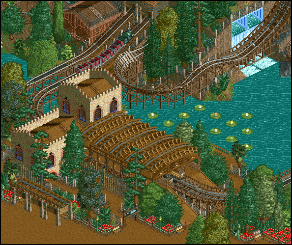
I've got two more screens of Schirmerinnerungen to show, I hope you like them.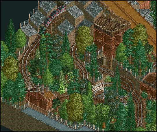
-
musicman
Offline
Looks awesome, a lot better than I can do. The only thing I don't like is that the lily pads in the second screen look too "gridlike" (There's a real word for this I'm sure, but you know what I mean). I know there's only so much you can do about it, but it may be worth looking into.
-
 tdub96
Offline
I am in love with the first screen. Its one of the best in this thread, and there hasnt been a screen I havent disliked yet. Fantastic.
tdub96
Offline
I am in love with the first screen. Its one of the best in this thread, and there hasnt been a screen I havent disliked yet. Fantastic. -
 JDP
Offline
the mine train hurts just looking at it. other then that this is really nice stuff. really nice
JDP
Offline
the mine train hurts just looking at it. other then that this is really nice stuff. really nice
-JDP -
 Turtle
Offline
I really like this, I like the lillies, but I think if you could stack some rushes in amongst them it would look more natural.
Turtle
Offline
I really like this, I like the lillies, but I think if you could stack some rushes in amongst them it would look more natural. -
Dotrobot
Offline
In the last screen there seems to be an overload of red flowers near the path
Maybe insert some yellow and orange? -
 Midnight Aurora
Offline
First screen has way too many trees. I can't tell what it is that I don't like about the second screen.... Maybe the lilies, but I think it's how square everything looks.
Midnight Aurora
Offline
First screen has way too many trees. I can't tell what it is that I don't like about the second screen.... Maybe the lilies, but I think it's how square everything looks. -
Dimi
Offline
Thanks for the comments again!
musicman, pierrot and Turtle: I know about the lilies, how do you stack rushes in them on the water?
Dotrobot: I like the flowers, and there are no orange flowers in LL.
MA: I disagree about the amount of trees. I hope you like the other screens.
To show I'm still working here's a little screen of the end of the park's central and largest coaster, Geltungsstreben.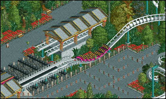
-
 Liampie
Offline
I think that building is fucking brilliant. Very clever.
Liampie
Offline
I think that building is fucking brilliant. Very clever.
There are two things I don't like in the screen though:
- It's too open. Add two or three palms to the area or anything else that looks good.
- I don't like how close the transfer section is to the path. It's not a big deal for the queue, but it is for the other path! -
musicman
Offline
The brake run is too short. If you're going for realism, it would be better to brake it completely before the train reaches the transfer section, this could be fixed by getting rid of the final dip there. Other than that, it looks great!


Tags
- No Tags