(Archive) Advertising District / The Legend of Zelda
-
 01-July 11
-
 muuuh
Offline
hello guys,
muuuh
Offline
hello guys,
this is my solo project, that I started 4years ago.
It`s themed to a zelda park, especially to the ocarina of time game.
screens:
Zora`s domain
http://kumba.parkmak...oras-domain.jpg
MORPHA
http://kumba.parkmakers.com/morpha.jpg
enjoy! -
 chorkiel
Offline
I try to like it.. but it's just not my cup of tea!
chorkiel
Offline
I try to like it.. but it's just not my cup of tea!
Those paths are just terrible!
Your themes could be executed way better, try detailing more! -
 Casimir
Offline
I don't like the paths either =/
Casimir
Offline
I don't like the paths either =/
Everything else is <3
Love how you did that station for Morpha
-
 posix
Offline
very good ride design. 4 years ago? wow.
posix
Offline
very good ride design. 4 years ago? wow.
what's the map size and how much % is the project overall completed? -
 Cocoa
Offline
^crazy paving with dirt quarter tiles would be nice.
Cocoa
Offline
^crazy paving with dirt quarter tiles would be nice.
these screens are OK, but they don't really feel like Zora's domain to me. i think the one from twilight princess will give you a better idea of how it should look, ocarina of time's one is sort of bleh looking. the station looks pretty good, but the path and the bare rocks around it make it seem really meh and boring. i'd say put cliffs and caves and stuff, some interesting rock features that also double as buildings, etc. also the coaster colors are a bit bright... i'd consider changing either the supports or the track (maybe purple track/tan supports?)
what is that worm thing anyway? is that meant to be the whale dungeon thing? that could be done so much better as a shop protruding off the path, and a lot more work could be done to make it look more like a giant fish. also, put king juba juba somewhere! -
Luigi
Offline
The first screen is nice. The path just ruins it. I also don't really like the texture of the small building with the green roof. I do really like the interaction in this screen.
The second screen is awesome too. The station is very nice. You do need to support the mid-course brake though. Also the path ruins it again.
Oh, you also need some benches/bins/lights in all screens.
Really looking forward to this, I love the original Zelda games. -
muuuh
Offline
what is that worm thing anyway? is that meant to be the whale dungeon thing? that could be done so much better as a shop protruding off the path, and a lot more work could be done to make it look more like a giant fish. also, put king juba juba somewhere!
that worm thing should be the boss of the water temple, morpha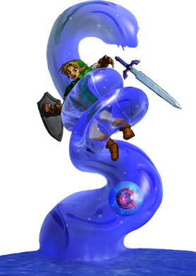
King juba juba will be placed somewhere in the zora domain, same as the king of the zoras.
The map size is really small (130²), so I`m not able to build all things in ocarina of time in that park. -
Cocoa
Offline
oh i thought those screens were zora's domain. i guess it fits for lake hyrule, but you definitely need that potion shop! i imagine that would translate well into rct2
morpha was the most retarded boss ever, especially after how hard the water temple was. -
 Liampie
Offline
Wow!
Liampie
Offline
Wow!
What's with the flat rock roof though? It doesn't look as natural and good as the rest of the landscaping. -
 Fizzix
Offline
I 100% agree with Liampie. I do, however, love that bit of trackitecture on the right side of the screen, and the teeth.
Fizzix
Offline
I 100% agree with Liampie. I do, however, love that bit of trackitecture on the right side of the screen, and the teeth. -
 Flap
Offline
And i miss supporting,
Flap
Offline
And i miss supporting,
When you test it please with Supports.
Or your Coasters can Fly in space.
Well theming is Great so far!
Also i think like Liampie Said already, you could bring more effect into the Flat roof. -
 Timothy Cross
Offline
This is meritorious.
Timothy Cross
Offline
This is meritorious.
mer·i·to·ri·ous
adjective
deserving praise, reward, esteem, etc.; praiseworthy -
Luigi
Offline
Yeah, change the roof a bit and add supports. Great screen otherwise!
Loving this project so far. -
 leonidas
Offline
Definitely some horrible textures in there,
leonidas
Offline
Definitely some horrible textures in there,
But I really like the imagination behind it all,
You're not afraid of making big, unusual gestures.
But I would like you to calm down a bit, as it looks like too much some times.
I wouldn't grasp on to loads of bright colors that quickly, and maybe reduce all
the expressive textures next to each other.
Just take your time, do some fine tuning, balance things out a bit,
but besides that, amazing work, really imaginative and fresh. -
Cocoa
Offline
I'd say dodongo is more of a green/brown/ earthy color and texture. and he breathes fire, so maybe make the coaster orange and add some flames and stuff? i like the bombs, nice detail


Tags
- No Tags