(Archive) Advertising District / So I'm packing my bags for the Smoky Mountains
-
 02-March 12
-
 BC(rct2)
Offline
I agree with @pierrot, don't change nothing please!
BC(rct2)
Offline
I agree with @pierrot, don't change nothing please!
Loving all in the picture! Just perfect!
-
 Dimi
Offline
Again, thanks for the many comments!
Dimi
Offline
Again, thanks for the many comments!
@ Louis!: wow thank you.
@ trav: I agree.
@ Steve: I'll think about the theme. I thought the landscaping was enough, but I agree that some real scenery will only make the ride better. You're also right about the planters in front the station, they will be improved. I'm keeping the red supports though, they work really well and make the coaster a bit unique, I think.
@ Croustibapt: The first looping of the coaster is made out of a big B&M-loop, these two loopings are smaller because the train passes them slower.
Today I have both an old and a new screen. The first screen shows the park's darkride Smoky Mountain Hop, located inside the building. It can be compared to Pandemonium in Parc Astérix.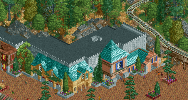
The station of West Ryder Pauper Lunatic Tornado, obviously based on Dollywood's Tenessee Tornado, is located in front of the log flume.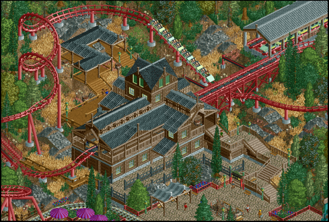
-
 Liampie
Offline
The last screen is sick. I hope you get drafted in H2H!
Liampie
Offline
The last screen is sick. I hope you get drafted in H2H!
Your work: looks good from a distance, looks good close up, good coasters, good architecture, good landscaping, good foliage, good atmosphere. You've got everything. -
 Pacificoaster
Offline
I really enjoy both of these screens, although the first screen resembles more of Disney park. The building could look a bit more purposeful if there were more vents and fans on the roof. The second screen would be better if those table awnings in the bottom left were a different color. Also, that arrow could be better if that transfer track wasn't so close to the coasters final drop. Good use of the landscape though. very Herschend of you.
Pacificoaster
Offline
I really enjoy both of these screens, although the first screen resembles more of Disney park. The building could look a bit more purposeful if there were more vents and fans on the roof. The second screen would be better if those table awnings in the bottom left were a different color. Also, that arrow could be better if that transfer track wasn't so close to the coasters final drop. Good use of the landscape though. very Herschend of you. -
 djbrcace1234
Offline
djbrcace1234
Offline
I really enjoy both of these screens, although the first screen resembles more of Disney park. The building could look a bit more purposeful if there were more vents and fans on the roof. The second screen would be better if those table awnings in the bottom left were a different color. Also, that arrow could be better if that transfer track wasn't so close to the coasters final drop. Good use of the landscape though. very Herschend of you.
Completely agree.
Thanks for giving this style some love. This is what I was trying to convey with my own inspiration, but you have pulled it off much, much better. This park oozes atmosphere. Good work! -
 Louis!
Offline
Judging by those screens, I don't think you will get picked. And if you do, it will definately be a very low one.
Louis!
Offline
Judging by those screens, I don't think you will get picked. And if you do, it will definately be a very low one. -
 Turtle
Offline
Dimi, i've always loved your work. This is no exception. Possibly having the supports the same colour as the coaster isn't working?
Turtle
Offline
Dimi, i've always loved your work. This is no exception. Possibly having the supports the same colour as the coaster isn't working? -
Louis!
Offline
^I think that's what makes the coaster so goddamn gorgeous. The same colour supports are beautiful.
-
 CedarPoint6
Offline
Wow I love it. Really has a great atmosphere going. I wish you would have made the brake run a bit longer, but I can't fault that too much. The first screen does feel a lot more Disney and a lot less Dollywood, but that's not necessarily a bad thing. If you're going for Dollywood, go for more earth-y tones on the big stuff like the roofs.. also more wood and natural looking materials. But really this is fantastic... enjoying this topic quite a bit.
CedarPoint6
Offline
Wow I love it. Really has a great atmosphere going. I wish you would have made the brake run a bit longer, but I can't fault that too much. The first screen does feel a lot more Disney and a lot less Dollywood, but that's not necessarily a bad thing. If you're going for Dollywood, go for more earth-y tones on the big stuff like the roofs.. also more wood and natural looking materials. But really this is fantastic... enjoying this topic quite a bit. -
 RCTMASTA
Offline
Daaamn...
RCTMASTA
Offline
Daaamn...
That right there is some fantastic work.
There are a few things bugging me, though: that misplaced support piece that's visible at the end of that Arrow train, and that same section of track the support piece is in sort of looks like it's "floating." Maybe you could add a support on top of that rock formation underneath?
(That's what I get for not seeing that this topic had a second page ...anyway, these comments were directed at the second screen on page one, not on the above screens.)
Comments on current screens:
All I can say besides "fuck, that's good" is that I dislike that tiny rock formation inside that u-bend in the queue.


Tags
- No Tags