(Archive) Advertising District / Zac's/ Shotguns?'s stuff thread.
-
 13-May 12
-
 BC(rct2)
Offline
BC(rct2)
Offline
bitch fighting? who is bitch fighting? if feedback is bitch fighting that's with you...And can you please stop bitchfighting?
-
 Xeccah
Offline
Xeccah
Offline
bitch fighting? who is bitch fighting? if feedback is bitch fighting that's with you...
Not the given critisism, I thank you for that. I mean you and buckeye.
edit: totally looked past k0ngs post, i'm lauging.
Fizzix, if your reading this, your still better than me in ncso, we just have different styles. -
 Scoop
Offline
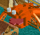
I feel the atmosphere sort of it just doesn't have the certain spark that is needed to put it up there.
Scoop
Offline
I feel the atmosphere sort of it just doesn't have the certain spark that is needed to put it up there. -
Xeccah
Offline
serpent, actually,
I wanted to see if it is good, because it is my first try at heads like that, -
 trav
Offline
^That was my exact first thought haha.
trav
Offline
^That was my exact first thought haha.
I think it's the eyes, they don't look particularly serpent like. -
 Turtle
Offline
I don't know what you want people to say. It's nothing new, so it's hard to get excited about. It's been done before, and better.
Turtle
Offline
I don't know what you want people to say. It's nothing new, so it's hard to get excited about. It's been done before, and better.
You are getting better though. Keep playing until you build something awesome. Try themes that no-one's ever done before. -
Xeccah
Offline
I dunno, but I love this building.
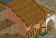
I hate MS paint croppings, it always fucks my screens
-
 Faas
Offline
You have got to show more than just that in one screen. I mean come on, what do you want us to say?
Faas
Offline
You have got to show more than just that in one screen. I mean come on, what do you want us to say? -
BC(rct2)
Offline
I like the architecture on the pic but in my opinion, that path always screw everything. It's like pitbull, the music can be awesome but when he start rapping, the song is spoiled...

-
Turtle
Offline
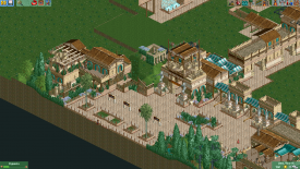
That's looking very nice, good start. Interesting shapes, and a nice setting. Be careful with those trees though, they pull all the warmth out of the screen.
I'd add some more colours in, warm colours. What with the aqua everywhere, the dull browns and the trees, it's a cold looking screen. Add some yellows, oranges, warm purples, warm greens etc., will liven it up a bit I think.
You're improving very well, though. Keep at it man. -
 Liampie
Offline
Listen to Turtle and beware of pointless detailing (and pointless discussions; I can't say this enough), and everything will be okay.
Liampie
Offline
Listen to Turtle and beware of pointless detailing (and pointless discussions; I can't say this enough), and everything will be okay.


Tags
- No Tags