(Archive) Advertising District / Zac's/ Shotguns?'s stuff thread.
-
 13-May 12
-

 Xeccah
Offline
To me it's really too unfinished to comment on. It's definitely more interesting, as there's more going on. Qualitywise I'd need to see more.
Oh and please don't listen to this:
Atmosphere (=mostly Foliage/landscaping) is of major importance. Furthermore, what does he know? I mean, he's only admin and #9 of all times at this site. Clearly you'd better listen to me and disregard his comment.
274>9 lol. Posix has some really good tips such as building having a purpose, and I've been trying to implement his and others comments.
Also, comments> complements. -

 Ruben
Offline
Well, clearly I was joking around. However, that does not take away the core of my comment: Even though Posix is right about what he calls ''substance'' I think it's important, especially for builders with your kinda style, that you do nót place rides/archy before foliage/landscaping. That's something a part of NE does quite quickly, which is a shame, because actually some of your screens in this topic show that it is often foliage/landscaping that makes something wow you out and not so much the ride/archy.
-

 render8
Offline
Hey shotguns?, just want to let you know this is coming along quite nicely. I've been trying to keep up with the progress on this and each shot just seems to get better. Maybe just a bit much brown and dead foliage overall for my tastes, but honestly, this is probably light years ahead of what I could do lol. Really I don't think it would be fair for me to critique it, but I do like where you are heading with each new shot. Please keep up the good work!
-

 Liampie
Offline
That's much better already. BUT!
- rainforest cafe? area looks too urbanised for such a name to make sense
- iron fence around the waterfall is an atmosphere killer. Use stone or something like that.
- the mix of path textures doesn't work. The textures are too different to mix them like this.
- also, the sand path blends with the architecture.
- I'd definitely make the path go around the waterfall. That's what the round (alright, octagonal) fence suggests.
- after h2h, and this park has progressed further, can I have a guest spot? Or in your next park, since you appear to be fast. -

 Xeccah
Offline
That's much better already. BUT!
- rainforest cafe? area looks too urbanised for such a name to make sense
- iron fence around the waterfall is an atmosphere killer. Use stone or something like that.
- the mix of path textures doesn't work. The textures are too different to mix them like this.
- also, the sand path blends with the architecture.
- I'd definitely make the path go around the waterfall. That's what the round (alright, octagonal) fence suggests.
- after h2h, and this park has progressed further, can I have a guest spot? Or in your next park, since you appear to be fast.
Yes, you may. By the end of H2H (about late July?) I'll probably be about 2/3 done. This is a decent size map.
Everything you said makes sense. So,thank you. -

 posix
Offline
Don't get carried away and post too many screens too soon again. I think it really did wonders to your game when you forced yourself to finish something to more fundamental level last week.
On the new screen, I'd give the coaster diving into the paths more space, as in a bigger opening than 3x3, and also not as abrupt. These kind of things need some transition, for example via jagged rocks that blend the height between ground and path level just a little.
The white stone path mixed with the brown dirt path looks random to me. Rush job? Building quickly is great for flow, but stop when you notice you lose heart in what you raise up and just start filling. -

 Xeccah
Offline
Should I post within the next few days (I have a LOT done) or wait a week to completely finish an entire part of a park?
 -

 trav
Offline
Completely finish. You don't need to show us all of your work, we like it to be a surprise upon release.
 -

 posix
Offline
The initial intention of this forum was to advertise, not show everything that's new. Maybe you could revive this by posting only finished teasers that don't give away the whole park.
 -

 MorganFan
Offline
^Yeah, that's what some people do, and it really gets people excited, even if it's a 200x200 pixel screen.
If you just focus all your energy into one spot until it's done, you can post screens, and you'll get better results. Like that RoB-ish log flume you posted. -

 Xeccah
Offline
No-Lifed today on RCT. Finished a shitload (almost a whole fucking part). I'll add the finishing touches and give you guys a peek tomorrow.
Peace. -

 Hex
Offline
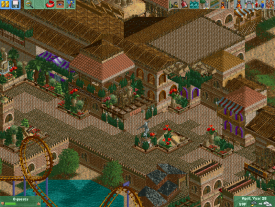
I always love these types of coasters that go underground and pop up in a section surrounded by path, go back under and repeat several times. It's always neat to make the surroundings of the coaster.
 -

 Ling
Offline
You appear to be mixing something like alpine and something like Spanish not only in the same area but on the same building. It's also a little brown, but I like the foliage and use of flowers. I think you may have overused the lattice inner detail.
 -

 Xeccah
Offline
You appear to be mixing something like alpine and something like Spanish not only in the same area but on the same building. It's also a little brown, but I like the foliage and use of flowers. I think you may have overused the lattice inner detail.
Your going to see the effect when I am completely done with the park. -

 Ruben
Offline
Your going to see the effect when I am completely done with the park.
Well for now the effect is that you appear to be mixing something like alpine and something like Spanish not only in the same area but on the same building...
Which is, in my opinion, not a huge success. I love both styles, just not when you stick 'em together in such a ''bold'' way. -

 Liampie
Offline
I don't like the mix either, but if you have a reason to do it go ahead. The individual buildings look great, especially the one with the peach arches. It's so 2005!
By the way, PLEASE don't ever use that oak tree again. -

 Dark_Horse
Offline
Well there is enough substance in the screen, I can't really comment on it because I like to see how everything fits together and flows. All I can say is keep it up cause individually, the buildings look gorgeous, even with the unusual mix of architectural styles (which is kind of refreshing)
 -

 Ruben
Offline
By the way, PLEASE don't ever use that oak tree again.
If used as filler in bigger parts of foliage to mix up scale/sizes it's a great object... Or do you just want all of us to use your trees and nothing else?

 Tags
Tags
- No Tags

