(Archive) Advertising District / Agencia
-
 26-July 12
-
 Corkscrewy
Offline
This looks amazing in game. Really can't wait to see how everything goes together.
Corkscrewy
Offline
This looks amazing in game. Really can't wait to see how everything goes together. -
 posix
Offline
AC, been wondering what you'd been up to RCT-wise- Pleasant surprise to see this update. Looks fantastic. The majority of details work for me, for once. The theme is very clear. Almost like J K would do it. What I like best about the screen are the colours, which are similarly vibrant to Cocoa's work, yet have their own distinctive style which is wonderful.
posix
Offline
AC, been wondering what you'd been up to RCT-wise- Pleasant surprise to see this update. Looks fantastic. The majority of details work for me, for once. The theme is very clear. Almost like J K would do it. What I like best about the screen are the colours, which are similarly vibrant to Cocoa's work, yet have their own distinctive style which is wonderful.
This really is a release worth hoping for. -
 Louis!
Offline
I know this is totally unrelated to AC's topic, so for that I apologise, but Po Po I have beef with your signature. RRP's Castle Howard isn't a good example of macro style, and I'd even say that eyeamthu's Magic Realms isn't either. I was disappointed by your selection there
Louis!
Offline
I know this is totally unrelated to AC's topic, so for that I apologise, but Po Po I have beef with your signature. RRP's Castle Howard isn't a good example of macro style, and I'd even say that eyeamthu's Magic Realms isn't either. I was disappointed by your selection there
-
 Xeccah
Offline
Xeccah
Offline
I know this is totally unrelated to AC's topic, so for that I apologise, but Po Po I have beef with your signature. RRP's Castle Howard isn't a good example of macro style, and I'd even say that eyeamthu's Magic Realms isn't either. I was disappointed by your selection there
/>
they are, we're chatting about it. it's a different style from the other selections but it fits macro. -
 Wanted
Offline
Hey man, just remember one thing: if you're ever in dire need of a bj, don't hesitate to ask. I'm all yours.
Wanted
Offline
Hey man, just remember one thing: if you're ever in dire need of a bj, don't hesitate to ask. I'm all yours. -
 dr dirt
Offline
dr dirt
Offline
I know this is totally unrelated to AC's topic, so for that I apologise, but Po Po I have beef with your signature. RRP's Castle Howard isn't a good example of macro style, and I'd even say that eyeamthu's Magic Realms isn't either. I was disappointed by your selection there
/>/>
Yeah both of those are not macro style really. Not to mention four of the other parks in there went unfinished. /> Sense not made there..
-
 robbie92
Offline
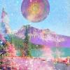
The only things I'm not feeling are the foliage in the top of the screen, the white tops to the brick, and the regularity of the entrance into that brick portion. The rest is pretty much flawless, especially the swoop around the tower on the left.
robbie92
Offline
The only things I'm not feeling are the foliage in the top of the screen, the white tops to the brick, and the regularity of the entrance into that brick portion. The rest is pretty much flawless, especially the swoop around the tower on the left. -
 Steve
Offline
I agree with Rob, what's up with the white on the bricks? The rest does look great, excellent use of monster truck track.
Steve
Offline
I agree with Rob, what's up with the white on the bricks? The rest does look great, excellent use of monster truck track. -
 Cocoa
Offline
the only problem I have is the white tops of the bricks. Please make them the same color as the brick, or even black. but not white. Also, that doorway framed by the brown and light blue arch pieces. that's just sloppy
Cocoa
Offline
the only problem I have is the white tops of the bricks. Please make them the same color as the brick, or even black. but not white. Also, that doorway framed by the brown and light blue arch pieces. that's just sloppy
But otherwise, awesome screen. I love to see creativity like this! -
 Turtle
Offline
OK, the white tops of the brick I love actually, it looks like glare from the sun, but if you could colour the ones this side of the wall (the ones which would be hidden from the sun) brown on top, it would look better.
Turtle
Offline
OK, the white tops of the brick I love actually, it looks like glare from the sun, but if you could colour the ones this side of the wall (the ones which would be hidden from the sun) brown on top, it would look better.
Such a good mix of track and scenery, you're one of the best at doing that. Colours and textures are awesome, reminds me a bit of x-sector. If you could possibly add slightly more interest to the large brick wall in the middle, some bricks sticking out or inwards, to add texture to the flatness? Or vines, or something? -
 AvanineCommuter
Offline
AvanineCommuter
Offline
The only things I'm not feeling are the foliage in the top of the screen, the white tops to the brick, and the regularity of the entrance into that brick portion. The rest is pretty much flawless, especially the swoop around the tower on the left.
I agree with Rob, what's up with the white on the bricks? The rest does look great, excellent use of monster truck track.
the only problem I have is the white tops of the bricks. Please make them the same color as the brick, or even black. but not white. Also, that doorway framed by the brown and light blue arch pieces. that's just sloppy
/>
But otherwise, awesome screen. I love to see creativity like this!OK, the white tops of the brick I love actually, it looks like glare from the sun, but if you could colour the ones this side of the wall (the ones which would be hidden from the sun) brown on top, it would look better.
Such a good mix of track and scenery, you're one of the best at doing that. Colours and textures are awesome, reminds me a bit of x-sector. If you could possibly add slightly more interest to the large brick wall in the middle, some bricks sticking out or inwards, to add texture to the flatness? Or vines, or something?
Thanks everyone for your comments! Great feedback guys, I appreciate it. The white on top of the bricks was supposed to brighten the screen; they were brown before and it was too dark. I will darken the sides of the wall like Turtle suggests, it only makes sense if it's in the shade. Good ideas about the hole in the wall Robbie and the detail on the doorway Cocoa. Also I will fix the foliage, that area behind the wall is still incomplete. The problem about vines is that these stone objects are 1/8th width and vines are only wall objects... any other ideas for spicing it up? I was thinking of adding some lanterns hanging off the side of the wall..gif)
Hey man, just remember one thing: if you're ever in dire need of a bj, don't hesitate to ask. I'm all yours.
I love that my RCT inspired such carnal desires. Wanted, though I'm never desperate for bjs, I still might hold you to it.
-
 Liampie
Offline
Liampie
Offline
The problem about vines is that these stone objects are 1/8th width and vines are only wall objects... any other ideas for spicing it up? I was thinking of adding some lanterns hanging off the side of the wall.
You can make good looking vines by stacking bushes. You can also mix up bushes and vine walls, even if the walls don't align with the walls properly. They may even glitch and it won't matter.
http://www.majhost.c.../h2h6/scr66.jpg
http://www.majhost.c...2h/h2h6/gs2.jpg (bottom)
I don't think they will look good here in large quantities though. Vines at the bottom, lanterns higher up the wall might seal the deal?


Tags
- No Tags