(Archive) Advertising District / GoldRush
-
 23-August 12
-
 RCT2day
Offline
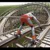
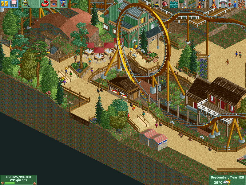
Beautiful work. Just watch for glitches on the path with the people (middle of the diagonal wall). Maybe add some foliage to the middle of the turn to break up the brown. Just a thought. Nice logo.
RCT2day
Offline
Beautiful work. Just watch for glitches on the path with the people (middle of the diagonal wall). Maybe add some foliage to the middle of the turn to break up the brown. Just a thought. Nice logo. -
 ScOtLaNdS_FiNeSt
Offline
@Austin: Cheers man.
ScOtLaNdS_FiNeSt
Offline
@Austin: Cheers man.
@Highroller: No one likes to take a dump but thats the way it is. I dont get you about the windows and such...
@Ling: Yeah those landblocks up there are more experimental than anything else will no doubt remove.
@Chorkiel: Thanks.
@rct2day: Cheers, Those peep glitches cant be helped really because its diagonal and the path is square there is a glitch, Its no biggy anyway i dont think... There will be more foliage in the middle there as you said.
Still a long way to go with this, not even half the map is finished. -
 Ruben
Offline
I like it, only comment is that those rock formations like the one in the center of those helixes and the one on the corner of the map desperately cry out for more detail. Maybe use multiple textures/1k ruins/contrast with surroundings more? Now they just blend in with the rest and all you end up with is a messy blur of unclear plain landscaping, instead of the cool stuff it could be with some minor changes. It's like painting, you always need something to contrast with something else in one way or another (shape/color). If not, like with the rocks, it becomes bland and boring... which would be a shame.
Ruben
Offline
I like it, only comment is that those rock formations like the one in the center of those helixes and the one on the corner of the map desperately cry out for more detail. Maybe use multiple textures/1k ruins/contrast with surroundings more? Now they just blend in with the rest and all you end up with is a messy blur of unclear plain landscaping, instead of the cool stuff it could be with some minor changes. It's like painting, you always need something to contrast with something else in one way or another (shape/color). If not, like with the rocks, it becomes bland and boring... which would be a shame. -
 Midnight Aurora
Offline
My first impression was that it's very square. I think what's going on is that you're trying to put too much at the edge of the map. I'd suggest getting rid of the path on the lower part of the screen and giving the loop some room to breathe.
Midnight Aurora
Offline
My first impression was that it's very square. I think what's going on is that you're trying to put too much at the edge of the map. I'd suggest getting rid of the path on the lower part of the screen and giving the loop some room to breathe. -
 Ling
Offline
I really don't like the 45*-60*-45* hill on the right. Seems very awkward, like you were trying to shoehorn the ride in to fit some specific heights. I don't like the pointy umbrellas. I don't necessarily think it's "very square" though. It does feel organic and I like the foliage (except for your broken tree at the bottom there).
Ling
Offline
I really don't like the 45*-60*-45* hill on the right. Seems very awkward, like you were trying to shoehorn the ride in to fit some specific heights. I don't like the pointy umbrellas. I don't necessarily think it's "very square" though. It does feel organic and I like the foliage (except for your broken tree at the bottom there). -
 disneylandian192
Offline
I agree with louis, its the track colors that really kill it for me. (I do get the connection to the design name though.)
disneylandian192
Offline
I agree with louis, its the track colors that really kill it for me. (I do get the connection to the design name though.) -
Ruben
Offline
Love the interaction and foliage. Agree with Louis about the colors though, and I think you're getting more & more sloppy with the landscaping. Such a shame to put so much work in archy only to be so unrefined in the landscaping...
-
A.S.Coasters
Offline
Agreed with Disneylandian and Louis, the darker yellow (in my opinion) rarely looks good as a track color. I think if you just make the track bright yellow and leave the rest as is it would look better.
-
 pierrot
Offline
personally I think the foliage colors are random and too bright. I really can't feel mine theme with that foliage, honestly..
pierrot
Offline
personally I think the foliage colors are random and too bright. I really can't feel mine theme with that foliage, honestly..
love the track colors though, it's quite epic. I'm sure it could be works if you refine surrounded details. -
 rct2isboss
Offline
All you guys are saying is that the colors are bad. Why don't you actually suggest a different color scheme instead of just complaining.
rct2isboss
Offline
All you guys are saying is that the colors are bad. Why don't you actually suggest a different color scheme instead of just complaining. -
Midnight Aurora
Offline
You sure are a moody little fellow. There are suggestions above.All you guys are saying is that the colors are bad. Why don't you actually suggest a different color scheme instead of just complaining.
-
imawesome1124
Offline
I think it's a little messy because it's kinda unfinished, but what is there looks good. I agree about changing the track colors, regular yellow for the track and gray for the supports would look good.
-

Rhynos Offline
You sure are a moody little fellow. There are suggestions above.
I think you forget that the internet is not a place for reading unless "TL:DR" is typed. -
 Louis!
Offline
Louis!
Offline
All you guys are saying is that the colors are bad. Why don't you actually suggest a different color scheme instead of just complaining.
Because i'm not here to politely give suggestions, I'm here to bitchily point out flaws. Don't you know anything? -
 FredD
Offline
I know you've said you won't change the coaster colors, but I'll say it again. Please change it, it hurts my eyes. I'd go for (soft) red. The path and buildings are already very brown, so if you change the coaster color I think it would break the brownness.
FredD
Offline
I know you've said you won't change the coaster colors, but I'll say it again. Please change it, it hurts my eyes. I'd go for (soft) red. The path and buildings are already very brown, so if you change the coaster color I think it would break the brownness. -
 Xtreme97
Offline
I think the gold works well and fits with the theme but perhaps try changing the rails and/or support colours.
Xtreme97
Offline
I think the gold works well and fits with the theme but perhaps try changing the rails and/or support colours.

Tags
- No Tags