(Archive) Advertising District / Marvel Park (first park)
-
 17-May 13
-
 Recurious
Offline
Hey all, my name is Peter and i'm new here. I used to play rollercoaster tycoon 2 as a kid. And lately I got interested in playing again. And now i'm building my first real park. Thought u guys might like to see it and give me some critique since i am not really the best park maker but Im trying to get better.
Recurious
Offline
Hey all, my name is Peter and i'm new here. I used to play rollercoaster tycoon 2 as a kid. And lately I got interested in playing again. And now i'm building my first real park. Thought u guys might like to see it and give me some critique since i am not really the best park maker but Im trying to get better.
Anyways here are some screenshots:
The entrance:
The green house is going to be a station for the train trough the park. On the higher floors is a hotel.
Also the entrance and part of the main street:
The images are still really a work in progress, so let me know what you think and help me improve! />/>/>
-
 Arjan v l
Offline
Hello Peter, welcome to NE.
Arjan v l
Offline
Hello Peter, welcome to NE.
From what i can see, it's definitely not bad.
I would lose those white blossoming trees though, as they stand out too much.
There are also diagonal path blocks available for rct2, to create a better path flow. -
 AK Koaster
Offline
That's pretty good for a noob, I really like the french-quarter style architecture (that's usually difficult to pull off, but it looks great here. I think a little more color and architecture variety would also take this a long way. Foliage could use a bit of work as well, but overall great start.
AK Koaster
Offline
That's pretty good for a noob, I really like the french-quarter style architecture (that's usually difficult to pull off, but it looks great here. I think a little more color and architecture variety would also take this a long way. Foliage could use a bit of work as well, but overall great start. -
Recurious
Offline
Hello Peter, welcome to NE.
From what i can see, it's definitely not bad.
I would lose those white blossoming trees though, as they stand out too much.
There are also diagonal path blocks available for rct2, to create a better path flow.
First of thanks!
As for the tree's I will try some other trees and see what looks best. And im aware that there are diagonal paths in rct2. I just don't have them yet. I will try to find some and update it with the diagonal paths. Just one question. How can you make the fences diagonal?That's pretty good for a noob, I really like the french-quarter style architecture (that's usually difficult to pull off, but it looks great here. I think a little more color and architecture variety would also take this a long way. Foliage could use a bit of work as well, but overall great start.
Thanks, Foliage wasn't finished yet but I will work on it .
-
Arjan v l
Offline
We also have diagonal fences as scenery.
But i assume you're using the regular paths.
Most players around here use invisible footpath with path blocks underneath, it'll allow you to make big squares without peeps getting lost, you can create flowing paths with the use of path blocks (diagonal, curved) and a whole bunch of other things.
If you download a recent park from here, then you should be able to see what i mean. -
 Faas
Offline
Try to save your pictures as JPEG and not as PNG.
Faas
Offline
Try to save your pictures as JPEG and not as PNG.
The uploaded pictures will have a better quality and better colours that way.
The screens look good, but try to use a bit more colour in your buildings. -
 chorkiel
Offline
In an area like this, with quite some foliage and grass, green is probably not the best option for a color for your buildings. Other than that it looks like a promising start.
chorkiel
Offline
In an area like this, with quite some foliage and grass, green is probably not the best option for a color for your buildings. Other than that it looks like a promising start.
Can't wait to see how you're gonna incorporate the themes. Is this park gonna be based more on the movies or on the comic books? -
 posix
Offline
posix
Offline
It's actually the other way round.Try to save your pictures as JPEG and not as PNG.
The uploaded pictures will have a better quality and better colours that way.
Screens are looking good but a bit bland and boring. The path contrasts are too high (grey + bright red). Also the dark unsaturated green with the grey brick looks unappealing to my eye. I would work on colour balance and harmony. I like how your path layouts are relatively fluid instead of rectangular, that's nice. -
Recurious
Offline
Try to save your pictures as JPEG and not as PNG.
The uploaded pictures will have a better quality and better colours that way.
The screens look good, but try to use a bit more colour in your buildings.
Tried putting some more colour in my buildings (see update). I still like to use unsaturated colours tough, they look more realistic in my opinion. The really bright colours just don't seem realistic to me and burn my eyes />/>.
/>/>.In an area like this, with quite some foliage and grass, green is probably not the best option for a color for your buildings. Other than that it looks like a promising start.
Can't wait to see how you're gonna incorporate the themes. Is this park gonna be based more on the movies or on the comic books?
More on the movies I guess. But I haven't planned the whole park yet, so that may change.or just don't edit them in paint and save them again, that seems to fuck them up
I edited them because I wanted to cut parts out, so you guys don't see to much unfinished stuff.
Small update:
Part of the main street. Tried using more different colours other then green.
Still working on my first 2 screens with the advice I got. I will post the updated version when I'm done.
CnC is welcome
-
 Mattk48
Offline
Too much brick, you need to break it up somehow. I think a strip of tarmac by the buildings would go a long way. Also that yellow building should be accented with white, like the red one beside it. Currently its too yellow
Mattk48
Offline
Too much brick, you need to break it up somehow. I think a strip of tarmac by the buildings would go a long way. Also that yellow building should be accented with white, like the red one beside it. Currently its too yellow -
 Cocoa
Offline
lol my capslock was still on from xcoasters post
Cocoa
Offline
lol my capslock was still on from xcoasters post
anyway, i'm pretty sure the specific use of green is not what the problem was, but rather the fact that everything is the same color. in these structures, everything is gold or red. vary up the colors within a building? this isn't de blob -
 Super G
Offline
Archi looks nice, but please if you edit your screens with Paint, save them as .jpg and not as .bmp. Because right now, the colours are pretty damn fucked up.
Super G
Offline
Archi looks nice, but please if you edit your screens with Paint, save them as .jpg and not as .bmp. Because right now, the colours are pretty damn fucked up. -
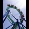
Recurious
Offline
Small update: The park is still in scenario editor but I already build a rollercoaster in a different scenario that will go into the park. The scenery is not the final scenery. I didn't have custom scenery in this scenario and I only put the scenery there to get a general idea of how it is going to look. I will add custom supports and custom scenery when this goes in my final park. Having said that, all critism regarding the scenery will be kindly ignored since this it's only there to give me a general idea how it could look. Suggestions are always welcome ofcourse. I want to know what you guys think about the track layout, I personally like it but I think it might be a bit short. Also, I think I fixed the problem with the screens being in weird colors.

lol my capslock was still on from xcoasters post
anyway, i'm pretty sure the specific use of green is not what the problem was, but rather the fact that everything is the same color. in these structures, everything is gold or red. vary up the colors within a building? this isn't de blob
what do you mean with: de blob? -
chorkiel
Offline
De blob is a game for nintendo wii. Look it up!
I dislike that tunnel, at least as of now. -
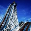
Arjan v l
Offline
Isn't the train going way to fast through the corkscrew?
Or is there a curve too fast?
Your lateral forces are very high.


Tags
- No Tags