H2H8 / H2H8 Round 1 Match 3 - UltraRealists vs Heaven's Gallery
-
 14-April 18
-
 Version1
Offline
Version1
Offline
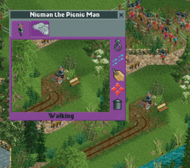
The main concept is about tripping, hence the names and ideas behind the rides - Ego Death, Psylocibin express, pareidolia, etc., the black holes, the glitched rides, etc. Im not sure if you got that?
Maybe it should have been obvious from just looking at the park without a need to do research...
-
 Austin55
Offline
Austin55’s stream of conscience thoughts on HG’s park (Sorry UR, I’ll get to you I promise. It’s a lot to take in)Initial reaction is to the name. Sounds very western European. I don’t know what it means. I try to avoid looking at the screen but can’t help but notice the city vibe. Onto opening the park. Is that a welcome message? Didn't we all talk about not having these due to open? Well, you did so props for it. I like that the screenshot is the same as the entrance. I also like that the park opens up to the entrance and zoomed in. Makes me want to explore and is easier for this style of writing (and my style of viewing). Entry is small, I’m assuming this is not meant to be a park but rather a city. Someone parked sideways. What a dick. The green area hasa bow and arrow? I’m not sure. So onto the city. Decent architecture here, nothing groundbreaking really. Perhaps a bit small feeling. Not really memorable. There does seem to be a lot going on here though, it feels like a big area but doesn't actually take up much room. So what's up with the minigolfer? Beachcombers! Brilliant. This is why h2h is awesome, these moments. Great shit. The car ride station is really well done, best bit of the archy here. The lighthouse is mediocre as possible. The white cliffs coming into view is really cool, and starting to further sell the english theme. Dover, right? And of course there’s sheep. Live the diagonal windmill blades, well I love the shape anyway, not sure if this object is the best. I followed the path through the cave to where the coaster wraps around around. This area is a lot better IMO, the achy feels more enhanced and detailed and right sized. The palette starts to come through. You pulled of the train crossing over itself, brilliant. Always wanted to try and when I have it never worked. The landscaping is well brought together and composed here as well, with great interaction with the coaster and train. Then of course the maypoles. I have no clue how this is working. Seriously how is this happening. Brilliant. Def an area which made me stop and admire for a while, watching the trains of both rides roll through. Excellent. I see the yellow tube sliding down the hll our the corner of my eye and instantly know. Hilarious. My thoughts are now coming through in a briish accent. Or whatever people who chase cheese sound like. I followed this path around through the fairground. Cute, interesting to see someone try to custom support a ferris wheel. Themed to cheese obviously. Moving on to the back corner now. There’s a bit of new another architectural style here.I do think the subtleties of these styles will be lost on people not familiar with them. Americans in particular. The fox hunting coaster is fun, station is pretty but a bit boring again. A steeplechase is also the perfect coaster, just feels british. I wisht the castle felt more… prominent? Not really excited by it. The path working it’s way down is again lovely. The park’s central canyon is really my favorite part, every angle is scenic and composed. I’ve been seeing the coaster going for a bit but not stopped to follow it so I stop over there. The station is dope loving the smokestacks and the pallette’s effect on the brick colors. Excellent. The hole in the roof as the train moves in is a nice touch, though I’m not sure why it’s there.The lifthill supports are weird, and not attractive. ANd why on one side? Anyway, the sortoff triple down first drop all the way into the village is fantastic, looks like a lot of fun. Again, great interaction over the bridge section. Liking the doubled over bridge and the final section. The helix into the breakrun is a perfect ending. Definitely a well done coaster in my eyes. Except the wonky lift supports. At this point I think I’ve seen everything and only fully zoomed in, so I go out a couple of levels. Everything looks fine. Struck by how green it is, lot of filler foliage space. Not sure if that’s good or bad, perhaps could have gotten some more architecture or something in there. Again, the small scale of the city areas does strike me as generating a lot of atmosphere for the size that they occupy. Digging through the staff menu reveals some fun, like shogo in the bushes and Alex actually mowing. Some funny stalls as well, the outdoor bathroom a great touch. Starting to gather overall thoughts here, it feels a little bland. Some things we’ve seen before. Definitely feels like someone wanting to make an ode to their hometown or a vacation memory in the UK. It doesn't strike me as feeling “h2h”, nothing wrong with that though. I’m a little underwhelmed but charmed pleasantly, it’s an attractive park that doesn't feel like it did anything wrong and all was executed well. And ofcourse the details are spot on, the little things. I’ve looked at the maypole a dozen times now.
Austin55
Offline
Austin55’s stream of conscience thoughts on HG’s park (Sorry UR, I’ll get to you I promise. It’s a lot to take in)Initial reaction is to the name. Sounds very western European. I don’t know what it means. I try to avoid looking at the screen but can’t help but notice the city vibe. Onto opening the park. Is that a welcome message? Didn't we all talk about not having these due to open? Well, you did so props for it. I like that the screenshot is the same as the entrance. I also like that the park opens up to the entrance and zoomed in. Makes me want to explore and is easier for this style of writing (and my style of viewing). Entry is small, I’m assuming this is not meant to be a park but rather a city. Someone parked sideways. What a dick. The green area hasa bow and arrow? I’m not sure. So onto the city. Decent architecture here, nothing groundbreaking really. Perhaps a bit small feeling. Not really memorable. There does seem to be a lot going on here though, it feels like a big area but doesn't actually take up much room. So what's up with the minigolfer? Beachcombers! Brilliant. This is why h2h is awesome, these moments. Great shit. The car ride station is really well done, best bit of the archy here. The lighthouse is mediocre as possible. The white cliffs coming into view is really cool, and starting to further sell the english theme. Dover, right? And of course there’s sheep. Live the diagonal windmill blades, well I love the shape anyway, not sure if this object is the best. I followed the path through the cave to where the coaster wraps around around. This area is a lot better IMO, the achy feels more enhanced and detailed and right sized. The palette starts to come through. You pulled of the train crossing over itself, brilliant. Always wanted to try and when I have it never worked. The landscaping is well brought together and composed here as well, with great interaction with the coaster and train. Then of course the maypoles. I have no clue how this is working. Seriously how is this happening. Brilliant. Def an area which made me stop and admire for a while, watching the trains of both rides roll through. Excellent. I see the yellow tube sliding down the hll our the corner of my eye and instantly know. Hilarious. My thoughts are now coming through in a briish accent. Or whatever people who chase cheese sound like. I followed this path around through the fairground. Cute, interesting to see someone try to custom support a ferris wheel. Themed to cheese obviously. Moving on to the back corner now. There’s a bit of new another architectural style here.I do think the subtleties of these styles will be lost on people not familiar with them. Americans in particular. The fox hunting coaster is fun, station is pretty but a bit boring again. A steeplechase is also the perfect coaster, just feels british. I wisht the castle felt more… prominent? Not really excited by it. The path working it’s way down is again lovely. The park’s central canyon is really my favorite part, every angle is scenic and composed. I’ve been seeing the coaster going for a bit but not stopped to follow it so I stop over there. The station is dope loving the smokestacks and the pallette’s effect on the brick colors. Excellent. The hole in the roof as the train moves in is a nice touch, though I’m not sure why it’s there.The lifthill supports are weird, and not attractive. ANd why on one side? Anyway, the sortoff triple down first drop all the way into the village is fantastic, looks like a lot of fun. Again, great interaction over the bridge section. Liking the doubled over bridge and the final section. The helix into the breakrun is a perfect ending. Definitely a well done coaster in my eyes. Except the wonky lift supports. At this point I think I’ve seen everything and only fully zoomed in, so I go out a couple of levels. Everything looks fine. Struck by how green it is, lot of filler foliage space. Not sure if that’s good or bad, perhaps could have gotten some more architecture or something in there. Again, the small scale of the city areas does strike me as generating a lot of atmosphere for the size that they occupy. Digging through the staff menu reveals some fun, like shogo in the bushes and Alex actually mowing. Some funny stalls as well, the outdoor bathroom a great touch. Starting to gather overall thoughts here, it feels a little bland. Some things we’ve seen before. Definitely feels like someone wanting to make an ode to their hometown or a vacation memory in the UK. It doesn't strike me as feeling “h2h”, nothing wrong with that though. I’m a little underwhelmed but charmed pleasantly, it’s an attractive park that doesn't feel like it did anything wrong and all was executed well. And ofcourse the details are spot on, the little things. I’ve looked at the maypole a dozen times now. -
 AvanineCommuter
Offline
AvanineCommuter
Offline
Maybe it should have been obvious from just looking at the park without a need to do research...
Seems like most people got the theme so I dont think research was necessary. Theres apparently a select few who cant understand it but hey, you win some you lose some. 🤷♂ -
 chorkiel
Offline
chorkiel
Offline
It happens every time. You can't always have everyone understand every concept and idea. Just like how people hadn't seen Zombieland and Big Hero 6, or how someone did not get Le Reve, back then.
-
 Cocoa
Offline
Cocoa
Offline
wow, two great parks to kick this competition off. time for some reviews!
Heavens Gallery
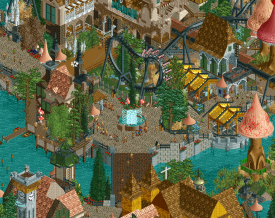
I really really love this park. You did something that I'm hoping we see more of in this competition- you took an atmospheric, inspired idea and did it to perfection. It wasn't overly worried with "being the best" or look like its really "playing the h2h game" and the park really does well because of that authenticity. Amazing palette too- awesome new colors. I suspect we'll be seeing quite a few new ones this competition!
As for the park, lovely all around. Lots of little details and cute things to notice, and its all excellently composed. Great archy, great atmosphere, and some awesome cultural and geographical nods. The train bridge and the mansion on the other side are phenomenal. I hope this will be par for the season!
Ultra Realists
What I said before about park authenticity- throw it out the window! But thats ok, playing the H2H game is a skill unto itself and a perfectly legitimate strategy. This park is also great, sort of like a explicity-on-drugs le reve (yeah sorry, of course you'll invite comparisons if you build a similar park!) A lot of great, huge archy, mixed in with some more forgettable and uninspired work, that only seems to clutter the park. But, I say that lightly, because it is in the whole very good- atmospheric, fun, lively, silly, etc.The coaster station is great, as is the castle mostly. I especially like the whirlpool, insectorium, and the mushrooms are done well. Overall a good park, whose 'macro' sense is cluttered a lot by some less good/derivative buildings, and with some good ideas. I think a trap I personally fall into a lot, and maybe happened here, is that as a builder of a park, the layout is very intuitive to me, so I assume everyone else will be able to 'see' what is going on just as well as I do. But really, I make everything too vertical and cluttered and without any breathing space and suddenly no one knows where to look, how to progress around the park and every time you turn the camera its confusing. I'm not saying that massively took away from this park, just my two cents.
Lastly, I would guess that the two builders here are both pretty obvious. I hope that people can still vote on the parks fairly despite any previous prejudices or love towards any of them.
I don't know who I'll vote for yet. It feels to me like the community will lean towards the realists, and the park is almost constructed purposefully to do that. I could swing that way and be impressed by the scope of wits end, or pull back and really soak in the restrained gallery park. I'm not sure.
-
 FredD
Offline
FredD
Offline
Heavens Gallery
This feels like an English version of Lijang or Technototsqldlcdk.... Rural England is the most beautiful part of England, it has a certain vibe that is very charming. This park succeeded to translate that charming atmosphere into rct. No need to ask what the theme or setting is, the readme is ;traditionally from Heavens Gallery; quite original but necessary at all to understand the park.
The archy is perfectly done, just the right details. Not too much so it doesn't feel overdone but still enough to make it interesting. Also, foliage and landscaping are on point, really really good. The best areas that really stood out to me were the port, the white cliffs with the sunday ride and sheeps above it and the upper village with the church. I really dig that church. Overall this park could easily be a set for an episode of Midsomer Murders.
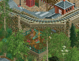
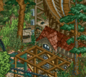
One thing I didn't really felt so enthusiastic about is the wooden coaster. For some reason it didn't do much for me and I feel like the park wouldn't lose any value, charm or something if you got rid of it. Outside of some movement in that area. I like the fox hunt better, though I don't understand why the station is in the greenhouse and not in the/a typical English manor? There seems to be one right next to it but I find it a bit too small compared to the surrounding buildings.
So many great details over. Could easily miss some. I'd give it between an 80 and 85, I'd rather would have liked to see a more interesting coaster over there than the woodie. But that's my only downside to this park! Great job and a fantastic start to H2H for you guys.
Ultrarealists
First, let's kick in an open door... Why does this park hasn't a readme contrary to it's opponent?! If any of the two needs a readme, it's this one! I can only guess the theme... a mushroom in medieval times?! Enough about that. The park looks cool, no doubt that castle with that mine train drop around is easily the strongest stuff on this map.
The mushrooms are great. I like them. Archy is good, but not as strong as HG displayed. Some buildings are really nice, some are more meh and feel bare (like that church with the circus in it). What it does better than the opponent: better coasters! I like every coaster on the map. That mine train is incredibly good placed and very well paced. I like coasters who rage over their tracks and don't seem to lose their speed. The invert is great too and the trick you guys pulled off at the end was great

The water bowl with a cut out view was also very fun to look at, nicely done. Overall a very good park, I must admit fantasy isn't my thing but this park is really a fantasy park I can really enjoy. 80% for you guys.
So my vote will go to Heavens Gallery. With a really atmospheric park full of little fun details they managed to amaze me just a bit more than Ultrarealists did. This is a great match-up to open the eight season of H2H! Let's hope the other match-ups will be on the same level

-
 Iron Rattler
Offline
Iron Rattler
Offline
Just as a general rule for this H2H, I'm not going to review my teams own parks. I'm clearly biased, and don't want to come off as shilling for votes. That said here is my review for Heaven's Gallery in a pros and cons format as I move through the park.
Pros
+ The white cliffs turned from a con to a pro on my second viewing of this park. It's a pretty fun unique feature that helps place the park in Britain.
+ The town was a pleasant area, simple but very nice architecture, and the beach combing and running cars nearby were pretty good ideas.
+ The railway bridge area was nice, very scenic with some great interactions with Locomotion. It also allowed that cool two tiered bridge back over the river for locomotion
+ I thought the church building and the railway station were very nice.
+ The cheese rolling and the maypole hack were brilliant details. Great ideas, and it was fun figuring out how you guys did them.
+ Overall the whole entry was lovely and atmospheric and cohesive. It conveyed the sea side British town vibe well and was lovely to look at.
Cons
- The steeplechase. I thought the station was the weakest point of the park from an architecture standpoint. The layout also sprawled out too much for my liking, and the lack of synchronization bugged me. At first I thought it was intentional, with the fox leading the hunters, but then saw the hunter was in the lead for a large part of it.
- The station area for Locomotion. While the station itself is brilliant, it's pushed way too close to the edge of the map for my liking and cramped. This really hurts the queue in particular. You have a super nice scenic park, and the queue is just a straight shot into the station with no good sight lines. A missed opportunity for me.
- Not quite sure how to phrase this last critique, but while I admire the simple atmosphere you guys built in this park, it could have used a few more details to really hold the viewers attention longer. The maypole was one of the first things I saw viewing the park, and I was really hoping for more charming things like that as I was exploring the park. This could have really elevated this park to the top level of H2H parks for me.
Overall its a lovely park, and a great start to H2H. By the comments and community scores it looks like this will be a close matchup and both teams can be very proud of their work. Go Ultrarealists.
-
 G Force
Offline
G Force
Offline
Some more specific things I enjoyed from each park:
Man this angle is just fantastic, what a moment.
The name of the boat ride was a great little touch, as was the whole boat ride itself, really fits the theme I believe.

I wish I knew what some of these words meant though, a read me would have been nice.
Overall, I think this park is an 85% for me... I know the Le Reve (thanks Julow) comparisons are clear for some. But honestly I think this is built just a bit better than Le Reve. Its far more natural, readable and just easy to look at. I think if people want to draw the comparisons, actually look at that park again. The more I look at its there's really not a lot of similarities outside of some of the basic trends.
I actually think this flat ride "Drunk and ost" is quite clever, subtle but a nice addition:
Abandoned crashed car is a nice little touch though I don't know the reference if its even supposed to be that:
I don't understand this either, but its nicman so its good with me:
For me I think this falls a little short like I said earlier, probably in the 70-75% range. Its well made but as Liampie said before me:
But I think a spotlight requires a certain amount of scope and grandeur that this park lacks...
If you replace "Spotlight" with "a winning H2H park" I think the same sort of holds true. Maybe not scope in terms of size, but in terms of concept and ambition. And while DKS is well made, I just don't think its that impressive to me. A lot of the stuff outside of the archy felt like something a Fisch could have done better (or did) in Riverland. The archy was quite good though, and definitely shows a veteran hand who knows their way around the game, its again very simple but interesting to look at. While Wits is very elaborate yet also very interesting to look at. Quite a good contrast here between the two.
But yes, I'm normally not a fantasy guy, but to me Wits end was still just the better park to me, it had a more interesting concept and achieved it at a level high enough to counter any of the things DKS did better, notably rides and those big moments which separate this parkmaking out from the competition. Filling a park with cool little easter eggs is fun too, but I don't know if one can get by simply on that alone in this match up.
Also, there is no rain in DKS, I am disappointed!
-
 Fisch
Offline
Fisch
Offline
Hmm, starting with a tough one right away. I think this is all about clean but tame against messy but awesome.
One second I'm thinking "oh wow, that little gate under the building into the port town is so beautiful. Oh look at those cars running on the road, going over the crosswalk. So well done." The next second I'm a bit bored by the non-flamboyant approach. Sure, you have the great new colors, lots of which I was hoping to see introduced to the game at some point. But it still feels stuck somewhere in between Lijiang and the Parkmenistan park.
As I said before though, it's all really pretty and super well done. But is it trying to do enough (despite the amount of British references)?Then there's Wit's End, which has an amazing castle, yet architecturally/technically overall falls short to its competitor. That said, Wit's End is anything but boring. It's intense, has great coasters, lots of out of the box content, and amazing elevation changes. The park feels layered so well with its verticality. It stands out even more because it's up against a park that's much more flat (despite the chalk cliffs and the river). For its ideas and its weirdness I find this far more exciting. But I'm not sure yet if I should pick the more exciting one or the cleaner, more technically pleasing one. I'm leaning towards Wit's End though. It's very close.
I think I'm going to wait another couple days and then I'll hopefully be able to decide who to vote for.
-
 Turtle
Offline
Turtle
Offline
Great parks, love it. Not sure who i'm voting for, or even if I am, but I loved them both.
-
 CoasterCreator9
Offline
CoasterCreator9
Offline
What an interesting match. Both parks were very interesting and I've far from decided who I'm going to vote for.
Preliminary thoughts:
DKS - Charming, wonderful atmosphere, splendid details to explore, great architecture, coasters felt a little weak.Wit's End - Unique, great ideas and fun things to look at, unfortunately very busy/cluttered and hard to read in places
-
 Dr_Dude
Offline
Dr_Dude
Offline
Maybe it should have been obvious from just looking at the park without a need to do research...
maybe you should do more drugs
-
 dr dirt
Offline
dr dirt
Offline
Took a look at these briefly this morning, then a little more in depth tonight.. First go around, my initial impression was I enjoyed Heaven's park more. Took a look again, and came around a bit on the Ultrarealist's. I'll say these are certainly two well above average parks for H2H - at the very least.
So Heaven's DSK highlights for me was the seaside town, particularly along the small river, and the bridge area. The town overall was very quaint, well constructed, and offered many practical details - like the cars, and the mechanic garage, among others. I enjoyed that unusual textures were explored here and pulled off very well. The bridge area also was great with the interaction between the train, Locomotion, and the path & buildings, all while maintaining the quaint feel. Those two areas, however, I felt were the only ones where the interaction between the elements felt strong. The steeple chase felt like it was doing its own thing, and left something to be desired in terms of its inclusion with the rest; the manor building it ran through was great, though. Locomotion almost fell into a similar thing, with it feeling so secluded from everything else on the side, but the middle half of the layout checked that box for me. The bridge element included in it was great too. I liked the factory quite a bit, maybe I missed the connection to locomotion in there, but a little something more to make the name fit would've been nice. The cliffside would've been so much better without the quarter land block texture repeating throughout. Cheese running was a nice detail. Overall, atmospheric and executed well, felt a slightly unambitious in scope. Felt very true to the theme, and the work hard a stronger connection to it than the Realist's, I felt. I think it's comparable to #diamondheights (yeah, yeah, don't compare to old parks, w/e), and it felt like it had stronger technical execution, but was weaker in conceptual/coolness factors.
Wit's End, I'll admit, takes a minute to begin to get. It took looking at the names to initially understand what the theme is beyond fantasy castles. So it's a hallucinogen (mushrooms) quasi-medieval theme? I'm still not sure if I have that classified correctly, if I'm honest. Personally, I feel that drugs are not the best theme to tackle, as it's either too subjective or you end up doing what everyone expects from a drug park. I don't see the connection to the castles and shrooms, and didn't feel an awesome creative vision that would have saved the lack of connection between the two. My impression was the concept came from the architectural theme most comfortable to the builders, and then add shrooms, then build the park. I'm sure the builders have a much different perspective, of course, it just seemed to come across that way. So first look, I felt like the architecture was missing a little finesse. There's some bits of the buildings that feel clunky - I wish less was done in some cases, where the essential form of the architecture was the focus and oversized ornaments didn't dominate. I didn't recognize the mushrooms as mushrooms until reading comments/the discord, and I think clarity would've helped massively. The truth is, egg_head did the mushrooms effect better in The Hidden Pond. Taking those objects and adding colored spots in the object editor (or add them some other way) would have completely elevated this park beyond that. I didn't see the invert going off the track as a good move. Now for the second viewing - and I must say I saw the positives way more. So the castles for the invert and mine train were fantastic and probably spotlight-quality work and the best aspect of the park for me. The left (from the starting view) of the map also was excellent. The waterfall + underwater area was super cool as well. I felt the interaction of the rides with everything else was much stronger than in DSK, and this is something I really, really look for and appreciate in parks. The front area and right side felt clunkier, still. So - finally, I found it hard to ignore the similarities to Le Reve (again, I'm/we are going to make them), and was in a similar position to DSK compared to #dh.. better execution, but I felt the conceptually it felt less iconic as in not delivering that powerful creative vision from your minds to the park.
Both parks I felt had layouts that were good, but didn't deliver the lasting image the greatest layouts plant in your mind with elements/placements you won't forget - ie, El Encierro's diagonal lift over the town, SQPR's (w/e it's called) sprawling & dominating layout, Nebulocity's LSM incline on top of it's launch section and loop placement in Lenox, basically any RRP and maybe Phatage layout has this magic. Locomotion's over/under bridge was the closest to something like it, and the invert's batwing placement, but I'm not sure if either as a whole are quite a 'lasting' layout. Admittedly, this is holding layouts overall to an incredible standard, and it isn't something I'm disappointed in either park about. Just may be the one extra 'umph' either needed, to elevate up to the very elite parks of H2H history as I think highly of the work in both, even if this post may not seem to reflect that. If anything, bringing up either not quite reaching their own conceptually highest level, and the layouts not reaching my 'hall of fame' is testament to how strong I think both are.
I'll have to have another viewing to decide, for sure. But we certainly have two parks that I'm sure will go down in the communities memories, and it's got me thinking we may have the highest quality H2H yet.
-
 shnupz
Offline
shnupz
Offline
Just love this unexpected park vs park in H2H... 2 parks on each scale of the spectrum battling it out! Both are lovely parks... I'll review them shortly. Hats off to UR and HG!!! Way to kick off the tourney!
EDIT: For some reason the train on Pareidolia jumps off the track after the batwing, then goes through the cork and helix disconnected from the track. Is this a glitch in my game or on purpose?
Paredoila is the word for when you see something in the grain of your carpet, the shape of your curtains, in the corner of your eye etc that spooks you because it looks like something else. I think its intentional and supposed to catch you off-guard when you're looking at the centerpiece and other eye-grabbing details -
 pierrot
Offline
pierrot
Offline
Really well said.Parks are meant to tell the story, and that if you need an external source to get information about a park, then the parkmaking wasn't effective. As with visual art I think rct parks should be in a lot of ways up to the viewer to extrapolate meaning out of the work.
-
Cocoa
Offline
I disagree shotguns with the above quote. no art lives in a vacuum, and changing the context and information we view something with has an effect on the meaning and associations we put on it. theres obviously a legitimate and valuable philosophy in making the park stand by itself with visual storytelling and the myriad tricks we use (ride names on trackitecture, staff names, signs, references to real parks, etc). thats great and I definitely encourage parkmaking which is deliberate in this regard- exploring the boundaries of a medium is often a great formula for art (see: bioshock or the witness for video games, if on a winters night a traveller by italo calvino for literature, etc)
but its also perfectly legitimate as a parkmaker to want to make the audience feel or think in a particular way or know certain things outside of the pure construction of the park, like with a fictional backstory (corkscrewed, riverland) or helping the audience know something about the method of construction (stream of consciousness? nostalgia for real parks?). those things, in my opinion, can't be separated from the whole 'artwork' that is the park. they're another method we use to create the art that we envision, and just because that may not fit into one person's parkmaking philosophy, does not discount it as "less good parkmaking". And I think it does constitute meaningful criticism to say "I don't think this art achieved what it intended to for me". Its either a call to improve your visual storytelling, consider other forms of media which can add to parks, or feel free to ignore because you don't need to believe anyone's criticism. Obviously you can debate about who art is "for" for years and what constitutes an informed audience or any of these pretentious subtleties of art criticism but who cares, we're a bunch of twenty-something roller coaster enthusiasts obsessed with new orleans architecture
this conversation about the relationship between parkmaking and art/art philosophy probably should be a separate topic, although we've had a bunch before. I don't really want to surpress conversation here about the real parks so feel free to tell me off and I'll move it
-
 bigshootergill
Offline
Alright, so it’s review time (+/- style for me too). For starters, I have to honestly say these parks are in my Top 2 list of favorite parks for H2H8 so far!
bigshootergill
Offline
Alright, so it’s review time (+/- style for me too). For starters, I have to honestly say these parks are in my Top 2 list of favorite parks for H2H8 so far! Wit’s End:+ It took me a little while to grasp the theme as others have said, but fantasy building style is totally my shtick, so even in my first tour of the park I really enjoyed looking through the park, without really grasping what you were going for... I could look at this kind of building style all day long!+ As for specific highlights, I actually really liked the entrance to the park, it’s not overly noticeable as it’s much smaller than your average park entrance, but the little brown/yellow building with the iron gates, and then being greeted by a reversing splash coaster was so cool+ Some of the archy bits that struck me was the intricate castle for Psilocybin Railway, it takes skill to put together such a large & complex structure, but the builders did a great job here, love the train dodging in and around. Actually, one of the more picturesque portions of the castle was the layered gardens in the front with the stair case, it looks really beautiful!+ The “staob hsalps” layout is fun and quirky, cool station (I see Fisch’s arches are going to get a full workout this H2H), the toilet bowl effect was great, though I wasn’t a fan of how the boats disappear into the ground full of peeps and then come out at a waterfall (you couldn’t have built a cave opening on both ends?!?!?)+ Another high point is the station for Pareidolia, the use of browns is pulled off well here which is tough and usually criticized, and the interaction of the coaster itself is great, very exploratory... and the beautiful batwing placement. SG!+ A little thing that I liked was the dripping brick style you employed in little spots in the park (I just might steal that idea in my fantasy park I'm working on. In fact, I have some very similar building styles in that park already... so I might use another idea or two... we'll see)+ I like how you played with the larger mushrooms, having them I guess as dwellings, or at least real buildings. I love a quirky, busy, jam packed park.- Didn’t really think the trick with Pareidolia at the end of the ride was very well executed, it was choppy and weird... it seemed very glitchy, which I guess it's what the theme was going for, which I guess is kind of my gripe with the park in general. After I gathered the point of the park, I don’t really see what it has to do with a drug trip... as Dr Dirt said, it’s more a medieval park with mushrooms. It’s too bad someone on your team couldn’t edit the color palette, some psychedelic colors could have really pushed this theme... maybe even releasing the park with 3 or 4 different color palettes all with different whacky colors, labelling each one as a different trip.- There was obviously some struggling with matching building styles among the team, some buildings could have been spruced up a bit, but that’s kind of how H2H rolls, so it’s not a major issue overall.So I’ll refrain from discussing our team’s park, perhaps I’ll throw in a review after the votes come in. But what a great first match!!! Freakin' awesome! Should be an intriguing voting result. I know we’re only 2 parks in, but I can see both of these parks being in my Top 10 at season’s end... and if they’re not then we’ve got a damn good H2H ahead of us! Great parks from Ultra Realists and Heaven’s Gallery, setting the bar high from the get go!
 -
 Ziscor
Offline
Ziscor
Offline
Such a great matchup to start the season off with, damn.
Wit's End
I accept I might not be ready to take this park in fully for what it has to offer right now, and that'll change as I look at this park more and more in the long-term future, but so far it's just looking okay. While it has some pretty good moments of greatness, there's something holding it back from looking better.
The vertical aspect works great in some places (parts of the castle), but also throws me off in others (the invert's station). Sometimes it's an absolute mess but there'll also be much to appreciate outside that which makes for a confusing experience overall, as to what to feel about the park. Also, I can't help but think that the building style this park uses (if it even has a singular one) doesn't help my opinion of it. It's very macro, but there's unimpressive micro detailing once in a while. The buildings themselves weren't too spectacular. The overall layout of the park is a little hard to follow too (at least for me) due to the [intentional?] incoherence between everything.
Still, it has some really, really cool ideas in here, which is a standard for H2H I guess, but I really appreciated the underwater thing, those insects (presumably bees?) and all the cool hacky things like the glitches. Looked fantastic in OpenGL mode. For now, at least.
Would have appreciated a readme as well. It's not inherently bad to make readmes to help a viewer understand your park more, in my opinion. It doesn't have to equate to spoon feeding. You could write vague pretentious poems in those text files for all I care, but having a supporting bit of information can very easily elevate someone's understanding of your work and maybe even judge it more fairly. Loved reading your post above, cocoa. Good stuff. Originally came to say the same (but with less elegance lol) but didn't see your post until I'd woken up.
I've yet to look at DK&S as much to comment on it but it's the one I'm probably leaning towards voting for.
-
 saxman1089
Offline
saxman1089
Offline
So here we go. Since it seems to be the standard, I'll do the +/- format too.
Wit's End
+ I enjoyed the overall layout of the park. Thought it was pretty readable, but not too much so, which fit the theme well.
+ Ride design. The reverse splash boats were really cool, and the invert was a really neat idea and I thought was executed well.
+ That whirlpool/toilet bowl/whatever it is. So cool and fun to look at.
+ The glitchiness when using OpenGL mode. Made me think I was tripping balls, and made for cool effects all over the park.
- Unfortunately, also the glitchiness when using OpenGL mode. I think a park should be almost the same experience across all viewers for most effective story telling. This concept, while totally cool, can be completely hit or miss. The glitchless version of the park without OpenGL just doesn't feel the same at all, which is really unfortunate. While it may have been an intention to have the experience unique for each viewer (much like actually taking drugs), it could really make viewers into lovers or haters of this park.
DK&S
+ Really great archy and atmosphere, had fun details everywhere. I loved the woodie station building.
+ Foliage and landscaping, the cliff was awesome, and the foliage sold the theme well.
+ Train viaduct. That thing was great.
+ The Maypole, and cheese roll. Really fun details that put me there in the park.
- As G Force and others have said, this park was good, but didn't really blow my mind. It needed to do more, and it's fallen short of that a bit. I think people are accustomed to having these amazing parks come out during H2H, and this one is just really good, not fantastic.
Still need some more time to process both of these, not sure how I'm voting yet. Wit's was a great experience, but I'm not sure if I can vote for a park that loses its true feel when you choose not to use certain capabilities of OpenRCT2. Gonna need to think about this match a lot.
Tags
- No Tags