H2H8 / H2H8 Round 5 Match 3 - The Replacements vs The Icons
-
 14-June 18
-

 Recurious
Offline
Since the discussion has pretty much died down a bit I thought I will share a bit of the origin story of our park. I don't really wanna go into all the drama so for the sake of this post I will just act like nothing happened.
So the day after the draft I was working late so I wasn’t online for the whole day. By the time I came online all the park themes had already been set and most people were also already loosely assigned to a park. At first I was slated to work on Arendelle, but for some reason that never happened and I was reassigned to round 4, the round this park was originally supposed to be in.
Believe it or not, this park actually started out as a board way park. However the board way park wasn’t really working out so it was discarded after a couple days. Instead I offered the idea to make a park related to Time. Everyone liked the idea and with that this park was born. During brainstorming ideas for this park we got onto the idea for the story about the depressed clockmaker in Berlin. Trav started with the Berlin architecture and V1 made an excellent readme. This readme was kind of similar to the final page of the diary that is attached with the park and formed the inspiration for the rest of the park.
After Berlin was finished Trav was leading the park and we started planning the islands. At first we also had a second and a third ring of islands around the main island, but due to the space limitations of 3600 tiles we removed these. In the end I think this was the right decision because in my eyes they also did not really look that great to be honest. After that we started building on the main island but progress was extremely slow, and nobody really knew what direction we were going in. Trav and me had very similar ideas of what we wanted to do, but at the same time they were also completely different, leading to no clear direction for the park. This went on for quite a while leading to weeks without progress up until somewhere near round 3.
Since we had little to show for our work and our round 5 park was already (nearly) finished we switched this park from round 4 to round 5. At this point, FredD was also working on this park and he was actually one of the fastest builders in the group. However Fred wasn’t really feeling the theme of the park and therefore felt it was better if someone else was put on the park. At some point there was even a discussion of scrapping this park entirely since Trav also had less time at that point. Because I really liked the concept I decided to put my foot down and take over leading the park. I took out Fred’s work and also took out all my work that I had put in the park, and decided to completely reorganise the park.
There were some discussions on what should be in the park, but I strongly believed that a coaster was required, preferably even two. Because of this I made the Chronos coaster. This coaster was inspired by California screaming and originally it had white track and theming. Furthermore a second coaster was planned for the opposite side of the island which was supposed to be a launched wing/flying coaster which we wanted to have teleporting using the mini golf track through several time periods. This however did not really end up working out due to space limitations so this coaster was never really realised.
From the very beginning of the park I had the idea to make floating islands using animated objects. I made many “prototypes” but it proved more difficult than it seemed. Only small scenery can be animated, and in order to get a floating island of decent size required a lot of object slots for which we did not really have space for, never mind multiple floating islands. In order to combat the amount of object slots required I pitched the idea to make the floating islands only visible from 2 angles. In order to do this we had to somehow make sure to cover up the backside in some way. Since Trav was always talking about “Berlin” and the “Pocket dimension” I thought, why not make the pocket dimension an actual pocket watch? This was we can use the watch to cover up the backsides of the floating islands. The others were a bit hesitant of how this was going to be pulled off but I told them I would handle it and was on my way. This was the original idea I showed the team:

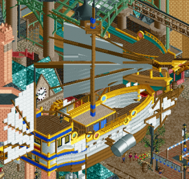
At this point I also got the idea of making the harbour with floating boats and I created the white boat with the diagonal sail. This got the rest of the team enthusiastic and I basically got the greenlight to do whatever I wanted with the park which was nice. At this point I made the floating harbour and the water front area and got more ideas for the park.

At this point I also decided that the area near the coaster needed to have different theming. My first idea was to have it similar to the rest of the park but I thought this was too boring. So instead I wanted to make it an industrial area which could be a bit more steam punk. I actually wanted the whole park to be a bit more steampunk from the beginning but I had the feeling that Trav wasn’t really feeling that. However since I basically had free reign at this point I decided to just go ahead with it (Sorry Trav). I rethemed the coaster and gave it the new colour scheme. I also thought of the cogs which would be part of the overall clock mechanism of the pocket dimension. In the end everyone liked the idea so that pretty nice.
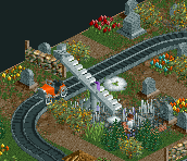
Since we were really struggling with time and getting stuff finished we brought RWE on the park. I had built with him before so I knew I could count on him. He is also a fast builder which is exactly what we needed. At this point I decided to split the island in three distinct areas: the waterfront, the industrial area, and the Bavarian town. RWE worked on the Bavarian town and came up with the idea of having a graveyard ride with a couple of historical figures revived. Later we were building in a multiplayer session and RWE and V1 basically finished the whole Bavarian town in the timespan that I placed about 3 arches on the log flume building. I still have no idea how you people build so fast, but maybe I just build at a snails’ pace.
After this everything was set and it was basically just finishing all the areas. This also proved to be quite a challenge, since we had started the park out by building the castle and the floating docks, we were basically building the park from the top down. This meant that many of the parts of the park on the street level were incredibly difficult to built as they were quite difficult to see.Because the lower levels were built using cutaway view a lot of these buildings actually have a lot of details which can't be seen without using cutaway view. So when you cutaway the view you can see a lot of extra details on some buildings which you normally can't see, although some buildings are also just finished enough so they appear nice without using cutaway view.
A lot of this park was built in the last 2 weeks before the deadline and at some point I was just building full time on this park in order to get it finished in time. In the end the park wasn’t quite finished before the deadline so we needed the extension. Because I wasn’t sure the golden ring was gonna work out we made sure to first finish the main island. During the extension I made the golden ring and I also wanted to put in the floating islands. In the end this proved a lot of work and I only managed to get one in on time. I made a bunch more of floating objects but due to a glitch in the object editor they ended up all being useless and we had to settle for one floating island. I think it is maybe also for the best as the park was already getting quite crowded everywhere.
Even though we had a bunch more ideas for this park that we might have implemented if we had more time, I am really happy with how this park turned out. Given the space limitations I think we got everything out of this park which we could have, and I am extremely proud of this park. It is also my first park on NE in which I had a significant contribution so I also kind of consider this park my first major contribution to NE. I would also like to thank my fellow builders, as I don’t think I would have been able to produce such a cool park on my own. Also I would like to thank the rest of the team which gave me an endless amount of feedback on all the screens that I posted while building this. Lastly I would like to thank Version1 for supplying the excellent readme (the actual real readme, not the second one), he did a great job imo and I really think the story puts the park on another level.
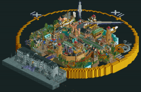
Below you can find a picture with who build what for this park, the golden clock is not indicated but was made by me, while the numbers and the dials of the clock were made by Trav.

Although there was quite some controversy during this round, I hope you guys can appreciate the park and that you guys were entertained a bit by this write up. I hope to hear your thoughts on our park. Depending on whether people are actually gonna write reviews at some point, I might also make a follow up post pointing out some of my favourite details of our park (I mean, gotta do something right?)
-

 In:Cities
Offline
Finally got to check out these parks in game. Sorry in advance for the sketchy review, I'm on my phone and its annoying to type.
A Far Cry From Home
I can really appreciate this park for what it is. But it does stick out to me in a weird way. The layout is a little too organically shaped in my opinion, and would have benefited from better macro planning from the start. With the theme being Silk Road, I would have loved to see that built and featured prominently, connecting the two halves. But it's still a great park nonetheless.
Things I enjoyed about it:
-The waterfall. This is my second favorite waterfall of the contest -surpassed only by cuco's curvy cascade in Forbidden Youkong. This one really makes for some picturesque backdrops for Zheng He.
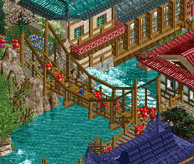
- The blue roof entrance building to the Asian area is beautifully done. The colors are texture usage are so spot on.
- The little island with the small pagoda on it is great. So simple, but so well executed.
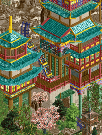
- The color combination of teal /yellow /red/brown/tan work SO well for those two pagodas on the mountain. By far my favourite thing in this park. The swinging monkey is a nice touch too.
-The entrance gate to the Arabian area is so cool. While I think it could have benefited from maybe one accent color, the general shape of it is great. The texture usage to vary it up is well done as well.
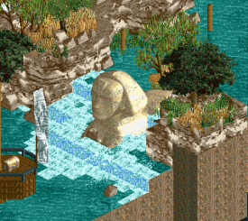
- The Sphinx in the waterfall has a cool aesthetic to it. Not sure exactly what it represents, but I love how it adds to the atmosphere of the area.
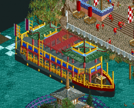
- The riverboat with the yellow rails is beautiful! The colors work together really well, even with the green rooves.
- Viper roll of a unique, but welcome change of pace. Really nicely done. Support work on it is great too.
- Boobsy41
The Apprenticeship
First off, WOW. This is an absolutely incredible map. Lots of great little details to discover, and it is very very immersive. The only gripe I have would be the readability of some of the airships on top of everything else. That's more due to the isometric nature of the game though.
Things I love about this park:
- THE MUSIC. Seriously so so good. I'm glad you guys included it. Really adds to the atmosphere, and is beautiful.
- The use of the color purple to represent time (I'm assuming). Seriously very cool and very well done. It's a great motif for the park.
-The colors on Chronos are fantastic.
-The floating islands/houses.WTF this is great. Fantastic idea, and fantastic execution. Had to do a double take.
- the gradient colors on the entrance bridge from Berlin are great.
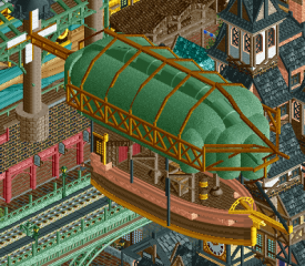
- The airship. We all know which one. Absolutely perfect. The colors are spot on, and it is so cleanly executed. I just wish it didn't have so much below it, because it's a little distracting from how good it is.
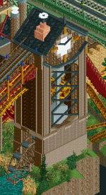
-The station for River of Time. Again, very clean, and very pretty.
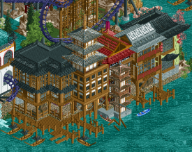
- The tall pink building in the center of the map is beautiful.
Very lovely park. The theme is so well done. I would love to see it done on a grander scale someday with a bit more breathing room. But for H2H, it's phenomenal as is. Most definitely would have received my vote in this match, and is easily one of my favorite parks this season.
Josh -

 GammaZero
Offline
What the shit
Uhh... I actually built stuff this time

Great park by the Icons, and props to everyone involved in our park. Good thing I was away for the week so I missed out on the flame war.
-

 posix
Offline
I've had to be away for a while to find this topic, and I'm very annoyed by the sabotage and consequent selfishness it speaks. Putting one's own agenda over the nature of the contest which is to earn yourself a spot in the next round is wrong. I don't understand how fellow admins or an official referee allowed for this to happen.I'm not quite capable to post many thoughts on either park as my feelings are honestly quite distracted. I can say though that the Icon's park was way too crammed and full for me, even if some content did seem quite interesting. The Replacements' seemed like lacklustre chemistry between its builders and thus lacked cohesion a lot.Every H2H has major drama as it stresses people a lot and has a strange way of bringing out the worst in people. A lot of what I'm reading reminds me of how I felt during past seasons. Relax and let the storm pass. It will.
 -

 Cocoa
Offline
I'm late with my review but I haven't missed one yet, I think
Replacements
I think maybe this site drags on too much about composition. Yeah its super important and I'll always pay a lot of attention to it, but we (myself very included) seem to just shut down otherwise incredible parks with those few words. So fuck that shit, your park is awesome. Firstly, stunning entrance area- you guys sure know how to compose an entrance. all the archy here is beautiful, especially the waterside stuff all around the coaster station. the gigantic mountain is amazing and the layout is so good. I'm happy those cliffs seem to be here to stay, but sad that I didn't get to release it first

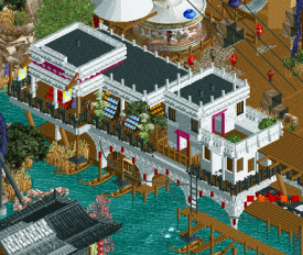
The african/middle-eastern area is really good too- slightly less but still great, especially that white complex on the riverside. I do wish there was a bridge. I love the sinking sphinx too. I'm not sure I really get the whole park on a conceptual level, but all the content is just really top notch.
The apprenticeship
Another concept I wish I could have done first... grrr... Really great work. The ominous, giant grey entrance is highlighted so well with the golden clock and purple haze, and I love the reverse view with the floating/bobbing scenery- great trick that I want to steal. I love the verticality of the harbor- even if it is difficult to work out what I'm looking at sometimes, the ships are awesome and the steampunk vibes are top. Theres a lot of beautiful archy and structures to catch my eye, and I love it all. Really great park from you guys, and I dont have so much to say because it was just all good.
IDK who I would have voted for. Possibly the icons, but both parks are pretty great tbh
-

 FK+Coastermind
Offline
A Far Cry From Home: This park was a big mixed bag for me. The park had tons of amazing little moments. The archy was often fantastic, with juicy details and fun interaction between rides and structures. The atmosphere was on point throughout, particularly some of the Asian village where the chaos of clashing buildings all piled on top of each other really came together into a cool, authentic feeling. In other places; however, this chaos really messed with the composition. I know a lot of focus has been put on the two sides, them being separated by water, but I think the composition even within these areas suffered. Very often rotating the screen revealed that things were right on top of each other or hidden behind each other. The result was that, while some angles were really nice, others lacked or were confusing. The rockwork was also challenging, as the textures made it difficult to determine height and depth. And there were a ton of glitches and overlappying things, particularly for the coasters which always seemed to be flying through walls or trees. Personal preference, but I like a coasters smooth and glitch free, even if that means moving things around. Overall, a really high quality entry, clearly made with a lot of skill, but I think just a step further in composition and polishing of elements would have done wonders.
The Apprenticeship: by comparison, bit less of a mixed bag. This park had so many fun, innovative moments that appealed to the artist in me. The clock shape in itself (though it could have been more appealing IMO), the use of angles to hide things, the animated floating scenery pieces, the too many ships, the black and white color choices, were all wonderful. In some of the screens I had seen, this park really came across as too crammed and too chaotic, and I think examples of that working and not working are in the park. Some of the backside of the park was actually really well composed, as there were views where architecture and the mass of ships and even the clock arms above made for a really cool layering. But, that being said, there were also a ton of places where you couldn't see a lot of content from any angle, even if you knew it was there. The coaster loop, for example, was impossible to see except the top bit. In fact, I think this for me was another park that didn't need the coaster, or at least, didn't need this coaster. It was sectioned off from most other content, but also hard to follow or explore. I do appreciate the idea of time being layered and complicated, but this felt more like a lack of composition than a purposeful sense of chaos. Overall, as with all parks this season, it was really well constructed, and the dedication to a concept and artistic and fantastical vision gets applause from me, particularly in a season dominated by realism.
While I enjoyed both parks, I would have voted for Icons.
-
 Jappy
Offline
I don't have much to add to the things others have said in here but I promised a review so here it is.
A Far Cry From Home is a great H2H park. It has some amazing archy and great interaction with the rides. It doesn't have a backstory or explantation to why there's all this Asian archy and suddenly we're in Babylon. I also don't know if it wants to represent something medieval or not. But this is one of those parks where I don't need one. It's good enough to stand on it's own. However.....
...the addition of a story is exactly why I would have voted for the Icon's park. It has this great fantastical Narnia-esque feel of a great magical adventure linked to our own world which I love. I really like the contrast between the black and white setting of WWII and the steampunk feel of the world behind it. I'm seriously impressed by the floating stuff. Even though the park itself is kinda generic steampunk and occasionally feels piled on top of each other making it difficult to read I found it had enough innovative ideas and colours to hold my attention longer than the other park.
Shame about how this match turned out, but let's hope we can all still remain friends and create some awesome RCT in this fantastic community.
-

 Xeccah
Offline
A far cry from home is fairly aesthetically fresh; it actually reminds me of my solo lol. I like how, in Fronterland even from this round, that this wasn't really about anything other than a park and its themes. I think H2H spoils us with the expectation of a narrative; while it is appreciated it's not always a necessary vehicle for enjoyment. It did do something great enough for it to stand out among the other stuff this h2h, the aformentioned style of it. I like how, even with modern objects, the park is rather divorced from modern realistic parkmaking conventions and allows itself room for some aesthetic experimentation, and as much as some of the details and narration The Apprenticeship showcases, raw parkmaking generally wins out with me.
The Apprenticeshipreally could have been a masterpiece. It and probably (shameless plug incoming) Wits End were the only two parks to have the potential to exude the essence that is La Reve; both failed. The storytelling in this park is so strong that it partially makes up for its biggest issue: its readability. Having so much stacked on top of each other leads to me not having a sense of what level, spatially, everything is at. I think this park is definitely the weaker one aesthetically of the two in this matchup although a lot of the stuff recurious did in particular were strong.
This matchup I thought was going to be weak but I ended up not being so. Both parks pushed some aspect of rct and broke molds in an H2H season unprecedented for doing so. I probably would have went with Far Cry but it's an extremely close call.
-

 CoasterCreator9
Offline
I was gonna type up a big review, but I found that posix already posted my thoughts.
Neither park, despite being filled with content, really held my interest for very long. A bit too much "stuff" (objects in the case of Apprenticeship and texture in the case of Far Cry) distracting me in both cases. Both well done and really interesting concepts for sure, and it's a little tough for me to add on anything that hasn't already been said.
-

 Camcorder22
Offline
When this match first came out I preferred The Apprenticeship to Far Cry but Far Cry has grown on me a bit. The Chinese section is easily 80+ work for me. Beautiful architecture all along the water that has a perfect level of detail without going overboard. Zheng He was one of the most memorable coasters of the contest for me. Love all the natural elevation change and the seamless interaction with the coaster, archy, and waterfalls. Framing of the loop between the waterfalls is particularly picturesque. One criticism is the LOTR rock spam and mixing with the krypton rock/1K ruins, but it looks about as good as it could with that amount of texture.
The Arabian section archy was a bit of a step down, probably 70ish quality. Although the main fortress is nicely detailed up close, the macro is just a little too plain and tan for me. The flyer also didn't impress me as much.
The Apprenticeship has some incredible archy, possibly the best of the entire competition. Also a very impressive overview with everything fitting nicely within the clock. However the composition in the middle is a bit too chaotic for me to really focus on anything. I think the floating ships and multiple levels would've worked better if there was a clearer difference in texture or color between the multiple levels. The sections that have more room to breath, such as the front left corner that has The Death of Time have great atmosphere though. Props to the builders, must've been a nightmare to build at times. Would give this around a 75 as well.
-

 CedarPoint6
Offline
This review isn’t going to touch on all the stuff that went down related to this contest. It exists to focus on the parks. I’m sorry to see the buildings get overshadowed by a few idiots making stupid decisions, but I hope post-contest these parks can both get some love.
A Far Cry From Home
It’s amazing how much a park can feel like two completely separate maps in one. Not just in geography, but architectural style and color palette as well. Not that one way is necessarily better than another, but it’s almost like the maps were built separately and then pushed together towards the end. I don’t necessarily get the reasoning for splitting these sections apart. While I understand the location difference, I feel like there would still be an easy way to put in a bridge without ruining thematic intent.
My personal favorite area is the entry island with the big Arrow. I like how exaggerated the terrain and rockwork is. All the brown rockwork contrasts very nicely with the huge waterfalls and teal architecture. Even though it’s totally forced, the skyride and rockwork arch through the coaster’s loop is a beautiful scene. I actually kind of like the coaster’s layout for how nontraditional it is. It does still have some qualities of Arrow coasters, but there’s a fair bit of fantasy mixed in, which works with the landscape. Needs 3 trains, though—especially with that block brake. The station for the coaster does a great job at covering the whole thing while not feeling too large with all the various architectural elements. There’s lots of great little details around the town in this area as well, as well as awesome theming and effects on the enterprise.
I do like the other island as well though it’s a bit more of a mixed bag. The tan architecture is really well done, but it’s all so monochromatic. It would be great to see more color added—whether that be additional flags, climbing vines, or more carts. The lack of color harmony is what holds this side back a bit in my opinion. Architecturally, it’s all really great, but the colors don’t work well with each other I feel. There’s a lot competing for my attention so it’s kind of drawn everywhere. I do like the coaster layout generally, though that weird curved midcourse isn’t necessary. I like how it wraps the drop tower inside the building. Some of the ships around this area are fantastic although with that amazing market in the white building along the water.
Here are little things I enjoyed:
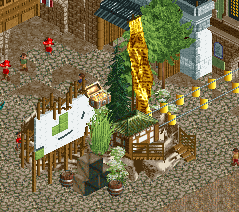
Love this entrance element.
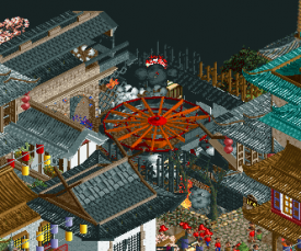
The theming on the enterprise is really well done.
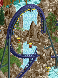
This loop interaction is so cool.
The interaction is cool too—the terrain differences, architecture, and coaster dive right through the middle of it.
This is a beautiful little bridge.
I enjoy this selection of architecture including how well the stock pagodas are worked in.
Cool detail with the sphinx.
This is maybe one of my favorite buildings on the map.
Really nice job on the boat.
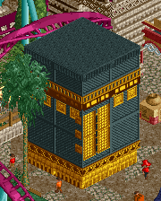
The Kaaba is a little odd sitting where it does. Feels like an afterthought maybe rather than a developed processional space around it. Nice detail, though!
The lack of cohesion holds this park back a little bit, but not too much in the end. The park is beautiful in terms of architecture, and the landscaping with the mix of rockwork types is great as it has been all season. I’d really love to see that first island expanded into a larger park—I think there’s a lot of opportunity for a much larger, really interesting map.
The Apprenticeship
This was a bit of a hard one to make sense of initially—It’s trying to do a bit of everything. From macro to micro, the park is looking to cover everything. The initial impression is fantastic. It’s the best looking park this season when all the way zoomed out. Zooming in, the park gets a whole lot harder to read, but there are some really excellent parts throughout.
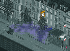
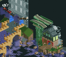
Starting with the grayscale streetscape, I’m struck by just how detailed it is with only 3 colors. It looks fantastic. The size of the façade really helps those few colored areas to stand out as much as they do. The two colors of purple mist really help on the contrast too. When I first was exploring the park, it took me a while to rotate the view and look at the back of this building. There’s some incredible stuff going on here from the use of black tiles and the broken railroad tracks to the floating scenery. The floating scenery is incredibly trippy and took me a while to figure out what was going on. It’s such a cool effect and the slow speed of the movement sort of adds to feeling.
Getting into the main portion of the park, there are some absolutely gorgeous ships—some of the best of the contest—but it’s also really hard to pick out some of the details because there’s too much going on. I’d love to see some of this airship port and buildings in the center of the map, but I can’t make it out without deleting some of the ships or the giant clock hands. There’s some of the same colors in the architecture as the buildings behind it, so you’ve got so spend a little bit of time separating all the forms. But wow those ships are excellent. Easily the best parts of the map.
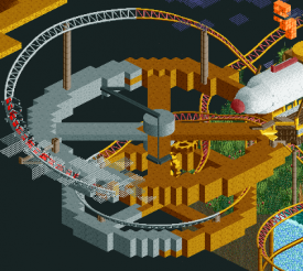
The rides seem to come secondary to the rest of the scenic on the map. They aren’t particulary standout compared to how good the architecture and theming is. Chronos has some interesting spots on the layout, but I had to set ORCT to no breakdowns in order to get it to complete the layout. It might have been nice to see one bigger coaster in there that covered most of the map, but I suppose that would be at the sacrifice of other things.
Here are the little things I enjoyed:
This is such a cool shot from the architecture to the color selection.
And the backside of the building is equally as cool.
Stairway to heaven?
This is the best ship on the map, I think.
The clock here is strange, but really nice looking.
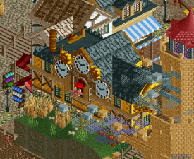
I like the cuckoo clock on this building.
This airship and the smaller one nearby both look excellent.
I do like these gears that the coaster races around.
This is the only macro shot I’ll do in any of these reviews, but it’s the one that’s most worth doing it for. Just a cool overall presentation.
This is a really cool park. My biggest complaint is that it’s just too hard to see everything. I wish some of it could be spread out a bit more. The overall concept is interesting and unique and I love the overall map design really helping to dictate the overall park shape. All contest issues aside, this park was a strong end to the RR portion of the tournament.
-

 Recurious
Offline
@CP6, thanks for the thorough review! I enjoyed reading it and still read it from time to time as motivation
 .
.@Bubbsy, in an earlier post I promised that I would review A Far Cry From Home at some point, and as a man of my word that point has arrived. So here are my thoughts on the park:
The first thing that obviously sticks out imo is the landscaping, especially on the Asian part of the map. It looks absolutely sick. The vertical aspect it gives to the map is something that I really like, it is also one of the best cliff faces I have seen in rct so far. Even though it does look really nice, I feel like you can see that it was build with a certain angle in mind, as it doesn't look as good from any angle, but that is a minor complaint.
I also like the way the landscape arches through the looping of the coaster together with the chairlift, people said this looks forced, but I don't care, I think it looks sick. The coaster layout itself was also pretty cool and I liked the archy on the cliff (and the building with the blue roof which kinda serves as the entrance of the park)
Another ride which I really liked was the enterprise. The theming and naming of this ride was really clever imo and it adds a fun aspect to the asian town.
The Arabian area was a bit less convincing in my opinion, although it does feature the best building on the map which I think is that white boat building on the waterfront. The building is super unique and the way it interacts with the river and the landscape is just really cool, this combined with the colours makes it look awesome.
The rest of the arabian area, while technically quite good, felt a bit stale to me compared to the Asian area. In this asian area you have a lot of small details and a lot of different colours going on, while the Arabian area felt a bit more monotone. It's not bad, but its just a bit boring maybe (when you compare it to the Asian area that is). The same went for the boats in the Arabian area, they are very brown and simple/underdetailed compared to that Asian boat (which I absolutely adore). I do like the docks in the back with the canoes and the red canvas roofs, that looked pretty cool.
Some people complained about the lack of transition between the Asian and the Arabian part of the map. While I can see where they are coming from, to me it is not really that much of an issue. I think the way the map looks right now works fine although you do have this dead end in the path right now on the asian side which ends on a terrace. This looks kind of awkward and maybe could have been implemented a bit better, but still I like the overall view of that area.
The area that I'm talking about for reference.

Overall I still think this park was really well made. I think I voted it somewhere around 85% and I think if there had been a vote it would have been tough for us.
-

 saxman1089
Offline
So essentially, it appears to me that all the behind the scenes cheating is coming out now. I don’t recall 6 builders being permitted in round robin...
Why did we have rules if half the teams were just breaking them anyway? -

 G Force
Offline
This match didn't count anyways. Referee didn't have any problem with it. So who cares. Stop complaining. Thanks
 -

 MK98
Offline
This match didn't count so it doesn't matter.
Someone tried to hit me but he missed, so stop complaining.
The referee didn't care, but that means someone else should come in action. No penalties after cheating means it will happen again and again. Drama isn't going to stop happening this way. Everyone can cheat because nothing is going to happen anyway.
I respect the admin team for the effort they put in the site, and I love you for that. But it happens too often that someone does something bad and nothing happens. Please see this as an advice, not as an annoyance. -

 saxman1089
Offline
This match didn't count anyways.
Did the Replacements know it wouldn't count when they were building it? Did the Icons even know they'd be forfeiting until the last minute? How can "it didn't count anyway" be a justification for cheating if people didn't know what was about to happen? Sure it's a justification for putting all the builders' names up now, but that's also an expression that this cheating is essentially condoned by the site. Why should I want to spend time competing here if rules mean absolutely nothing?
Referee didn't have any problem with it.
This might be more laughable than the first point. The ref didn't have a problem with it, so it was fine? Putting aside the fact that the ref was completely corrupt at this point, does anyone have an ounce of ethics? Did anyone actually care about the integrity or reputation of the contest? Again, why should I want to spend time competing here if my fellow builders don't care about the rules enough to stand up and say "No, we'll do this the right way and lose honorably" ?
If you actually include the fact that the ref was completely corrupt and didn't care about the rules anymore, how is "the ref said it was okay" a decent justification at all?
So who cares.
I'm sure many on the site actually care about its integrity, and the integrity of the contest. Why compete in a contest if everyone can just cheat for whatever convenient justification exists at that time? More importantly, YOU, as a member of the staff team, should care that your contests are fair and have integrity.
Stop complaining.
I'll stop complaining when you guys actually censure people for cheating in contests.
Thanks
Thanks for nothing apparently, since my concern was just dismissed without any discussion based on excuses that are as flimsy as tissue paper.
As MK said, I respect you guys for what you do for the site and the community, but you all need to learn how to put your foot down. NE is already a poisonous place to be thanks to the complete and total lack of moderation in the Discord (see for prime example the V1/AVC/Camcorder/Faas pissing match the other day). Don't let that happen to the contests too. -

 Liampie
Offline
I think any form of cheating is selfish and disrespectful for the people who are essentially working a part time job to make contests like H2H a success. Breaking the rules to finish your park even if it wouldn't impact the outcome of the contest is direspectful to those who slaved away for weeks on their parks, and ended up submitting the park in an unfinished state because time was up. That's the game, and if you don't like it, you don't play. Or you figure out a way to work with the rules and make up for your own shortcomings. Finishing is a relevant skill.
That said, moderating contests like these has been a logistical problem for a long time now. I think most of us (at least those of us who have some respect for the other players) would agree that there is need for a referee. The question is who is going to do that? The staff is quite occupied with running the rest of the contest on top of playing/captaining. We found a good candidate in trav, and to be honest I think he did a great job for the most part. It's too bad it didn't work out in the end, but that's not entirely on the Icons as far as I've understood. We all have a breaking point.
Moderating Discord, and the site in general, is another problem with two aspects to it. One: who has the time to moderate Discord 24/7? Two: what would be an appropriate measure when a bitchfight occurs? Bitchfights are one reason some people don't want to spend time on NE. But on the other hand, the large degree of freedom people have at NE is also a traditional selling point that keeps some other people around. It's hard to find a good balance. -

 saxman1089
Offline
Thanks Liam. I completely agree with your first and second paragraphs. Next time around, I think having a non-playing ref (or two) might help things a bit, but as you said, it will definitely be hard to find someone who is willing to be so involved with the contest but miss out on all the glory (i.e. actually building rct).
As for the third paragraph, I didn't really mean to bring this up as an issue. You guys are free to moderate the site and discord as you choose. You're certainly right that there are practical issues and it's difficult to find the right balance between law and lawlessness that everyone is okay with. I personally don't like some of the shit that goes on (thus my calling the community poisonous), but those are my personal feelings and my personal feelings shouldn't be imposed on the rest of the community.
 Tags
Tags
- No Tags

