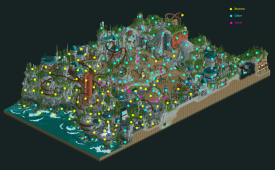
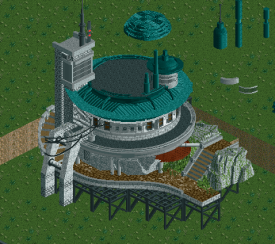
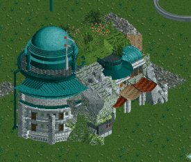
Head-2-Head-X / H2HX: Round Robin - R1M2 - Hurricanes vs Evergreen Gardeners
-
 30-April 24
-
 Fisch
Offline
As a former Cane I want to tell Kumba and his team that you started into this season amazingly. The Hurricanes revival begins with a banger. What a great park, with amazing landscaping and some really effective macro shapes. I love how you have this rectangular map with basically two rather vertical faces on both narrow ends, where you were able to put in a lot of content and storytelling imagery. The central "bath tub" in your map's macro is so effective in giving a sense of place and context to both of the aforementioned ends. The textures and the technical skill are on point. The ctrs and new objects work really well and I'm a huge fan of all the activity on the map. It's really a great park and so far my favorite of the non- Evergreen Gardeners parks this round.
Fisch
Offline
As a former Cane I want to tell Kumba and his team that you started into this season amazingly. The Hurricanes revival begins with a banger. What a great park, with amazing landscaping and some really effective macro shapes. I love how you have this rectangular map with basically two rather vertical faces on both narrow ends, where you were able to put in a lot of content and storytelling imagery. The central "bath tub" in your map's macro is so effective in giving a sense of place and context to both of the aforementioned ends. The textures and the technical skill are on point. The ctrs and new objects work really well and I'm a huge fan of all the activity on the map. It's really a great park and so far my favorite of the non- Evergreen Gardeners parks this round.
I love our park as well and think it's a an awesome and incredibly polished final product to be proud of. The macro composition around the river works so well and is very picturesque. -
 Turtle
Offline
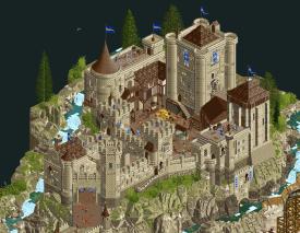
LostilethThis park grew on me. It was an interesting starting point for the map, not my favorite scene but it did make you explore the map from one end to the other which worked really well. And the ship doing barrel rolls out there was a really nice moment.Once I got into the map properly I was blown away. i'm not a huge star wars guy but i don't think you need to be... you get the gist. red lightsabers bad, blue/green ones good, library being raided, lovely stuff. the landscaping throughout was absolutely beautiful - hard to choose an aesthetic when the theme is essentially completely open ended, and the one you chose with gradiented rocks and tons of greenery and then this barren area in the middle with gas vents and walkways was absolutely beautiful.i'm sure i missed so much in terms of little scenes and things, but i appreciated them all the same - gives the map life and a little personality. the architecture, colors, atmosphere, everything was spot on, beautiful, interesting, inviting. lots to explore. loved it.Troubadours et BaladinsThe scale of this upon opening is SUPER impressive. it looks full and vibrant and the landscape is imposing and incredible. and then you get down into the nitty gritty and there is SO MUCH to see. everywhere you look there's life. if i'm right about the builder, then that's definitely a hallmark of their work and something that has had a big impact on the community recently, i feel like. definitely on myself.i don't love the pallette, i think it's meant to feel like a summer afternoon back in the day, and it sort of does, but it makes everything almost blend into itself which makes it a little hard to read. having said that, once i got past it i didn't care too much. but i also don't think it added much really.highpoints were all over the place - the french colors, tents and flags dotted around were really lovely. the architecture was great, including the brilliant castle - my original thought was that it was slightly small, but it was so high up on the hill that it still feels imposing. and once i got in there, the forms were really spot on. love the sloped bridge up to the entrance, that feels like something that hasn't been done well before and you nailed it.two amazing parks again - the bar has been set high for this contest. it's a shame one park has to lose, as they're both excellent.
Turtle
Offline
LostilethThis park grew on me. It was an interesting starting point for the map, not my favorite scene but it did make you explore the map from one end to the other which worked really well. And the ship doing barrel rolls out there was a really nice moment.Once I got into the map properly I was blown away. i'm not a huge star wars guy but i don't think you need to be... you get the gist. red lightsabers bad, blue/green ones good, library being raided, lovely stuff. the landscaping throughout was absolutely beautiful - hard to choose an aesthetic when the theme is essentially completely open ended, and the one you chose with gradiented rocks and tons of greenery and then this barren area in the middle with gas vents and walkways was absolutely beautiful.i'm sure i missed so much in terms of little scenes and things, but i appreciated them all the same - gives the map life and a little personality. the architecture, colors, atmosphere, everything was spot on, beautiful, interesting, inviting. lots to explore. loved it.Troubadours et BaladinsThe scale of this upon opening is SUPER impressive. it looks full and vibrant and the landscape is imposing and incredible. and then you get down into the nitty gritty and there is SO MUCH to see. everywhere you look there's life. if i'm right about the builder, then that's definitely a hallmark of their work and something that has had a big impact on the community recently, i feel like. definitely on myself.i don't love the pallette, i think it's meant to feel like a summer afternoon back in the day, and it sort of does, but it makes everything almost blend into itself which makes it a little hard to read. having said that, once i got past it i didn't care too much. but i also don't think it added much really.highpoints were all over the place - the french colors, tents and flags dotted around were really lovely. the architecture was great, including the brilliant castle - my original thought was that it was slightly small, but it was so high up on the hill that it still feels imposing. and once i got in there, the forms were really spot on. love the sloped bridge up to the entrance, that feels like something that hasn't been done well before and you nailed it.two amazing parks again - the bar has been set high for this contest. it's a shame one park has to lose, as they're both excellent. -
 RobDedede
Offline
RobDedede
Offline
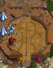
Troubadours et Baladins:
+++music
+++amount of content
++castle
++arched bridge
++windmill swing ride
+jousting
~some rock choices weren't my favorite, but on the whole it was solid
~the RMC is too fast, but its layout was cool, and I liked the shooting arrow effect
Lostileth:
+++music
+++curved buildings built into the rocks
+++park entrance with the Jedi? Sith? symbol
++space ships
++dark ride
++flying coaster
++rockwork
+spinning coaster
~the middle section of the map maybe could've been spiced up more with a bit more movement, or at least reduced in size, but that's really picky
Amazing work to both teams. Two excellent parks once again. The Hurricanes won me over due to superior ride design, their having a slightly more unique theme, and a more defined goal for the macro. It felt a little easier to digest, while also having a lot of content.
-
 posix
Offline
posix
Offline
I'm sorry but I null voted. Just quite impossible to pick a favourite for me here. Both had so many wonderful moments to their own. The macro in the HC's park, the 2024 meta extra fleshed medieval theme in EG's. I felt both parks pretty much maxed out what you can achieve in the H2H mini park format. Neither deserves the win more for me.
Incredible performance guys.
-
 Ge-Ride
Offline
Ge-Ride
Offline
Lostileth. I like the Millennium Falcon-like ship. I like the general feel of the landscaping which while not so interesting from the match overview, looks quite good in game. The flying coaster was very fun to watch. I like all the different indoor and underground segments. Nice water and steam effects and just an intriguing feeling all around.
Troubadours et Baladins. The colors weren't my style at first but I grew to like them. I liked the jousting, the small rides, and the architecture which was a cut above Lostileth's in many respects.
I couldn't decide for the longest time which I liked better and I needed to find some arbitrary criteria to pick a winner. I liked the music slightly better in Lostileth and that's the straw to grasp at that sealed it for me.
-
 roygbiv
Offline
roygbiv
Offline
tough decision had to go with null vote.
But seriously I went with star wars park. The execution probably won me over.
Troubadours et Baladins. Was really great too. The colors schemes and the coaster layout kinda lost me. The details in this park were probably better. The jousting, ballista, the pot of soup stand. Really reminded me of playing stronghold. Even the little keeps look the same. I probably have personal bias to more sci fi themes over medieval but that's my fault. Great park all around.
-
 Jens J.
Offline
Jens J.
Offline
Can y'all calm down a bit with these awesome parks, geez...
Lostileth
Just beautiful!
I love that there is lots of movement around the map in the forms of coasters flying by (as well as those cool starships) and effects like the flowing... mist? Not well-known with the Star Wars franchise sorry haha, but nonetheless I really liked it! Really dug this angle with all the blue awnings as well.
Great work Canes, I would've loved to work on a park like this!
Troubadours et Baladins
Oui oui, j'aime ça! This park is so rich of detail and with every twist and turn I explore a new detail that catches my eye. I love how you guys did the castle, well executed and the colors work lovely in combination with the rocks (also glad that you guys used gradiants in the rockwork, really appreciated!).
The texturing and crunch around the church area was a bit blocky, but I loved the texturing in the curved roads leading up to the castle and especially the jousting area!
Wish I could visit this place in real life! Great job on the park.
-
 AvanineCommuter
Offline
Two really impressive parks, but the decision was easier than I thought upon first glance.
AvanineCommuter
Offline
Two really impressive parks, but the decision was easier than I thought upon first glance.
Starting with Lostileth, a few major things stuck out to me:
1. The main coaster itself was very impressive and I loved how it flowed despite having unique elements. It nestled the landscape perfectly and had great moments of interaction with its surroundings. Definitely my favorite coaster of Round 1.
2. I loved the unique architectural forms and the use of larger massings integrated into the landscape. Really inspired forms gave us something new, particularly the tall rust tower and the symmetrical landscape-framed entrance. The terracing of the rounded buildings and staircases was notable and I appreciated how clean and legible the park was despite having quite a bit of content.
3. The macro decisions here were spot on - having a backside with cutaways, open central area with tiered walkways over a creative flat landscape for breathing room, and the rocky cliffs along the water. Beautifully composed.
My main critique is a personal one, since I've only seen one Star Wars movie myself...so personally I didn't catch nor care for any of the lore or narrative elements you've obviously taken a great deal of effort to include. That's the risk of playing off an IP. But man was this beautifully done when considering my "Big 3": Flowing layout with heavy interaction, well composed macro and landscape, and innovation architectural composition. Won my vote.
As for Troubadors et Baladins, this was super impressive for just how LIVELY the entire park felt - you can see movement in every corner, little scenes everywhere, and that in itself is really well done; I think you captured the messy vivacious nature of a medieval town perfectly! I particularly enjoyed the unique spin on all the custom rides you included. Each attraction looked like it was designed thoughtfully and with attention to detail, and it really is wonderfully done.
I think where it fell behind your competitor just *a bit* was 3-fold:
1. While I really liked the Ballista idea and the layout of the RMC was quite nice, the pacing was wayyyyy too fast. I'm actually genuinely curious what was the reasoning behind this decision, as I really don't understand it.
2. The landscaping and color palette was very monotone and brown throughout, and I was missing a very needed pop of color to offset the muddiness of it all. Even just a few more accent colors here and there and some more greenery would have helped tremendously to alleviate the sea of brown.
3. The base concept of generic "medieval-land" didn't particularly draw me in despite the very high level of execution of the theme. This kind of architecture was really well executed and you had some innovative forms that I really liked (the jousting arena is *chef's kiss!*) but it also didn't lend itself to the kind of innovation or unique structures that your competition had.
That being said, the park overall is wonderful and I'm pretty sure there probably tons of scenes and details I haven't yet discovered. It's a shame it had to go up against another great park that had just a slight edge for me in terms of composition, color and texture usage, and overall architectural forms. -
 Gustav Goblin
Offline
Gustav Goblin
Offline
Lostileth:
+ Banshee is amazing, both in flow and in interaction. Early to call yet but so far the strongest layout of the contest.
+ Great supporting rides as well with some spicy interior work.
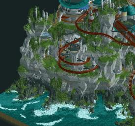
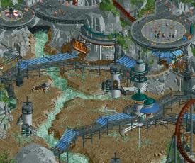
+ Incredible landscaping. Great forms with some unique Star Wars-y shapes. I'm also a fan of the central plaza with the steaming river below.
+ Archi definitely feels Star Wars, especially some of the taller facades and the round buildings near the cliffs.
+ All the greebling everywhere sells the sci-fi look. The micro detailing is kinda boggling my mind. I want all of this.
+ Incredible CTRs. Eating my words for ever doubting Kenos as a fifth round pick.
+ There's always a new scene or section of the park every time you turn the camera. It feels so much bigger than it really is.
= (muffled jizz music playing in the distance)
= Fun fact: I looked up Lostileth and only got this park. The Hurricanes' first park in twelve years is Star Wars fanfiction.
- Macro is a little odd with the titular library shoved to the end of the map and the rift taking up the majority.
++++++++ GLUP SHITTO!!!!!!!!!!!!! YES!!!!!!!!!!!!!!!!!! 500/YES
Troubadours et Baladins:
+ Great verticality with a well-defined shape and path for your eye to follow.
+ Big fan of the soundscapes in both parks.
+ Macro is just as good as Lostileth but in a different way. This town is so immersive!
+ As I touched one earlier, atmosphere is through the roof. All the little scenes you have to look extra hard for just make it.
+ Love all the hacked rides with parts that move together in sync, such as both swinger rides with windmill blades in the same train. Big sucker for that kind of stuff.
= RMC's pacing is very fast. Neither hate nor love honestly.
- Is Un Roy une Foy supposed to be swung by the church bell? I love the idea but it looks like it's kinda floating in midair.
- Kind of a one-angle wonder, although it could be argued that you're overlooking the town from the castle when the camera is turned south and that's pretty neat.
Very very hard vote, had to revisit both parks so many times. Troubadours was fantastic but my heart went with Lostileth. Definitely slept on the Hurricanes, they're very very scary right now.
-
 Sulakke
Offline
Sulakke
Offline
Lostileth
+ I'm appreciating this park more and more with every viewing. It actually took me a while to get into the park, but as soon as I was settled I start to notice how much skill and vision went into this park.
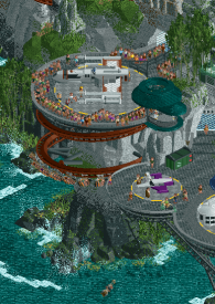
+ The composition and execution around the first drop of the flyer is so so good! The round architecture, the stairs, the stalls, the small details. Everything is perfection here. Might be one of my favorite pieces of RCT of all time.
+ As far as I know, this location didn't exist yet in the Star Wars universe and you came up with it yourselves. If that is true, you did an amazing job on creating a place that fits the Star Wars universe perfectly.
+ The integration and interaction of the flyer in its environment is great.
+ The plain in the middle with the cracks is a cool aesthetic. Love the couple of towers that are there as well.
+ The rockwork and landscaping is great, especially around the coastline.
+ The diagonal X-wing is incredibly made.
- The corner with the spinning coaster lacks a bit of atmosphere compared to the other areas, which are busier and have more peeps.
- To me it isn't really clear if the library area is meant to be an open space or if it is a cut-away view. The aesthetics of the archives are cool though.
Troubadours et Baladins
+ Love the theme. After Forum Caeleste I had the idea of doing a similar park but in a medieval setting. You did a great job.
+ I really like the look and placement of the inn halfway on the hill.
+ The placement of the castle is really cool. I especially like the streams running around it and the verticality on the front, with the open sewer underneath. Not sure if it is smart to start a quarry in the rock under the castle foundations though.
+ There's a lot of small details to discover throughout the park. The accident with the cart for example.
+ I love the horse stalls and building. Very clever how you integrated the cab station and queue in there too.
+ The path leading up to the castle is really nice, including the tall bridge.
- Some rides were not credible which ruined the immersion for me a bit. For example, how are the clock bell ride and free fall powered? Adding some random cogs to the ride is a bit easy and doesn't explain how a ride functions. Also, barrier tape in 1170?
- I think the architecture was pretty monotone and could have used some more color. Timber-framed houses with red or green beams instead of brown for example, or salmon pink or redish walls. It could have made the village a little bit more interesting and the overall pictures less brown.
- I think you could have done a better job with the placement of invisible paths. There are a lot of spots where peeps are walking through scenery like walls, rockwork and crates. A lot of these spots are easy to fix.
- The rockwork around the castle could have used some more love, especially on the map edge.
I really liked both parks, but one of them was more memorable than the other.
-
 Hobeon
Offline
Hobeon
Offline
Lostileth
While I don't know anything about outside of a handful of memes circulating the internet, you really don't need any knowledge of the series to appreciate the craftmanship that went into this map. Any references to the media will be lost on me but gosh I love this architecture and landscaping. Incredible.
The high rise mountains with the water caves, the super tall buildings hacked into the rockwork (very much appreciate the DKSO objects used for that) and the fuming cracks in the ground, just sublime.
Love the Banshee coaster aswell, even if it is hard to follow sometimes.
Troubadours et Baladins
Brown is a theme right? If Jens were on your team that would've been my first builder guess haha
But seriously, love this theme as well as the execution. Always a sucker for medieval themes, especially when it's done this well. Love all the on-theme ride names.
These mountains are magnificent and that bridge in between is just chef's kiss. The height difference in this map is really something. Rondeau pour une Pucelle is so cute.
Montjoie! Saint - Denis ! is an awesome layout, but really a bit too fast
Having to choose for one of these parks is a very difficult choice,
-
 Liampie
Offline
Liampie
Offline
Lostileth
This concept is entirely original? Very, very impressive if so. It’s totally believable as a part of the official Star Wars canon, though of course the general style is well established and therefore it lends itself well to being expanded like this. I think most of the strong points have been pointed out already. Fantastic landscaping (especially the cliffs), strong archy, many great functional details. The entire hill under Banshee’s lifthill is my favourite, theming looks so good here. I think I’ve read some criticisms of Banshee, but I think it’s rather amazing. I love the layout, very original, and it looks good from every angle. Maybe some of the tunnels towards the end are too long, makes it impossible to easily follow the train. But it’s a 9/10 coaster for sure. There’s also some points of criticism: the whole back of the park (library and such) feels very unnecessary. I think you could’ve kept the concept of a sith plot in a new star wars location without the library. Or you should’ve found a way to make it more (visually) interesting. Another point of criticism, also relating to the prequel movies: too many lightsabers. Jedi and sith everywhere. Cheapens it. Overall: incredible work!
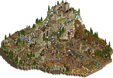
Troubadours et Baladins
Such a simple concept… done so well! The park looks repetitive at first but I think that helps to make the stories and details thrive in this case. There’s so much to see, but it doesn’t feel like a chore to explore. So many cool ideas, big and small. The ballista shooting in sync with the coaster is a standout idea. Small things I noticed and liked are the the drinking peeps behind the RMC, the shrine with candles on the hill, the slide, the flower field with bees, the poop incident… Does the quarry count as a detail? I’m enjoying it. Architecturally this park is also excellent. The houses look like actual timber framed houses, whereas often when people go for this look they just add a bunch of trims and poles randomly - here it all makes sense structurally. The diagonal one in the centre of the village is one of my favourites. The castle is also really nice, I especially like the keep with the four corner turrets, as well as the two towers in opposite sides of the jousting arena. Cool use of ACE signs for banners, btw. Not the only example of creative object use. Here I must also end with some criticism: the comparison with Forum Caeleste is obvious, but I think there’s one difference: aside from the theme park concept being anachronistic, Forum stayed away from the cartoonesque. Troubadours et Baladins has references to an actual dragon, a giant beer mug shop, a speech balloon, and a taped off traffic accident. Whenever people do that I think they just didn’t trust the setting itself being interesting enough. The park didn’t need these things, but I must also say that these are all quite insignificant and not at all do they hinder my enjoyment of the park. In fact, even though I creatively disagree with these ideas, I still enjoy the scenes you created with them.
Vote: Evergreen Gardeners -
posix
Offline
Match conclusion
 Winner
The poll is now closed. The final voting score was:
40 > 23Congratulations Hurricanes for fending off what was a rather strong challenger. You are bagging the win.
Creators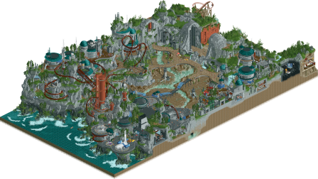
 LostilethTroubadours et Baladins9 total3.88 weighted10 total3.55 weighted
 -
 CoasterCreator9
Offline
LostilethIt was awesome watching this park come to fruition. I enjoy Star Wars, but I really think Xtreme, Otter, and Levis really accomplished something special. Of course, the wonderful custom rides by Kenos are a lovely addition as well! I definitely think this is successful in being a standalone piece with an identity beyond just being "another Star Wars park". Really proud of these guys (and love that X-Wing).Troubadours et BaladinsThis is a really fun park, I enjoyed it a lot. It was a bit busy for my tastes, and the hybrid layout was rather forced and didn't have the best pacing, but I really liked the other rides, especially the way they dotted the mountain ridge. I thought it was an amusing irony based solely on the thumbnails for a Kumba-led team to be up against a park utilizing so much brown - but the park as a whole was a pleasant balance. There were a few questionable design decisions for my tastes (that spiral slide forced into the tower didn't really seem to fit as intended, namely) but in general it's a super fun and super interactive park. The foliage, water work, and overall landscaping were super well done - it really ended up being a match featuring some impressive landscaping work in general!Huge congratulations to my teammates and a big handshake to the Gardeners for putting forth an impressive submission!
CoasterCreator9
Offline
LostilethIt was awesome watching this park come to fruition. I enjoy Star Wars, but I really think Xtreme, Otter, and Levis really accomplished something special. Of course, the wonderful custom rides by Kenos are a lovely addition as well! I definitely think this is successful in being a standalone piece with an identity beyond just being "another Star Wars park". Really proud of these guys (and love that X-Wing).Troubadours et BaladinsThis is a really fun park, I enjoyed it a lot. It was a bit busy for my tastes, and the hybrid layout was rather forced and didn't have the best pacing, but I really liked the other rides, especially the way they dotted the mountain ridge. I thought it was an amusing irony based solely on the thumbnails for a Kumba-led team to be up against a park utilizing so much brown - but the park as a whole was a pleasant balance. There were a few questionable design decisions for my tastes (that spiral slide forced into the tower didn't really seem to fit as intended, namely) but in general it's a super fun and super interactive park. The foliage, water work, and overall landscaping were super well done - it really ended up being a match featuring some impressive landscaping work in general!Huge congratulations to my teammates and a big handshake to the Gardeners for putting forth an impressive submission! -
 Six Frags
Offline
Six Frags
Offline
Lostileth by The Hurricanes
-Concept: **
While the concept itself is good, I felt the concept execution could've been a bit improved upon. You say the library is under attack by the Sith, but I only see like 2 battles of Sith vs. Jedi on the map and some rubble on a stair north of the map. Would be cool to see a battle of those awesome Starfighter ctr vs. a Sith Infiltrator for example, or more light beams (Liam made a laser ctr a while ago iirc) shooting across the map from the Sith vs. Jedi lightsaber fights.
-Content: ***
Great amount of content to explore, good balance of main ride, supporting rides and architecture.
-Quality: ***
Very high quality throughout the map. I'm amazed now that I know the builder shares, that both your styles blend so well together, looks like it's made by 1 person.
Overall;
It was a great experience to explore this park more in depth. As a big Star Wars fan, I adored all the references and atmosphere the galaxy offers. Kenos made a great impact with his ctr (what a great pick from you Kumba) and Xtreme and Otter both delivered exceptional quality on the map (and great to see you back at the game again as well Levis
 ).
).The terraforming, landscaping and Fisch rock work was so nice and consistent throughout the map, it made for a great visual. The round architecture forms with those Tolsimir Roman balustrade objects made for a very unique architectural style, which fits very well into the Star Wars universe. The color scheme was a bit monotonous though I felt, with all the greys and cyans, but the overall polish and quality of construction more than made up for it.
The various structures around the map, such as the spacecrafts, towers and vehicles were very high quality and gave the park that extra depth. Also loved that you guys did interiors all over the map (very Otter-ish) and the spinning mouse & 'Search the Archives' (dark)rides flowed nicely through it.
Banshee has a great layout, good pacing and very cool interactions with the landscape and structures. I also really liked the red on it, which breaks that monotonous grey-cyan dominance up a bit.
You guys used some heavy hitters on us, can't wait what you bring next though!

I'll probably review our own parks a bit more in depth after the contest is over. I think our guys did a great job though, and just unfortunate to face this high quality work so early on.
-
 Xtreme97
Offline
Xtreme97
Offline
Thanks for all the reviews and for the votes! Amazing match-up, very proud of this park and getting the chance to work with Otter and Levis has been wonderful. I'm of course thrilled that we won, great to start the season off with a win and against some heavy competition; I'm sure this isn't the last we'll see of Babar, and the Gardeners will be even more amped up. Round 1 is always a tough spot to be as you often have to make some sacrifices to meet the early deadline with the added pressure, but it's worth the struggle for H2H.
First off, some thoughts on Troubadours: When I first got a look at our competition I was definitely very nervous. Peak Babar ideation, high density and on a map that really uses its space effectively, excellent job guys. The town is really nicely constructed with some of the best medieval architecture I've seen, with lots of variety in the style while remaining cohesive. Some highlights in this area would be the mug of beer shaped shop, the wave swinger that runs in line with the windmill, the jousting arena (great way to fit it into the space by making it diagonal) and the ballista timing on the coaster launch. Speaking of the coaster, it's definitely very fast paced but the flow is fantastic. The castle on top of the hill is really nice and gives the map some verticality that makes it feel even bigger. Also shout out to the music on this map, sets the scene perfectly!
Right, time for some background on our park! As some have figured out, Lostileth is a made up planet/name. The original idea was to create a new world set in the Star Wars universe rather than relying on an existing setting, as I think this gave us a lot more freedom to play with the architecture, landscaping and story of the map in multiple ways. The inspiration for this approach came from the development of the Galaxy's Edge sections of the Disney parks which aim to create a believable setting for guests to imagine their own stories. I'm really pleased with how successful the approach was, and hope that the choice also enabled people who aren't familiar with the lore or anything to still be able to enjoy the map and understand the setting.
The setting of the map is largely inspired by the Jedi: Fallen Order game, featuring a village on the planet Zeffo with an ancient underground temple. We used this to build out the early landscaping and architecture with the stone curvilinear structures and teal roofs, set among a craggy landscape with a large rift at the center from which the planet emits energy that can be harvested. There are certain "layers" of history designed into the map - the bronze structures and big stone archways are intended to be much older and more ancient, as if created by a different civilization. The stone houses on the hills then are the more recent history but still quite old and crafted using the natural materials of the world. I would place the extraction towers on the Rift floor in this category as well. The landing pads and port structures are the later additions, and use more steel in their design as if brought in from off-world.
After we settled on the general approach, Otter put down the early layers of the macro and we built out from there - the front of the map being where the rocky cliffs meet the sea, the center being where the major elements of the Rift would be and the back third or so being the entrance and partial interior of the Library. The flying coaster is something I'm quite proud of, especially that early lift hill and first drop. The whole style of the cliffs was a bit difficult to envision at first but using the fisch rock gradients to create a sort of grassy-topped cliff look opened it up in my head and it came together quite quickly after that. I was also determined to experiment with curved structures to imitate the Zeffo look and the roman balustrade object was a life-saver.
Working with Otter has been fantastic, we were on the same page and both super excited by the idea, and Otter took to the style very naturally (though when I pitched it I was a bit hesitant as Otter had just done a Star Wars land for his solo lol). Levis was an enormous help as well and though he only had a small share on the final map he was instrumental in determining the look of the Rift and quickly getting it into shape, as well as providing a great stream of ideas. And of course a big shoutout to Kenos for enabling our insatiable CTR use! The droids especially were super fun to play with on the map. Also thanks to BSG and Terry for the graphics music - love the logo, and the various spaceship sounds and the Galaxy's Edge theme really complete the map. And lastly, big thanks to the team! Lots of great ideas and feedback in that final week that provided the necessary polish. Go Hurricanes!
As a final note, here is the rough dot map of who did what - though it mostly looks like a split down the middle, there is a lot of crossover in real life. I'll also throw in a few WIP/test pieces of the architecture just for fun, by both myself and Otter.
-
Six Frags
Offline
Always love to see posts like that Xtreme, going in depth of the park creation process. Love the extra pics as well and the dot map of course. Well played guys!


Tags
- No Tags