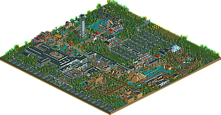
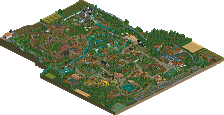
Park / Fränkisches Abenteuerland
-
 04-June 12
- Views 10,865
- Downloads 1,266
- Fans 4
- Comments 28
-

-
 74.62%(required: 70%) Gold
Casimir 85% turbin3 85% Liampie 80% Maverix 80% Phatage 80% SSSammy 80% Steve 80% tyandor 80% Wicksteed 80% CedarPoint6 70% wheres_walto 70% posix 65% prodigy 65% BelgianGuy 55% RMM 55% 74.62% -
4 fans Fans of this park
-
Full-Size Map
-
Download Park
1,266
-
Objects
522
-
Tags
Similar Parks
-
Riverland
-
[H2H7 R3] Lotte World
![park_3345 [H2H7 R3] Lotte World](https://www.nedesigns.com/uploads/parks/3345/aerialt3036.png)
-
Riverland Walheim
-
Euroscape
-
Erlebnispark Ochsenbach
-
[H2H8 R3] A Year in Winkelheim
![park_4113 [H2H8 R3] A Year in Winkelheim](https://www.nedesigns.com/uploads/parks/4113/aerialt3858.png)
I personally liked this but it seems any park of size makes a gold these days and I think this one was a low silver at best for some obvious reasons.
Coaster layouts had no flow for me, even in their respective themes they did not hold my attention and let a lot to be desired in terms of flow and aesthetics...
The parts that where park where good but a lot of the map(too much if you ask me) was filler and more filler, like the huge center placed parking lot thing really broke the map for me, also the farmslands felt uninspired and looked like they where there to not have to blacktile a part of the map while I think the blacktiles would've made the park better.
Foliage wasn't doing it for me either, can't really figure out why but it just didn't click for me, as was the overall landscape...
I really think you're a good talented player but to me this has won gold for the exact same reason as pinehills did, overhyped AD topic of an up and comming player that shows good screens, I mean what's there is good don't doubt that, but not to the level of a gold, as I said I think this deserved low silver and voted accordingly and still stand by that opinion. I think this park and pinehills recieving gold kinda baffles me and gives me the feeling that starting members are given higher scores because we don't judge them like a player like robbie or other established members like Kumba or JK, ... I feel this shows that the quality required for the high accolades is lowering imo and I think that should change because NE used to be more about the quality and if we have to wait a long time for another spotlight or a gold park, so be it but don't vote high just to vote high.
Again I'm not putting down your work Jonny but it needs more refining than the score reflects in my opinion and I hope your next projects can prove me wrong.
I've spent more time perusing the architecture here than anything else, and I'm not really sure how I feel about that. You obviously have talent, but I question a lot of your design choices. Oh, and peepless is probably the way to go unless you have a park layout that caters to their incessant needs. I found a bunch of the tired buggers in a plaza near the western/mountain section's park entrance.
I loved how the layout was very accurate to Phantasialand, although I do think that the compactness of that park lends it a certain charm that is lost when it is more open. Most of the areas were really well made and the architecture was quite good.
I felt that the african area should have been more compact and architecture based, with a lot less foliage, but what was there was nice. It just felt a little plain and "filler-y".
The Mexican/western areas were brilliant, and while the pyramid was a bit big, the architecture here was superb. I also love the triple entrances throughout the park, especially the one in this area.
The Asian area was definitely best near the hotel, where it really felt "Asian". it was just a bit too sparse otherwise. I also would have liked to see the winjas area (can't remember what it's called).
European area was also excellent, although I'm not too sure how well Mystery Tower translates into RCT
Anyway, amazing work, blablabla yay
And apparently I see some quality loss in the banner.
Congrats Jonny!
I think you allready know my opinion about the park, so I wont translate it in bad english for the other guys here.
Between, am I allowed to make a video about the park?
Colorado-Fan Offline
Congrats Jonny!
Congratulations on this, a well deserved accolade, although a solid-high silver would've been better suited imo.
EDIT: I love the drop tower building, don't know why but I love it.
The coasters were really the big let down of this park. only 3 for such a large park, and really not that exciting. Black Mamba was the best, but still somehow not smooth or exciting. The wingrider was awkward and the mine train was SO SLOW. the layout also seemed odd, two parking lots with 3 entrances? it didn't look bad, just seemed weird, like that entire middle parking lot could have been another section, but instead, its a bunch of cement.
good park, i'd say a very good silver or low gold. congrats on the win!
FK
Or maybe so many of us raters gave it a high score because we actually really liked it. I thought this park had something that few have had, and that is that feeling of being able to imagine myself there that I didn't feel with Santa Fe or Dreamport. It's an intangible tangibleness that put me in a good mood like an amusement park should. Its size didn't automatically grant it a higher rating but it certainly helped; parks these days don't have a good sense of space because there's the assumption that there needs to be 50 pieces of scenery per tile but this park found some sort of balance between detail and space.
I don't see what raters would have to gain by rating newer members' work higher than that of older members, and if I could be as presumptuous as you for a sec, I'm claiming that your sentiments are because you've never had a release rated this high. Btw I would've actually rated this higher but I do agree with the points that you made.
it's just I don't see why everybody voted this high or voted this high on pinehills, I mean half the map is a parking lot and just flat roof of some buildings, that's doesn't get gold in my eyes, this combined with the so-so foliage and the downright bad coasters I didn't see this getting any higher than I voted, apparently I'm wrong here but I still stand by what I said. I think an overhyped AD topic of a new member really helps in the scoring and I think I'm right about that no matter how you put it
First i have to say thanks to Dave for this great logo work and to dimi who made the review. Of course to everybody else who was involved backstage.
I know there are a lot of things which are not good. One thing is that my coasters are shit. I have to agree with everybody here on this. My focus on this park was definately on the architecture. I am not a good coaster builder but i would rate coasters not higher than architecture.
Deserved or not derserved, i cant judge this but i am very pleased about the vote.
@BelgianGuy: Thanks for your honest words. I agree with you in a lot of your opinions and i hope i can do it better on my next work.
@Ling: The giant stadium is inspired by the phantasialand. They are there for watching a parade in the late afternoon before the park is going to be closed. Or you can just relax a bit there during the day.
@Cocoa: Thanks for your friendly words. Good to hear that you enjoyed the park. I agree with about the squares. This park is a gigantic square.
@MCI: Thanks, yes i know your opionion on that and you are allowed to make a video.
@Ruben: Thanks!
@Joker: I dont agree with you on the eyecatcher. A park must not a have an eyecatcher. A harmonic overview is more preferable than a big eyecatcher.
@Fizzix: I reseted the date to reach the end of the mission to let people fly their ballons.
@BC(rct2): For witch type of parks are you tired? I am a bit tired about statements like this.
@Phatage: Thanks Phatage for this friendly words and for that you tell me the reason for your vote.
@highroller: After such a long time of building i only want to see this finish to think about new ideas. I also dont agree with you that the middle on a map must be the best part.
All in all i am proud to made this park. It was a lot of fun to create it.
It would be nice to hear some opinions from other voters of this park.
Greets Jonny93
I know I few people said that they thought the parking lot and such was filler, and while it did take up a bunch of the map, most theme parks do have a lot of parking, and your choice to include this just added to realism and gave the map the 'whole' park feel. It seems as though you wanted to include every aspect of a theme park experience into this and I thought it was all very well done.
My only advice is to work on your coasters, as they really hold back what would otherwise be an amazing park. Take a browse around RCDB and see what real coasters do and try and understand why. Hell, just look at some recent designs and see what made those coasters great or pretty much any coaster JDP made.
Congrats man.
I'm getting sick of hearing that.. isn't this game called Roller Coaster Tycoon?? To me the coaster design should be one of the main factors when voting on a submission. I understand you could have an amazing layout but without any scenery or atmosphere it's just that, a layout. But come on guys.