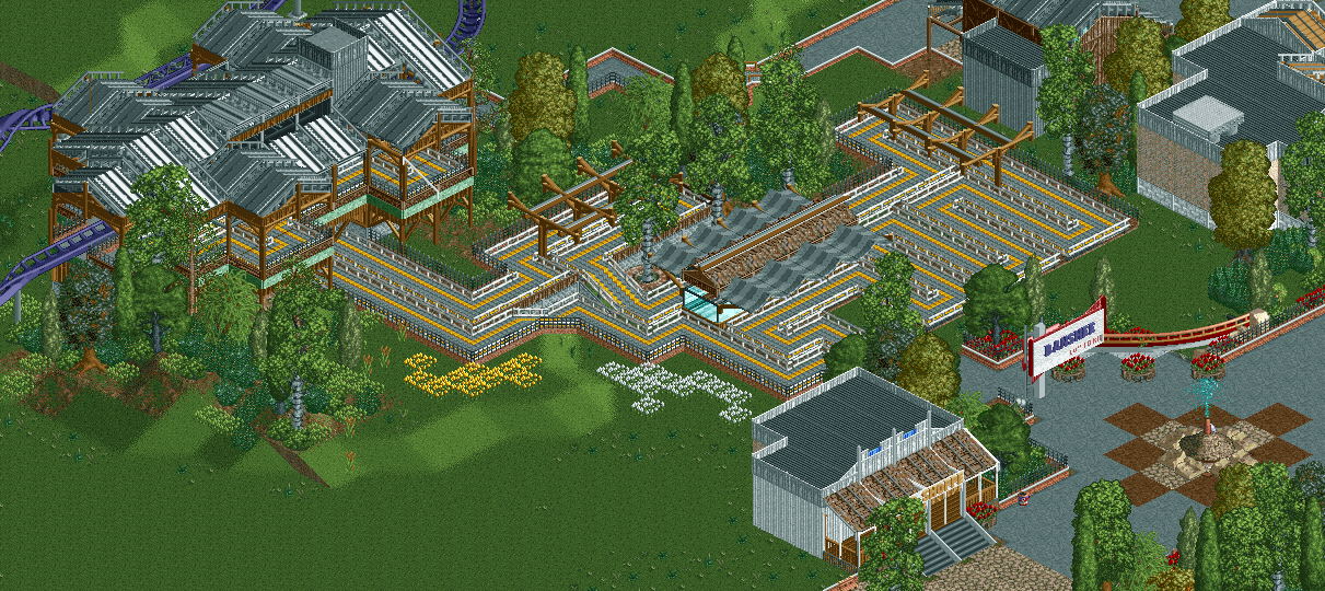
Screenshot / NCSO -- Banshee's new station (and colors!)
-
 08-December 14
-
Blue Oak Amusement Park
-
6 of 13
- Views 2,971
- Fans 0
- Comments 21
Community Forum Software by IP.Board


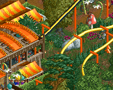
The queue covers are cool. I hate the giant mass of gray roof on the station there.
What color(s) do you suggest then?
Black may look good there I dunno
I also have a lost color opportunity with those awnings that I will take, by the way
Love it, I'm liking the flow and the design of it. The tent structure is also very nice.
Color would help, something other than grey, though i love the form. With that purple coaster, something red, maybe black. Perhaps a greyish brown with some accent color by multi-coloring the track? Just play around a bit
NCSO has really been an amazing booster for you shogo. The innovation you have been forced to come up with is really pushing your work to the next level. Well done.
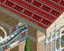
I don't think that station should have a massive steel roof. I don't know that a different color choice can save it.
Maybe it's because the roof is the heaviest looking part of the building, so bulking up the walls might help some.
Update on the roof color
Personally I don't like the black. It's too dark with a dark track color, its dark-dark combination that's making me not like it. I liked the grey better, at least it was lighter than the track color and not too light like white. Everyone got their own preference, just do what you like
i prefer the black, as it stands out from a lot of the white/lighter colored stuff i have around that area
All these new screenshots, I feel like a spoiled kid
I am legit gonna do a screen every day haha
Fuck yeah the black works! Awesome dark feel that perfectly complements the name of the ride; have always thought that the theming around Banshee should have a darker undertone. Really great form on the station in my opinion and although it's perhaps a tad big I like it that way.
I would go with a magenta for the canvas queue covers; just a thought. Also wanted to point out how incredible the wooden queue covers look; innovative use of the suspended track to give the idea that the wooden struts are supported on that 1/4 tile axis as well so they look more solid.
I'm really digging the roof actually.
It's just too complex for its own good. Grey and black are both fine because the roof itself is the problem. It is just crazy busy, visually.
The black works, the roof is now much better than what it was.
I wouldn't make it stick out on both sides though. If you know what I mean. Make the queue side jut out like it does, but on the opposite side have those parts sit flush with the rest of the structure. Still keep the roof pitch going the way it is though.
But yeah, much better improvement on what you showed me last night.
You know I'm a sucker for a fuck ton of trackitechture so I love this roof. I really like the queue coverings too... very nice.
I think you're losing it. It's too systematic and soulless now.
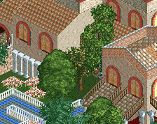
There's a lot I like, such as the uncovered wooden queue awnings and the entrance sign. But that statue is too chaotic for me and does, as posix said, seem soulless. And the amount of unfinished screens you post kills me. I like seeing screens but please finish them bro.