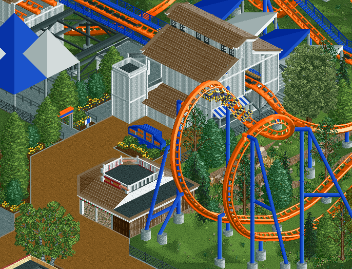
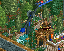
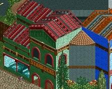
Those awnings don't blend in well and are just bland and out of scale with the station building, which needs a bit more texture variation itself. The landscaping near the cobra roll is really nice though, and the support work is decent.
Was this built in the stream yesterday? Damn! Missed it! No matter. I agree with the above criticism though. Coaster colours are nice, but the station could be made more interesting. Perhaps some vents or windows? Maybe an industrial theme?
The problem with such a coaster like this is the lack of any real depth or identity in the surroundings. Dominator is just a coaster in a field with some metal buildings around it. In real life it works because its an amazing coaster and looks amazing from the path. You dont care about the surroundings because the coaster is the focus, while in RCT, the coasters are less of a focus and therefore more emphasis is put on the surroundings.
You have really put any strong stylistic mark on the content here, and also forgone the inclusion of realistic detail and accuracy. So it kind of fails in both categories.
Take someone like Geewhzz, or Disneylhand or example. They dont build the most themed or amazing concepts, but their style is superb and therefore allows the content to thrive in RCT and become very admirable. Another good example is a Pacificoaster, who also have taken slightly less than groundbreaking concepts and made them great with top notch execution and style.
When building something like this you need that great style to carry the idea and concept, combined with attention to detail and planning. It seems here you kind of skip out on all three. You dont have a solid style architecturally or ride design wise that can carry an idea, nor is your attention to detail and planning at the level it needs to be in something like this. Everything with you feels super compact and over dense, not saying you should build low density stuff, but take a loot at other parks and how they space their rides and structures. Its also important to look at the positioning of buildings and rides, you want to both provide good sight lines and opportunity from the peeps view, as well as catering to accurate and believable structure placement.
You have a building right in front of the cobra roll entrance on the edge of the ravine for no real reason. You could have a great viewing area for the coaster and peeps and allow for the area to breath a bit more. Note on the real Dominator the position of the merch shop, its off to the side and is right in the path of the exit, it doesn't get in the way of the midway or isn't crammed up against the coaster in what would be prime viewing angle. The building also provides great opportunity with the sign that puts it in viewing distance of the whole lead up midway and right next to the entrance. Your sign is crammed in the back and isn't view able from more than a few yards in front. It also doesn't really define the entrance of the coaster, or really give any viewing angle the coaster in the background of the sign like the real one might.
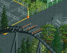
You also refuse for whatever reason to build realistic toon supports, I had a big issue with this in your last park as well as some of your newer projects, its not all that difficult to look at the real elements and mimic those supports. Right now its just random and you leave a few huge gap in track that is unsupported.
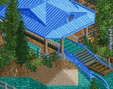
I'll echo the comments on the queue covers as those have stated before, as well as the foliage which does look nice. I'd go light on the road lines though, you seem to use them just to use them, rather than actually using them to make the area look nice and clean.
Anyways, probably wrote far to much for the screen, but hopefully you can get something out of this. Sorry if its sound like I'm being harsh, but I'm just trying to help, and its NE so yea...
 18-April 16
The most nin screen ever made.
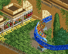
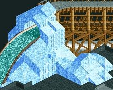
needs a little more color variation than just blue/white on everything.
Those awnings don't blend in well and are just bland and out of scale with the station building, which needs a bit more texture variation itself. The landscaping near the cobra roll is really nice though, and the support work is decent.
Always a fan of an orange and blue coaster.
Station structure is nice, colourings need to be sorted out though, very plain.
That ride sign is so good.
but cedar fair is bland.
You can do a lot better with the buildings.
so could kings dominion.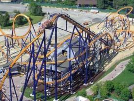

It is literally a white box. A park chain shouldn't be used as an excuse.
I get that it is meant to be bland, but there are other ways you can jazz up a structure like this, and keep it bland.
So this is meant to be a rec?
Was this built in the stream yesterday? Damn! Missed it! No matter. I agree with the above criticism though. Coaster colours are nice, but the station could be made more interesting. Perhaps some vents or windows? Maybe an industrial theme?
Somewhere in the world a Ride the Ducks driver just drove off a bridge.
lmao, this is so true
If I'm going for accuracy then a white box should translate as a white box.
Why recreate a white box? If I would recreate a turd I can expect people to say it looks like shit.
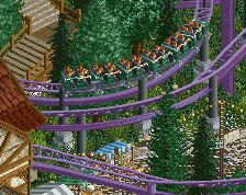
Coaster and foliage look good.
Well I guess you guys will have to get over it
The problem with such a coaster like this is the lack of any real depth or identity in the surroundings. Dominator is just a coaster in a field with some metal buildings around it. In real life it works because its an amazing coaster and looks amazing from the path. You dont care about the surroundings because the coaster is the focus, while in RCT, the coasters are less of a focus and therefore more emphasis is put on the surroundings.
You have really put any strong stylistic mark on the content here, and also forgone the inclusion of realistic detail and accuracy. So it kind of fails in both categories.
Take someone like Geewhzz, or Disneylhand or example. They dont build the most themed or amazing concepts, but their style is superb and therefore allows the content to thrive in RCT and become very admirable. Another good example is a Pacificoaster, who also have taken slightly less than groundbreaking concepts and made them great with top notch execution and style.
When building something like this you need that great style to carry the idea and concept, combined with attention to detail and planning. It seems here you kind of skip out on all three. You dont have a solid style architecturally or ride design wise that can carry an idea, nor is your attention to detail and planning at the level it needs to be in something like this. Everything with you feels super compact and over dense, not saying you should build low density stuff, but take a loot at other parks and how they space their rides and structures. Its also important to look at the positioning of buildings and rides, you want to both provide good sight lines and opportunity from the peeps view, as well as catering to accurate and believable structure placement.
You have a building right in front of the cobra roll entrance on the edge of the ravine for no real reason. You could have a great viewing area for the coaster and peeps and allow for the area to breath a bit more. Note on the real Dominator the position of the merch shop, its off to the side and is right in the path of the exit, it doesn't get in the way of the midway or isn't crammed up against the coaster in what would be prime viewing angle. The building also provides great opportunity with the sign that puts it in viewing distance of the whole lead up midway and right next to the entrance. Your sign is crammed in the back and isn't view able from more than a few yards in front. It also doesn't really define the entrance of the coaster, or really give any viewing angle the coaster in the background of the sign like the real one might.
You also refuse for whatever reason to build realistic toon supports, I had a big issue with this in your last park as well as some of your newer projects, its not all that difficult to look at the real elements and mimic those supports. Right now its just random and you leave a few huge gap in track that is unsupported.
I'll echo the comments on the queue covers as those have stated before, as well as the foliage which does look nice. I'd go light on the road lines though, you seem to use them just to use them, rather than actually using them to make the area look nice and clean.
Anyways, probably wrote far to much for the screen, but hopefully you can get something out of this. Sorry if its sound like I'm being harsh, but I'm just trying to help, and its NE so yea...