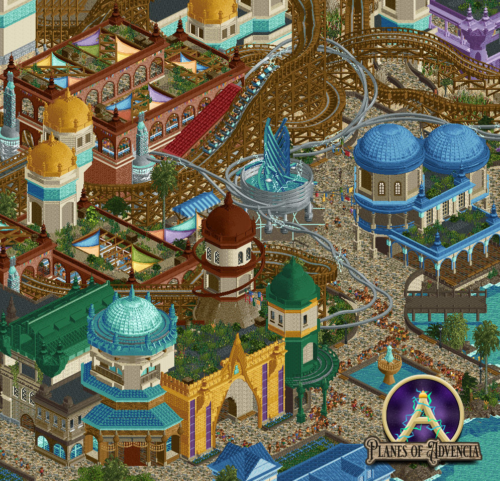
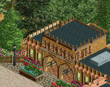
This is technically great, but missing a layer of fine detail I think. Some lighting (path, integrated, mounted), signage, railings, banners/flags, umbrellas, trash bins, integrated seating, potted plants, etc would do wonders for this area. Very minor, but I think it could really be brought to life more.
Regardless, this is some of your best work yet. I love it.
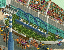
This is a really cool easthetic. Arabian architecture combined with the flowy ´electricity cables´. Love it. Was only wondering if there is a peep-problem somewhere? Given the business in the bottom right area.
I'll echo what Josh says. I think the path could use some more details. In general I am also not a huge fan of the path choice either. The texture is very busy and overwhelming and it blends in with the beige on the buildings. For example on that building with the blue dome on the right the beige poles blend in with the path a lot and its hard to distinguish the two from afar. I'd personally go for a path with a contrasting colour so there is a clear divide between the path and the buildings.
its good. for screen purposes its lacking finishing details. Big peep jam. Path texture is really busy here. the station is kind of square doesn't match the motif of the other buildings. Roofs are pretty busy too and mismatch canvas are odd i think.
Your style has evolved in an interesting way. It feels like early AVC, using modern objects. I think the best thing for you to do would be to go look at some recent AVC work and really dissect it to find what takes his work to the next level, then put your own spin on that.
I get all the comments for things like path details and the horrendous peep jam... trust me. It took me way to long to even get it to where it is now. As for the path I love the way it looks so probably not changing that, as well as awnings or coaster type. sorry not sorry. Also this just because the name is close to Agencia doesn't make this AVC trav
Lots of good stuff here, though the path is a bit noisy as mentioned. With some finesse you could blend it with a more subdued piece and achieve both clarity and the texture you're after.
Agreed with most of the above. In places you hit an amazing level of details, composition, and execution, but elsewhere some of the buildings feel a bit simple or under-detailed by comparison. Certainly felt at first that parts were maybe unfinished? Also, some smaller adjustments to break up the amount of large rectangular buildings would help.
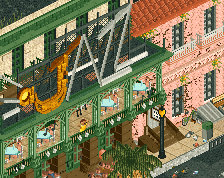
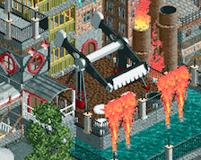
Really some cool stuff to see here, that golden gate there is really nice. Not the type of rct we'd expect from Scoop, but a nice surprise to see from you. You're clearly having a lot of fun with this which I love to see.
Just a quick one to say love everything you're doing here. Another 10% push on the small details, and this will really enhance this. What's currently there is a superior level but because it's a more fantasy approach, are there any more smaller details, generators, electric-making thingies you could add to help benefit the path. Crack the path detailing (not to an excessive amount) and this will elevate it further.
Shout out to the top of the roofs, I've been coming back to this a few times to gawp at them.
Also the enclosed courtyard is beautiful, I love it when queues have this. Great job Scoop. 85% from me
Really loving this project and this is looking really nice. The one thing I’d say to add on top of the existing comments is that the colors could be tightened to create more cohesion. Right now there are quite a few different color choices on the towers and roofs that clash IMO, so perhaps just small changes may help.
The sands of time have given this place fortune greater than anyone could ever imagine. Step into a world where streets are alive with aether and dust. Just don't get caught in the sandstorm.
 03-June 23
i got snad in my eye
This is technically great, but missing a layer of fine detail I think. Some lighting (path, integrated, mounted), signage, railings, banners/flags, umbrellas, trash bins, integrated seating, potted plants, etc would do wonders for this area. Very minor, but I think it could really be brought to life more.
Regardless, this is some of your best work yet. I love it.
This is a really cool easthetic. Arabian architecture combined with the flowy ´electricity cables´. Love it. Was only wondering if there is a peep-problem somewhere? Given the business in the bottom right area.
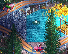
loving all the curves
I'll echo what Josh says. I think the path could use some more details. In general I am also not a huge fan of the path choice either. The texture is very busy and overwhelming and it blends in with the beige on the buildings. For example on that building with the blue dome on the right the beige poles blend in with the path a lot and its hard to distinguish the two from afar. I'd personally go for a path with a contrasting colour so there is a clear divide between the path and the buildings.
Overall it looks cool though.
its good. for screen purposes its lacking finishing details. Big peep jam. Path texture is really busy here. the station is kind of square doesn't match the motif of the other buildings. Roofs are pretty busy too and mismatch canvas are odd i think.
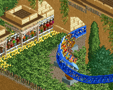
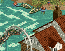
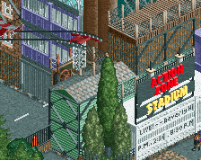
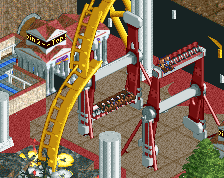
i don't know why but i find the woodie destroys the whole estetic of the buildings i am not a fan of him in there
Your style has evolved in an interesting way. It feels like early AVC, using modern objects. I think the best thing for you to do would be to go look at some recent AVC work and really dissect it to find what takes his work to the next level, then put your own spin on that.
I get all the comments for things like path details and the horrendous peep jam... trust me. It took me way to long to even get it to where it is now. As for the path I love the way it looks so probably not changing that, as well as awnings or coaster type. sorry not sorry. Also this just because the name is close to Agencia doesn't make this AVC trav
Lots of good stuff here, though the path is a bit noisy as mentioned. With some finesse you could blend it with a more subdued piece and achieve both clarity and the texture you're after.
Agreed with most of the above. In places you hit an amazing level of details, composition, and execution, but elsewhere some of the buildings feel a bit simple or under-detailed by comparison. Certainly felt at first that parts were maybe unfinished? Also, some smaller adjustments to break up the amount of large rectangular buildings would help.
Really some cool stuff to see here, that golden gate there is really nice. Not the type of rct we'd expect from Scoop, but a nice surprise to see from you. You're clearly having a lot of fun with this which I love to see.
feels like it wants to be nepal, arabia, and 2008 zodiac/egg_head all at the same time. I love those interior courtyard colored awnings tho
Just a quick one to say love everything you're doing here. Another 10% push on the small details, and this will really enhance this. What's currently there is a superior level but because it's a more fantasy approach, are there any more smaller details, generators, electric-making thingies you could add to help benefit the path. Crack the path detailing (not to an excessive amount) and this will elevate it further.
Shout out to the top of the roofs, I've been coming back to this a few times to gawp at them.
Also the enclosed courtyard is beautiful, I love it when queues have this. Great job Scoop. 85% from me