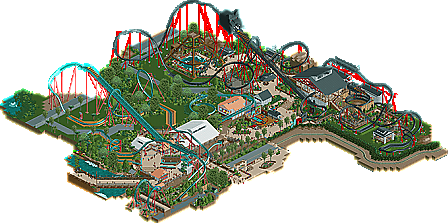
Park / Son of Kumba
-
 07-July 11
- Views 22,566
- Downloads 1,562
- Fans 1
- Comments 50
-

-
 76.15%(required: 65%) Design
prodigy 90% RCTCA 90% robbie92 85% BelgianGuy 80% Casimir 80% geewhzz 80% Maverix 80% Roomie 80% Levis 75% Liampie 75% Loopy 70% Wicksteed 70% Metropole 65% RMM 60% JDP 40% 76.15% -
1 fan Fans of this park
-
Full-Size Map
-
Download Park
1,562
-
Objects
411
-
Tags
Similar Parks
-
Westwinds
-
[H2H8 R3] Castles-n-Coasters
![park_4102 [H2H8 R3] Castles-n-Coasters](https://www.nedesigns.com/uploads/parks/4102/aerialt3848.png)
-
[H2H8 R4] Park Guell
![park_4122 [H2H8 R4] Park Guell](https://www.nedesigns.com/uploads/parks/4122/aerialt3861.png)
-
Dulce, NM

-
Dimensions: Realms of Creation
-
Piraña
i don't like the combination from a desgin and a realistic coaster, it could be when it was more realistic
Nice to see this is getting a lot of feedback even if it's not a lot of nice feedback. Only thing I want to point out is that is a real flat ride.
Thanks for the 304 points, a nice robbie write-up and my 6th NE design... guess it's time to start on Grandson of Kumba!
Now with that being said, I'll reiterate that I agree with the criticisms as well. I wish you did make a readme, Kumba, because even though it seems like it should be obvious and I've even seen the park before this release, I'm not fully sure of your intentions. Were you creating something that you can honestly see BG(T,A?) adding to the area? Were you trying to RCTify something that you had always wished was there in real life ever since you first rode your favorite coaster ever? Were you even trying to create some weird dimension portal bridging realism and fantasy?
While I do think you showed a good deal of good park planning skills, I still don't think you've captured a BGT feel of foreign continent (realistic) theming. Really the heart and soul of BGT's theming is the fact that the villages of buildings not so separate from nature. BGT's Congo section, as I said before when you released Kumba, is beautifully lush and full of broad, shade-providing trees that from a bird's eye view would partially obscure the path. Your new area was pretty much devoid of this, most notably the queue line, as you opted for a bastardized version of RRPchitecture that is being abused a lot these days. Most of the coasters have sections where their layouts take them sprinting along nature's plains, whereas I though this was overly dominated by path and 'civilization'. Again with the more realistic take on theming, I can't see a Busch park ever making something like that cat on the lift hill. The cat would work great with 1) more supporting and 2) if Universal opened another IOA somewhere and this coaster was in another cartoon-oriented themed section.
I thought the coaster had some very good aesthetic value, would have been cool to see it as a wingwhatever coaster not paced nearly as fast. I still don't quite understand if you were going for something realistic because I think the coaster itself ended up somewhere in between, refusing to commit to either side, and it's not just the launch. I also think it would have been cool to have SoK's layout intertwine with it's father's at one or two points.
Anyway if you're content with this, that's fine but I would like to see you give it another go; maybe keep the coaster but try to address one or more of the criticisms in this thread to see where it leads you. I for one think that you are at a level where you shouldn't settle for the outcome of that Huss ride. If you couldn't make it more accurate in terms of the behavior of the cars or the relative size of the cars to the structure, then I think you should have removed it altogether. The area it occupies could be used for an animal exhibit or restaurant or something to bring nature more into the equation. I think the station could have housed an entire flat ride or two, maybe try that even! Preferably I would like the station smaller and more obscured by trees to heighten anticipation.
Congrats on the accolade. I think this would have actually been better not on the same map as Kumba because of the context it set; I don't think it's as bad as it's own independent ride, set to exist not in BGT. I honestly do hope that you take another stab at this though.
The architecture was very Similar, but not in a pleasing way like Kumba, and the two didin't blend very well. I. . . want to like it at a whole, but Nin pretty much hits the nail on the head on this.
However I want to thank you for the contribution that this park brought, and that are some nifty objects that I was almost willing to make myself, but your effort was way better than mine.
Congrats.
But really, I think people are holding you to a higher standard, this is great, it just not what everyone wanted. There were a lot of great parts, and the banner is absolutely beautiful, I think you fully deserved this. Congrats.
And I pretty much agree with nin. I'll go ahead and add what's the point of making a ride that is practically the same as Kumba itself, RIGHT next to it? I've been following the whole coaster community for nearly two decades now and one thing I distinctly remember is the topic about how Stand-Up coaster's cannot contain an in-line twist, and yet there's the first inversion... meh.
Other than that, not as bad as some make it sound. The original just had a cooler path layout with the diagonals and height variation. But in your defense it's a lot harder when you're building off of imagination.
overall the design was pretty excellent though, especially with the realistic details, like nets, paths, supports etc. the atmosphere was pretty and msot of the architecture was pretty cool. the layout itself was pretty bad imo. after the mcbr it was nice though, the first half felt very repetetive and awkward. i also really hated those two black faces on the ride, it completely killed whatever realistic vibe you had going with their obviously-rct2-deco blocks look to them. the foliage was sort of iffy in some places too, but i general felt fairly faithful to the original design, although i would have liked more flowers.
also, what is that pyramid tower thing? it really did not fit in with any realistic aspect and was pretty ugly in execution... but was classic kumba I guess.
Overall, this was certainly design-worthy. Those who think otherwise are only kidding themselves. I'd even say it was a strong design. Seeing it next to Kumba (arguably the greatest design ever?) didn't help much, though. Overall, I did enjoy this quite a bit. Congrats.