Park / Son of Kumba
-
 07-July 11
- Views 22,566
- Downloads 1,562
- Fans 1
- Comments 50
-
-
 76.15%(required: 65%)
 Design

prodigy 90% RCTCA 90% robbie92 85% BelgianGuy 80% Casimir 80% geewhzz 80% Maverix 80% Roomie 80% Levis 75% Liampie 75% Loopy 70% Wicksteed 70% Metropole 65% RMM 60% JDP 40% 76.15% -
1 fan
 Fans of this park
-
 Full-Size Map
-
 Download Park
1,562
-
 Objects
411
-
 Tags
Tags
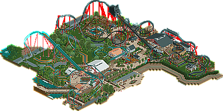
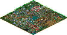
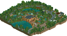
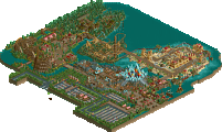
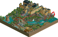
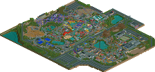
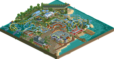
Of course Kumba did not realistically portray a themepark to build two similar rollercoasters next to each other. No, instead, he plays RCT and put them on the same map because he's calling the other one "Son of Kumba".
I'm reading replies that seem to bash the design on its aims. That's just the part you have to accept. Kumba chose what he wanted to create. You can not like that, but you can't really blame him for it personally.
And I'm sorry, changing other people's designs and posting pictures? That's just a bit disrespectful.
Oh, Nin, check the map closely.. Kumba did not ruin his previous design: he actually included it in there for you!
People are bashing the coaster for its name basically, if it wasn't called SOK but something like Demon Hunter and the concept of SOK im positive more people would actually enjoy it.
I like it very much, its a good design, even if it is a bit fast, the themeing is fantastic (not counting the cat head, but its there for a reason obviously) abd the attention to detail is fantastic, like the drink on the shop,the catwalks are perfect, the doors to maintenance etc etc.
Its a bloody good design worthy of an 85% and a thumbs up in my opinion.
Good job Buudy
I liked the layout, the Hulk-esque launch at the top was nice, but the cat head ruined it for me. Also, the triple helix there at the end wasn't my cup of tea but the rest was nice. You made some excellent, very useful objects here too.
Overall, I really like your realistic building, not that your fantasy parks are bad by any means, but as I said when you released the original recreation, I'd like to see a full size solo with the level of realism and detail in this little park here. Looking forward to what you have in store for us next, and no, this was NOT as bad as people are making it out to be. Probably an 80% from me, with potential for a 90% if it stood alone. Congrats!
I told you so Kumba
Remove Kumba itself from the map and rethink the cat head.
I liked it a lot anyway
Pros:
The ride had some great moments. Particularly the part shown in the banner with the sculpure surrounded by the coaster's sweeping turn.
I loved the entrance to the queue line.
Part of the foliage and path looked really lush and very good.
The basketball thing.
The flat ride (I actually really liked it)
Cons:
Pacing: This was the biggest issue of them all, and in heinsight, I think I should have judged you more severly regarding this. The pacing wasn't even a little off, it was actually so far off I couldn't believe it. You have shown you have knowledge of how real world rides work (just look across the map, the amount of research you did for Kumba really showed, but it seems you have forgotten all you've learnt). The pacing on this was actually fatal. Also, considering this is a stand-up, if anything it should go slower through the elements, and a launch into zero-g roll just wasn't the correct choice here.
Cat Head thing. This was a gross misjudgment on your part I think Darren. I'm not sure there has been anyone who thought it was a good addition. It was too large, blocky and seemingly completely unsupported. It looks like the coaster would topple over bearing it's weight.
Some of the foliage. I think I mentioned this in the topic, but the lines of jungle bushes just didn't do it for me.
That cave thing. I agree with nin. A lot of people in the topic mentioned that the cave did not look very good (to say the least). You chose to ignore the majority and stick with it anyway. My mind hasn't been changed. I understand that you build for yourself, and I encourage that, but if that many people state that they think something looks bad, you have to step back and consider you may be looking at it through tinted glasses.
As a side note, I don't think having this on the same map as Kumba changes anything (even though I think it looked a bit worse since you had the lift hills going the same way, something I reckon you should have avoided). I think you immediately raised expectation of this because of it being the sequel to Kumba, and everyone wanted it to fulfil all of the realistic requirements (and the way you advertised this seemed to suggest that it would). On one hand you did this with realistic looking queue line, path layout, cool shops and stalls, but then you strayed so far away from that with the cat head and the pacing issues and whatnot, that it just didn't sit right. However, even if this was completely unrelated to Kumba, I don't think it would have got a significantly higher score. At the end of the day, it looks to be a realistic attempt at a stand-up, and definately fails to deliver due to some pretty fatal flaws. This was it's downfall, and this is why I (now) don't believe it to be worthy of a design. For me, it's annoying, because you are obviously capable of making something amazing (both realistic and fantasy) and that's why it's such a disapointment for me.
I know I'm late... by almost a decade... but I just wanted to add one observation
I think Kumba was trying to take the piss out of Son of Beast
i thought he was trying to take the piss out of son of kumba