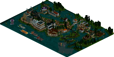
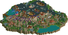
Park / Phantom
-
 02-September 11
- Views 10,521
- Downloads 996
- Fans 0
- Comments 26

-
-
 75.00%(required: 65%) Design
prodigy 95% nin 90% Kumba 85% Casimir 80% JDP 80% wheres_walto 80% CedarPoint6 75% Liampie 75% Metropole 75% turbin3 75% Maverix 70% geewhzz 65% Levis 65% Loopy 60% Wicksteed 30% 75.00% -
No fans of this park
-
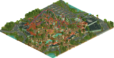
Full-Size Map
-
Download Park
996
-
Objects
286
-
Tags
Similar Parks
-
[NEDC6] Valley of Huanglong
![park_6118 [NEDC6] Valley of Huanglong](https://www.nedesigns.com/uploads/parks/6118/aerialt6364.png)
-
Bussin' Bayou
-
Pinocchio: Ride to Maturity
-
Castle Howard
-
Macaw
-
Six Flags Santa Fe
Your other inverted coaster was way much better, it's a bit empty in my opnion.
But otherwise, Layout is really cool!, Love the Transfer, Im not a big fan of the Droptower, Bit to Empty, And bleak in my opinion.
But Gongratz
And wicksteed, I mean no disrespect to you, solely. I think this is a problem seen in a lot of releases.
Dlhand, I think this was a great design. I have absolutely no complaint with the layout. I thought it was nearly perfect in pacing, and it looked like a hell of a lot of fun to ride. My only problem is that I really couldn't tell what kind of park you intended this particular ride to be a part of. It kind of felt like its own entity to me. As a design, it's nice to see some context.Regardless, great job on this. So glad to see an accolade release by you again.
Wicksteed Offline
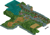
It was so conceptually awkward that it was hard to get into, but a lot of it was smaller stuff that hopefully would've been redone if you had enough time. The road systems look neat upon first glance but then your realize that same direction lanes are separated by yellow lines and the intersection makes no sense. You go lengths to use track to make custom curved and diagonal walls but then you also use alternating scenery fences in perpendicular directions to symbolize a diagonal fence in areas. Some of the fenced-off areas have easy access points (see the edge of the map small parking lot near the I-5 sign). There's that random building where a lot of the lift supports are (???) and the handicapped parking for said building is farther away from the entrance (of the building) than other parking spaces. You have random track-fencing around some of the cobra roll's supports but no fencing around where the train actually almost reaches the ground at the valleys of it. There are no fences around the drop tower loading area.
So call me an over-analyzer but I'm honestly trying to find justification as to why this feels weird and maybe it's the combination of these things, the lack of or the lack of a lack of an obvious theme (industrial setting yet one the buildings is half in a cave or something), or the Hershey water building restrictions still allowing this park to build supports on the beach parts (the train-supporting bridge would indicate that the area does sometimes flood, which would then make the supports be in the water). It just seemed like a lot of half-developed ideas that reminded me of your protour entry.
The bright spot was the coaster though. The layout does make sense in this context and it still emphasizes the main large elements like B&M's do. I think there could have been some more creativity with the supports given the park's circumstances, and zero-g roll didn't need any support in the middle. It was a a little weird regarding using Great Bear's colors. I did like the entrance in the mcbr, reminded me a lot of the standups, but I think you needed some (actual) brake so that the second half of the ride wasn't too painful. Last thing was that the transfer table needs to be 1 tile longer if only for allowing the track spine to be raised for the entire table (as in not starting to incline in the beginning only).
@ Wicksteed: You said a while back, that you would like to see people build like in 2004. Ok, that's your respectable opinion, but I don't think it's alright to judge things harder which are not oldschool. Most people here prefer to build at the state of the art (me too), you shouldn't try to force people into a dirction with your votes they don't want, only because you would like that.