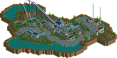
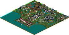
Park / Avenger
-
 21-April 05
- Views 11,060
- Downloads 686
- Fans 0
- Comments 25
-

-
 66.11%(required: none) Design
][ntamin22 75% Cocoa 70% inthemanual 70% Liampie 70% MCI 70% G Force 65% trav 65% trav 65% alex 60% posix 60% 5dave 55% 66.11% -
No fans of this park
-
Download Park
686
-
Objects
150
-
Tags
Similar Parks
-
Cliffs of Utopia
-
Bayfront Parc

-
Golden Heights
-
Rocky Mountain Mystique
-
[NEDC6] Unfriendly Invader
![park_6135 [NEDC6] Unfriendly Invader](https://www.nedesigns.com/uploads/parks/6135/aerialt6375.png)
-
Disneyland Park
Geoff's, was...eh. I can see what he was going for in the Intamin Looper, but it didnt come out well at all. The vekoma-track-style loops made no sense (use the twister loops next time), and it didn't flow right. The themeing was alright, but I just thought it was overall ugly and a very strange layout. Trains were perfect though.
Good job to both on the realism though.
Geoff's:
The layout didn't appeal to me. The ending was too slow paced and seemed to lack direction. The architecture was nice, but lacked any depth which probably could have been gained through more colour. It seemed unfinished which should automatically exclude it from being a design IMO. There were no supports holding up the main drop, and the area around the lift hill was unfinished. Although you have improved, and if this had been finished with more depth, then I would have enjoyed it much more.
Steve's:
Disapointing. Lacked any substance that your work usually gives off for me. The coaster layout was solid, but there was nothing that really took me in. The supports were well done, in fact, everything was pretty well done, just nothing that seperates it from anything else. I just didn't enjoy it. I much prefer your other work, namely, Mandarin. That made me smile....this didn't.
I also agree with Posix. Music adds so much to a ride/park, I don't understand why people don't use it.
Anyway, well done to the both of you for getting designs, evidently, others enjoyed them much more than myself, so keep it up.
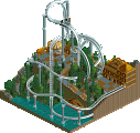
Metro
I really enjoyed this, very nicely flowing, tight layout. The use of grass was excellent as others have mentioned and it just all flowed together quite nicely. I wish you put some more work in the surrounding areas though. Oh and by the way like Corky mentioned, the transfer track thing was cool. Nice work, man.
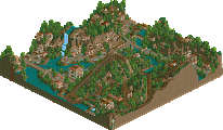
Lumeria by Geoff
I didn't like this one as much, but it wasn't bad. It was just very mediocre. The layout was awkward in places and lost its punch by the time it got to the double inline twist. However, the idea of the Intamin looper was pretty cool. There really just weren't that many interactions with stuff and that really took a lot away from it in my opinion. The supports were sloppy and in some places just lacking them completely. It was also quite unfinished...I know it's "just a design" but I think spending more time on the surroundings would make it better. Not bad though, would've liked to see more effort into it.
Avenger - steve
Pretty nice design, the layout was great, small,sharp and effective. i loved the realism in the park although some parts were a bit off, the thing that i didn't like was the architecture, it was a little too bland for me and kind of ruin the coaster for me. not bad, congrats on getting design.
Lumeria - geoff
I really like this one, the layout was different but i thought it was great, i always love colossus inspired coasters, the themeing was very peaceful and loverly, the thing that ruined this design for me was the coaster supports, they looked unfinished and some parts of the coaster were supported and some were not, just something to think about in the future.
overall two good designs, but nothing more imo. [/font]