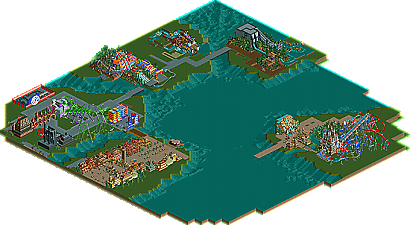
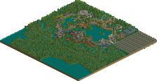
Park / IOA Hollywood
-
 16-September 05
- Views 32,814
- Downloads 584
- Fans 1
- Comments 327
-
1 fan Fans of this park
-
Download Park
584
-
Objects
385
-
Tags
Similar Parks
-
Project Dinosaur
-
Kronecraft's Allure Lake
-
Baiht Oashyr Vel Thalloo
-
Le Parc du Daim Blanc 2000
-
Bedroom 101

-
Harakiri's Islands of Adventure
Importance of detail = Bewlow average
Architecture = bad
Overall screen = meh?
Explained:
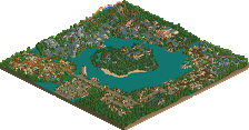
At first glance it looks impressive, but instantly it gets random.
This is no beef towards you, the work gone into this park is evidently high, but what function do all those things hanging off the sides of the buildings serve? They dont serve anything constructive other to decorate an 8x3 (or whatever) rectangle building.
Its hard to put my point across, the buildings in the screen just irritate me, they dont make sense. I mean, they are hardly themed buildings, they're just rectangles with millions of decorations on. And they are pretty far from generic buildings, so what are they? They dont seem to have any shape either. The themeing in the screen doenst scream Arabian, my biggest gripe is the ticket area, it looks 100% Disney, while the rest of the screen looks.... ?
If you're going to build a park in the style of Universal/Disney/Any other 'fantasy-realistic' theme park, you need to shape your buildings. I have seen this kind of themeing becoming more evident, where parkmakers use the same building shapes through out their whole park, and then slap it with a different 'skin' depending on what theme your using. IMO oppinion its acceptable to use small scale squares and rectangles which most RCT1 parkmakers use (and the veteran RCT2 players like Slob, SACF etc) so long as the buildings look fitting and 'work as one'. But I look at the buildings in this screen, and they're all solo buildings, they dont interact with each other at all.
The last thing im going to say is that the scenery items in the screen dont fit together. If you look around the base of the buildings and work your way up, you will see plenty of examples of bad mixture (Church windows in Arabia?), lots of what looks like glitches but are prolly yet more examples of the wrong scenery in the wrong place.
I really didnt mean to sound harsh with those comments, but I think you need to look at your buildings and ask, "does it serve a purpose, or is it a space filler".
you've allways been one of my favorites 'round here!
about the location, posix, youre right, i dont give a shit about the location. i care about whats inside the park and things like location dont mean anything to me. most of the time i build a park and then slap on the name. the point was that i wanted to build an IOA park that is similar to the orlando park but not a recreation. thats it.
thanks for all the comments, both the good ones and the bad ones.
Richie Offline
Im not trying to sound harsh even if it seems that way, im just trying to help, if you dont like it tell me to kcuf off.
Edited by yeshli2nuts, 20 November 2005 - 08:18 PM.
Nice colors, though.
Still, the building is completely symmetrical... try to work some asymmetry into the building shape. Hell, just a simple L-shape is sufficent.
It looks ok, but put more work into the basic design before you detail it.
-ACE
Some store fronts "stick out" or protrude from the crowd of store fronts, some are sunken back. This lends to the hap hazard construcion of the stores and causes their differences. There are a lot of small interesting details like stacks of crates, barrels, pushcarts, umbrellas, awnings, balconies windows, flowers, trees, display tables etc. Think "Diagon Alley meets Middle Eastern marketplace with a Medeterranian Bazaar" flavor. And throw in some turn of the 18th. century technology with ancient influences & traditions.
So, clutter up the buildings, but give each structure it's own unique collection of clutter.
Richie Offline
It's over done. P&S (Plain & Simple.) I just wish you would study up on some basic archi styles. This would take you soooooo freakin' far. This say's "I haven't got a clue to what I'm doing".
Yeah, "harsh", sorry.
Something I noticed, no biggie but the direction of the poles are all parallel. One floor they should run East & West, the next floor North & South. Just so it alters direction between floors to make a stronger structure. Hope that helps.
inVersed Offline
I hope you understand my nonense. Keep it up though.
Metro
This park so far has shown alot of skill and i find it great. I love the colours and the architecture. Just because its not the normal port of entry that you see doesnt mean it isnt good. It just drives me up the wall when you see parks like this (great parks) then people making stupid comments for example about the name, i believe he didnt know abour IOAH and does it really matter that much? no it doesnt. Anyways i have a few problems with the screen the tacky custom scenery doesnt fit imo like the foliage twirly thingys lol take them out and use the normal rct foliage and your there. Im telling you to me this is better quality that foozys park and thats saying something.
Please carry on with this and if theres room for a small guest spot lemme know i would love to give it a go.