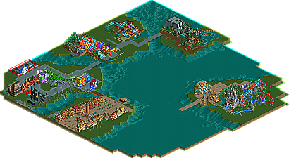
Park / IOA Hollywood
-
 16-September 05
- Views 32,263
- Downloads 580
- Fans 1
- Comments 327
-
1 fan Fans of this park
-
Download Park
580
-
Objects
385
-
Tags
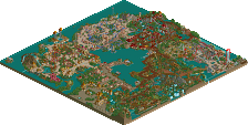
A while back in the Isole Calabria thread, I mentioned how I could see some people around that I thought almost needed LL, just to know what it's like to not have 60,000 pieces of custom scenery at one's disposal. Although Yeshli's case is not as desperate as others', I'd still say he falls into that category. Yeshli, you're a notable case in that your singular weakness, which is that you sometimes have a hard time making sense of all the custom scenery you use, can be attributed to a single fact: that you were brought up only among RCT2 parks with massive amounts of custom scenery. The fact is that it would be hard for almost anyone to make sense of such a diverse workbench from day one. What you need to realize is that you need to actually limit your in-game scenery options in parks, rather than broadening them. This is because you can hone the ability to pick and choose scenery items tastefully in the construction of a building much more quickly and efficiently if you have fewer at your disposal. When you have less to work with, you become better faster. I know it sounds counterintuitive, but it's true and there are many examples of it at work. And once you have reduced the number of scenery options available to you, you starting really noticing and working on things like building form and aesthetic setup with the limited tools that you have. LL is like the nirvana of this. The building options are so limited to most people that if you don't have good building form and shape, you don't have anything.
Basically I'm just trying to help you out and what I'm saying is that you need to look at some LL parks, not out of shame for not knowing them or anything but for the sake of parkmaking wisdom. And then you need to embark on either some RCT2 work with little or, even better, no custom scenery, or some LL work. That will be the single most advantageous thing you could do. I'm not going to talk about the Port of Entry resemblance but when you whittle it down, essentially what you have there is two vertical rectangles loaded to the gills with custom scenery (no offense intended), and you're not going to get very far with that. The best LL parks, and BGSS and RoB in RCT2, don't have better use of building form than this despite using little scenery - they have better use of building form than this because they use little scenery. And that's where you need to go.
inVersed Offline
And I agree with Jacko about the colors. :|
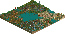
And it also seems like you're holding back with your colors. Don't be afraid of the RCT palette. Use it; experiment with it; become one with your colors
-X-
Metro
going from red directly to green is somewhat, bleh.
EDIT: i mean those shitty looking custom ones. yeah.
inVersed Offline
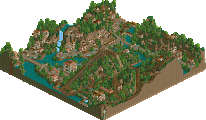
Now beside that everything looks very nice. good stuff.