Park / Dusk
-
 04-August 13
- Views 2,661
- Downloads 414
- Fans 0
- Comments 14
-
 60.77%(required: 65%)
Design Submission
60.77%(required: 65%)
Design Submission
In:Cities 80% ][ntamin22 80% chorkiel 75% tyandor 70% Fizzix 65% Kumba 65% Liampie 65% Pacificoaster 60% posix 60% zburns999 55% CedarPoint6 50% Phatage 50% prodigy 50% pierrot 45% 5dave 40% 60.77% -
No fans of this park
-
Full-Size Map
-
Download Park
414
-
Objects
263
-
Tags
Similar Parks
-
Dimi's Superhero Island
-
Top Gun
-
The Necromancer
-
Tropic Thunder - a design by Thirteen
-
Sasquatch
-
Totem
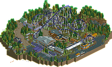
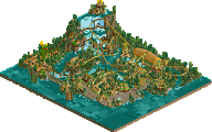
The layout has a certain ballsyness. It is clearly intended as a more-intense flyer, and it sticks with that idea.
The dusk/dawn play was a good idea
The main portion of the layout is really very pretty; visually speaking, A+ would flow again
There's some really nice interplay with the relatively moderate terrain. This is a good example of how just a few trenches or tunnels give a ride a lot of personality, and you don't need a giant land difference to effectively use terrain.
Transfer details very cool
The big turnaround with the cliff tunnel is so picturesque.
I like the idea of the ride station on a path island.
Excellent foliage work, if a little bland. Very effective at defining the borders of guest space and setting the mood of the area. Plenty of care taken with reeds and flowers.
Very effective rockwork, I particularly like the stuff out among the footers and the concrete slab for the cliff tunnel support.
Spot-on station building, very cedar fair. Architecture throughout quite pleasant, every building has some uniqueness but they blend together well.
Peeps are good, who doesn't love peeps?
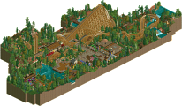
Didn't like:
Coaster took several elements very fast. Obviously the quarter-loop size is a limiting factor, but it was a little disappointing.
"Dusk" as a ride name doesn't seem to fit the spirit of the ride, which is pretty intense. It seems to be less about the sensation of flight and more about crazy maneuvers. I have a hard time understanding what the concept was; Dusk vs. Dawn would be a cool concept, but Dawn is a third-tier flat ride that seems like an afterthought. The architecture almost follows a "Night monster attacking the village" theme, but not enough to really say that's how it was intended.
Would have like to see some planters or fountains or something in the path to break it up a bit.
While perfectly ok, the architecture wasn't super exciting at any point. I have a hard time imagining what would stick out in my mind as a park guest as symbolic of the area.
The queue was certainly handled realistically, but with no real interaction with the ride it was still dull.
Scott.S Offline
Having said that, I dunno what else to say, Intamin pretty much said everything and I agree with it. Interesting that pierrot was absent for over five votes but returned here to add the low vote.
I agree with ][ also. While the positives of the design were good(i especially enjoyed the landscaping), the negatives pulled me to 65%. I look forward to more Ling!
In the end, I submitted my vote almost upset about it being so low. But really, I couldn't see this as a design. It just was missing the vibrancy and life most designs have. Not a bad attempt at all, though. I know you've had a tough run at design attempts lately, but I wouldn't get discouraged. I think you have all the pieces of the puzzle to turn in a nice submission; you have just yet to put them all together.
tdub96 Offline
Don't be let-down Ling, you got some great talent and because you were robbed of a design doesn't mean you can't win one in the future. Keep it up, I loved everything about this.
Scott.S Offline
Anyways, the last three parks you've submitted competitively (Aurora, Infineon, Dusk) all have a very refreshing, clean, and polished feel to them as opposed to the "overcrowd every available square with objects" mentality I see a lot in other parks. I'm sorry you're not winning designs with them, I definitely think they're worth it. There's obviously a lot of effort put in.
And that first drop is incredible, really well executed, and in my eyes, not at all unrealistic. I may steal that in the future.
I think the surroundings just aren't the right level of quality for design. You're improving still, which is great, and I'm sure you'll hit the mark soon!