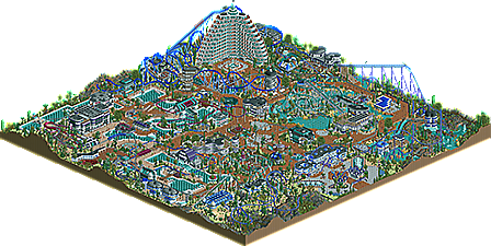
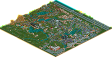
Park / Oasis of X-citement
-
 02-October 13
- Views 8,717
- Downloads 1,126
- Fans 16
- Comments 37
-
 70.77%(required: 70%) Gold
Wanted 85% In:Cities 80% Liampie 80% 5dave 75% Cocoa 75% posix 75% Jonny93 70% Maverix 70% Pacificoaster 70% Phatage 70% pierrot 70% Sulakke 70% Coupon 60% Airtime 55% geewhzz 55% 70.77% -
16 fans Fans of this park
-
Full-Size Map
-
Download Park
1,126
-
Objects
477
-
Tags
Similar Parks
-
Florida Action Park
-
[H2H8 R2] Mzima Springs
![park_4097 [H2H8 R2] Mzima Springs](https://www.nedesigns.com/uploads/parks/4097/aerialt3837.png)
-
Pirate Bay
-
[H2H6] R4 - Reservoir Dogs - Atlantis Resort
![park_2420 [H2H6] R4 - Reservoir Dogs - Atlantis Resort](https://www.nedesigns.com/uploads/parks/2420/aerialt2160.png)
-
Bramble Lake Resort
-
Paramount's Xtreme
This is now my absolute favorite park that I have ever downloaded. I love all the architecture and how the roller coasters interact with the buildings. This one has now been saved in my game folder.
Love the entrance. You kinda overused the curves in some places, but they look REALLY nice in some others.
Amazing man. I love to see someone that has total disregard for whatever paradigm there is about how to play RCT.
Absolutely loved the rides and how they interacted with everything around them. The coasters were sick man.
I was thinking 75% all the time, but them I stumbled upon a maze and a glass floor with animations underneath, and then I switched to 80%. Architecture is not always good, landscaping is not always good, colours are often depressing, but it's still a goddamn awesome park with more awesome features than you might expect. Great effort Arjan. Congratulations on finishing a park!
When I saw World of Creations I almost instantly became a fan of your work. I enjoyed every park you released and just loved your very creatice style. This park is just minblowing in my eyes. It breaks in this pattern of realistic parks by being somewhat post-modern realistic. Although some buildings don't look so good, there are some absolutely fantastic ones on the map. The interaction is just insane (espacially on "X-Treme", one of my favourite RCT2 Coasters of all Time) and the coaster layouts fit perfectly in this post-modern style.
I want you to know, that you are incredibly inspiring for me, and although I never was the biggest fan of learning CSO myself, you really motivate me to go and try. Thanks Arjan!
@ bdawgtk1982 : Thanks! I'm glad you like it.
@ Inthemanual : Thanks! And i'm not done with this kinda style yet.
A lot of objects were produced during the project, so i'm definitely not done experimenting with it.
@ Faas : Thanks man! Your also one of my inspirers.
@ Liampie : Always nice to read your comments and they are always helpful .
I can't promise anything, but i'll try to work on my flaws... maybe a collab park or design in the future...could be a knock-out!!
Thanks.
@ Version1 : I'll keep my eyes open and hope you try some cso.
Glad to be an inspiration for you.
Thanks!
I'm a bit like Faas though... It's a game, not real life.
A game should be fun, because real life mostly isn't.
I will always be that stubborn guy that is here to show HIS way of rct.
I haven't looked in game yet, but my thoughts echo the rest. There's just so much that goes against the grain intentionally, not out of naiveté, that you've made something quite good here. While the layouts are unorthodox, the architecture is adventurous, and the quality is inconsistent, the whole picture you've put together makes up for it.
85% for the out-of-the-box thinking, sticking to your style, and for trying unorthodox things and pulling them off pretty successfully. Wouldn't vote spotlight though, the inconsistent quality of the architecture and odd compositions do seem unintended, and detract from the mind-blowingness. This is definitely an improvement from your previous full-size park though, and it looks like you had a great time building it! I can't wait to see how you refine the details of your style in your future work.
I have to say, this park kinda blew me off my feet. Main reason is, i'm taking an architecture history class and soooo many of the things you have done in this park are similar to turn of the 20th century architecture, particularly Le Corbusier. Its kinda crazy.
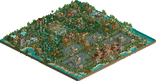
This park really hits me as a demonstration of beautiful, unique abstract architecture shoved into a theme park format. You have all these gorgeous buildings that play with space and interior-exterior interaction (the corckscrew station, the curvy building in the center of the park) but you also have these giant coasters that seem intrusive. A lot of time the coasters just seem to be floating over everything else. Unfortunately, don't think many people would be interested in just an "here's some architecture" park, particularly as, while i find this stuff amazing, others may not appreciate it as much.
That being said, i'm still blown away by your archy. Its hard to take organic, whimsical, and generally unconventional forms and make them seem okay and acceptable in rct. I think you managed to do that flawlessly.
The only places this falls short for me is, as mentioned, the coasters. Not terrible layouts, but often weird and intrusive. As well, the colors could have used some more variation. I like the overall atmosphere and unity it gives the park, but its hard to distinguish between elements in certain areas as its grey on brown on blue on gret on brown.
I would say this DEFINITELY deserves an accolade, due to the creativity, uniqueness, and brilliance uses of architecture in a way few others can accomplish. Arjan, my friend, don't ever loose your unique style. It is unbelievably refreshing!
FK
@ Hepta : Your comment is greatly appreciated.
I hope you stick around and see, since this isn't my last work yet!
@ FK : I've never had any architecture class or whatever in that direction, so i feel honored by what you said.
It's a bit of an experimental park, but somehow that's something i like to do as well.
I know some will like it and some don't, but i've learned by now not to build for the community, but for me.
I will add theme in my work, when i'm ready for that.
My work will improve though, but i'm taking my time for it, no rush.
Don't worry FK, i'm not going to lose my style.
Thanks.
The architecture in this park is the best I have ever seen. This is the Kind of park that just draws you in the way the rides weave in and out is fantastic this is your best work so far.
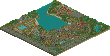
really awesome park, with some unique curvy architecture and lots of really awesome details (the water maze). Also a very cool use of glass. The only thing that really annoyed me was that everything was blue-purple. I can understand why you wanted that as your general theme, but you can still color things differently in order to contrast and really make the blue stand out. For example, red/yellow flowers would actually make the cooler colors work better, and especially the coaster layouts were sort of difficult to follow as they blended in to everything else. When I downloaded it, I recolored the coasters to more warm colors and it did really look good.
but anyway, great work. I really enjoyed the park.
on a side note, I almost missed this park... maybe we should have a dedicated space on the home screen for park releases? (not just screens)? idk
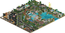
This is friggin' awesome. Some of my more favourite stuff I've seen here in a good while. I personally like the landscaping a lot. Good use of rocky crags vs the arid ground. The coaster clustered over the little island. I especially like the two hills greeting the visitors in the entrance area. The part where the coaster dips under the enterprise. And I love that architecture. I can imagine this being in the middle of the Nevada desert somewhere.
My only complaint would be maybe more coaster interaction?
Great stuff!!!!
My thoughts exactly. Combined with the new voting system it could get super hard for everyone who´s not Pacificoaster, to even get those 25(?) community votes just because nobody knows their parks were released.
But BTT: I really like the park, the architecture is quite impressive at some points and as Cocoa said, the use of glass (and water) is lovely. The colours are, as Cocoa said before a bit monoton. A few warm colours would have done wonders IMO, but if everything is blue/purple it may get "boring". The Coasters were mostly great, I really liked the Floorlesscoaster and the slides. I´m not that a big fan of the Intamin-layout though. Just seems to big/huge. But overall I just loved all the great ideas and the wonderfull refreshing architecture, the great interaction between everything... A 75% for me.
lg.
MCI
This looks very impressive from the overview alone. I don't have access to RCT at the moment so sorry I can't vote. It's a big achievement you finished this. I didn't realize the park was actually this big. Job well done Arjan. Ever since you came here you've been an enrichment to the site.
@ olddtfan : Thanks!
I'm going to release more curvy stuff in the future, but more with a story, or based on a fantasy comic, or cartoon.
I'm somewhat done with the 'free' building style now.
@ Cocoa : You're one of my inspirers when it comes to using colors, but somehow i always fail in accomplishing a good balance in colors.
Many of you gave me advice on it in the past and i listened to it.
Still i always fail on that point so far.
I'm glad you like it though and thanks!
@ Angroc : Thanks! I'm glad you like it.
I knew the entrance greet by the intamin would raise heads, just as a perfect welcome to the park.
If you want to see more coaster interaction, then keep your eyes open for my next release, a wooden dueller design.
@ MCI : I agree, the intamin turned out too big, should've been somewhat smaller, hence the name Extreme.
Thanks though.
@ posix : Yes, it's quite big.
I just didn't want to give away too much with the screens.
you make me feel honored by saying that i'm an enrichment to this site...
But on the other hand, i feel quite bad for the asshole i've been lately, releasing my frustrations on NE.
I just hope the ones i may have offended in the past, will forgive me for that.
I'm probably going to p.m. you one of these days, since i have some stuff for NE, you might be able to use.
Thanks for the warm reply though.
Something else...
I agree with some comments about the architecture being various in quality.
Some find it cool and some noticed the uninspired parts.
I just had a lot of uninspired moments... unfortunately.
There's has also been too many time invested in editing those curved objects and i think that may have ruined some inspiration for the project itself.
I'm still happy with the result though.
Thanks everyone.
Your style is unmistakable, and it really looks great. The curvy buildings are great. It's all great. My only complaint would be that it could've done with maybe one more water ride instead of another coaster, because it has more of a water-park feel to it. Great theme, well-executed. I would give 75-80%.
I'm a little unsure why you didn't have the guests exit the water slides from the pool...
@csw you can give it a 75-80%