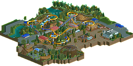
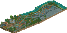
Park / Whirlwind
-
 04-November 13
- Views 4,951
- Downloads 755
- Fans 2
- Comments 30
-
 64.23%(required: 65%)
Design Submission
64.23%(required: 65%)
Design Submission
Maverix 75% Pacificoaster 75% Arjan v l 70% inthemanual 70% Louis! 70% MCI 70% Xeccah 70% AvanineCommuter 65% JJayMForce 65% geewhzz 60% Jonny93 60% Airtime 55% posix 55% 5dave 50% pierrot 40% 64.23% -
2 fans Fans of this park
-
Full-Size Map
-
Download Park
755
-
Objects
240
-
Tags
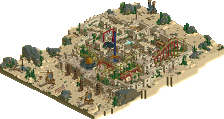
![park_3607 [NEOlympics] Abu Al Sheikh Amusement Park](https://www.nedesigns.com/uploads/parks/3607/aerialt3220.png)
^no, I just think we've had quite a few borderline submissions from newer members recently which have just swayed below. I don't think the difficulty/rarity and quality has changed
I think it has.
These are some older designs which scored design (and I'm not saying they are not design worthy):
http://www.nedesigns...1347/excalibur/
http://www.nedesigns...ap/233/ogopogo/
http://www.nedesigns...645/hammerhead/
http://www.nedesigns.../513/scarecrow/
With the last one having 5 votes of higher than 85%.
While these (including this one) are more recent submissions that haven't won design:
http://www.nedesigns...amba-vs-taipan/
http://www.nedesigns.../2533/infineon/
http://www.nedesigns...park/2876/dusk/
With the lowest votes being around 40%. (Come on, 40%?)
So I'm saying it is becoming more difficult to get a design, especially because people are more willing to give things like this
a 4 out of 10.
This is awesome, I love it. Reminds me a lot about SSSammy's style.
Shame this missed out!
Thanks to everyone who checked it out. I had a blast building it.
well you'll probably get it next time, especially if you really nail the surroundings
You're welcome
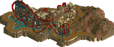
This was pretty good, but not design worthy in my opinion. Frankly the ride was a little boring to look at, too little movement. It would work really well as a supporting ride in a densearea with more interaction though. The ride itself was well designed. The surroundings were alright, not very interesting honestly, although I admit that it's really cool how you did the woodie.
55%
This may sound weird, but I liked your earlier NCSO parks more.