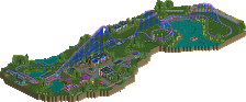
Park / [NEDC4 8/15] Ukiyo (The Floating World)
-
 23-April 17
- Views 4,185
- Downloads 729
- Fans 5
- Comments 24
![Park_3809 [NEDC4 8/15] Ukiyo (The Floating World)](https://www.nedesigns.com/uploads/parks/3809/aerialm3438.png)
-
![Park_3809_[NEDC4 8/15] Ukiyo (The Floating World)](https://www.nedesigns.com/uploads/parks/3809/logot.png)
-
 66.88%(required: 65%) Design
CoasterCreator9 80% posix 75% bigshootergill 70% trav 70% alex 65% chorkiel 65% Coasterbill 65% Faas 65% Stoksy 60% Steve 55% 66.88% -
Description
Ukiyo means "the floating world" or more specificly living in the moment and detached from the bothers of life. This map illustrates both of things in subtle ways. Hopefully you can spot them.
-
5 fans Fans of this park
-
Full-Size Map
-
Download Park
729
-
Objects
34
-
Tags
![park_3796 [NEDC4 4/15] - Wildfire](https://www.nedesigns.com/uploads/parks/3796/aerialt3454.png)
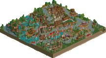
So far, the justified best scoring submission. I really like it Scoop. No, the concept of floating islands isn't new but that doesn't make this one bad. I think you made this one stand-out with the roots beneath the islands and the ice background. I do like a blue background instead of a black one for a change. Rotating the park was a bitch though.
The Asian theme is done before and the style you used is great but seen before. It would be lovely if you added some different elements to it. The waterfalls and foliage is great, think the outside of the islands could have used some more love than just plants spammed around them. But that could be due to time limit I guess? The waterfalls are great.
The loop support is pure genius, wow! Overall I really enjoyed this and I think it's only fair and justified it won design. Fact that you stepped out of your comfort zone and tried something new is also great, kudos for that Scoop.
I agree with everyone that the ice was very distracting in the background. I assume you didn't blacktile because it would make the roots harder to see? I loved the overall composition of the islands. The highlights for me were definitely the incredible support work, (the loop support might be the most creative thing we have seen so far), and the foliage especially the way the vines drooped off the edge. Definitely design worthy
Very cool, scoop! Congrats on the design!
While i would have loved to have the architecture a little bit more detailed and special, since we've seen this asian theme thousand of times now, the floating islands and foliage were great and you definitely composed everything pretty well. The loop support is also pretty awesome, and definitely the most memorable thing of this map.
The blue sky background isn't really my thing though. Blacktiles would have been more unrealistic, yes, but it would definitely have been better to have more contrast there.
Overall great you tried something new, and i'm looking forward to your next stuff!
65%
Nice job on this.
Floating islands are becoming less of a novelty, but I don't think that makes your any less interesting. The roots of the big tree object were a nice idea. It goes your island a little more depth. The hanging vines helped too. I think the biggest challenge here is that it starts to get repetitive. It's hard to avoid but maybe some larger rocky outcroppings or something could help that. For the most part the top of all your islands are flat-- some mountainous terrain would really make these seem like floating rocks rather than platforms. Would also allow you to do some interesting things with the architecture.
If the ice is meant to be sky, it would have been cool to set it up with some scenery including clouds to really drive that home. I get it's a stylistic choice, but I would have preferred the standard background to the ice.
Fantastic torii gate as everyone has said-- that was the highlight of the design for me. Really nicely integrated into the ride.
Looking forward to seeing more from you. Congrats on the design!
I think you have some cool ideas here and did a good job pulling off this concept. The foliage and water was pretty cool to see, as well as in the interaction of the coaster with the surroundings, didn't feel forced or un-natural.
The archy felt pretty awkward however, especially the station, kind of a bummer that the center building in the map was probably one of the weakest in the park. Also, like many have said the height of the islands made this pretty had to view at times.
Overall a solid entry, borderline design for me, but congratulations on the accolade.