Park / Vortex at Kings Island
-
 22-May 17
-
Vortex at Kings Island
- Views 9,295
- Downloads 807
- Fans 4
- Comments 31
-
-
 75.00%(required: 65%) Design
Steve 85% CoasterCreator9 80% Stoksy 80% alex 75% geewhzz 75% Liampie 75% Sulakke 75% bigshootergill 70% Coasterbill 70% posix 65% 75.00% -
Description
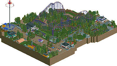
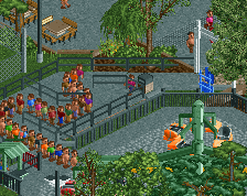
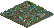
New at Kings Island for 1987!
Vortex is a steel roller coaster at Kings Island located in Mason, Ohio. Designed and built by Arrow Dynamics at a cost of $4 million, the ride officially opened to the public on April 11, 1987. Vortex debuted as the tallest, full-circuit roller coaster with the highest drop in the world. It was also the first to feature six inversions. -
4 fans Fans of this park
-
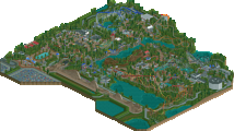
Full-Size Map
-
Download Park
807
-
Objects
359
-
Tags
Similar Parks
-
Windrush
-
Southwinds
-
[H2H7 R2] Bermuda: The Lost Colony
![park_3334 [H2H7 R2] Bermuda: The Lost Colony](https://www.nedesigns.com/uploads/parks/3334/aerialt2938.png)
-
Starpointe
-
Westwinds
-
[H2H7 R1] Circus Circus & Adventuredome Atlantic City
![park_3324 [H2H7 R1] Circus Circus & Adventuredome Atlantic City](https://www.nedesigns.com/uploads/parks/3324/aerialt2970.png)
Very nice!
You really nailed the look and feel of Vortex, including the complex support work. You really have a thing for Arrow supports which is honestly a rarity in this community.
While you obviously had some challenges getting this ride to fit into the game, I think changing the orientation of the midcourse was a good solution, as was the curved brake run at the end. It put the turnaround near the path in the right place as well as that iconic batwing.
Excellent work overall. This is accolade worthy simply for the support work. You crushed it.
why is it purple???? everything looks so good though! good work!! <3
They re-painted it to a dark purple a few years ago to match the original colors:
https://s-media-cach...87aea771657.jpg
Technically very well done. Nice atmosphere, nice foliage and full of detail. Nothing really new though, just good ol' typical G Force realism.
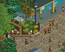
I thought this was very tastefully built. I really appreciate the way you’ve been using open spaces lately (with NEDC and Bizzaro) and being bold enough to leave patches of plain terrain - with your careful placement of details it ensures it never comes across as bare. It only makes us appreciate those details more.
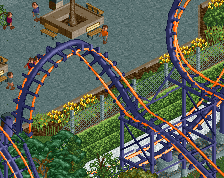
Layout is beautiful. From looking at reference pics it seems you’ve adjusted the corkscrew/brake run set-up. This does work well, however I would’ve liked to see you still try and retain the corks going between the two loops - that seems almost like a signature element in this coaster and it’s a shame its lost. Colours were great - so fresh to see contrasting rails in this realistic context. I’m no expert on supports but they look very beautiful too.
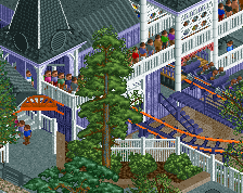
Architecture is simple and basic for the most part but very clean and most importantly every building has a clear identity. The standout buildings were the coaster station and the Jukebox diner with the beautiful entrance ornament.
Great stuff all round man, people may criticise this for just being 'G-force business as usual’ but I say keep doing you.
I will say exactly the same than Alex, I really appreciated this park and the way you used open spaces. It's those little details that makes your work something else than just "usual realism" etc.. Hands down !
This is probably my favorite of your three recent designs. I don't know much about the ride you picked, but it is very interesting looking and as such a good pick. The supports were a highlight for me, really well done. The architecture seems a little more bland than your normal work, but that is likely a product of the real area. The secondary additions of the two flat rides were both very nice as they were both very clean.
Your paths keep getting better with every screen and release. Archy too. The coaster station, as well as the purple restaurant and the big white brick corner shop were very well done. I also see that your style is becoming more detailed and 'gritty'. Good. Shame the coaster is just ugly and uninteresting. I don't think the layout was good, but since it's a recreation I won't say that you should've went with something else... It does affect the score though. 75% seems well deserved. Good job.
PSA: zoomed in aerial is now available!
Congratulations on the design! No surprise of course
Absolutely beautiful. I haven't been to the park in 13 years or so, but Vortex was my very first coaster experience I will never forget. One trip I logged 12 rides and loved every single one of them. It's a shame about the corkscrew/loop interaction, but it appears it was for the best.
I really liked this park due to the high amount of detail for re-creating a real ride. 80% from me.
Love it. Really glad you left some open patches of grass; they add a lot to the overall feel of the design.
So weird you chose one of the worst coasters to recreate. But I know it looks pretty impressive and very photogenic. I think you pulled the recreation off well, only thing that's a bit of a downer is the midbrakes. You gave it too much honor in the way you've built it. In real the turn before is way shorter (too short for the speed it has) and the midbrakes are also really short. Think you could have displayed that better.
Foliage and archy is great. Like Alex said, the open patches of green work very well. Love the station. Feels very recognizable, though I won't ever ride that shit machine ever again 75% is a good score, a better, more interesting coaster would have lifted the score up I think.
you finished what I started, nice to see someone complete a version of it.
I really enjoyed this, almost raptor-ish level of recreation for me. The layout is well done, although it is a terrible RL-Layout in my eyes, same goes for all the architecture, which is pretty basic and generic, but also interesting and somehow atmospheric. Both flat rides also felt pretty good.
The only major thing that bothered me was the path. It is indeed well made and better than in former releases from you, but it's still not up to the quality of the rest of your stuff in my opinion. The different types of grey really confused me, also i would have loved a bit more interesting stuff here and there.
What i also didn't liked much was the way the map is cut off, having that one piece of The Beast overthere just felt pretty weird for me. Same goes for the building backsides, where i would have wished to see more of the cool backstage stuff we're used to see in projects like this.
Overall awesome work! Solid 75% for me. Congrats on the design!
Thanks for the comments guys, I'll try to get more direct replies in the near future.
However, regarding my decision to create a bad coaster... well, It's RCT. It's not like I have to ride the thing or am going to ride it when I recreate it. In my opinion, when recreating a coaster, I'd rather someone recreate a photogenic and appealing ride visually, than a better ride that is very ugly. Again, its RCT, not like you have to ride the coaster or anything. To me its much more about creating the look, and atmosphere of the coaster than creating a coaster that would be an enjoyable ride IRL.
Even so, after actually riding it last week, I assure you that there are far worse coasters around.
Plus, I just really enjoyed building this, which is why I was able to finish it so quickly. Combined with the amount of source material present to assist in the recreation, it was a pretty relaxing build that didn't require me to think buildings and composition up on the spot. Being able to just focus on bringing real like content to the game has become much more enjoyable to me at times, combined with the problem solving involved with things that don't translate directly and the natural issues that come up when recreating something in a isometric game.
This might infuriate people, but this is still a style I really enjoy building, and perhaps will attempt on full scale again in the future...
hey finally a recreation of a ride I've been on (actually wait, I've been on kumba, lol). anyway solid realism, seems like a pretty accurate recreation. so accurate in fact, that its just a bit boring! sort of like the real park maybe... so I'm not sure thats any slight against you that it feels a bit... drab. anyway I'm mostly just happy that there aren't any brick paths anywhere, you definitely overdid those in previous parks
Congrats on the design!
Solid work.
Think you did a very good job with the station. It's beautiful.
Well, good job!