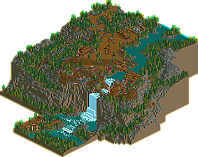
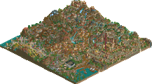
Park / Röthbach
-
 07-December 17
- Views 3,673
- Downloads 631
- Fans 6
- Comments 20
-
 70.00%(required: 65%) Design
Xeccah 85% csw 80% CoasterCreator9 75% Cocoa 75% Faas 70% Louis! 70% bigshootergill 65% Steve 65% trav 60% posix 55% 70.00% -
6 fans Fans of this park
-
Full-Size Map
-
Download Park
631
-
Objects
1
-
Tags
Similar Parks
-
Dynasty
-
Lostileth
-
[PT4 R5] #DATCREEKYBRIDGE
![park_2848 [PT4 R5] #DATCREEKYBRIDGE](https://www.nedesigns.com/uploads/parks/2848/aerialt2501.png)
-
[H2H6] revoLLutionists - Cars Land
![park_2369 [H2H6] revoLLutionists - Cars Land](https://www.nedesigns.com/uploads/parks/2369/aerialt2121.png)
-
Villerouge sur Mer
-
The Good Earth
Great landscaping, great colors, great architecture, monster layout. I just wish this had peeps
Definitely a design in my books, 75%.
I enjoyed this a lot. The color choices are really good and much better than your last release. foilage and landscaping is really good and I'm really liking the old school vibe of it all. overall I think it's almost a design. I'm not a fan of how much path there is, but I think that is problem with many of your works. I would give this right in between a 60 and 65, so I will round down this time. 60% from me. That score could show how young I am in this community but it's okay. I still like the map and am a fan of it.
It is so rare to get any haphazard review out of me, and while this may be a first, I cannot not review this.
I'll start with all the pros of this design entry:
+ Landscaping: While this landscaping is surely jagged and does look rather blocky, the amount of sheer time it took to get such a mesmerizing landscape is beyond me. Each piece feels like something you could see in real life, such as on a mountain. Maybe it is too blocky, maybe not, but this definitely works well for me. I wish you would have used less grey stone and mixed in some dirt (more of it) as well as grass and dirty grass and such. That waterfall is one of the prettiest things I've ever seen in RCT.
+ Foliage: To go along with amazing landscaping, you bring in a vast selection of trees and shrubbery that works. Those purple flowers bring in a lot of colour into something that is otherwise, too brown. The woodsy, natural feel of this foliage among the landscape works well. Although I would have liked to see more sporadic clumps than all on one section of land, or two, and nowhere else.
+/- Coaster Layout: To top it all off, you bring us a really lovely designed wooden coaster that interacts so well with the again, stunning landscaping + foliage. The worst part of the layout to me is definitely the second lift back to the station. Even though it is otherwise unable to get back to the station, I feel like you could have done more with it.
+/- Architecture: This architecture sure was repetitive, and it has perhaps too much brown, but the hints of purple and maroon do help mediate that. Even though the architecture is repetitive and roughly the same colour, it still works well to me.
- Layout: This is where I feel this design falls away a little bit. While I do love the idea, but having a relatively massive park on top of a mountain's plateau which is only accessible from a chairlift ride is a big let down to me. While I am certain there is a way to get to the top elsewhere, it is not shown as a part of the park. So, the only way up is the chairlift and that provides so many 'overcrowded line' problems.
- Layout (Paths): There is too much path. Simple as that. It detracts from the overall value of this design simply because there's so much of it, that it adds even more brown to something that is already overly brown.
+ Overall: I really did enjoy this release a lot. A bunch more than your last one. While this did have its issues, i still liked what I saw. This gets a 70% from me. Good job, Poke!
this looks good. i approve.
This is pretty great. Very nostalgic, and I hope it does well. This reminds me a lot of the "old school" parks and designs with massive, sprawling woodies. The architecture and path structure resembles this further, and I couldn't stop watching the coaster; great layout with some wonderful interaction. I fear a lot of newer members may vote this lower for some of the reasons I find this so good and nostalgic, but I really, really enjoy this.
Yeah boi. I love these types of parks (take a look at Relaxembourg National Park if you doubt this), and you nailed it. Only complaint is the chain lift at the end of the layout, but the rest of it is epic enough to make up for that.
This is the kind of thing I wish I could build in LL, but the map isn't big enough to let me make wide, grand areas like this.
Some of your best work. 80%
I really like this, a lot more than your last release. great, classy old school vibes and techniques. really soaked in atmosphere and some great overall composure. the coaster was exciting and pretty, and the landscaping was very dramatic. nice work all around and a clear design imo
This is a 70% from me. The coaster was pretty great (except for the last lift as others have said), the cliff and waterfall were awesome, and the architecture was well done. It does give off an old school vibe. If it weren't for the large amount of path, I would've voted a bit higher.
Overall, very nice job!
This. Not everything has to be super-realistic to the T.
I think my vote will fall around 75%. Great work.
I went for 60%. The coaster is great, and the old school feel is really nice...but I cannot get behind the landscaping. Sorry but the landscaping just ruined it for me. It was too blocky and just not interesting enough.
Still a really nice release overall and I can definitely see it hitting design.
The waterfront was gorgeous, the rest lacked in quality for me. In a way refreshing to see a whole hearted semi-realism release in the classic sense. Not sure when we last had that.
In places this seemed very loveless and underinspired. A bit of a critique trend to your work. Still makes me happy to see you back and bring this style to the table again.
Enormous classic landscape here, which is hard to see these days. I still believe that the bare height tools can create powerful atmosphere. and I think you've made it.
loved:
-Coaster layout. Great sense of exposure and danger, especially the orientation of that drop. At first i was disappointed that the coaster didn’t do full-blown cliff diving, but then I grew to like the fact that it’s actually precariously perched atop the cliff instead. A classy decision. I liked the final lift too, this is the way to do it - make a feature out of it. It echoes the chairlifts too.
-Great palette and mood created with the earthy foliage mix, magenta flowers and all that brown.
-Im a sucker for this kind of architecture, even when it’s a bit monotonous.
didn’t like so much:
-Landscaping was hit and miss. I think Trav has a point when he said its blocky. I think the problem (with the cliffs) is that nearly every tile is on a different height - so it emphasises the games grid structure. Let’s be clear though, i’m not advocating 1/4 tile land blocks here. What would’ve helped I think is breaking this up with more semi-smooth lines. It’s hard to explain what I mean so a quickly mocked it up. (Bare in mind this might just be personal taste) Before:
After:
You actually did this really well on the other side of the map haha. I like the bare dirt patches a lot too.
-The Waterfall was too regular and blocky also, even for this parks style. Over the top too… seemed tacky. I would’ve had it set back more into the cliff and without a 90degree corner.
other small note:
i would have liked one tower midway up the chairlift, i think it would’ve accentuated the vertical space and add to the DRAMA.
Overall very nice. In some ways different, in other ways very safe and traditional. Would’ve voted 70.
dude that layout is the tits wtf i didn't realize you were sg with ride design. loveless? not everything needs to be super fleshed out to be more enjoyable than something that is. you're not supposed to look at the structures for more than 30 seconds apiece. everything there was deliberate and it felt it takes a masterful tightrope walker to do what he did. only added the things that were needed to convey the atmosphere and park-feel and thats it.this is a design after all, so it shouldn't be seen as a fault that things are done as a supplement to the coaster/area.
super unique in terms of ride layout / landscaping / the charlift that really sets the idea for me. the only thing i didn't like is the dichromatism. the magenta should have been used solely for flowers
Congrats on design, as you can see, I scored this perfectly.
Congrats on the design! It's well deserved for sure!
Me too! Can I be a panelist now? =P
It felt more like 65% for me but 70 is good !
This really needed Peeps I think. It as also infatuating how the game listed this as a 7,700ft long coaster, it looked far less than that to me. Maybe its a testament to your layout and landscaping here or something.
Probably a 60% from me. The coaster was nice enough and I liked the chairlift ride integration into the terrain and coaster. However the landscaping and archy as a whole felt a little uninspired. The main plaza area especially just felt so lackluster to me, lots of path and faceless buildings that didn't really seem to add much.
Placing this coaster in a bit better context and a bit more time spent could have made this really special.