Park / Terra Ventura
-
 28-January 18
-
TerraVentura
- Views 6,507
- Downloads 865
- Fans 2
- Comments 21
-

-
 69.00%(required: 60%) Silver
Kumba 80% Poke 80% trav 75% Fisch 70% G Force 70% SSSammy 70% Coasterbill 65% CoasterCreator9 65% Faas 65% Liampie 65% nin 65% Xeccah 60% 69.00% -
Description
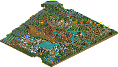
What if the makers of Port Aventura opened up a new park from scratch?! That was more or less the idea while starting up this park. Port Aventura has his influences on Terra Ventura, my second solo park.
Terra Ventura contains 5 coasters which all offer unique experiences to its riders. All this in a heavily immersive theming.
OpenRCT2 only. -
2 fans Fans of this park
-
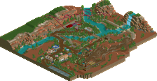
Full-Size Map
-
Download Park
865
-
Objects
97
-
Tags
I'm actually surprised to see this as a silver park. I understand why, but I was still surprised.
Let's get down to business and tackle this park's main issue. Peeps. I find these incredibly important for a park's atmosphere. I know you hate building with them but I'd seriously suggest you to change your attitude towards them. Having a great looking park that also works is IMO more satisfying than a great looking park in which you get spammed to death with messages saying peeps are lost/hungry/thirsty...
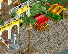
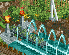
Now that's out of the way, let's talk about the rest. You really have your own style that I can appreciate. It's modern, but still relies on old school touches. When looking at the Greek area you can immediately see it's yours. The best areas however are without a doubt the Cuban and Bali areas. My god am I jealous of you for that last one... The water splash, the archy, the foliage, the composition.... It just works. Cuba on the other hand has all these little touches that just make it come alive like the old cars and the tank. Great work.
Any cons? Sadly yes. Like others have said, the Australian area feels empty and some of the layouts are iffy. I'm not going to go too deep into that last one since I'm far from a coaster expert. One big problem for me was the strange park layout. I found the position of the entrance a bit weird at that angle, but no biggie. The dead end at the swinging ship was a no-no. Why you just didn't connect the path to Australia, I'll never know.
Overall a great park, but on the scale a little lower on FUCK sadly. I know you can do it, you've shown us here and in the past, you just need to keep your focus and have an eye for the bigger picture I think. Keep building and we'll see greatness for sure!
I'll go through this area by area and highlight some stuff in general along the way.
surroundings: a bit bare and underdetailed I think. the car objects are horrendous also- i think the map would have been better with another park area or just blackness all around tbh. or maybe just something a little more interesting and fleshed out?
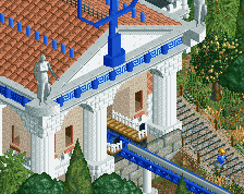
greece: easily my favorite area of the park. nice, detailed archy, good foliage and landscaping that interacts with the rides and paths well, etc. a couple buildings are a bit off but on the whole really well put together. maybe a bit large and meandering? keeping it tight would draw out the atmosphere a bit, which i think about a lot of sections throughout the park actually. planning the areas very carefully is important for a large park to flow well.
bali: this feels like two areas to me- the bit 'swaddled' by the hyper and the bit around the log flume bordering greece. the latter area is amazing- rice paddies, landscaping, cool interaction. The area falls over in the other bit though. as with the woodie, and the havana coaster, the coasters feel like they've been plopped on flat land next to areas instead of really being a part of them. it sort of makes the whole area feel flat and average, and the atmosphere struggles to come out as well as where the log flume is used to shape the area.
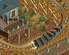
havana: great archy and cool idea. I think it needed a bit more to really sell it- more buildings, more compact market-y stuff, lush foliage and landscaping. the coaster just plopped in the field like a fairground coaster sucks away so much potential atmosphere!
western: while there are a lot of good buildings and details (something I feel about your work on the whole, actually) the area itself doesn't quite come together. its very spread out, the landscaping feels a bit funky, and I can't help but feel like its rips Belgianguy's area a bit too much. I really like some of the structures and textures though. the woodie layout doesn't do it for me though. I think RMC's aren't an excuse to just plop whatever elements in whatever order- its got to still be aesthetic and interact in a meaningful way with the area for top tier rct work.
overall? a good park. bits verge on great and excellent. there is a lot of archy and small bits to like- i could put together a board of little pictures which would make this park look like a top quality, amazing piece of work. I think you need to step back and think about how to stitch all that together. the individual pieces should compliment each other and build a more impressive whole. Its hard because its hard to explain or learn exactly how to do that other than by trial and error and keen eye. you're definitely close though.
I think you'd make an amazing partner in a team-based competition with someone slightly more experienced to help guide the whole park, which you could learn so much from (it helped me greatly in the past!)
silver is slightly harsh for this park, it could have been gold. but a high silver is still relatively appropriate I feel. nice work and congrats on it!