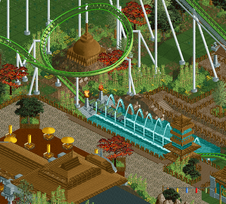
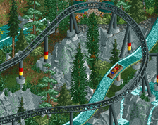
I think the coaster would look cooler if it had the deep green colour all over instead of the 2 faded green tints
also try and enhance the interaction a bit by having a little platform that goes even closer to the splash zone also breaking up the very long straight line of path you currently have
7 cars feels a bit short, I would recomment turning it up to 8. Echoing what BelgianGuy said, I would witch the two track colors so the darker one is on the rails. That's how B&M track usually ends up after the wheels scrape the paint.
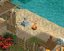
Why is there a temple-like structure on that mound of dirt?
Because there would be a lot of temples in Bali, in peoples yard etc. So I thought some temples like this here and there wouldn't be out of place and give it more meaning. Besides, I think it fits wonderful in that turn.
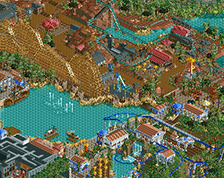
Placing extra path near the splash seems it would get too close imo. Maybe I can get rid of some path in the top.
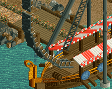
Good macro, but path edge needs more ride feature interaction. A lower/higher (or otherwise separated) line of path leading to the splash, a bridge (?), glass walls to protect from water, etc.
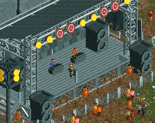
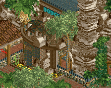
Aesthetically this is quite nice, like your other recent screen, too. The red trees seem like a bit of a dirty object though. Maybe try other options.
I echo everything here. Very good stuff but... net niet. It lacks a bit of life and looks a bit sterile. Some path details would do wonders. The regular like benches, bins and lamps, but perhaps also little stalls, barrels, crates.... Just junk to make it feel like a place with human activity.
@Posix: knowing Fred, the red tree is here to stay... And why the hell not, it's something different for a change and it isn't that bad.
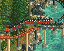
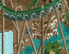
If that's supposed to be a real splashdown, or even a realistic "fake" one, the fountains should go the other way. They arc behind the train, not in front of it.
If that's supposed to be a real splashdown, or even a realistic "fake" one, the fountains should go the other way. They arc behind the train, not in front of it.
Well it's based on Shambhala's fake one, which is more of a surplus than Diamondbacks real one because no one on the train notices the splash accept for the back row. In the video you see the fountains go straight up when the train passed, I used the diagonal ones in this way because I find them more aesthetically pleasing.
 22-August 17
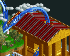
I think the coaster would look cooler if it had the deep green colour all over instead of the 2 faded green tints
also try and enhance the interaction a bit by having a little platform that goes even closer to the splash zone also breaking up the very long straight line of path you currently have
Path still feels a bit too angular and neat, for a theme like this you can probably afford for it to be a bit messy.
7 cars feels a bit short, I would recomment turning it up to 8. Echoing what BelgianGuy said, I would witch the two track colors so the darker one is on the rails. That's how B&M track usually ends up after the wheels scrape the paint.
Everythings too straight/square again.
Why is there a temple-like structure on that mound of dirt?
Because there would be a lot of temples in Bali, in peoples yard etc. So I thought some temples like this here and there wouldn't be out of place and give it more meaning. Besides, I think it fits wonderful in that turn.
Placing extra path near the splash seems it would get too close imo. Maybe I can get rid of some path in the top.
I echo everything here. Very good stuff but... net niet. It lacks a bit of life and looks a bit sterile. Some path details would do wonders. The regular like benches, bins and lamps, but perhaps also little stalls, barrels, crates.... Just junk to make it feel like a place with human activity.
@Posix: knowing Fred, the red tree is here to stay... And why the hell not, it's something different for a change and it isn't that bad.
You my friend, are right I like the tree very much, it's something different than we are used to and it fits the theme well. It stays.
After some feedback from Alex, Steve and Jappy:
If that's supposed to be a real splashdown, or even a realistic "fake" one, the fountains should go the other way. They arc behind the train, not in front of it.
It depends on how you look at it, seeing as the water does go in the forward direction.
Well it's based on Shambhala's fake one, which is more of a surplus than Diamondbacks real one because no one on the train notices the splash accept for the back row. In the video you see the fountains go straight up when the train passed, I used the diagonal ones in this way because I find them more aesthetically pleasing.
https://www.youtube.com/watch?v=FpAKtldJA4Q