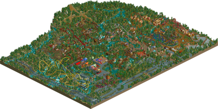
Park / Redlynch Heights
-
 28-February 18
-
Redlynch Heights
- Views 6,352
- Downloads 821
- Fans 5
- Comments 29
-
-
 58.50%(required: 50%) Bronze
Poke 70% Cocoa 65% Fisch 65% trav 65% bigshootergill 60% G Force 60% ][ntamin22 60% Faas 55% Iron Rattler 55% CoasterCreator9 50% csw 50% SSSammy 50% 58.50% -
Description
After one year, 18 days, and a whopping 338 saves, it's FINALLY here!!!!!!!!
I will appreciate every single comment you all give me; trust me, it has gotten me to a release! Thank you, all of you!
May this be the mark of my (hopefully) long and productive career! -
5 fans Fans of this park
-
Full-Size Map
-
Download Park
821
-
Objects
1
-
Tags
Oh boy, here we go.
First things first. Congrats on finishing this huge map.
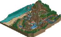
Second things second. Holy crap, there is a shitton of coasters on this map! And as I'm more of a coaster-guy and less of a decoratings-guy, this map was great to hover through.
What struck me, though, was that you could clearly see that there were a few coasters built last-minute, to fill up some space. (Think: the Eurofighter, think: the Alpendrachen coaster).
Alright.
Entrance area
Your entrance area was good, in my opinion. Perhaps a little blocky (and brown!), but it does the job fairly well.
Landscaping & Foliage
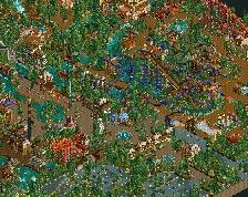
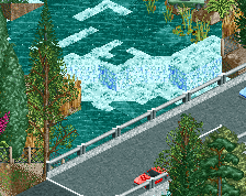
Your landscaping skills have improved massively. I enjoyed looking at the rivers weave through the park. Your foliage was although being a tad repititive still very good.
Backstage areas & Roads/motorways
Your roads and backstage areas were good. Nothing exciting, but it definetly did the job.
Park layout
Meh.
I thought the park layout was confusing. And that's mainly because of the usage of brown in your paths. Almost all of your paths are brown. And that's what makes it a little difficult to follow. There was very little contrast when looking at the paths & surroundings. Also, the paths were the exact opposite of the main criticism point on NE when it comes to pathways: it was too dense, I thought.
Coasters & other rides
Like I said before, there are a LOT of coasters in this map. Most of your layouts were good, like the GCI and the Intamin Blitz, but some of them felt cramped and forced, like the white Schwarzkopf (or is it?) coaster near the alpine section. So I would have gone for less coasters and more other rides, if I were you. But that's a matter of perspective.
Conclusion
This park was big for a debut solo park, that's for sure. And with a park being big comes its consequences.
That doesn't mean that your park was bad - in fact, I liked it, it was very fun to take a look at and hover through. The coaster layouts were good, archy was alright, and this (new) semi-ncso style felt just about right and fitting for this park.
I'd give this park a 65% ~ 70%.
I hope you get an accolade for this park. I think a silver would fit this park the most.
Keep it up!
wow this thing is huge! and with a massive coaster lineup too. They're probably the highlight of this park- they're detailed, (mostly) great layouts, realistic, and make use of the terrain excellently. They stand out for sure, except the SLC and the tempesto-clone one, whatever those are called. they both felt a bit less loved and awkward to me. The park gains a lot from being built on the awesome, active river system. You use it to your advantage a lot, creating epic crossovers for coasters, paths, etc. It really helps the park shine, and as a whole the terrain is pretty good- foliage is a tiny bit 'spammy', but I think it sort of works and sets a good vibe overall. The atmosphere is warm and inviting, reminding me a bit of a NCSO, rookie-er coasterbill.
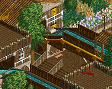
archy is a bit bare and 'classic ncso' throughout, but doesn't necessarily take away from the park. It definitely would be the thing to improve though; I want to be equally wow'ed by buildings as coasters. Like "damn that is a sexy diner", or gift shop, or whatever purpose the building needs to serve. So less of a generic, boxy filler, and more of a purposeful piece of detailing which really adds to the park. that said, most coaster stations are pretty good. I don't think your buildings are bad, they just don't stand out to me.
I think your paths/park layout is pretty solid actually. its mostly quite pretty and easy to follow, although for realism sake, which it seems you're going for, I'd watch the waterline- your park would flood in one cm of rain!
overall, awesome work. A really solid silver from me, and a release at a good time for the draft!
I guess I was the final accolade vote.
Congrats on bronze, I think this is a fair score. This showed a lot of dedication, and it was a huge park but it had its obvious flaws. I will list the three biggest ones for me.
- All the architecture felt a bit samey. It looked the same and I was not sure of the purpose of most buildings.
- I wasn't sure of the theme of most areas. None of this parks conveyed an actual story imo.
- Some rides didn't work
What I liked was the moments of cool interaction and most of the landscaping.
redlynch h y p e
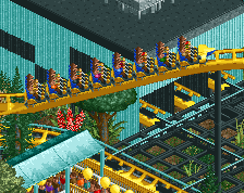
congratulations on high bronze, you earned it! its exciting to finally see this park in game. screenshots never could have captured how wonderful the atmosphere is here. every inch is so exciting and full of life and wherever im looking theres almost always a fun coaster interaction on screen. all of your coasters were fun to watch! i think you handled custom supports very well, you used enough without overdoing it. what im most impressed with, other than how huge and filled in the map is, is the architecture. its just so... fun. its so much fun just to look at all of the buildings, the colors, the textures, the selection of objects you used is just fabuous! it actually makes me want to try building in semi-ncso! its all filled out, aesthetically pleasing and as far as american realism goes, very well themed. the landscape is unique and makes for an interesting park layout.
i dont mind the highways having placed cars, but what does bother me about the surroundings is the highway junction. i appreciate the idea but i think its just not viable with this object selection. its a clunky mess and frankly it looks ugly. although i mostly like the foliage and landscaping inside the park, the objects used for the underbrush of the surrounding landscape just dont look good to me. i think theres just a bit too many different textures, but thats also because i personally dont like cso foliage in general. i feel the same way about the cso water features, ie i think that white water and sloped waterfalls were a tad excessive and distracting to see everywhere you look in certain areas of the park. as for the scale, the only issue i have is that the playground seems massive. quite honestly im not sure what i would do to improve it with this bench but it just doesnt look right. (its very cute and colorful though!!)
this is my first time writing a full review for a release of this size so i hope that i was thorough my review. this is a very exciting release and quite inspiring! 70%
Awesome work!
Pros:
- Probably one of the better RMC layouts we've seen in RCT
- Caballo is very strong, both the layout, the pacing and the aesthetics
- Great landscaping and atmosphere throughout. I feel like I shouldn't like the foliage, but I do.
- Raging Fire is great
Cons:
- At this point it's so easy to have moving highways that freezing the cars seems a little odd.
- The Blitz coaster has an odd layout and odd pacing. I'm really not a fan at all, and it's weird since the other coasters in the park generally have nice layouts and good pacing
- Leaving rides closed, stuck and/or crashed is definitely an odd choice.
- Some of the support work on Nexus is odd (though overall the coaster is great)
- The architecture is definitely the weakest part of the park
Personally I really liked this. It's a shame you didn't spend the time to get the rides open / fixed and it seems a bit careless but I still think this deserves a really nice score. Personally I was almost leaning towards low silver. Nice work!
I'm so happy for you.
You just showed with this release how fast you learn and improve.
I remember seeing parts of Redlynch Heights some months ago and being a bit hesitant about almost everything on it. I was affraid it was going to be a low 50% accolade.
But man, honestly I'm so chocked about how much you improved.
The foliage and landscape is the strong point of this release, maybe the foliage is a bit weak in some places but overall it's very nice to look at.
The composition is also surprisingly good in my opinion (except for the placement of Fire Hazard, feels too forced in that place).
Honestly, all the weakness other people pointed out didn't bothered me that much.
Okay archy and roller coasters weren't very modern overall but their context was very well done and colors were well chosen.
Loved Nexus and Mountaineer in particular.
And with all of this, I think you're really reinforcing your own style and character.
65%-70% for me and with honors !! Congrats.
I quite enjoyed watching this park in-game. There are a lot coasters and they are almost one for one really neat to look at. Nexus and Mountaineer are really topnotch imo! Good job.
There are some points you should work on, most of them are already mentioned: archy, foliage, operations of the coaster (I'd really use block brakes )... Almost everything has been said, so not gonna go deeper into this.
Congrats with the bronze. A good first solo park.
Still haven't given this a review, which is almost an insult since I've been following this park since its start. Well, better late than never I guess So, I'll just give you some quick pros and cons before I get into the real meat of the review:
+ Landscaping was top notch, reminds me of Thundering Sierra and Skylands National Park;
+ Great layouts all around, except for ones listed below*;
+ I like the main street canal concept you have;
+ Some areas have cool architecture and atmosphere;
- Foliage was lackluster, seems like you just sprayed trees around to fill the park. I get it's a huge chore, but it adds (or detracts, in this case) so much to your park;
- *El Grande, Kumali and Hurricane stand out from the rest for being so bad. If you want some pointers on them, definitely tell me, but I won't include it here to make this review less of a pain to read;
- A lot of the areas have bad architecture, thus killing the atmosphere.
So, I guess I'll start with the underlined points. This park's building process spanned your entire improvement curve up until release, and it shows. Most of the areas in the back of the park (Raging Fire, Alpendrachen, Nexus) demonstrate your current architectural skill and show that, in the end, you managed to get used to the strange object pool (more on that later). Sadly, the park is judged as a whole, and the areas that were built first have entry-level architecture. It looks like beginner NCSO (tons of poles and wall-layer spam), but infused with some custom objects for convenience (again, more on that later). This is not something bad per se, as I know you just wanted to get this park under wraps to start fresh. Kudos to you for that, finishing a park of this size is something I haven't done to this day. However, it did hurt the score.
I know the point I'm about to make has been said by pretty much everyone, but I still want to point it out: the whole thing is just so unrefined. Rides constantly breaking down and not getting fixed, block brake inconsistency, all that object clipping and glitching, and especially that frozen traffic. All of this makes looking at the park really difficult, and it's something you should keep in mind for future releases.
And now, the thing you probably wanted to hear the most, the ungodly object selection. Before reading this, keep in mind that it is a very biased opinion coming from a massive NCSO purist, so take this with a grain of salt.
This was, quite probably, the biggest weakness of the park. Not to sound completely irrational though, let me break it down:
1. You restricted yourself to a mostly full-tile grid without proper planning, this is where most NCSO projects fail/don't get off the drawing board.
2. It creates an uncanny feeling that you tried to limit yourself to the challenge of NCSO, yet kept adding more and more custom objects, thus making one wonder if you shouldn't just have gone for full CSO to avoid architectural problems.
3. Some custom object choices look hideous, like that brown path used on the main street, and all of the custom roofs you decided to paint fifty shades of ugly.
I know that you have moved to better object plans from now on, and I hope you keep that up, because I believe in your architectural potential.
Okay, that was a lot of stuff, let's take a breather for a moment. I did say a lot of negatives, but I still think the Bronze you got is a fair score, simply because of the scale of the map and the great potential you've shown us. Would have voted 55%. Keep it up, and congratulations on the accolade!
First thing I will say is, maybe it makes my work less good, is I'm well aware the finished result had issues. Whether the breakdowns, or missing pieces, whatever it is, I usually knew about it. There were some things that weren't broken if I recall completely correctly; Nexus wasn't crashed, and Raging Fire wasn't stuck. What else, I wouldn't know as I no longer have the saves.
The second part to go with this is, the biggest reason it's all mostly unpolished is because I couldn't stand to look at the park anymore. The last two days before submission were the hardest as I couldn't muster up enough motivation but to get past the last little bits. That's why it is all unpolished.
I want to thank you all for the comments here on the full release, and all the screens - yes, including the scrapped ones. It got me here.
You can bet that the next release won't be nearly as unpolished as I will polish them more one, because hopefully, I won't be tired of it, and two, it's not good for a release.
I've taken into consideration a lot said here and on other screens. Composition, archy, layouts, etc, and I can already tell you, these two new projects are going to be a lot better than Redlynch Heights is now.
To stop rambling, thank you all for your comments. You can bet I'll be looking back at this release, old screens, and new screens to come for insightful tidbits that could eventually get me to Gold, or even Spotlight level. Thanks, and see you all next release!