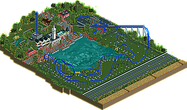
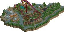
Park / Ride the Lightning
-
 13-October 18
- Views 2,338
- Downloads 525
- Fans 1
- Comments 15
-
 61.82%(required: 65%)
Design Submission
61.82%(required: 65%)
Design Submission
posix 75% RWE 70% Coasterbill 65% CoasterCreator9 65% Liampie 65% Scoop 65% Faas 60% G Force 60% Steve 60% ][ntamin22 60% Camcorder22 55% Poke 55% Xeccah 55% 61.82% -
Description
About the park:
Basically what I had in mind is a Bay-Area themed zone in a Hard Rock Park kinda setting with Metallica getting the major coaster. That's pretty much it.
About the park from a meta standpoint:
To get it out of the way: Yes, I basically copied these buildings from DAW. I kinda struggled with it, and if that will cost me design, not that I think this is design worthy anyway, then so be it. I tried to come up with a different solution, but ultimately decided that I might as well chose the option that results in the best visual look instead of trying to do my own thing. I just want to build cool stuff and I don't mind if not everything is an original idea by me.
Again, if you choose to vote this park lower because I'm ripping off Pac too much, feel free to do so, I deserve it. In the end, this was really fun for me, I got to play around with an American style a bit more after the Six Flags Idaho disaster and I think I can look into my future with a bit more optimism.
Obviously: OpenRCT only -
1 fan Fans of this park
-
Download Park
525
-
Objects
297
-
Tags
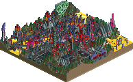
![park_3809 [NEDC4 8/15] Ukiyo (The Floating World)](https://www.nedesigns.com/uploads/parks/3809/aerialt3438.png)
The napster logo in the middle of the field with James Hetfield walking over it was brilliant, nice touch.
Great work. I think this is a success. The inspiration you've taken from the community is very clear, but it's a good thing. It's nice to see you have come such a long way after a few difficult moments. I'm glad you've channelled things the right way and managed to develop yourself as a player.
Despite all your self-protest of how you've copied a lot to achieve this, I think there are some very unique qualities in this. The queue entrance for instance is super beautiful and warm, latter attribute which is quite rare for this strictly realistic style. You have a good feedback loop with your emotional perception of what you build now, and it speaks a language that prioritises inviting atmosphere over anything else. That's important, and something that makes this very uniquely Version1.
Well done.
I think this is a massive step up for you. I think the style suits you well, and if you enjoy it - I really hope to see more from you. Your inspiration is obvious, but you're building what you want to build and that's the best thing you can do to improve.
Coaster is pretty cool, very DC Rivals-esque. Could you have done more with the land under it? Maybe. But I also think that what you've done is totally reasonable. People are going to disagree with me on that one I'm sure, but just look at Hyperion or other rides hanging out in the grass. Not much a park might do with that space and I think it's fine.
Architecture is nice. Obviously not completely 100% original as you have plainly stated, but that doesn't make it less nice.
I think you'll be right on the edge of Design with this, and I hope to see more as you continue to improve.
Technically, it's brilliant, but it's just so empty. The queue is totally lifeless. I think the layout would make more sense with more inversions, and could have done with a bit more interaction or some more themeing/set pieces, even though it's in a very clean ultra-realistic style.
I have no more shame, if I copy part idea of someone's, if I do it because it is cool work.
I still do not have the clinical eye as other + experienced, so I will tell you what I felt:
01) I loved the support and support base in gray square, as it has several, it was cool, I think in the end everything ended up matching the roller coaster in blue color.
02) I loved the road because it was simple (I say as a compliment) without paraphernalia, and the cars running passed the idea of highway it was good.
03) Farm is fine, the tractor gave a special touch, I liked the ditch.
04) The lagoon was good, without exaggeration grass - flowers - stones in the background is perfect
05) I am not an expert, but I liked the queue
06) Overall the foliage is good
07)I like the fence style you used
Good work
Don't really know what to make of this one.
Clean architecture, nice little area. The car ride is fun. I can't tell if it's tongue-in-cheek americana or just uncanny-valley, but stuff like the disconnect between colonial architecture and 80's bands, the car ride cutting off the american flag planter, the hyper that isn't quite a six flags intamin, the not-quite-cohesive stall names all make it feel just a bit off. Is it set in america, or this a "Classic America" themed area in a euro park?
I think this is great, you prove that you can build great things if you want to, even if most of it we've seen before. It's obvious you found inspiration in other parks, but despite that, despite the fact you keep saying it's all ripped off, it still feels Version1 for some reason. Beneath all the Americana, I can see your style.
Now, I do have to agree with Shogo on some points here. The coaster itself isn't that interesting. Situated on an empty green field, with no interaction whatsoever doesn't make for a very interesting viewing experience. And I also agree with him on the idea of narrative. I don't really see the connection between one of the most famous heavy metal bands and generic, nice and quaint Americana architecture. It could've benefitted from a more industrial approach. Music has a style and narrative you can connect to certain themes and visuals, something I attempted myself with Piano Park.
Is it a design? Unfortunately, I think not. For that, the coaster isn't interesting enough. But it is IMO a great show of potential you've got, despite all the self-doubt. You just need to sit down, think for a moment what you want to achieve with this game, and set out to do it. Don't think about what the rest thinks, to hell with us. Is it bad you copy other people's work? Not if you don't make carbon copies of it but draw inspiration, building techniques from it. Like I said, even with you basing most of this on DAW and other generic dirty American realism, you can still see it's yours.
Now go and build!
Very nice!
I like the coaster a lot. It flows nicely, it's pretty unique and the support work is ace. It feels like American style realism to me which you generally seem to hate (more in real life than in the game) which is sort of funny since you nailed it here and it looks really nice. Good stuff. I think it's Design-worthy for sure.
I honestly think this is a design! So glad to see you've found your personal style, i really enjoyed the coaster. Missing interaction and a bit of uninspired theming are a problem, but all in all i'm having more positive feelings viewing this.
Didn't noticed the archy rip off until i saw others talking about it, i also don't care that much about it, the archy is quite fine and i saw it more as an hommage to DAW when viewing it.
Good work, curious to see what comes next for you!
I actually liked the layout.. it looks like it would be a blast to ride. Good flow.. some nice air time hills.. and the inversion is a good addition. I also see where Shogo is coming from. Not sure how Metallica goes with some standard "American" stuff. Its a weird mixture. I'm not a panelist voter.. but I honestly wouldn't let goofy naming conventions ruin a design.
Quite good, but not quite there yet for me. I'll try to add more later, but I think it just needs a bit more depth and organic feel to really be respectable realism. Some of the theming decisions were a bit odd, mostly the S&S tower and entrance... But overall the micro details were a solid step up. Just need to combine that with better planning and more natural feeling construction and you'll be winning big accolades in no time.
I can see you miss design with this, with a majority of 65 votes, but with 60s outweighing 70s. Rooting for this to make the cut though, I think it's good enough. Does it lack some originality? Yes, on the surface level everything is skillfully put together. Beneath the surface level, like Shotguns explains, there's not much holding the park together. There's no narrative, it's a generic coaster with random archy and some Metallica music playing. With a few tweaks you could've tightened this up a little. This, however, is not a problem that really influences my voting until we're talking about 70s/80s quality work and upwards. It doesn't feel fair to hold a fun unpretentious RCT work to these standards anyway.
So yeah, good layout, with good layouts, surroundings that added just enough to justify being included (those cars are driving so fast though), good looking archy, foliage works, everything kind of works. I wouldn't have included Ride the Lightning as a WAV here but I thought the music was kinda cool in this setting, despite there being no connection to what was actually on my screen.
It makes me wish real theme parks would step away from using the psuedo-epic music style. Movies and games too, perhaps. It's so forced and cheap and insincere, and there's so much more you can do with music. I pray for the day that the Efteling does a synth soundtrack. I don't like hiphop, but I'd like to see a serious hiphop soundtrack for a theme park ride. Any genre but 'epic music' by a wannabe composer.
Well this is a pleasant surprise, I didn't think you were so close finishing it since we last talked about it. Or you just build really fast From technical execution, this is a massive step up! I'm impressed.
It's clear where you got your inspiration from. Getting inspired by other work is good, and it seems like it helped you a lot. The archy is clean and it looks pretty, but also very generic. I fully agree with Jappy on what he said about finding a narrative/style. His Piano Park is a great example of doing that with music themes. I mean, the 4 buildings are all alone pretty good but they don't really fit together. Like they are each taken from a different zone and put together.
The coaster itself is decent. I still hate the coaster colors but that's personal preference The inversion seems a bit out of place in this type of coaster imo, and I still dislike the dip before the brakes. Overall a nice coaster though, with good support work. I don't know if the lay-out is special/unique enough to say it's design quality.
Foliage is good. I'm not an expert at this too, nor I like to do it. I don't mind the open grass, I think it works. And since you went for an ultrarealistic approach I think it makes perfect sense to make it like this. As this is what pretty much every park does.
Is it good enough to win design?! I don't know, I think it will be a close one. It sure is your best work (yet) and it proves you are a way better builder than you think yourself! On the other hand, I think it just lacks a bit more originality when it comes to ride design and narrative. But whatever it will be, keep on building. I want to see more like this from you! Also thank you for including me as an off-cam cleaner
finally got to check it out. definitely the only thing holding it back is content- i had seen it all in just a couple minutes, and there wasn't any particularly fascinating interactions or beautiful vistas to linger on. that said, its quite good. nice detail and realism. the buildings that were "yours" were distinctly better than the ones borrowed from pac, because they felt more genuine and less like stale props. i think just a little push of self-confidence in your own abilities and creativity is what you need. don't judge yourself too harsh or think you need to borrow from the best- i prefer when its your own, like your heide park-y park.