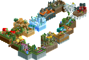
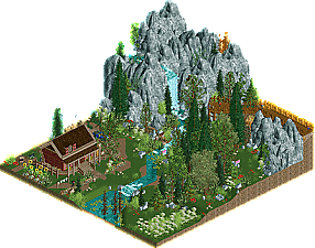
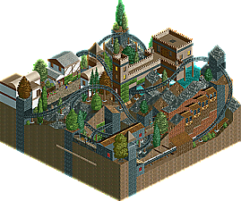
Park / [MM3 R1] Audubon Society's Field Guide Series I - Black Bear
-
 08-April 19
- Views 7,292
- Downloads 525
- Fans 0
- Comments 30
![Park_4392 [MM3 R1] Audubon Society's Field Guide Series I - Black Bear](https://www.nedesigns.com/uploads/parks/4392/aerialm4157.png)
-
No fans of this park
-
Full-Size Map
-
Download Park
525
-
Objects
143
-
Tags
Similar Parks
-
[NEDC5 - 03/10] Nøkken
![park_4713 [NEDC5 - 03/10] Nøkken](https://www.nedesigns.com/uploads/parks/4713/aerialt4585.png)
-
Mushroom Kingdom Links
-
Assigned Male At Birth
-
Behind the Music
-
Corrosion Complex
-
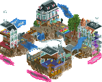
[NEDC5 - 01/10] Ririku
![park_4715 [NEDC5 - 01/10] Ririku](https://www.nedesigns.com/uploads/parks/4715/aerialt4584.png)
How to vote?Round 1 - Group L
__________________________________________________________________
Steve - Audubon Soceity's Field Guide Series I - Black Bear
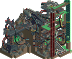
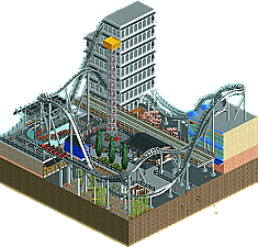
Maverix - Tokyo Dome
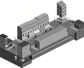
Gustav Goblin - Sub-Rosa Subway
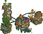
BBT - Fantasyland
__________________________________________________________________
First of all, check out all the entries in this match. If you can't view one or more entries, for example if you don't own LL, then please, do NOT vote. Once you've viewed all 4, select your favourite and second favourite in the polls above.
After 3 days, we will close the poll, the results of the two polls will be added together, with the votes from the second poll weighing only half as much as votes from the first poll, and the 2 highest scoring entries will proceed to the next round. The third placed park will place its creator on the reserves list for the next round of the contest.
Votes are public and so any cheating of the system, betrayal of honesty or mistrust will be picked up on and will be dealt with.
1. steve- although we tease you about losing all the time, it seems like you'll pull it out of the bag here- although I think you got a very lucky group to go so low-key with. Could have been bad in a different pot! the landscaping is nice and the cabin is cozy. I like the extra black-bear storyline, which is the main thing that really keeps my attention longer than a quick glance.
2. maverix- I love lightning whale as a name . Decent entry- a bit rough around the edges compared to your usual but still a solid layout in a decent urban atmosphere. Was good enough to slip through! Also an entry that might have suffered in a more difficult pot.
3. subrosa- nice idea with the b&w old american (I'm assuming?) town. I like the buggies. The buildings are a bit flat and the facades sort of merge into each other in a slightly strange way but still a really decent showing from a newer player.
4. fantasyland- gotta love a taron inspired park. not bad all up, with a sort of semi-ncso style to it and a decent little layout. probably could have used a bit less jagged landblocks if anything.
Steve- It's so peaceful! Just goes to show you don't need rides to make a good micro. I'm not sure what you were going for with the three twister coasters. If they're supposed to display text when you hover over the pink signs, they didn't work for me. Love the concept though. Best micro of the bunch IMO.
Maverix- Solid! I'm no expert on Japan, but I really get a Japanese feel from your micro. I love the mix of old and modern architecture. Lightning Whale is such a cool name!
BBT- You've got potential! I love the Taron-inspired giga. I also like how Water Quest weaves into the landscape, although the structure enclosing the lift hill could've definitely been done differently. I would've used the wooden sloped roof instead of the flat one and fences and poles instead of the wooden wall. Solid stuff overall!
Sub-Rosa Subway- Self review! This park was inspired by the Klaatu song of the same name, which focuses on the Beach Pneumatic Transit I attempted to replicate. I have to admit, I'm very disappointed in myself. While I'm happy I got something out in time, my visions for Sub-Rosa Subway exceeded what I ended up doing in the end. I got sidetracked with work and school, and what free time I had I didn't devote to RCT2. Had I given myself more time, I would've included telegraph lines, the pneumatic assembly next to one of the stations, and more detail in the buildings. I also wanted a psychedelic fantasy aspect in my park to match the feel of the Klaatu song, but I couldn't think of anything. Decent IMO, but far inferior to what I feel I could've put out.
Thanks for the feedback! Sub-Rosa Subway is based on the Beach Pneumatic Transit, which ran under Broadway in the 1870's. You're dead on with the old American feel, although it's less a town and more New York City. I would've loved to do more with the buildings, but I got sidetracked and the buildings were pretty much done in two hours right before the deadline. I'd love to do something a little more colorful should I miraculously make it to round 2.
For those viewing Sub-Rosa Subway, I've designed it to be viewed with the cutaway view at 0 ft.
Steve -- As an outdoorsman, I appreciated your concept, and thought the landscape was well executed. I like what Liam was depicted as doing in the cabin haha.
Mav -- Nice B&M micro, especially the drop through the white building. I disliked the back of the tan building just being a box, I thought that could have been a bit more polished.
Gustav -- I've never seen that horse & carriage ride before, cool object selection for your chosen time period. Other than that, I didn't feel like there was much to keep me entertained here, especially with the black & white palette. It is a nice townscape though, don't get me wrong.
BBT -- Impressive you fit two tracked rides into such a small plot, I like the coaster. I like the brown castle-style building too, but am a bit lost on the 'fantasyland' theme here -- I find myself wishing for some more fantastical elements with a name like that, y'know?
Overall, good job folks!
~B-]
Gnarly Throwback NCSO Concoction Trophy: Fantastyland
Coasters Bustin' Through Buildings Award: Tokyo Dome
Stay The Hell Away from My Cabin & Let Me Play With Bears Badge: Audubon Society Field Guide Series 1 - Black Bear
Before Color Existed Medallion: Sub-Rosa Subway
My Vote Goes to: Steve and Maverix
1. Steve - Nice foliage. Can't say I'm not disappointed though.... I'm putting the onus on you to make up for it in R2!
2. Maverix - I like the references to the real tokyo dome, and lightning whale made me smile. The overall look is a bit gray / drab, it most definitely could have used more color, as well as some more detailing on the buildings. However it was a good effort and I did enjoy the micro!
3. Gustav - I really enjoyed the atmosphere you created here. The sepia tone worked well, the buggys and peeps made everything feel alive, it looked as though I was watching an old daguerreotype come to life. Some more attention to the actual architecture would have upped the micro to the next level, but the concept was really nicely done.
4. BBT - Didn't get a fantasyland vibe, but I did enjoy the coaster woven into the landscape. The general color scheme was drab and overall could've used some color and detail.
1.) Steve - very cute, beautiful foliage. And it had life to it which other architecture/foliage-centric parks did not have. Especially love the vibrant look of it . 7.5/10
2.) Maverix - I know you're going for an authentic Japanese look, but you nailed it too much. I reckon th2.) at's because you didn't have much time so it ended up rushed. Love the reference to Thunder Dolphin. Could've used more color and less boxy architecture, but you don't need to be told that since you're one of the best. 4.51/10
3.) Gustav Goblin - very interesting, but not a ton to look at. The tone works really well, especially with the horse drawn carriages and people walking around. Architecture needed some more attention, but you've got some clever ideas clearly. 4.5/10
4.) BBT - was this a Disney Fantasyland interpretation? Doesn't seem like it, so perhaps a different name would've been better. Anyway, you did a great job framing the big moments on the coaster which is difficult to do. Work on that architecture and you'll be there in no time. 4.5/10
(This was tough to say, but I think Mav took more risks)
Audubon Soceity's Field Guide Series I - I think it's a safe bet you're going to make it through, and I'm interested in seeing where this goes and what else you come up with. It is at least unusual and I'm a sucker for landscaping and foliage so I don't feel at all bad about voting this one through.
Tokyo Dome - Building a hyper is always going to be tricky on such a small map, and I think it suffers from being all right turns and not paced particularly well. I will say it feels very real and believable, and that's non-trivial. As others have mentioned, it's very grey and not very lively. It's great work, but I just don't think it's living up to the other crazy stuff we're seeing in the contest.
Sub-Rosa Subway - Not sure what to think about this one. For being the namesake the subway doesn't really do anything. The palette is novel but makes it sort of hard to look at. If there could have been some bustling turn-of-the-century setpieces here it would have made all the difference.
Fantasyland - I really like this. Reminds me a lot of what we normally think of as a micro plot. An interesting, well-paced coaster and manages to squeeze in some solid interaction and another tracked ride. It's not as "big idea" as some of the stuff turning heads in other match-ups but I appreciate it for what it is. The foliage and landscaping are clear weak points however, especially in a match-up against Steve. This one is very narrowly in third for me behind Maverix.
Steve- You really do know how to build a strong landscape. I think you're one of the best at it. Those rocks are typically not my favorite, but work decently well here. There's a lot to look at, and all the frozen staff create a nice little story to go with it (though I'll be there for a while fixing that truck based on current skills). I think for future rounds you might need some more movement and something less 'safe' but this is a good opener to get your feet wet with a pleasant entry to kick it off.
Mav- This one is not particularly unexpected based on your current travels, but it's cool to see. Little much gray maybe and maybe a tad underdetailed, but I think it'll get you through. Some clever support work in there as is to be expected. Would've been cool to see a JR run down the train line every little bit. A strong initial effort!
BBT- The coaster here is the strength. You get a ton of layout in there for such a small map and still manage to weave a second (albeit short) ride in with it. The buildings are pleasant though a bit generic which I think held it back. I'm not getting too much Fantasyland out of it. The placemaking doesn't feel quite right. I'd love to see you branch out some more on your theming while keeping this same level of ride design. Could be really nice.
Gustav- I think the idea is there, but what held you back is detailing. If you added a ton of detail to those facades and all sorts of period specific detail in the streets, I think you'd have a winner. The pneumatic tube is neat and a kind of history that I find really interesting, but I don't think there's enough to keep the viewer's attention here. With another layer of detailing, this would suddenly become really strong.
This vote was pretty straight forward for me. Steve's micro was my favorite, and very Steve of an entry. I agree with everyone else that this would suffer against a more content heavy micro concept, but when it comes to Steve I expect something more like this, extra atmospheric. Clearly the best executed and gorgeous foliage without being too uniform or cluttered. Well done, excited to see what II is...
Second I went with Tokyo Dome, as I think it had the second best concept/execution mix behind Steve. Overall, this felt a little rough, a bit like you ran our of time, and for a park so filled it didn't really have a ton. Like, it seemed like you were a step away from adding in all the little bits that would take this over the edge. But, A solid entry, so well done.
Sub-Rosa Subway - I can see where the ideas seem to be going, but the execution wasn't amazing, and the ideas seemed a bit unclear, like this was a sketch but not the full concept.
Fantasyland - honestly, I liked the feel of this, almost like an old-school style map if randomly crammed onto a smaller map size. That being said, it just lacked details and a clear concept, and micro requires at least one or both of those to be successful.
1. Steve: Nice and pretty little park. Interesting idea to use different viewing spots of a black bear doing stuff. Not much more to say that hasn't been said already. Curious to see where you go with this Audubon theme in future rounds. Gotta keep it going.
2. Maverix: In another group, probably wouldn't have voted 2nd. I liked the coaster.. definitely has good pacing and looks fun. Just that the archy is lacking. Definitely could tell that not a huge amount of time was spent on this, but then again, why should we spend 20 hours on a micro?? Regardless, liked the idea and hope to see you do something ambitious in round 2!
3. BBT: Nice entry! The title as AVC said is a little off.. not much of a fantasy vibe here. The giga was nice.. the rapids was nicely integrated. Having interaction is great. Just the archy was a bit rough. Keep building and hope to see more from you!
4. Gustav Goblin: Liked the palette choice.. definitely set a solid tone. I think the lack of some detailing hurt you a bit. Definitely a fan of the concept though. I agree with FK that the idea was there. With a little more polish and more going on at the street level this would've been #2.
Like group J, this seems like a more laid-back round. Anyways, onto reviews:
1. Audubon Soceity's Field Guide Series I - Black Bear - I can't help but feel that Steve got lucky in this round. This entry is pretty unambitious but it's still good. Especially all the small details like the parkmakers screwing around. If this is a series then I'm looking forward to seeing more (non-)parks like this.
2. Tokyo Dome - This was also a nice entry although the architecture was kinda rough. The coaster had a cool layout and a hyper-twister was a cool choice. More texture variation and a break from the concrete would have helped this but I think it was a good execution on the location.
3. Sub-Rosa Subway - I liked this entry but it felt kinda bare and rushed to be honest. The palette really set the atmosphere, and the buildings are nice... everything is quite clean, but if this is late 1800s New York, I'd expect there to be lots of clutter! The Beach pneumatic transit vehicle was also an exciting inclusion.
4. Fantasyland - Not a bad entry, and it feels kinda retro with the use of various jagged rocks and cliff textures. The inclusion of two decently-sized tracked rides was pretty impressive and I enjoyed this. Just didn't stand out enough for me.
1. Steve - Very clean and atmospheric micro. The rocks are really great, just as the foliage. I can see me wandering around there. Perfect example a micro hasn't to be filled with walls or blocks to be good. Funny you included Logan...
2. Maverix - Best coaster from MM19 so far. Good use of layers, think you could've done a bit more with archy. But overall a very likeable micro.
3. BBT - Also a very good coaster, I like how it's everywhere. It lacked more detail to level this micro up.
4. Gustav Goblin - Interesting palette use. I like the idea you went with but the micro itself is really hurt by a lack of details. It show especially in the archy, those buildings are way too bare.
Steve: The obvious winner I think. Excellent foliage and landscaping as usual from you and the scene was wonderful. You got a bit lucky with this bracket though
Maverix: I'm not familiar with the inspiration for this, but it was pretty good. You managed to fit a solid layout in so good work on that! I just wish this had been more colourful though. The grey track and grey building are very drab unfortunately. I think a bright track colour like yellow or blue would have really popped here.
Gustav: Not bad, the theme you committed to is great but the execution fell flat for me unfortunately. Would be cool to see more period pieces like this though.
BBT: Cool layout, clearly inspired by Taron. The integration with the landscape was quite nice too, but overall the theming wasn't really there. Also, I'd suggest 4 or 5 cars for the train. 6 makes it seem to bulky.
1. BBT - I liked this the most. I loved the layout and the architecture. I thought adding different colors may help here as well.
2. Maverix - I liked the atmosphere in this. The layout was fun and I liked the reference to "Thunder Dolphin". you hit the Japanese city feel on the atmosphere.
Steve - overall great atmosphere and landscaping. Just didnt hold my attention. Sorry.
Gustav - Just thought it was missing more details on the facades, but I like the idea.
MAVERIX) I liked the roller coaster, it has a good pace and looks fun
Hyper twister was a cool choice, i liked.
BBT)A good roller coaster, I like how it is everywhere. I think there were more details missing. The colors pleased me, and the buildings are good.
GUSTAV GOBLIN) Really very interesting, everything in gray I found different. The tone works great with the theme.
The horse drawn carriages and people walking around were nice.
#1. Maverix. Solid micro. Great job on the support work and layout of the coaster, its the centerpiece and is skillfully done. Archy overall is good, station is the highlight for me. Good atmosphere overall. Nothing crazy here but good enough to take the top spot in this group.
#2. Steve. Now this is a gamble, a landscape based micro. It is a beautiful landscape. Whats there is charming, warm, great atmosphere. Im glad you got the peeps in and the black bear walking around adds character. Good enough to move on and a nice change of pace from other stuff so far this contest. Probably good luck its in this group and not group N, but hey, I suppose that could be said about any micro so far.
#3. Gustav. This micro is in my third spot of the group, but only because of the grey scale gimmick. I liked the horses that was a nice touch that really helped sell the old town vibe here. The general atmosphere is what gets this to third. But other then that I don't have too much nice to say. I thought the textures used with the archy was too similar none of the buildings stood out. Which isn't helped by the grey scale, texture becomes even more important when you cant rely on the crutch of colour to differentiate buildings. The subway, which is in the name, doesn't really stand out and almost kind of seems like an afterthought. Glad to see you in the contest and hopefully this strikes a cord with someone else.
#4. BBT. And that leaves BBT. The layout is what shines here, its not easy to fit a full coaster layout into a micro so props for that. But for me this is just a layout. im not crazy about the landscaping, doesn't seem very natural. Foliage isn't very strong, seems half haphazardly placed. Archy for the most part is pretty good, especially the white buildings. The castle is just okay in my mind. I think you missed a great chance to have the castle as a centerpiece. Maybe a bit larger, taller with some spires. A centerpiece like that may have really taken this to the next level and tied the micro together. Its a nice layout, and I'm glad to see you in the contest.
GG
1. Sleve: Clear winner and would've held up for me in the other brackets too. Entries like this are a bigger risk than something big and conceptual and risk falling flat if the execution isn't spot on. Think you've shown you're one of the best in the game with foliage and landscaping and also the economy of object use here was impressive as well.
2. Maverix: Very Maverix-y but also clearly rushed. A decent entry but think it could've been executed better with more time. Even though the source material is a grey coaster, I think the lack of contrast of grey track/supports against a largely grey background doesn't help it. The facades and foliage along the bottom was nice.
3. BBT: I've never really gotten the pseudo-NCSO thing. Overall the composition, landscaping, and ride were alright, just not enough to stand out.
4. Gustav: I like the idea, and it sounds like you didn't have enough time to execute it as you wanted. The start of atmosphere there with the pallette and carriages, but the buildings are just too blocky and undeveloped and the streets are missing any real details. There wasn't a whole lot to see underground either, you at least could've changed the track type to the actual railroad track.
In no order, again.
Audubon Soceity - I'm not fixing that. Seriously though, I wasn't sure how I was going to feel about this when I first opened it, but I think these really atmospheric submissions are a hit for me. The foliage and landscaping is top notch, and I loved all the small details you included.
Tokyo Dome - Everyone should know that I have a soft spot for urban Japanese parks, so this one strikes a chord with me. Lightning Whale is a perfect name and a neat homage to Thunder Dolphin. I do think that there's a certain deficiency in detail when it comes to the roads and architecture, but I enjoyed it nonetheless.
Sub-Rosa Subway - This is super atmospheric. Unfortunately, I think the level of detail overall brought it down a notch. I think you're aware of this and I'm sure if you had more time this would be an absolutely stunning micro. You have a ton of potential shown in such a small release, you'll go far. Keep at it.
Fantasyland - Is this one of the longer coasters we've seen in MM3 thus far? I think I was pleasantly surprised by just how much of a ride you were able to fit into this - not only that, but you didn't really sacrifice aesthetics to do so, it interacts with everything quite well. The architecture is a little on the plain side, and there's a bit too much reliance on brown shades.
2) Tokyo Dome - I probably went back and forth on ranking this first, second, or third. On one hand it's crazy impressive to fit a rather decent little coaster on the map, but somehow the entry felt rushed. I think the majority of the park was great but the city buildings didn't play into your strong suits like the rest of it did. Loved the little raised bridge with the archways underneath and the coaster station was cool with the glass work.
Sub-Rosa Subway - I wanted to put this second, I really did. The theme is right up my alley and it was building the atmosphere up really well. I love that one store was named Gustav's, very fitting and cool in a meta way. Keep working on building complexity into your work, as that's where it fell behind. The talent for setting and atmosphere is there, and I hope you keep using it.
Fantasyland - Pleasantly surprised, as Liam mentioned you come from a non-RCT community and this turned out to be pretty solid. Tucking in both the Taron and rapids was impressive. There was good traces of complexity in the building but ex citing them with finesse will come as you keep building. Very nice work competing so well here.