Park / Six Flags Worlds of Discovery
-
 13-March 20
- Views 11,523
- Downloads 1,109
- Fans 15
- Comments 40
-

-
 84.50%(required: 70%) Gold
CedarPoint6 95% yes Cocoa 90% yes G Force 90% yes robbie92 90% yes Camcorder22 85% yes CoasterCreator9 85% yes Scoop 85% yes csw 80% no Faas 80% no posix 80% no RWE 80% yes Kumba 75% no 84.50% 66.67% -
15 fans Fans of this park
-
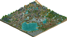
Full-Size Map
-
Download Park
1,109
-
Objects
545
-
Tags
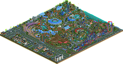
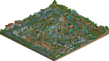
![park_4120 [H2H8 R4] Ruigrijk](https://www.nedesigns.com/uploads/parks/4120/aerialt3860.png)
I have been to a couple of Six Flags parks, so I have some familiarity with the coaster types. Was this park based on Six Flags Discovery Kingdom? I haven't been there. I have been to Six Flags Fiesta Texas, Geauga Lake before it closed down, and Six Flags America.
I like the colors of the park but being a realistic park I was already familiar with most of the kinds of coasters. The S@S freespin was interesting since I haven't seen one in real life before. I liked the sea stadium. My thoughts in general are that it is a good park but ultimately I wasn't the audience for it.
The sorts of realistic parks that I like most tend to be the RCTNW blockbuster kind and the kind that has a lot of fun coasters and other rides but either chooses a theme that would be super fun in real life or goes for a more traditional park but doesn't get super detailed, leaving a bit more to the imagination and has layouts that are interesting regardless of whether or not they're realistic.
Quick edit to point out that while it's not my favorite sort of park, it did hold my interest longer than some older more basic parks so in that respect you're doing something right.
This is one of my favorite parks in recent memory on this site. I did not expect to be the high vote to be honest. In fact, I expected several 95s. I went back and forth between 95 and 100 and I can fully justify either one of those considerations.
What this park does well is roll up all the realism details that have started being added to parks and combine them into one powerhouse of realism, built be people who actually understand theme park layouts and design. There's an underlying detail in here that's not apparent from a cursory look, but shows itself when you really spend some time in the park and see how various areas and pathway layouts work with others across the whole map. What you have is a very clever path layout that may look chaotic from the start but makes plenty of sense and matches its inspiration incredibly well. There are some incredible coaster layouts, great stadiums, and perhaps the best crafted 'context' I've seen in quite a while.
To guide this review, I'm going to clog this thread with pictures and talk about what I like with each. Enjoy.
Start with the sign. So intricate. But pretty simplistic too. Fitting of what a SF park might do. The water and landscape in front together are a nice touch and you have the animal featuring prominently, which I'd expect from a park of this type.
The context as a whole is just a wow. I could have taken a shot of any of the buildings, but it's all there. Solid California-esque architecture with the tall parapets and detailed without being done purely for the sake of detail. The signage is on point (and throughout the map this continues to be a strong point).
Look at this great roadside architecture! It's ugly in a good way and uses color and texture quite well.
This you'll see in a few spots around the map-- orthogonal architecture accented with a curve. It really takes the structure to the next level in terms of feeling natural and 'real'. It's not blocky, it's not a forced diagonal, just smooth lines to detail up what can otherwise be a dull building. Feels like the real thing.
Landscaping done very well across the whole park. This park is busy and cramped, but that doesn't mean every single tile has to be filled. Look at the open space here. Grass and subtle elevation change of the island bed means there's room to breathe and not every single square needs to have something on it. And it contrasts well with the manicured island bad that's just packed full of stuff in a hierarchy of size so it works as a whole.
I like the fencing here because it could have very easily become one long straight stretch of wood. But jogging the fence by a tile in a few spots gives an opportunity for some landscape to soften the edge.
SFDK, the inspiration for this park, began largely as a wildlife park. After the SF takeover, rides were added, but largely away from the animal areas and brought towards the front of the park. Parking got pushed to increasingly remote locations as the rides choked the entrance. It's an awkward layout and not anything a park would want to do from the outset, but it's recreated here really well with both coasters squeezing in on the tram lane.
Look at this great sign.
I like how natural the animal habitat is here. Let's of ways to interact: ride, over-water viewing, interaction/feeder wall, covered seating. The edge feels really natural too while still being obvious that it's an artificial space. The LOTR and 1K rocks complement each other well and again there's not a need for landscape on every single tile.
The back of house trailers are a great touch.
I'm largely going to skip talking about the rides in any detail, but they're all quite strong. This is a particular nice piece of coaster here with the Sea Serpent roll into the diagonal mid-course. Quality support work as well.
The structure of this stadium is great (I like to think it was inspired by Shamu Stadium in my park, but on its own it is a great structure). The pools are a little cramped, owing to the small size of the map, but I like that they're all there with some suitable back of house infrastructure. Not quite enough filtration to be accurate, but it still looks nice.
Another use of the curved structures. This is a great queue and frames the ride super well.
Nicely themed ice cream shop. Feels like what SF was building in the late 90s, early 2000s. The ice cream shop on top doesn't even need further detail to work just fine.
What an awful coaster in real life, but executed quite well here. Proper support work again.
An amazing entrance plaza. The ride tunnel looping around it, the logo in the ground, and the theming only where it counts mentality is pure Six Flags. Top notch.
Such detailed photo capture.
The uplighting around the turn is clever.
Another ride that has definitely been done a few times in game but is at its best here. The mine train supports on either side are excellent as is the containment for the splash area. And being one of the newer rides here, you don't see the theming like Superman had.
I like the little stadiums too with the minimal set design but still feeling comfortable and like you can imagine yourself there. The diagonal stadium is sort of an easy-button for the park, but I can't fault that as its the best way to do it on the grid.
The S-bend is not my favorite, but I can't say anything bad about the supports which are just so well done, especially the towers. Easily the best looking I've seen in game before.
This is the kind of architecture that really carried the park beyond the smaller more themed buildings internal of the park loop. The blue roofs stand out so well and work great with the white. But the diagonal sloping roof overhangs take what could be a wood and metal box and make it feel like something an architect might have put thought into.
Nice detailing of the pump system for water features under the rockwork.
Another use of the curve. The offset 3x2 boxes and the big warehouse building in the back are fine, but mundane. The curved section solidifies this as a theme park building and the path types underneath help reinforce it.
Guest dryer for the water ride. Not sure I've seen this done in game before.
Another great California looking building. Really enjoying the texturing around the doors to the lefthand side and the wood door itself which has some great detail.
The transition between spaces is blended quite well here. 3 types of path, but water underneath and common fencing and pathway edging to bring it all together as a whole.
Best traffic lights I think I've seen.
Back one more time to Superman for this station detailing. The architecture of the station itself is suitably bland-- a big open air box. But Six Flags had a number of years where they would do this and then attach a bunch of theming to the front to give it character. It's handled very well here.
One more in Gotham City. while the row of facades to the left of this is great, this caught my eye because it recreates the sign in the real parks so well. Without a whole lot of detail, it very accurately shows the buildings and the sort of ominous text.
Lastly there was some commentary about the chaotic path layout in the discord chat. Except it's not. As with any good park, there's a proper pathway hierarchy with a main loop or figure 8 (red), secondary paths (yellow), and tertiary paths (green). They don't have to be smaller than the next type up, but they just need to read differently. The way the intersections are handled in the park indicates to me that there was some time involved in working through that level of detail. It's not something that happens by accident.
All told, I'm gutted for you all this didn't get spotlight, but I hope you can be pleased with your effort as you absolutely should be. This goes down for me as one of the most put together American realism parks and should be a model for others that want to learn from the style. It's incredibly well done and has kept me coming back looking for even more details.
If you've seen my comments in discord you'd know I'm flabbergasted that this didn't get spotlight. Honestly, its really incredible, and I'm disappointed that a small amount of people who aren't "into" american style parks are enough to sway the vote. It almost feels like a "meta-vote", wishing for more parks in a different style instead of judging this one on what it is. Yeah yeah go and start an argument with me. I don't think I can be convinced that any element in this park isn't exceptional design and clearly spotlight quality, and its sufficiently big and full of content. So what am I left to assume about the no voters?
The atmosphere and vibe is incredible. Feels so real and perfectly california-subtropical, with the foliage inside the woodie and perfectly framing so many rides and buildings. Obviously the archy is great and so there's so many structures with so many little details everywhere, it feels like theres heaps to see. The park composition is dense but elegant, and the collection of rides is both original as far as rct-realism parks go and also perfectly suited to my imagined history of this park. the zacspin is particularly well-executed IMO, but I love the woodie most of all. Overall its just a great, vibey zoo/park and a wonderful "surprise".
Up there with masterpiece with stolen spotlights. I'm not sure I can deal with the rct community anymore, even pulling away from discord to check it less than once a day has been too much for me.
Ideally, yes. But I don't think it is completely attainable in every scenario. A lot of people on NE are, not coincidentally, very knowledgeable when it comes to real theme parks. Fair enough if they take that very strongly into account when seeing a rec, you could say. But what if someone submits a fantasy park based on some obscure source material? Some manga or anime that's not even big in Japan? I think it is not reasonable that all panelists have to become familiar with all aspects of this fantasy material on their own before voting - some source material could be more comprehensive than even knowing everything about every theme park franchise.
Instead, you should try to present your concepts and ideas as clearly and unambiguously as possible within the park itself, and when you reach the limits of this in RCT (or just don't want to spell everything out with scrolling signs or whatever), then it should be on you to add readme's or other material in the .zip file to help clarify to the viewer what's happening. But I understand it is also not reasonable to NOT take what you know into account - a panelist might just happen to be intimately familiar with the obscure fantasy theme you happened to pick, and it would be hard to see that not affecting their score. This is all of course mostly relevant if your park is heavily reliant on concepts and ideas, taken from real life or elsewhere - I do think you can make a spotlight-worthy park based on incredible, jaw-dropping aesthetics alone, but not on concept alone.
As for the park itself, I did really like many parts of it - mostly the outskirts since I recognize how accurately it is made (which I realize goes exactly against my own voting "ideal" - but I've also acknowledged that it is incredibly hard to completely disregard whatever you happen to be familiar with). The water stadium was really cool too, a lovely organic-looking structure. All layouts were perfectly solid and flowed well. And I really did appreciate the attempts to spice things up color-wise with all that crispy blue, although I feel it is maybe just a tad overpowering being used so exclusively on an entire half of the park, and that it could have been mixed up with another accent color, or maybe just another shade of blue. Overall, it's an impressive park and clearly a labor of love and patience. For me personally, it's an 80/no.
No Spotlight? Dat Garden Inn Doe
This park sets a clear goal and then goes and does exactly what it was meant to at the highest level of quality. I’m also beside myself that this isn’t a spotlight. But such is the nature of a community. I’m just thankful it’s still here. This game series started in the late 90’s, and will be 25 in a few years. It’s like adults that bought us our first copies of RCT around 2000 were still playing classics from the early 80’s/late 70’s. That staying power is fantastic, and I’m just glad Pac, Nin, and Steve shared this amazing creation with us.
Ok, time to review this controversial release. Though I've seen a screen passing by, I didn't expect this release at all. A surprise, to be sure, but a pleasant one.
I haven't got the chance to visit SF Discovery Kingdom, but I do know the concept of the park. That said, I get that this could easily be sold off as a SeaWorld park. It also has that kind of vibe. But of course, the superhero themes and the freeflyer gives it away as a SF park for the theme park enthusiast
It's another topnoth realism park. I did like the zone around the observation tower a lot. Good opening scene for entering the park. The best area of the park is without a doubt the whole Superman area. Hands down the best coaster queue entrance we've seen so far on NE. The facades a bit further, across the Larsson loop, are also stunning. Clever station design for Superman too btw.
The coaster itself is also genius. Best Superman coaster on NE for sure, maybe the best Intamin hyper I'd say. I wish they made it for real so I could ride it. Coaster lay-outs are topnotch in this park. Great you guys managed to make a working freespin but I hate those coaster in real life and I hate them too in the game haha. Please don't let this be a trend in coming parks
Kudos for making a working PowerSplash. It's been done before in the game, but this is the best execution of it. Extra kudos for naming it Pulsar like the Walibi version. It's a great coaster and I don't get at all why it hasn't been sold more. If any of you American NE'ers has the chance to go ride the version that's SF over Texas is getting: go ride it!
It's a wonderful great park for sure. I think the score is quite accurate, I'd vote 85% too I think. Sorry you didn't get spotlight, this park is just on the edge and it fell on the wrong side for you guys. I get the people saying we've seen it all before, but on the other hand, shouldn't spotlight be for the really good parks? Not having to be innovative or new?! It's all up to debate. Maybe it is time the scoring system is up for review and change.
Kinda surprised at the low vote from Kumba. This would have been 85%+Yes from me. Every inch of this feels authentically Six Flags, and I've only been to a handful of the real parks. I can't add much on top of CP6's wonderful review - I just love the superhero area so much. Tons of lovely details and realistic touches, but also stuff that's just plain awesome, like the dive under the entrance at Superman or the ultra 90's feeling station design, and one of the most true-to-life pinball coasters I've ever seen in RCT.
Thanks for the comments everyone, regardless of the outcome it was a fun time building this park with Pac and Steve. I'm glad that some of our favorite bits are favored by others as well, and that no one has complained about the inadequate spacing in the giraffe enclosure.
In regards to the score, I am disappointed it didn't receive the coveted Spotlight title but alas, so it be. I would however love to know the mindset behind the scores even, especially if I'm to grow from this park and hope to achieve the award with my next. From what I've heard via discord, I know not to build a Six Flags park next, but any useful critique would be greatly appreciated. Especially from the lower spectrum of votes- I'd love to hear you guys' thoughts.
While I don't believe everyone needs to know context behind a park, especially if it's relating to real-life park examples, I do believe in this case the relation to SFDK may have calmed the minds of many in regards to the overabundance of blue, the aquatic exhibits, and the like. That said, I also hope that the panel and userbase remain unbiased to realistic park and vote unobjectively, but we all know that's not the case in recent years. Hearing panelists and users declare that "Six Flags parks are easy", or a waste of potential for the parkmakers should perhaps try it out themselves to gain some sort of respect for the practice (and the same can go for realism builders trying fantasy or any other trend). Or they could simply base their judgment off the park before them without preconceived expectations of a builder, or desires for what they want the builder to make versus what they're actually meant to judge.
Rant aside, I again am happy that people are enjoying the park and had a great time making it off and on with Pac over the past few years. He was the workhorse who drove the park to completion, I was merely focused on keeping the dolphins fed.
I’m such a fan of the blue rooves. In general I love repeated motifs in parks, especially when there is a focused colour palette - it’s what I love most about classic NE style parkmaking, and it’s something I miss in most realism releases. So it’s so refreshing to see such a bold motif here. It also looks stunning against the warm reddish and brown paths.
I tried to write a longer review but honesty I’m a shitty writer and it would basically just consist of: Park layout and composition: fantastic; architecture: fantastic; ride design: fantastic
For a while I wasn't sure if this was going to reach spotlight quality, but man you guys really did finish it in a way that push it clearly over the threshold in my eyes. Probably not better than Starpointe, relatively speaking, but its the best Six Flags park we've ever seen, however unconventional it is. Coasters are all fantastic and really some of the best we've seen in a long time, Superman is probably my favorite coaster all things considered in ages.
Glad I was able to see this park grow and contribute whatever I ended up contributing, thanks for doing this guys.
" ... the age of ultra-realism or pacificoasterism is slowly over. Let the era of Lagomism begin! " - Jappy, 3 years ago.
Trends themselves are not bad things. There's definitely reasons to prefer the newer trend of realism pioneered by Lagom to the one cultivated by the American mafia in the early 2010s. It can be argued that this newer style of realism, while perhaps captures actual parks less faithfully, captures the feelings people cherish about visiting amusement parks IRL. Preferences in what content people like to see are valid and those preferences influence the way we build ourselves. That diversity of thought is what makes NEdesigns a strong and robust community.
However, it is still important to talk about the elephant in the room. As of now, there's an obvious bias for heavily themed realism with tons of gimmicky, arguably unnecessary movement elements that's carefully marketed and hyped. There's also a bias against less textured architecture, anything that is seen as generic (even if it really isn't all that generic) or "too perfect", anything that decidedly represents any non Disney or Universal chain park, and particularly anything that can be shoved into the "American Recreationalism" box. I don't think anyone here can argue that this is *skillful* enough to be a spotlight; perhaps, in fact, it's one of the most skillful releases of all time. I would personally say that this is definitely more skillful than Riverland in terms of both micro and macro. Southwinds, too, is up there. But when we look at both of those parks, Southwinds barely won spotlight, only scoring an 82%, and this stands as a Gold.
As a community, we are divided on the roles that a Panelist in particular takes, and the ethics associated with voting on parks. Some, like I have in the past, embrace the subjectivity and feel that there's validity in talking about the underlying story that every release is a part of. Whether of not that can be a story of a player growing, a trend or style becoming in vogue or out of popularity, or some sort of artistic statement that NE parks- as works of art- can make. Some feel that there is some level of "objectivity" abstracted that somehow we've all accepted, and that perhaps the most important thing to judge is the skill level that is reflected in a piece. This latter viewpoint if it were extrapolated to art would read as some snarky conservative ranting about "standards of art" in a PragerU propaganda video. It's clearly against how artists themselves see art; it's more than just the virtuosity on display- it's about what the art *says*. If there's one thing that you should get out of SFWOD, and this review, it's that no one builds or creates art in a vacuum. We are all subject to subjective lenses and contextualization by the people who consume our parks.
I believe the real conflict is what I would consider for a lack of a better term "artistic criticism" and the structure of the site. Pointing back to "panelist ethics", we can almost universally agree that it is unfair to give something a lower score because of some vendetta that a panelist personally has for its creators. But is it okay for panelists to give something a lower score because that person feels a work of art is a lower score than what it perhaps "deserves"? I would say yes, but the fact that we use a numeric ranking system- an objective metric- to describe our complex feelings and viewpoints on art can be problematic. There isn't such a thing as a park "deserving" a score, and there isn't any way to really justifiably say that a park is better or worse than its contemporaries. That is sadly how panelist scoring is being interpreted here, and it's the crux of all the bullshit accolade debates on this site. You shouldn't look at a park's score and use that as a metric of what you should consume or create in terms of parkmaking; you shouldn't internalize any feelings that a park is more valid because it scores higher. "But then, why do we have parkmaker tiers? Why do we categorize releases into tiers like golds and spotlights, which are obviously more cherished by the community than lower tiers of releases?" I guess it's human nature, but it's also a system of preconceived notions that we have to do our best to deconstruct and detach ourselves from in order to become both better parkmakers and better artists. The connotation of prestige and higher importance that the color of a username or the shininess of the medal adjacent to a park map is one worth destroying in your psyche.
Meta commentary on parks is here to stay whether you like it or not. I do worry that it's going to leave people with the wrong impression to turn Lagom-ism into some sort of realism metagame that should be followed as carefully as possible, which is what happened to a lesser extent with a lot of realism trends preceding this new one. It's important to deconstruct what makes those styles work, and what you like out of them, and synthesize those into your own work. The dialetic aesthetic tradition of parkmaking is what keeps NE fluid and diverse.
Now, onto the park itself:
It's pretty self-evident that this would have won spotlight 5 years and a whole metagame ago. This ticks those "this is a spotlight, no questions asked" boxes in the right way to have been seen as the Pacificoaster sequel park that lived up to its original, and the debut nin park that would destroy the narrative that Kyle finishes nothing. It could have been the magnum opus in both of their careers and started the "Replacements Style" aesthetic that would have whipped a dead, American chain-park realism horse back to life and relevance. This park is a synthesis of what makes both nin and Pacificoaster exceptional parkmakers; the detail of macro and the big picture stylings of nin combined with the effortless complexity and ride design of Pac. CP6's comment shows this off really well. It's a fundamental park to view in understanding how motives are created in RCT, both in form and in detail, as well as in composition and in area design. It is essentially a perfect park which is no less what the expectation is when you see the names of those three creators name-dropped on a project. Its clean aesthetics that deliberately uses texture along with its bold use of colors does justice what Starpointe and pre-palette frenzy American Realism worked to cultivate. It also learned from newer parks, with a greater sense of space in a world that exists outside of the theme park. The outskirts are legitimately my favorite part of SFWOD. This park's concept is also a great way to establish familiarity with a brand and then flip the script, keeping things fresh in what could have been stale and arguably not even worth building at all.
It's also valid to say that this park "came out too late". The game has understandably moved on from this subject matter; much of the community has become jaded of things built like this. Perhaps these are just whiny, manic obsessions ravenous for something new, or a legitimate termination on a decade-long discussion about the praxis and intricacies on american parkmaking. There is definitely a nationalism versus cosmopolitan theme going on with discussion associated with this park.
A few more thoughts:
1. No one needs to perfectly understand the subject matter of something to enjoy it or to be able to have an opinion on it. Context is important, but also the context that a person's experiences bring are equally if not more important. You can't tell a person what a work of art is. The audience has to extrapolate meaning for themselves.
2. A lot of the thoughts that I've had come from a perspective of someone who's been on both sides; someone who fed into the prestige and sought more of it, and someone who now has emotionally distanced herself from having too much of an attachment on how much others value her- as a parkmaker and as a person.
3. It's understandable for people, especially nin and Pac, to be frustrated by all of this. It's a legitimate feeling to have knowing that you worked so hard on something and feeling like what you've built hasn't been as appreciated enough. I've been there, and that's why we all need to acknowledge how much time we spend creating things and understand that people have emotions behind what they create. Parks are often an extension of someone's personal expression, just like other forms of art, and that is something we should cherish.
nice park
Fantastic job. Great to finally see this finished.
:thumbsup:
I thought this was great, I definitely think Spotlight worthy personally, but I can understand why others thought it wasn't.
A few of my favourite bits:
The curve on this hotel was fantastic, and just makes the whole building feel that much more real. Such a simple effect, but done perfectly.
Again, this station is simple but executed to perfection. The station and the photo booth next to it are exactly the kind of half-assed theming I'd expect from a Six Flags park.
This roof is just on another level and makes this building stand out to me. It feels exactly what a 'modern' zoo/aquarium style park would be attempting to do on a budget instead of just making a block.
Easily my favourite building in the park. I don't know why, other than it's clean but detailed. It just reminds me of a typically Californian building. Love it.
An iconic entrance to an iconic coaster, translated perfectly into Rct. What more can we ask for?
This station is just a square...but it looks that good. Phenomenal.
These two are very similar. Both great ideas, I think I prefer the execution on Crime Wave a little more, but just great ideas either way.
Overall, I loved how dense the park was, and the 'sterile' atmosphere worked perfectly for an upscale Six Flags park.
^ Honestly the signage design in this park was top notch. Particularly the Crime Wave and Building a Better Metropolis signs. Still very impressed by this park.
Garden Inn?
What the fuck? So many questions
How did I miss this?
How did it not win?
How did you Pac manage to improve on Starpointe?
Airtime Offline
This is a top 5 all time park for me.
I get that you can argue that it’s more of the same but it’s more of the same perfection. More of the same spotlight material that Nin and Pac have been producing for years.