Park / Six Flags Worlds of Discovery
-
 13-March 20
- Views 9,280
- Downloads 811
- Fans 15
- Comments 40
-

-
 84.50%(required: 70%)
 Gold
Gold

CedarPoint6 95% yes Cocoa 90% yes G Force 90% yes robbie92 90% yes Camcorder22 85% yes CoasterCreator9 85% yes Scoop 85% yes csw 80% no Faas 80% no posix 80% no RWE 80% yes Kumba 75% no 84.50% 66.67% -
15 fans
 Fans of this park
-
 Full-Size Map
-
 Download Park
811
-
 Objects
545
-
 Tags
Tags
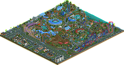
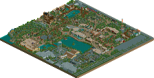
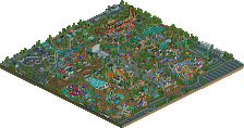
good lord finally
I'm finally convinced there should be a new accolade tier. Blue.
hamentashen in my butt
AAAAAAAAAAYYYYYYYYYYYYYYYY!!!!!!!!!!
Positives
+ Amazing surroundings, especially the big mansion (or whatever it is) in the middle
+ Fantastic architecture throughout
+ Great foliage
+ Superb layouts
+ Show buildings are really good
+ Cool animal exhibits
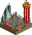
+ The entire Superman/Metropolis section deserves an extra mention here. Just fantastic
Negatives
- Not the biggest fan of how the GIB was pulled off
- White Water Safari lacks breathing room behind it
Overall: Fantastic park. Probably one of my favorites in the last couple of years. 90%
Small but very good, omg pulsar looks sooo good, and its function correctly
I really liked this park. Very skillfully done and incredibly atmospheric. Couldn't shake the feeling I've all seen it before though.
I think this was the best Superman coaster I've seen yet, but I can't help but feel it was very misplaced in this park.
Well I'm not seeing it, but "horses for courses" I guess.
I thought this park didn't add much in comparison to other recreationalist parks, but I guess that's just because I have no eye for this RCT. The blue was a winner though, of course.
Six Flags World Of Discovery - an inspection was carried out from the Office of Technical Inspection.
Officially: No abnormalities were found, although it is not recommended to overfeed animals - because they look lethargic. The note does not apply to animals in water reservoirs.
Seriously - it seduces the number of objects, watching you would like to choose one fragment from the whole area and like it. I chose two: "Hammerhead" and around, and of course the area of the small Zoo.
You could get a lot of ideas from your work. Everyone knows it. After seeing everything I thought about something like a Jurassic garden with a similar set of devices.
Greetings, understood a high rating and an appetite for similar in the performance of others.
The only thing not six flags about this is that it looks well maintained and the woody isn't an RMC
Damn.. impressive stuff. First impression is that this is super colorful. Aquaman and Sea Serpent were standouts in that regard.
Wow this is an incredible park! Really impressive. I like the awesome coaster layouts and incredible details throughout the park. So much skill; esthetically and technically.
I think a lot of SF/CP etc. recreations look great, but can feel a bit grim/grey to me. This park doesn't give me that grim feeling. It looks very realistic, but is also colorful and vibrant. I think your use of color is especially strong in the Superhero area. I loved the entrance of the Superman coaster and the front of Crime Wave bumpercars.
I also think the White Water Safari rapid ride stood out. Such a great natural atmospheric area. Also very cool that you made the Pulsar ride work realistically.
The only colorchoice I didn't understand was the lightblue. It's a very cold harsh color, especially on large flat surfaces. I think you guys tried to balance it out with the warmer reddish/brown colors for paverment? But I think in the end, for me, it actually highlights the contrast. Changing the lightblue to darkblue on the large surfaces would already made a very big difference for me.
The area outside of the park looks very good with beautiful architecture and a lot of realistic details, but I felt it misses some motion. It isn't very lively. Adding moving vehicles or peeps running around might have added that.
Impressive
Tough vote. Let me explain mine a little bit.
Things I liked: obviously you're all very talented parkmakers - the architecture, surroundings, and ride design are all great. I don't know a whole lot about what makes a park "Six Flags" but I think you pulled off the realistic American theming pretty well.
Things I didn't like: the park feels cramped in a lot of places, especially in the superhero and zoo areas. The superhero area also has lots of weird colors - for example, Aquaman splashdown looks pretty downright ugly with the bright orange/aqua/dark green combo. (Maybe that just means that Aquaman's suit is ugly, idk.) I also didn't like the foliage in some places - it didn't seem as prim and proper as it could have been. These might seem like nitpicks but I think they add up to enough to put the spotlight in question.
It is interesting to note that the 4 voters that never build in a realistic style were the no votes.
Figured I'd share my opinion here not on Discord so it doesn't get lost:
First off, I hope Pac, nin, and Steve that you guys all greatly enjoyed making this park and are proud of it. Please don't let the debate over spotlight or not ruin that!!
I for one already said the colors were great. Sorry csw! To compare this to other hyper realism work, this is more playful and bright IMO. Even the backstage areas are well done. Thought put in to water takes for the dolphin exhibit. Incredibly detailed stadiums! The tiger exhibit/stadium is well themed and stands out in relation to all the others.
The coaster layouts were great. Roar! was a very believable GCI.. although it might not have had a "ah-ha" moment, it fit really well into the park. Sea Serpent was oddly my favorite. The station was really neat. Seemed like such an improvement in station design/theming compared to other Six Flags parks on NE. That little area of the park was very cute.. the Discovery Tower and the little shops tied it all together nicely.
Lastly, I want to say if anything felt cramped, it was the River Rapids.. which I still enjoyed. I liked the narrow track a lot. The family drying station was a great touch.
Again great work guys. I would've voted 85/90.
If I’m expected to know “the source material” for every park that’s submitted to NE, you can take me off the panel. We’re all not theme park enthusiasts, and I personally don’t have the time to study the realistic tropes of every theme park chain to know whether or not someone is recreating them perfectly. I thought this looked more like a Sea World park until I was pointed in the direction of the source material by CC9, and then was floored that there was actually a unique Six Flags park in existence.
I said this in Discord, but the panel is a democratic body, and therefore there are politics involved. You can make the best realistic park aimed at the enthusiasts on the panel, but you’re not going to get a good accolade score unless you also put things into the park for those people who don’t know how “masterfully” recreated the park was. From a non-enthusiast’s eye, this park looks very much like all of the other recreationalist American Realism we’ve had at the site. I know some of you hate readmes, but I think a simple “here’s what we set out to do and here’s some pictures of the real park” might’ve helped convince some of the non-enthusiast panelists that this park deserved spotlight.