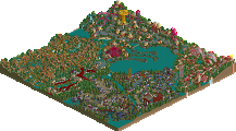
Park / Kongamato
-
 31-March 20
- Views 4,595
- Downloads 687
- Fans 3
- Comments 23
-

-
 73.00%(required: 65%) Design
SSSammy 85% Cocoa 80% bigshootergill 75% G Force 75% robbie92 75% RWE 75% Scoop 75% WhosLeon 75% CoasterCreator9 70% saxman1089 70% Faas 60% csw 55% 73.00% -
Description
Hello NE, for my birthday this year I present to you my first solo release :). (If this is released on the 31st of March) Enjoy!
Big thanks to RWE, Steve, G Force, Posix and Whosleon for testing this park and giving their feedback. -
3 fans Fans of this park
-
Full-Size Map
-
Download Park
687
-
Objects
331
-
Tags
Similar Parks
-
Land of Shadows
-
Goblins!
-
Last Days
-
[H2H8 R1] All Coasters Go To Heaven
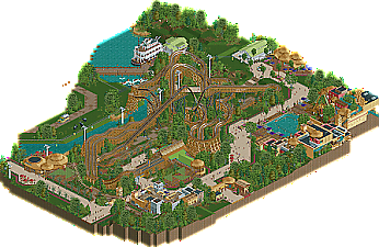
![park_4087 [H2H8 R1] All Coasters Go To Heaven](https://www.nedesigns.com/uploads/parks/4087/aerialt3818.png)
-
Walkman Of My Brain
-
Wilhelmina Wonderland
Thanks Alex!
The brown wooden structure would indeed maybe have looked nice for the chairlift station.
++ awesome racing corkscrew camelback things
++ outstanding architecture for the Congo River Falls sub-area
++ the path / flower / tree mix works really nicely, and I especially like the way you've worked in a couple planter blocks of big overhanging trees that feel like really natural interruptions of the main path but achieve it without blocking RCT viewer sightlines or hiding stuff
++ great boat bro
+ Cool entrance sculpture for the coaster queue
+ wild first drop interaction
+ great tiny realistic details on the station area, warnings + height check, ride photo booth, chain lift mech, ride photo flash towers
+ good representation of the new GCI support stuff, seems true to form at least from what I remember seeing
+ safari truck
+ I like the double/triple-ups at the end of the layouts a lot
+ also a fan of the brick / trim path edge fencing, really nice
+ cool little snack stall design, I really like the detail of the area-themed side umbrella roof
+/- not totally sure why you just did the same one twice though and neither has an actual stall in it I think
+/- aside from the palm trees, the foliage and landscape doesn't seem to be "African" particularly. Assuming the intent is a Busch-esque park that would just have native flora, not really a negative, but it could have been cool to see some intentional "oh you're in the african jungle now" planting at the area or ride entrances, transition zones, that kind of thing.
+/- the skyride is kind of weird. The relationship to the waterway and the coaster kind of puzzles me, in a "which was built first" and a "why build it there specifically" kind of way. There should probably be nets at the coaster/skyride crossover points. I wouldn't mind much if the park didn't seem to be aiming for a super-detailed realistic approach, and it's still a cool interaction, just kind off struck me as odd.
+/- the safari is clearly here as supporting / fringe material for the main dish, but it doesn't seem to have had a lot of thought put into how it works or why it's where it is. Again, not judging too harshly because it's pretty obviously just a suggestion of the context for the coaster.
+/- the entry for the disk-o is in a weird spot.
+/- I feel like the layouts could have been slightly edited to have them re-join earlier after the first drop so they feel like they're dueling/racing continuously.
- The attractions and architecture are all in weird little island blobs. I'm not sure if the dead space in between is intended as realistic, but it does hurt the flow of the park a bit.
- color choices for the coaster station roof are iffy - the green triangular canopies in particular really ought to be something contrasting and bright instead of a dull blend-in green. The coaster does not look lively or exciting with brown track, brown trains, brown station, and a dull green accent. I don't know what a Kongamato is, but it sure looks drab.
- the prelifts are weird and not really to my liking, and I feel like the layout has one obviously great view but just feels kind of okay in the rest.
-- the detail of the flipping "which side wins" sign at the brake run is great, but one side always wins. At first I thought it wasn't intended to be a dueling/racing and just a "they do the last duel and then go off to do whatever" ala dueling dragons , but then I caught this detail and was a little puzzled. Sure, one side always wins and the sign matches, but if it's supposed to be a racer then .. why not have them race? I'm pretty sure the trains have the speed for a 270 turn to the right at the end instead of a 90 left into the brakes that would put them way closer at least. Just kind of a baffling decision.
Here's the video review of this design, per request. Great work!
https://youtu.be/b8HZXE--N18
They both actually have an invisible stall in it!
Fair point, and the landscaping was indeed partially inspired by Busch Gardens Tampa.
The skyride is definitely a bit odd, I mostly just added it to get some interaction with the coaster and because I thought it looked cool. If this were a real park my story would probably have been that the skyride was there first, then the coaster got build and they raised those two poles to make it clear the coaster. I think CP6 said something similar in his review and I think that explanation would make the most sense. If it's the most realistic scenario I don't know, but I the park as a whole isn't meant to be extremely realistic, like there are more realistic details missing such as the lack of a transfer track on the coaster or a lack of a storage space for the coaster cars. Personally when it comes to realism I like to add just enough detail such that I can achieve some sort of Suspension of disbelief in the viewer, without actually going full 100% realism like someone like G Force for example.
This building including the colours was actually inspired by Gwazi/Iron Gwazi's station.
This is a good point and I did consider this, but I wanted to stay as close as possible to the original layout so in the end I decided against this.
Great review CP6! In addition to what is shown in the review, the two log flume buildings actually have a small cut-away sections if you set the max land height at 10.50 m or 28 units. They are nothing special really (especially looking back on it the right one is kinda ugly xD), but still a fun detail imo
