Park / Le Coeur du Ciel
-
 25-May 21
- Views 16,359
- Downloads 701
- Fans 13
- Comments 46
-
 88.50%(required: 70%)
 Gold
Gold

geewhzz 95% yes CoasterCreator9 90% yes Cocoa 90% no In:Cities 90% yes RWE 90% no Scoop 90% no WhosLeon 90% no Xtreme97 90% no chorkiel 85% no G Force 85% no posix 85% no saxman1089 85% no 88.50% 25.00% -
13 fans
 Fans of this park
-
 Full-Size Map
-
 Download Park
701
-
 Objects
533
-
 Tags
Tags
![park_4716 [NEDC5 - 04/10] Beyond the Canopy](https://www.nedesigns.com/uploads/parks/4716/aerialt4587.png)
![park_3229 [MM2014 Final] Cavumus](https://www.nedesigns.com/uploads/parks/3229/aerialt2949.png)
Ugh, it's technical brilliancy vs creativity in this match. I can't decide between these.
I love Le Coeur for it's theme and nearly flawless execution of the idea, but Papillo has the creativity and whimsy going for it. I really don't know.
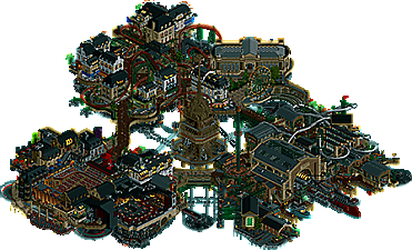
Le Coeur du Ciel
Visually stunning, in a similar way to Lost World, but with the palette polished just a little bit further. Best unique palette of the tournament so far, and best night palette made - love how it is dark but balanced, and the lit windows really pop in a great way. Though, I think the map should have been sprinkled with even more lit lamps/windows/whatnot, as certain areas were quite dark such as the central tower and the area around Volkarya.
As for the theme - I think there is a reference here to something aside from simply Paris and flying stuff I might be missing, but still - I gotta say I thought we were a bit over steampunk gimmicks at this point, flying in particular (don't think anything will ever top La Reve in that regard). The Paris aspect of it was incredibly well pulled off though - the archy is just stellar, incredible throughout, and Moulin Rouge? Holy shit that looks fantastic, really the cherry on top architecturally. Love the various stages and scenes depicted, especially the main Moulin Rouge theater - that might be one of the best interior's we've ever seen.
As for the two coasters I thought Skyline was the better layout. Well integrated into its surroundings, fitting ride type, and good flow. Volkaryia on the other hand did not feel as convincing.
Overall, a really incredible park checking a lot of the meta boxes. I didn't care especially much for the "flying stuff" aspect as mentioned - since the Parisian stuff is pulled off so crazily well, I'd be curious to see what a park just simply focusing on that (or combined with some more novel idea) are would have looked like as built by whoever the builders on this park are. Still, it's impossible to look away from the quality and detail density here.
Papilio Valley
A perfect contrast both theme-wise and looks-wise to Le Coeur. And, it feels a lot more refreshing. Bold in a similar way to TGD in that there are large swathes of just foliage and paths, and there is a similar focus on a more meditative atmosphere. Many great touches like the various bug statues, the enterprise as a spider web, the custom windmill blades, the ant colony (that actually creeps me out, too convincing, haha) etc. I also appreciate that there are areas with quite distinct aesthetical approaches, but they still really work together.
Moving on to the main attraction(s) - the duelling coasters. I must say they kind of underwhelmed me. They are not weak by any means, but being such centerpieces on this map, I feel they should have been more impressive. There are some fun moments such as the barrel roll threading the large loop in a parallell manner instead of perpendicular to it - but it looks more awkward than it looks great, and overall there's just a bit of a clunky feel to the layouts. It's difficult for sure to incorporate duelers into a tricky landscape like this, and the way they are places makes them tower over the map in a way that would have required them to be something really special to come off. I admire and applaud the guts to go for it - but in the end I think it's just a very narrow miss.
Overall, I so appreciate the fresh theme, all the fun details, the serene atmosphere it maintains even if there is a lot of movement on the map. The uniqueness of it means I'm pretty sure I will remember this one more than many of the other parks in this tournament.
__________________________________________________________
I would really have wanted to award Papilio the vote for doing something a bit different - but in the end Le Coeur just about wins out for me. Crazy good matchup, and the amazing parks just keep coming.
I want to start reviewing more, sorry NE that I haven't much. In the past I've typed a bunch of stuff and then deleted it, so I am committing to a short burst of commentary and then smashing that "post" button.
Bugs
I'm loving the arrangement of the map around the central meadow area, I'm a fan of the macro and colors. Some cool mid-range features too, like the windmill, tower + wasp, ant zone. Coaster is solid and the dueling is effective, but some angles are messy. At the detail level I appreciate the shapes but not the textures, it's just a bit too visually for my personal taste.
Air Paris
Kinda dark at first glance, but I can get past it! All the content in this map is so stylish. The weakest part of my rct skillset is architecture, so a park like this tends to wow me in terms of "i couldn't do this". The arrangement around the central tower feels extra effective with that chain drive system motivating it, very cool. The coasters are so well integrated with the buildings - which themselves are all lovely. Propellers and ships are tastefully executed in different ways. Lots of awesome details in the ships. Rich with details but feels clean, plenty of movement but still kinda chill. And in the end I'm just having a better time checking out this park, it has my vote.
Two super fun parks, thanks builders for creating these for us to enjoy!
Both of these parks exude character and encompass everything I hoped to see from H2H. Truly beyond my expectations. I can't help but smile when I open these and start looking into the little details. Both teams have so much to be proud of here. But I suppose I can only vote for one eh? Not going to be easy.
-Pistachio Valley:
Colorful, fun, lively. Absolutely spectacular execution here, you captured the fantasy/elven/etc vibe wonderfully. Every little scene is engaging and the detail work is top notch. Foliage is spectacular and really takes a front focus, which I genuinely appreciate. Standout coasters were really unorthodox and adventurous, which I enjoyed. Layouts seemed to prioritize synchronization over flow in a few spots, which is understandable.
-Creme Brulee:
Classy, refined, confident. The central theme is top notch, and the high quality detail work to flesh it out just makes it that much more engaging. Architecture and coaster train hacking are phenomenal, the omnipresent movement really makes the park exciting to not only look at, but watch. Layouts are solid and enjoyable, I really like the mega-lite. Colors are very fitting and atmospheric but I almost wish the coasters were a bit more eye-catching.
I really had to split hairs to pick a favorite here. I thoroughly enjoyed both parks, and both teams should be incredibly happy with their final product here. Complete polar opposite approaches to H2H as a whole, so comparing them was really really difficult. In the end, I went with Creme de la Creme, as it felt like a more refined, cohesive interpretation of the theme it attempted to portray. Again, I'm splitting hairs here, both of these parks are incredibly competitive and well-done. Major thank you to the teams for putting in the time and effort these most definitely required!
Tough match for me here. I liked both parks a lot, but I felt Le Coeur edged it out in the excellent execution of the straightforward theme. Papilio was beautifully made and kept me interested, I just felt that the execution wasn't as top notch as Le Coeur was. Great job to both teams!
This match was certainly refreshing! Thoughts included below:
H2H9 Park Reviews
Le Coeur du Ciel
Really enjoying the overall combination between the palette and busy atmosphere here!
This especially shines through around the Moulin Rouge/nightlife area!! It’s just so vibrant
+10 for the theater and clubs. The approaches are so fun and tasteful
Love the general lighting use throughout the map as well!
All the airships dotted around are fantastic
Notable are the Beluga, fire brigade, and the warship of course
The use of diagonals found in the architecture and docking areas are all great complements to the squarer blocks of architecture
Having the foundation of the map being the top of the Eiffel Tower is such a unique and thought-provoking touch that really sells the French theme for me. Not to mention the impressive architecture throughout as well!
I haven’t even mentioned the coasters yet! I love them both, with Skyline being my favorite
They are both nestled into their respective areas in a way that feels just right. Loving their structural details too
In general, I really enjoy the overall complexity and relative symmetries in the layering of the infrastructure. Notable mentions include the extensive archways and the apparent divide between the more industrial/municipal layers
Sightlines and interaction between the pathways, Highline, and Le Fan Belt benefits significantly from this!
+1 for the grape crusher being perhaps the only revolving piece not used to support flight!!
Shoutout to the gears embedded within the hanger cart structure and the balloons that carry the power lines from the Eiffel Tower to the rest of the flying city. Love these details in particular
Papilio Valley
Right off the bat, I really enjoy the colorful and lush foliage throughout. It’s very dense, but so atmospheric and perfect to theme!
The juxtaposition between the waterfall, knotted root systems, zipline, and coasters only add to this
The treehouses and Treehouse Supplies Pulley are so cleverly done. Love how they constantly change!!
Love the take on the duelers too, particularly given their naming and ride types. The element/s where the two interchange between loops and rolls are great moments on the ride, especially where the roll splices the loop. Had to do a doubletake to spot that one!
All the sculptures and signage throughout are wonderful
The entrance area and windmill(!!!) are both impressive, if a bit void of life compared to other parts of the map
+10 for the raging ant colony, I was very surprised and impressed to see this!! Especially with peeps?!
Also, really digging these new rock objects. They feel like a more ‘natural’ alternative to some of the WW objects commonly used
Enjoyed the cute little story with Lost on the Twy River and some of the details within!
Notable are the frozen enterprise web and the Alice in Wonderland-esque caterpillar
+1 for Swarm and the Honey Pot. I found this area adorable!
Vote for R3M2 – Le Coeur du Ciel
As I sat on this one, I realized how much Le Coeur du Ciel was growing on me in a way I don't normally experience for such steampunk/fantasy driven parks. It was as if the longer I viewed the map, the more I found myself fascinated by it, and the more I was able to discover. Not to take anything away from Papilio Valley, but over time I found myself more and more drawn to Le Coeur. Papilio Valley I will say had something intrinsically nostalgic about it that really piqued my curiosity, however. It was simple, fun, and refreshing. Part of me questioned my initial decision during later viewings that I didn't otherwise expect! Ultimately, a slight lack of refinement held it back for me unfortunately.
Overall, I thought this matchup was a nice change of pace with some uniquely different themes and park approaches! Commendable work all round as usual. I hope both teams feel just as proud!
One more till R4!
Another tough choice between two parks that I love.
Le Coeur du Ciel:
At first the palette seemed too dark for me, but I got used to it as I looked through the park and now think it was a good choice for the setting. The main airship is just such an impressive way to start off when looking at the park, and the other airships are also well done.
The architecture is so technically well done (Especially the diagonal building, one of the best I've seen.), has great variety and I love how the 3 separate districts are set up. The chain drive and fans add a ton of detail and motion to the park.
Overall I like this park more and more as I looked through it, it's now one of my favorites of this contest.
Papilio Valley:
I love the atmosphere of this park, it's fun, cheerful and charming. The architecture is great as well, the entrance, coaster station and treehouses are my favorite areas. The ant colony was also a highlight and added a lot to the park.
I liked the choice of having dueling coasters, especially a flying vs an inverted, and the timing was very good throughout the layouts. The river rapids had a lot of memorable setpieces and good storytelling. The foliage is dense but that fits with the theme and it's also well done.
Oh man these releases go fast. I just found some time to check both of these incredible parks. Just written up my thoughts as I went through both of them.
Papilio Valley – Tile Inspectors
Love the entrance area with the park name above the waterfall, the windmill and all those butterflies around. That plaza is so lovely with all those colours. Why have a sign say Mouse Car 1 though?
Grasshopper looks like a lot of work for something that doesn’t look that different from the in-game hopper ride to me.
The pretzel shops for beehives are nice.
You forgot to put on bumpercars music on the ‘bumper beetles’-ride. That’s a -1 for me.
That’s one seriously aggressive waterfall. I like it.
Yay, I found Walto.
Why is the water two different colours in the drop on the Twink River ride?
Yay the butterflies saved the day!
Ow wow, that’s a lot of ants! Don’t know if I like the use of those chimneys. Well I do know, I don’t like ‘m used that way.
Is that another black under-thingy? Guess someone forgot to use supportblockers multiple times.
Why can’t I see the top of this tower from this side? Ow it’s too high, damn, now you made me use my enter key.
That duelling coaster is gorgeous and I like how the ‘Butterfly vs Wasp’-theme is spread out over this park.
Le Coeur du Ciel – Manual Laborers
Ooh a French title, that sounds like it’s bound to be a classy park. Yay it’s Sky-Paris.
Damn it is classy, Classy.
Why do those panda’s have a weird stain on their belly, well they do work in a stripclub . . .
Wow this nightlife area just blows my mind. Can-can, a stripclub and a dance-club. And look I’m in it!
Those DL balconies underneath the walkway at the stripclub are a brilliant touch.
Beautiful lines with the Tunnel of Love and the Fan Belt. Those coasters look beautiful.
Ow man, I love this park even more than I love the first park.
In summary: Both parks are out of this world. But, Le Coeur is even more betterrer than Papilio. So it has won my vote.
And I'm back! I knew I promised yesterday that I would do more Steve Reviews but the last match was posted too late because Liam is lazy. Did you guys see he called me names yesterday too? What else is new. I am so under-appreciated in my time. And time is money. So, I'm broke, I guess. Life is weird. Apparently not as weird as taking a screenshot which is apparently foreign to people on the Manual Laborers, I hear. Gossip! I'm such a scamp.
I digress, though, as usual. There are parks to talk about! And by "talk" I mean "give undying praise" but also "rip to shreds." Just kidding! Kinda. At least about one of them. Which one though remains to be seen. Well, you'll see now if you're still reading this. Are you there yet, posix? Anyway. AirParis! I originally wanted to just do "NO NOTES" for my Steve Review and well, basically, that's it. What the fuck, guys. I get you lost twice in a row but you know the post season is still several weeks away, right? Man. I can't really find much to fault here, personally. I guess you guys all fucking suck for actually being good? Ah, I don't know. I need more coffee (cocoa, where is my loose coffee in a folder!).
Anywhoozle. Bugs in a Field (like Snakes on a Plane, get it? Not really a joke, but whatever at least I showed up). Overall, hey, this is not bad. Is it good? Well, depends who you ask. Oh, you're asking me? I mean SURE. The abundance of the tall grass is a nice aesthetic and the idea is cute! However, similar to before there is just something I can't get behind on this. Ultimately I think this boils down to preference to me, and this is just not my kind of parkmaking. The rapids are quite nice for what the are and the speech bubbles are a great way to tell a story (huge shoutout to using the enterprise as a spider web. How the fuck has no one else thought of that). Plus, the lil' section with the honeycomb ride/shop was fucking adorable. The cutest. Who did this? Are they cute? They must be cute. Ugh.
Another match for the ages and yet another subpar Steve Review. I don't know if I can keep this up. Who's doing the haiku thing? Louis? Is he still doing it? Maybe I can steal it. I shoulda just went with the "NO NOTES" thing earlier. Oh well, you live and you learn.
Le Coeur du Ciel:
I think it's fair to say this is one of the standout parks of the contest, at least it is for me. Straight from the get go it's superb, the composition of the port scene is really well designed with that looming brick hangar and the incredibly sleek warship taking center stage. The only complaint would be the strange shade of grey in the palette, used also in one of the Moulin Rouge buildings, which I find out of place and weirdly flat compared to the other colours. That aside, the rest of the map is equally stunning, I deliberately avoided screens when the park dropped because I wanted to experience it with fresh eyes and it was so worth it. The Parisian city area around Skyline is a brilliant showcase with loads of little details buried within such as the wine cellar and the fire engine, and that art museum is bonkers. The coaster is fantastic, but it does get a little hard to follow among everything, and I found the flyer to be a little tame as well. The Moulin Rouge piece is solid as well, amazing stage and sign design with more fab archi. Also shout out to the fans and moving parts which made everything come alive that much more, superb idea. I personally wasn't too bothered by the darkness of the palette, I think you adjust to it the more you look at the park and it gets easier to see - if anything I'm more offended by the grey shade than the darkness. Brilliant work guys, glad to see you grab a win with such a strong piece of RCT.
Papilio Valley:
Initially I found this park a touch overwhelming visually with all the textures but the more I stayed with it the more I warmed up to it and found myself digging into all the details and appreciating the elements. The entrance is very characteristic of a certain builder and I'll always enjoy this whimsical style somewhat, blown away by the working windmill as well! The grassy area with the eclectic foliage is also a favourite part of mine, love the atmosphere it brings and the way the plants form this natural wildflower look. The rapids is great as well, very much an adventure ride with a cool narrative and brilliant scenes that are just teeming with life, and a lovely station. The duelling flyer/invert makes for a nice setpiece, some cool interaction points included (such as the way the loop and roll are intertwined). The treehouse structures were a bit too varied in all the textures and shades for me, would have liked to see them be a bit more cohesive in style, but they do look impressively imposing and the ant farm in the back is a wonderful little thing to discover.
Mulled over my vote for a bit as I wanted to give both parks more time to settle in and give them both a few more looks, and Coeur got my vote in the end. I think both parks really impressed me in different ways, so excellent job by the creators. The rumour mill has been spinning quite a bit so I'm excited to see the reveal of who built.
Match Conclusion
The poll is now closed.
The Manual Laborers have won this match with a score of 53–13 .
Creators
Manual Laborers"Le Coeur du Ciel"
55%Pacificoaster
30%Suormot
15%Ziscor
Tile Inspectors"Papilio Valley"
40%bigshootergill
40%Kumba
18%AvanineCommuter
2%zxbiohazardzx (F)
Thanks for all the great reviews!
Papilio Valley
From the very first screenshot it became obvious that our parks were quite the opposite from eachother, and we'd been having the thought before submitting that if a park with very lush and well executed landscape would go up against us, we might be in for some trouble (since we barely had any landscaping to speak of, flying city and all). If it was your intention to create a whimsical landscape, you truly hit the spot. My favourite parts of the park were the entrance plaza, with some realy solid architecture and a great custom sign, as well as the small area around the Honey pot. The particles around the beehives are just such a clever touch and make the area feel so alive. On the other hand, it was clear that there was a rush to get this park finished in time, with the peeps getting stuck and some areas seeming a bit more polished than others.
Le Coeur Du Ciel
Now, for our own park. The first bit of reference that got us started was a planet coaster creation by Silvarret, called Volvarra. Its essentially a tiny floating island with a coaster wrapped around victorian architecture with a steampunkish vibe. This automatically lead to Bioshock references, however we quickly decided we wanted to take it another direction, and settled on some Hausmann and Paris nightlife references. As for the story behind the park and how it came to be floating in the sky, we decided to let the park speak for itself, and allow the viewer to make their own scenario. The tip of the Eiffel tower, the warship, as well as the "underground" society all lead to differerent storylines and possible background stories.
Ziscor was highly influential in the exploratory phase when setting the style for our architecture, and Pac was the mastermind behind the macro planning. Originally, the three islands would represent three different types of art, but over time this concept faded away a bit, and we decided to go with the docks for the third island instead. This turned out great, and allowed me to go ham on some flying ships and to get another architectural style in the park. Doing all the mechanical details as well as the glimpses of buildings tucked underneath the island quickly became my go-to task, as Ziscor and Pac seemingly got a good thing going for the street level buildings. It wasn't just us three though, shoutout to Cocoa for the Tunnel of Love idea. I thoroughly enjoyed working on the park and am extremely proud of the result.
- Motty
Manual Laborers - Le coeur du ciel
I have to admit I wasn't really screaming enthousiasm when I saw "another steampunk" park. But once I opened the park in the game I have to say the park is great and not just another steampunk park. Technical execution is topnotch here and combined with some awesome ideas. I also love the French touch over it, vive la France <3 That big ship in the hangar is a great set piece and an awesome introduction to the park. Archy is insane here, love it. I liked the coasters too, with the Intamin being the star of the show for me.
Tile Inspectors - Papilio Valley
Didn't really know what to expect when opening this park but I was amazed. Wow... this park is so full of atmosphere! The lush foliage here is amazing, done so great that it elevates everything up. That dragonfly ride is genius, loved it so much. There also some bonkers archy to find here, with great texture use. The treehouses are just awesome. And the coasters... man, it is so hard to nail a good duelers and you managed it. Not only is the timing right but the layouts also are very good. That cork inside the dive loop is a great piece of design.
While I opened La coeur first and thought that the other park couldn't top it... well, I had to change my thoughts. Papilio Valley is so full of atmosphere and seems so unique and original that my heart said to vote Papilio. It didn't help you guys in the end but you can still be proud of this very memorable park!
There were some wonderful ideas in Papilio Valley and in general it had such a warm and fun energy. I think it could've been helped with a bit more compositional refinement as sometimes the placement of things felt a little awkward. The coasters have some fantastic duelling moments - the roll through the loop (in the direction we don't normally see), the cork wrapped in the dive loop.. super inventive stuff, but it did fall a bit into a common trap of duellers: having a series of cool elements but then the connecting sections looking a bit forced or stretched out. The ants are fantastic and a little goofy - they sum up the park pretty well actually.
With La Coeur de Ciel I was expecting to be a bit bored because the steampunk genre in RCT (and h2h especially) is very tired at this point, however the execution and detailed worldbuilding blew me away. I was particularly impressed with the overall compositional forms in this park and it just looked so well planned out - with the triangular footprint with the 3 seperate districts and all the different transport rides wrapping around the underbelly and the fan structures - and with everything you achieved really clean readability which is no easy task with this kind of layered design. The architecture is amazing too of course, and all the belle epoch detailing sets the mood wonderfully. Unfortunately for the Tile Inspectors, this was one of the standout parks of the contests so far. Congratulations on the win!
First, I want to thank BSG, AVC, Bio and really our whole team. BSG was a fantastic help and did a ton of great work and was totally dedicated to making this a great park. AVC started out by doing some sample landscaping that we all loved and then joined us around the halfway point. He really helped us refocus the park and we changed most of the park layout with about 2 weeks left. It was a great choice and really helped. Also a big thank you to Rob for his incredible hacking help!
I owe ManLabs a review, but I doubt I'll have anything new to say.
This park is awesome, I saved it to look back on later for inspiration, which is about the highest praise I can give. The Moulin Rouge area is one of my all-time favorite spots in any park. I love the colors, I love the details, I love the level of refinement and polish (Pacificoaster, blink twice if they have you locked in a basement playing rct all day), I love the ships, I love the architecture, I love that the park is dense but leaves room to breathe. If I had to pick out some things I'd change, I would get rid of the jet ski chains. Good idea, but I found them distracting and unnecessary. The nighttime palette is really effective as is, but I think it could have been epic if you'd made it a daytime park with a blue/white cloudy backdrop. Building lower into the Eiffel tower could have created some pretty dramatic macro-level effects. Small things that take nothing away from the park's quality.
Super proud of our team's park too. Like Kumba said, a few weeks before the deadline things seemed to click and everything came together really quickly in the final week. Shame that it had to come up against a juggernaut, but still a Gold to be proud of.
Congratulations ManLabs - Pacificoaster, Ziscor, Suormot, what an incredible showing. This is my favorite park of H2H9 thusfar, and will be one I revisit often.
First, the idea is straight taken out of my own playbook, so I knew I would love it.
Moulin Rouge? Check.
Floating City? Check.
Belle Epoque Paris? Check.
Steampunk? Check.
Trackitecture? Check.
I loved the entire aesthetic, the night time glow, the commitment to the theme throughout all three areas, and simply the beauty of how it was all composed. It was absolutely dense yet legible, and had a lot of content. My favorite part was definitely the Moulin Rouge area, the stage setting is gorgeous, as was the strip club and night club. The eiffel tower centerpiece was really well done and I loved the setting of this overall.
In terms of coasters, Skyline was great and had a beautiful layout that integrated well into the surrounding paths. The flyer was middle of the road for me, it looked awkward in some views and it broke down twice when I viewed it and led it to valley. I think it could have been omitted and the park would not be worse for it.
Overall all the flying ships were beautiful and really cleanly built, they looked pristine and were seamlessly incorporated in just the right places. The use of diagonals and curves also showed a strong mastery for composition and still maintaining clean lines throughout. The missing link was some custom music to really set the tone for Paris, the fantasy music just doesn't bring the right atmosphere. Please please please, consider picking a simple mp3 to set the mood. It really does elevate a park in creating a strong immersive atmosphere for viewers.
I'm very happy to see Pacificoaster venture into fantasy land and killing it with such a strong park. Big up to Ziscor for the beautiful parisian architecture and also Suormot for a stunning NE debut. Great work!
As for Papilio Valley, Kumba and BSG really did such a great job, despite us having to reorient the park midway through construction. The overall end product is gorgeous and I really love our park. I was added to remove jungle bushes and update foliage, and ended up also assisting with some compositional issues and master planning and a few buildings here and there. My favorite part really is the dueling coaster, it really is a stunning centerpiece and had an incredible layout with some of the best dueling elements I've seen in RCT thusfar. Even though we lost and lost badly, we're still proud of what we were able to produce this round!
Another great match up, congrats to everyone. I liked the Butterfly park, and LOVED the flying park... kinda unfortunate that we have to judge the parks against each other to an extent and not solely on their own merit.
Butterfly Valley - I feel like I can see what you were going for, and it's definitely charming and very impressive in areas, but the macro atmosphere and overall composition didn't quite come together. Almost too much stuff crammed in there which makes a lot of it very hard to read. The entrance is charming and was probably my favorite architecture in the park, but then you don't see that again. Every screen has its own architecture that doesn't really carry over to the next bit. Really great windmill though.
The treehouses part was cool, but again really hard to see what was going on. Very busy and hard to focus. The duelers were very interesting to watch, some great duels there. The colors really didn't work for me though, and made the overall view kinda offputting.
Some really great ideas in this park if you dig into it - the enterprise as a spiders web and the coaster train caterpillar in the corner were awesome.
Steampunk Flying Paris - I think I mentioned, this is probably my favorite ever park. A bit like AVC above, it checks so many of my personal boxes. Love the theme, loved the dark vibe with bright yellow lights, loved the steampunk vibe. In a few ways it's similar in concept to Steampunk Venice from the other round, but I much prefer this park. I think overall it just feels more put together and thought out. I think it's the difference between putting existing architecture into a new theme, and altering existing architecture to fit a completely new theme. Not sure if that makes sense, and I might be being a little hard on the Venice park here.
All of the rotors were excellent, and really added to the theme. The airships, the rides moving around, the central tower.. everything just felt so on brand and fit so well. As some others have said, the Moulin Rouge area was a personal highlight, the little string lights everywhere were just so, so good. The scale of everything was perfect too, nothing too big or out of place so that everything has space to breathe, while still feeling dense and full of life.
The main thing here for me is how polished, finished and intentional everything feels. This makes sense, as it's definitely a defining factor of Pac's work historically.
Really great work from everyone.
Now that we're into the mid season break of this H2H I thought I'd put together a bit of a write up here. I'd first like to thank everyone for such kind words on Le Coeur du Ciel. It was by far the best H2H park I have ever been a part of and Suormot/Ziscor were an absolute pleasure to build with!
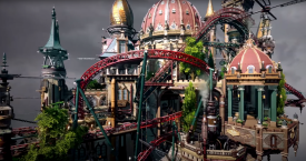
The entire concept started with Suormot (Motty) posting the Planet Coaster creation "Volvara" by the infamous Silvarret.
After watching the youtube video I was immediately blown away by the atmosphere and knew this was something I wanted to be involved trying to recreate. Ziscor, like myself, jumped on board and the trio was set very early on.
WhosLeon and I had toyed with the idea of a floating/flooded Paris Park in the last H2H, so the Silvarret design idea brought me back to the Parisian aesthetic quite quickly. Luckily after Round 1 I knew right away that Leon had gone in the flooded direction while i took the flying path. This was a sigh of relief as I think both of us would have been quite flustered if we had both revisited the exact same concept. That being said I proposed the idea to integrate the "Volvara" design in a more Parisian/French world and luckily Motty and Zisc were in 100%.
I immediately thru down a mega lite coaster layout and some early renditions of architecture in hopes that it would resemble that of the Silvarret counterpart. Jens J, having experience making some NCSO helicopters in the past, showed us some of his legacy work with propellers and we slapped those bad boys down under the mega lites first turnaround and knew this concept of a Flying/Floating City may actually be achievable.
We were all pleased with the coaster layout and the execution of the initial fans so the planning continued. We knew early on that we wanted a multi level "city" in the sky with all of the appropriate infrastructure needed to make the islands be self sustaining. Although some of the utilities may have not made it into the final cut of the park, the mechanical bits and infrastructure done solely by Suormot under the city really sent this thing up a notch.
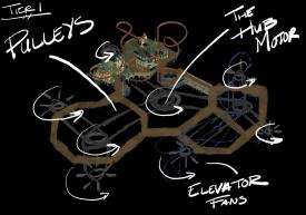
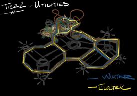
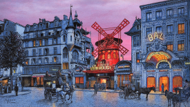
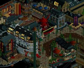
To be honest the theme got lost for about a week as we were trying to determine how to integrate 3 separate islands into one Macro theme. I had proposed the idea of each island being themed to a Parisian musical (Moulin Rouge, Phantom of the Opera, and Les Miserables). This concept didn't get much traction but I knew early on Moulin Rouge is something I wanted to integrate. And yes of course I knew AVC had already done this but you know what? I like a good challenge to one up somebody so I knew it was worth a shot. So Ziscor and I started going ham trying to recreate some concept art from the OG Moulin Rouge and it was at this point that we knew this park really had to be set at night. We knew the palette was going to be perceived as "dark" but it was a risk we were willing to take. We love the aesthetic of the concept art and just started rolling.
The Moulin Rouge Island (Island of Entertainment) quickly constructed into some of the fastest conceived content on the map as Ziscor built alot of Parisian architecture off the actual map and I used scenery manager to give it its proper home. This is where Ziscor was an absolute stud! Architectural genius and micro detail god.
Like I said we were still at a bit of a crossroads at this point when it came to locking down the macro theme and It wasn't until Suormot had mentioned a somewhat industrial dock for the third island that everything just fully clicked. We all were spamming reference photos of airships in the discord as inspiration and we all started to geek. Motty posted this reference image and shortly after he gave us the first of the airships and what became the centerpiece of the entrance docks. Little did we know it was this man's first whack as custom scenery! WTF!?
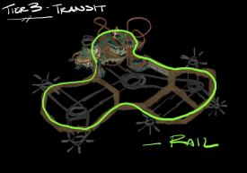
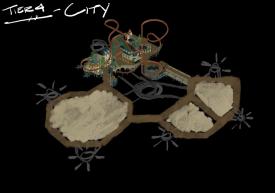
Motty continued his passion in the docks area of the park by describing how he believed a C-shaped layout is how he envisioned the island. I took his initial scribbly paint art as well as some Anno concept art and quickly turned that into a more detailed planned overview that we could more easily build from:
Once the docks were fleshed out conceptually it was time to circle back to the first island that was built (Island of the Arts). This island had been neglected for quite some time and felt very disjointed from the other two islands both in quality and layout. Ziscor and I revisited some of the initial Bioshock Infinite art that initially got us excited and started to integrate some of those buildings into the park. In parallel I generated another overview plan for the area that we could follow a bit more closely and I believe this really helped a lot to wrap things up. Although some things were left out such as the police station and the art heist on the back of the museum, we're all very happy with the end result in this area.
At this point the macro was locked and loaded and it was down to the micro detailing. Myself and Ziscor stayed street level and wrapped up any missing architectural details while Motty went ham detailing all of the supporting scaffolding, transit, motors, gears, and a variety of other vehicles inspired by the images below:
Like I said before, the end result turned into my favorite H2H park that I have been a part of. It was an absolutely pleasure to work with Suormot and Ziscor as we all pushed each other out of our elements. I was constantly trying to one up Ziscor in architecture, which mind you is incredibly difficult, and same with Motty and his technical and mechanical wizardry.
Gonna repost the dot map for all of those who missed it. But truly a cohesive work of art imo and couldnt be more proud of the team here.