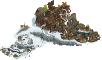
Park / Point Nemo
-
 08-August 21
- Views 11,007
- Downloads 555
- Fans 2
- Comments 30
-
-
 71.50%(required: 70%) Gold
Jaguar 80% chorkiel 75% In:Cities 75% Scoop 75% Xtreme97 75% CoasterCreator9 70% G Force 70% Louis! 70% RWE 70% saxman1089 70% Cocoa 65% posix 65% 71.50% -
2 fans Fans of this park
-
Full-Size Map
-
Download Park
555
-
Objects
330
-
Tags
Round Robin
VS
Diablo the Malaga;
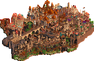
Was hoping for another insanely good park from your team given your standing. Unfortunately this park felt below par for your team. The architecture is blocky and could do with some crunch and the foliage felt rushed. On the good sides; the coasters interaction with the landscaping was great. That entire corner with the church and the river expedition station was my favorite part of the map.
Point Nemo;
Didn't expect such a cool park from a team that already qualified. I particularly liked the transition in darkness. The unique landscaping was also a big pro for me. One thing I didn't really like was the view from the backside of the volcano.
First thoughts on the parks as I go through them:
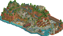
Diablo de Malaga: This park felt like a flashback to H2H of 10+ years ago, both as a positive and negative. The overall macro was good, the coaster had plenty of lovely interaction and some imaginative elements, though in places it felt awkward like the weird second chainhill and section separating the brake run and station. I liked the dramatic nature of the landscaping and the larger forms of the structure. The archy feels very old school CSO, and I would venture a guess was put together by someone still finding their footing with custom scenery. Some places had great smaller moments, but its generally pretty blocky and has a confusing balance of either a super ton of one texture, or a few two many clashing textures. There are also a lot of NCSO-ish elements or setups that, with primarily CSO at hand, feels a bit unusual. Unfortunately, compared to some of the other parks we saw last few rounds, this feels like it isn't intending to be nostalgic and is just missing some of the magic this H2H seems to require.
Point Nemo: By comparison, this park has the wow factor and impact that we've seen so often this H2H. The landscaping and the bold, unique ideas for different deep sea creatures and plants is really incredible. I love the volcano and the beautiful gradients that act as a backdrop throughout. The octopus, and squids, the variety of unique corals in particular, the angler fish, are all so fun and well constructed in very interesting ways. I do think some of the archy felt a bit underbaked in places, with the theme and palette doing a lot to cover that up in a way that Diablo de Malaga couldn't. Even just some trims and smaller details could've helped create articulation and depth to some of the structures. I also think the overall composition is lacking some of the vision we've seen elsewhere in the contest. Overall, a really unique park and a lot of beautiful and artistic sculpture and color choices.
Ultimately, decided to go with TI in this matchup. While there were things I liked about both, TI's felt better constructed and more innovative with the objects available today. Congrats to all the builders on another interesting match.
Diablo: Well there isn't too much I have to say about this park. It definitely feels like an older park which I am not a fan of. It feels kind of unfinished and unpolished. I do like that there are quite a few pretty scenes around the park but none of them work on a huge scale. The park probably could have benefited from having like a single viewing angle where everything looked good. The coaster is fun. I think the layout is great until the 2nd lift but I'm not a fan of putting 8 car trains on there because it looks just silly and no blocks is a very weird choice because the trains just stack on the station. The park does feel very cohesive though. I really like the market bit with the church on the side of the map. The courtyard is also pretty. Overall, its not my favorite but it's also not my least favorite. I really wonder what it would have became with more time spent on it.
Nemo: This is a very good park with a lovely atmosphere. The music really set a fantastic mood and it was fun to slowly follow the sub down into the depths. The buildings and ship are maybe not the best quality but they get the point across just fine. The volcano is probably the elephant in the room. It's just so huge and not very enjoyable to look at for more than a few moments. Where the park really shines is in the landscape, foliage and movement. It feels so alive yet dangerous as you go deeper into the park. The coaster is also really great. So fun to watch and see the weaving in and out of the coral. Many of the structures have such unique building techniques and they look so cool. My favorite bit is down by angler. Great park here.
Most likely going to null-vote, since it affects my team's qualifying so much. But man these are some great parks! Going to leave a review when I have a bit more time to take a closer look at both, but in the meantime - please enjoy these screenshots from the Adventurers Club discord back in June;
Diablo
First things first; this park doesn't "need" anything in particular. It's built with a very specific style in mind and I'm glad to see it. The park certainly has shortcomings, but the stylistic choice of using PT2 is not one of them.
There is clear inspiration from "old-school" parks, beyond the PT2 bench. A large, terrain focused wooden coaster and a splash boats with an impressive large drop as a set piece. All very nice inclusions. The terrain itself is the highlight for me. I really like this style of landscaping and foliage, and I think I know who was involved with it. It's appealing and effective. I'm not the biggest fan of the way the reds in the land are changed by the palette, but that's a personal thing - not a big deal. As for the architecture and the rest of the park, I would argue against FK's point that this was done by someone "just getting their footing with CSO" - this park is very clearly PT2-era inspired with some modern objects added. I think this park was built by people who really absorbed that style and tried to elevate it to a modern H2H level.
There are a few things I thought didn't work out so well. Viewing angles are one of them. I'll address some of the major offenders with screenshots; but in brief - there are some big visual moments that I thought were missed entirely due to being covered either by buildings or elevated land. The most notable being the huge showpiece drop on the wooden coaster. The coaster itself felt like an homage to the huge terrain woodies we once saw in nearly every major release, but I couldn't help but think the layout was a bit overly twisty, and didn't cohesively mesh with the terrain as much as it could have.
Excellent, best moment in the park.
This could have upstaged the prior screen, but the main drop being obscured on most angles was a bit unfortunate.
This is a great corner - I love the different levels and the foliage, and these are a few of my favorite buildings on the map.
Also really liked this, favorite part of the fortress. The tower, gardens, and even the coaster station nestled below are quite nice.
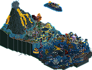
Point Nemo
I do love the way you guys captured the undersea "landscaping" and "foliage". The coral is a standout, and the rockwork is pretty well done. This park definitely relies on effects! We considered the track layering trick for Bellum, but decided against it. I think it works nice here, just a little glitchy at times, which isn't terrible. The bubble effects and marine life swimming around was a nice touch. Most of the sculptures feel quite well done, if only a little...big. I know, I know - deep-sea gigantism and all that, but still. I can't not comment on the ships, right? They're fine. The surface ship has plenty of clipping going on, but I liked the submersible a lot and the sunken trawler off near the volcano was well done.
The biggest drawback for me here was that I felt an odd sense that there was a lack of content. Obviously the scenes are well executed, but once I had watched the coaster do a circuit and saw Steve protect his trees - I felt that I had seen about everything this had to offer. A unique setting and some really neat scenery/ride use is fun to see, but it can only keep me interested for so long. There were several comments about ML's buildings being blocky/unfinished/unskilled; I felt the structures here were significantly less detailed and fell a little flat. (I'm mostly talking about the blue ones. I actually thought the ones near the drill were fantastic and I wish that they were all as good as those!) The fact that they're interesting shapes seems to help them a little, but they don't stand up to a close look in my opinion. Most of the landscaping is great, but I wish the volcano had more of a role in the park other than sitting off to one side looking cool.
Fabulous coral; I think we saw similar from Croaked but it was nice to see this application.
Favorite building; thought this one came together really well and was visually interesting.
The concept of the generator is a great one, but the ring of light was a little rough on execution. These buildings up here also felt much more plain and less interesting when compared to the rest of the map.
Love the sub; go get it Steve.
The pioneers used to ride these babies for miles.
________________________________________________
I need some more time with both parks before I decide. On one hand, there's a technically impressive park that is heavily reliant on effects, on the other there is a more old-school style park with more impressive scenes that misses out on a few even more impressive scenes due to the way structures or land conceal them. Both parks are on equal footing content wise; perhaps a bit less than we've seen in other rounds, but still both impressive works none the less.
Diablo de Malaga:
I always love a good terrain wooden coaster, lots of great interaction moments here, like how it dives behind the waterfall. For architecture my favorite part is the area in front of the bridge/towards where the guests come in, just love how everything comes together there and fits into the space.
Point Nemo:
An interesting concept, and done very well. The documentary clip helps set the atmosphere. All round the park there's a great mix of scenery, trackitecture and CTRs to make it look busy and alive. And then there's the creative object and mini golf hole use to make the reefs.
This matchup is interesting; there's one that is very nice traditional parkmaking with a coaster that harkens back to the days when parks would have these big landscape woodies that had aspects you'd never see in real life; and, the other is a cool concept, all modernized, and filtered through an interesting bioluminescent palette.
Diablo de Malaga: It's very hard to make a giant rectangular plaza like that and pull it off, and I think it did here. The standout was the woodie, that at first I was a little unsure of in its break from orthodoxy. Upon viewing some more I love the take on it: crazy height changes, a station at elevation, some ambitious elements in there, love it. The colors were quite beautiful. And the landscape setting was very nice, I like the way the land sort of drapes around the castle.
There isn't much I dislike in it - it feels a bit small, but I think this is a function of it not being crammed than anything. I wasn't sure I was into the trackitecture awnings on the castle, personally, they seemed like they should have been canvas to match some of them below. The main negative for me was the use of the brick arch objects in conjunction with a lot of 1/16 (1/32?) bricks to line things. It would be very much a benefit here to erase the extra thickness of the arch objects to avoid the bizarre perspective against walls. The other thing would be the use of castle sloped blocks; in my opinion you'd get enough value from giving them brick texture on the sides to warrant spending time on the object. Building something where the focus is on the aesthetics here rather than bombastic details, I think these little bits should be examined. The last negative I found was the flat interface of brick and land next to the brake run, it'd be nicer to continue brick all the way down to "set" it into the landscape more.
These are pretty small things, the above. The towns areas were great - nice, clean, and atmospheric. The hedge use was excellent, and the subtle raises in the corners are a good touch to add subtle complexity. The landscape textures were a great choice here, and the interaction of coaster and landscape was top-notch. There's some areas the landscape started to get a little bit less organic and the shape appeared more rote land raising. There's some very well done motifs in here, like the "ornate marble walls" (don't see those often), the use of half planks with either eaves or poles below, and the slight rounding of the tower roofs. (I do think 2ht Spanish roofs would be justified). But the coaster is awesome, guys. I love the huge brake run, with the post-brake course (? name). Not sure why the peeps were loading so far back in the station, some space in the trains would've been the final kicker.
Excellent park, but I have a feeling this will go undervalued, which is a damn shame. There's so many little choices done in the design here that, whether intentional or not, were truly brilliant. I've picked up some of the reasons/methods of why parts worked so well, and it's great stuff for parkmakers to add to their toolkit. But, I would guess a number of people won't see what's under their noses, unfortunately.
Point Nemo: The concept of underwater can be brought to some great places; did this go there? I'm not quite sure. I'm looking at it, and it seems like there's some sort of backstory that I'm unaware of that would explain some of the content. I can see the gist is a submarine excursion to an underwater base, cool, but after that it's a bit wonky IMO. There's awesome thematic bits, like the drills, the viewports in the base, the transport line thing. And then right next to that is a big octopus named Hank. For me, it's sort of like it was ready to go to this cool underwater research base park and then someone wanted to also make giant sculptures.
The park is strong in parts of the underwater base and the corals. There's some solid sections of landscaping at the bottom that interact with the coaster. The use of mini-golf for flat corals was probably the highlight of the park. The coaster was nifty - our team tossed around the idea of glitching track for Bellum but tossed it as it looked a bit unintentional. It was better implemented here with only using on some specific track elements, but there also was times I had the track randomly lighting up and glitching without the trains passing through. The coaster was missing out on half of its potential not using the landscape of the rest of the map.
One half of the map was a volcano, which was very static compared to the movement of the other half. The lava was also static, as was the explosion. Sort of odd, but I get there's some limitations on your tools available. Personally, I'd have opted for an unexploded cinder cone volcano to get the cool shape and mitigate having 'moving' parts that don't move. It was kind of a big mound of objects IMO, so much so that I thought it was a cutaway queue, but there's nothing inside either. It felt sort of like a big thematic element waiting to be used by something (maybe the coaster).
I think there was a ton of potential here, in terms of theme and scope; even keeping with a slight cartoony style would be strong, but I think the uneven scaling here put it into the realm of disjointed sculptures. It's got some brilliant little bits strewn about, however.
A good matchup, I went with ML on this one; but, I would guess - based on the trend this season - it's going to get overlooked too much.
Nemo
Nice touch with the sound file, and cool tricks to give of the seafloor vibe. It's just not something I am really interested in seeing in RCT like this. Great effort though, the underwater architecture was very cool.
Diablo
Nice classic parkmaking, and I agree with CC9 that it doesn't need anything extra. Imo it might even have an extra thing too much (the palette). I liked the architecture, especially how you guys made the windowless walls work and the extra touches of colour the awnings etc. added. It's a bummer some cool parts of the coaster weren't visible.
I ended up voting for Diablo
Point Nemo:
First of all, love how you set this up with the boat surrounded by the eerie blackness. Really great first scene that sets the tone of the map as the exploration for the viewer to find what's below. The park itself is super atmospheric - nice use of the palette (definitely best viewed at night time) and the music is a great addition. I do somewhat agree with the criticism that it's a sculpture showcase at times, but I think the map is varied enough in its content and has a lot to keep interest for me. Loved the landscaping, excellent use of these new rocks in this area and the colours gradient marking the depth is a nice touch. Also really liked the corals and plant life and the variety among them - extra shoutout to the creative use of the different golf holes for the various shapes. I enjoyed the various research hubs as well, sometimes a little flat in terms of detail but some of the ideas included such as the research pieces/drills built into the rock and the eels are great. Overall a unique piece of work and something to be proud of, that rounds out probably the strongest RR lineup of the season.
Diablo de Malaga:
I appreciate the choice of PT2 bench for this park, quite nice to see a team take that risk as with the NCSO choice last round and I think it pays off in the pursuit of the classic RCT feeling the park evokes. Very cool woodie layout, perhaps a little too spaghetti-like near the start but it has a number of strong set pieces with the landscape and the final drop into the valley is brilliant. The castle was definitely the biggest feature of the map, loved the dominance of the red roofs and how you incorporated different textures and small colour pops like the pink and gold. Don't think the steep pirate roofs were needed here, they sort of stick out among the spanish roof choice. The little enclave at the back was one of my highlights too, nicely composed spot there - same goes for the splash boats framed by the waterfall. Great work, I enjoyed this a lot though it felt lacking a level of deeper detail in places. A great ode to classic parkmaking however.
Diablo de Malaga Now on to the positive side of the story: the landscape is huge, and I love it! I also love how you went with default land textures. Nothing wrong with plain rocks. Foliage is a bit tropical, but oh well. The coaster uses the terrain well, I did not see that HUGE drop at the end coming. Awesome. Layout as a whole is a mixed bag, it lacks some flow and there are some ugly angles, but it’s also original and has some great looking set pieces. The ending between the brakes and the station is so weird, I kinda like it, but I think I would’ve chosen a different setup. Definitely no lack of space here to come up with an alternative. Then we get to the archy. Like I said, the scale seems off. I feel like the 4x4 structures should’ve been 3x3, and the 3x3, 2x2. Due to the size, you’re also stuck with large featureless walls. Add to that HUGE windows (as well as tiny windows) and weird trackitecture awnings (why?), and it’s probably my biggest specific criticism for this park. But again, some parts are really nice. The village looking bit in the corner is just lovely, the courtyard is great, and I do like the overall aesthetic, with the monotone beige-reds of the architecture in combination with the hedge maze motif.
First thoughts upon opening the map: old school, rushed, crude, spectacular. I can imagine that due to the terrible odds you guys are facing, you did not go all out with this park, which I totally respect! I’m glad you got another park out. And while it has some notable flaws, I definitely enjoy it a lot. The crude style is a strength due to nostalgia and appealing, easy to digest simplicity, but also a pitfall, because it has to be backed up with a good composition, which I found lacking here. A strange map layout, some odd angles, and odd scaling are some things that hold it back in that regard. On the other hand, the clumsiness of the way the map is set up also contributes to the nostalgia.
All in all: nice park. One of the weaker parks this H2H admittedly, but I’m glad you made it!
Awesome drop.
Dislike how the trains pile up... You had so much space, you USED so much space for the ride here, but what was the point if the ride functions like this?
This angle for the coaster I found pretty horrible.
Best archy and atmosphere on the map!
Very nice area.
Point Nemo
Great name and great concept, and the custom sound file really elevates it! Also a good use for a palette, the deep blues and the contrasting luminescent tones make for a powerful aesthetic, regardless of object use. The latter is a tad below average for H2H where it concerns architecture (with exceptions like the driller and the submarine station), and the the flat portions of landscaping. All the corals though, as well as the Fisch rocks (what’s in a name), are fantastic. The minigolf corners as well as the rotodrop cars are well done. Reminiscent of Alex LL work, but adapted to RCT2. I’m also being reminded of Monstrocity from H2H6, FK did a great underwater area with a similar but smaller anglerfish, and tentacles reaching from the deep, and glass tunnels. But it’s nice to see that setting expanded like this. Some details that stand out are the bubbles emerging from the drilling site, and the fish swimming around the anglerfish’s rod. There’s a few criticisms that come to mind… First of all, is this park finished? The transport system looked rough, and the bobsled rings are just giant coloured rings that don’t look like coral even remotely, unlike the lower level stuff. I really like the underwater volcano, probably more than most, but it definitely could’ve been more dynamic with a more central role to play in the map. I guess that ties in with the general composition that was lacking a little, the park seemed to have one good main angle that made everything look good, and the other angles just happened to be. You can’t make everything look good from every angle, but you can make sure that from every angle, there is some stuff that looks their best. Lastly… I think dr dirt said it? Conceptually the park was a bit all over the place. Scientific seafloor exploration, or suboceanic nightmare with monsters and secret buried evils? The concept lacks some focus. Stuff like the ship wrecks and the generator are just filler. An important rule for me in H2H is committing to a narrative, and not letting yourself be distracted by irrelevant stuff. Go the science route, or the Lovecraft route, either way, leave out whatever is not directly related to that.
Anyway, it’s a great map with a wow-factor to it. You definitely got more right than wrong. Great job.
Eh, unfinished?
Love the little elliptical gates!
Fantastic creative stuff.
Ice cream!
My vote goes to TI.
Finding Nemo won me over instantly, I'm just a sucker for this sort of thing. Even though I looked closely at both parks over the last day I don't think there was any real competition in my heart. I just love underwater parks and my own micros in mm3 and gt were very much in this realm. So I appreciate the challenges of it and then as I clicked through the TI park I just got super hyped finding new underwater objects and vehicles. There's plenty I might critique but this park but it so instantly sparked joy and genuinely got me excited about playing RCT.
I thought both parks were pretty cool.
Diablo de Malaga
+ The coaster is super weird but it somehow works. I hate it and love it at the same time. Favourite part is the epic drop off the cliff. Also think the little final lift hill section at the end is weird but cool. Only thing I wish was that the block sections were fixed properly so the trains don't pile up at the end of the station.
+ The villa's buildings with the maze that are accessed from the path that goes underneath the coasters first lift (which also looks great btw) are pretty cool. Just looks good and well composed.
+ The village opposite on of the castle on the other side of the bridge is pretty cool as well although the red brick wall on some buildings looks a little out of place imo.
+/- The castle itself is a little bit hit or miss for me. I agree with critique that others have said that it looks a bit blocky and underdetailled. I know this is a pro tour style park, but I still think more details could be added in some places. I think for example the area near the Scramble ride looks very good, but the rest of the castle doesn't have the same level and falls a bit flat imo.
Overall a cool park though.
Point Nemo
+ This park has a big wow factor on first opening it, which I think is pretty nice.
+ Love the volcano.
+ Love bob the angler fish.
+ Many of the plants made out of the mini golf track look great imo.
+ Love the base transport.
+ The coaster was cool and the track lighting up is a cool twist. We also considered doing this for Bellum Aeternus and even tested it out but in the end decided against it as we thought it was too glitchy.
- The coral rings didn't really do it for me, felt a bit underdetailled.
- I think the archy of some buildings is pretty simple and not that good looking, especially for the buildings on the higher level. It is covered up a bit by the palette so it doesn't really catch the eye but its def there. While it does fit the theme a bit as in this scenario these buildings would mostly have to be practical and not fancy, I still think it could have been done better.
- The ships in this are all pretty blocky.
When I saw the first screen I actually did not expect much from this park because of the blockyness of the ship and lack of details. However I am glad the rest of the park proved me wrong. Overall this was still a really cool park.
It's a close call for me but in the end I am gonna go with TI because it kept my attention for longer and seemed to have more details. Especially the folliage and all the sea creatures made me decide for this park.
Don't have much time for a long review, but just want to say what a terrific woody that was in Diablo. Absolutely loved it. Speedy and nostalgic, and gorgeous. Also a case where I actually loved the palette and what it did with the park. Very enjoyable entry. Pleasant, yet perhaps a bit challenged by too much height elevation.
Point Nemo was just so strong with its inventive ideas. The corals were just gorgeous. A lovely foray into the deep sea. Nicely amplified with the custom music narrator.
The ideas in the TI park won me over in the end.
Diablo de Malaga - The whole plaza area is really nice, and I appreciate the old school woodie. I did find it kind of strange that it stalls a train on the final lift hill every time though. I can't help but feel like that really big dramatic bridge should have been the centerpiece, not something on the fringe of the map, and the woodie could have interacted with it more.
Point Nemo - Wow there are a lot of crazy ideas here. I'm not convinced all of them really work, but the sheer effort to just try to make it look busy and full of life is certainly compelling. I did find it very difficult to track rides and get a sense of scale and distance when rotating because it's so hard to get a clear sense of where the features are. I admit I'm not generally one for these underwater high fantasy parks, and I think the deciding factor for me here is that I just like Diablo a bit more than I like Bioluminescence, but I do love the inclusion of the little color change glitch for the track.
Manual Laborers coming in guns blazing on this one. Maybe more like "water" guns blazing? Enough to like, annoy someone but not like, you know, murder them. Yeah, that sounds about right. Hey, that's not a knock though, water guns are water FUN. This map was right up Steve Alley (weird, but okay). Big, classic wooden within a tropical landscape and some neoclassical RCT2 architecture...sold, hombres. I do think the composition was a little lacking maybe, on top of some of the terraforming missing that true nature of a high quality park you'd find in the PT2 era. Overall, I think you dudes mostly nailed it but the thing pushing it over the edge in terms of overall refinement was missing for me.
When I saw the screen for Point Nemo I was like "wtf is this dumb looking boat screen" and then I popped it on with the custom music and followed the little submarine downwards and I literally stood up out of my chair and needed a moment because, wow, what a...well, what a moment. Fuck Gangland, I am all about following inconspicuous vessels into unknown places instead of some dumb title card opening up for a murder. Aside from the wow moment, this was pretty great in regards to overall parkmaking. Landscaping was solid apart from the volcano (idea was great but I'm guessing this could've been a victim of time crunch) and the architecture did the job. Coaster felt like kind of an afterthought to me, maybe because it's surroundings were such a scene stealer, but it was fine for what it was. It served it's purpose to the story and that's fine! A great map, dudes. You're really inspecting the *fuck* out of these tiles.
Although the two maps are very different, they ultimately gave me with a similar feeling that they left some of their potential on the table.
Manual Laborers
It is a gutsy move to fall back on fundamentals for the final round and focus on some good old fashioned RCT comfort food. I enjoyed this a lot and I think adding little modern touches like the palette and CTRs helps keep this feeling fresh and not like a stale retread despite the throwback bench. The coaster was a lot of fun with elements like the figure 8 and I even like the awkward ending, except perhaps the piling up at the station. The river ride was solid too and overall the architecture and scale was stunning in combination with the dramatic landscape.
I'd say this was just one fun element away from really being in contention. Based on the composition of the map I would have liked to see an old school trackless adventure ride (similar to Escape from Rockwood Prison). It wouldn't even have to be bombastic with timed explosions or anything but just could have made use of the open space. Perhaps some CTR base jumping or bungee jumping peeps off the bridge could have provided some fun interaction the woodie so deftly dodges. Another sticking point is both of the major ride stations. If you are going for a map that is scaled back, you have to nail what you do go for and I thought Diablo's was a little too far back with an odd tile offset and you had some old school unappealing "paper walls" around the River ride station which I can't even remember when that was something to watch out for. Overall though this was a lot of fun, fresh and well worth the effort. I hope it paves the way for some PT style experimentation.
Tile Inspectors
The opening scene was very cool in combination with the nature documentary audio and it helps build the suspense perfectly. I think I was most struck by the effective use of color to sell the depth and layers of the sea floor. All of the CTRs really add a lot as well, plus I can think of some alternate uses for them in the future, including more subtle ones like the shifting sands.
It felt like time might have been an issue towards the end which is a shame because with more polish this could have been a fun semifinals entry. I can understand having to finish the main season strong and this map certainly has a lot to offer. The main base architecture felt a little underdeveloped (with some missing glass in spots?), as does some of the map storytelling. It seems to be part ocean research being interrupted by sea monsters and part industrial overreach but it's a little muddled. I have to confess that I'm getting burned out on these Intamin Ultra lites or whatever variation this is. We have seen many and it's not like this one is particularly poorly executed or anything and the glow glitch effect is fun but it just didn't leave much of an impact as a main ride. Your team also has set the standard for CTRs and I would have expected something more from the volcano, such as flowing magma or boiling water vehicles. As is it's a little sterile on that side of the map.
Overall though the coral spire and use of minigolf and other ride vehicles were a lot of fun and elevated the TI above a very solid macro focused map for me. Congrats to the Tile Inspectors and well done to the Manual Laborers for finishing strong.
Nemo
What a fun idea! The screenshot threw me off a bit at first; I expected something much less finished or refined based on it, but I was happy to be surprised. Great use of a palette, which invokes bioluminescence nicely. As others have said, the archy may have been refined a bit more, but it didn't detract from my enjoyment of the map. I also loved the brilliant object and ride use throughout to make believable coral formations.
Diablo
It was nice to see another park this H2H that isn't dependent on crazy density, realism in coaster layouts, and ultra-detailing (not that we haven't had any of those, I just wish we had more of them). I liked the coaster a lot, with how much it swooped and dived around the map.
In the end, I liked the fun ideas and execution of Nemo a bit better, so it got my vote.
Finally got some time to dive (ha) into the round 7 parks.
First up Manual Laborers – Diablo del Malaga. A very decent park with strong old-school vibes (at least old school for me). Feels ‘proper’. Like ‘by the books’ if you know what I mean. I liked the Woodie. But it felt a little unpolished and it didn’t ‘wow’ me. Also, I was kind of quickly through it.
Tile Inspectors – Point Nemo had a fun opening with the underwhelming ‘boat in black mass’, just to surprise me with all the underwater stuff when I turned the screen. I really liked how you guys did all the coral and archy. Felt very liverly. You guys stole my heart with Hank. I love Hank.
My vote goes to Hank and his park.