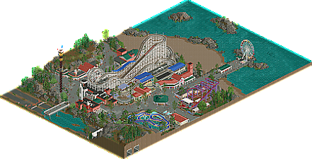
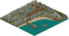
Park / Woodchip at Erie Point
-
 24-August 22
- Views 2,457
- Downloads 394
- Fans 4
- Comments 11
-
 79.50%(required: 65%) Design
CedarPoint6 85% G Force 85% SSSammy 85% CoasterCreator9 80% Cocoa 80% In:Cities 80% Jappy 80% RWE 80% Terry Inferno 80% saxman1089 75% Jaguar 70% Scoop 70% 79.50% -
Description
This park was made for the ‘Pimp My Ride’ building challenge organised by dr dirt, on the NEDesigns Discord.
Part 1: Coaster layout based on the default track design ‘Woodchip’ (ottersalad)
Part 2: Macro planning and rough landscaping (Whosleon)
Part 3: Station and coaster infrastructure (dr dirt)
Part 4: Finishing the map (alex)
Enjoy! -
4 fans Fans of this park
-
Full-Size Map
-
Download Park
394
-
Objects
1
-
Tags
Similar Parks
-
Kings Valley
-
Palisade Gardens
-
Southport Pleasure Beach
-
Luna Park
-
[H2H7 R1] Circus Circus & Adventuredome Atlantic City
![park_3324 [H2H7 R1] Circus Circus & Adventuredome Atlantic City](https://www.nedesigns.com/uploads/parks/3324/aerialt2970.png)
-
Raven
What a combo; fantastic work all around. I forgot I was looking at something made by 4 different people at 4 different times.
Lovely gritty seaside park vibe - my favorite kind of park. Other than the obviously well done layouts, architecture, and planning - I really like the landscaping. In case it isn't obvious yet, I'm a big fan of the chunkier full-tile landscaping that you've accomplished here - not only that, but I think you did a great job at capturing that "rocky coastline" vibe that I think is something a bit underrepresented in RCT.
I love this, but also hate this. Probably one of the best design releases in a long time.
Wow. This is gritty as heck. Seems like it is in the same universe as Grapevine. Love the old school boardwalk/Coney Island vibes with the arcade and midway games tucked underneath the ride supports. Really seemless.
You and Dr Dirt did wonders to really put the layout I did on a pedestal. And Leon did a great job with the overall macro. Lovely how it all came together.
@G_Force: So what you're saying is I've contributed to two of the best designs this year? Aw gee thank you
This is something I totally didn't think of and it's 100% correct, love that.
This was lovely to look though, the wild mouse is just done so well. The weird river rapids ride is so cool!! Never seen anything like it. The main woodie is great, supports are everything! So freakin good. the buildings are all so good clean simple and effective. Super fun release!
Big big fan of this! You're the king of cleanly built grittiness
I love the way you do landscaping, so uncomplicated and elegant. The flooded road was a fun touch.
I kind of wish the peeps could go down onto the beach, but that's a minor quibble.
Cool to see how this came together. No one feature is a stand-out or never-before-seen, but everything is arranged perfectly in its place.
I agree with Pants - peeps on the beach would have been a plus.
this is excellent. the vibe is this perfect mix of kind of dark and brooding but with this mid-century design flair. like the kind of beachside park that can't stay afloat but is beloved by locals.
I particularly love the little infrastructure details like those dried out tunnels. Just really cemented the sense of place for me. And the vertical park entrance sign, ooft. Also, I appreciate how big the beach is. so often in rct people majorly undersize their beaches
What a great tribute to a classic prebuilt. The classic realistic pier setting is perfect for it, I love the custom supports and the extra rides are well done too.
I hadn't had the chance (ha, I'm just lazy) to comment on this yet, but I still want to point out that this is really good. The main square feels so real! I don't even know why. Perhaps it's the flowers and the not overdone 'crunch'. Some of my favourite touches are the dark green quarter tile overhangs, the ice cream sculpture and the braces supports holding it up. Mundane technical detail, but it helps to ground it all. Rainbow awning for the ferris wheel. Rip Curl sign. Poster spam for the Woodchip exit. That's the first time I'm actually mentioning the coaster, strange enough. It's obviously good, but somehow mostly as something to help sell the map as a whole. Another 'gritty' thing I like is how the final brake run is situatied on an ugly rooftop. It's all so easy to imagine in real life!
Well done guys.
Very enjoyable design. The overview already atracts me. The treadmarks from vehicles is a nice touch. Heavy rain i guess. Woodchip is nice. Nothing spectaculair, but very well executed. Those custom supports look neat. The entrance building is nice, but the overhang was a bit much as in disguising the entrance a little. Ofcourse the big letters made sure not to miss it.I liked the entrance to the Tunnel of Love. That heartshape made it very noticable as well. Nice touch btw, to put that ride below Woodchip. Practical thinking. The use of colors, palette and wooden buildings gave it a warm atmosphere. Riptide is also simple, but effective. The supports look pretty. I'm just wondering why the roof of the station seems to be floating... Overall, very nice design. Very clean en beautifully organized.