Park / Twisted Timbers
-
 29-January 23
- Views 1,995
- Downloads 293
- Fans 0
- Comments 7
-
-
 47.00%(required: 65%)
Design Submission
47.00%(required: 65%)
Design Submission
ottersalad 55% CoasterCreator9 50% Cocoa 50% In:Cities 50% Jaguar 50% Terry Inferno 50% Xtreme97 50% posix 45% RWE 45% chorkiel 40% Liampie 40% Scoop 35% 47.00% -
Description
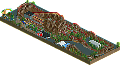
Recreation of Twisted Timbers at Kings Dominion.
-
No fans of this park
-
Download Park
293
-
Objects
1
-
Tags
![park_2096 [NEDC] Vesper Island - #3/9](https://www.nedesigns.com/uploads/parks/2096/aerialt1888.png)
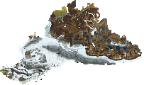
The general footprint and queue structures look good, but the first overbank seems dramatically oversized and forces you to have all those long straight sections which look kinda awkward. Like looking at photos I don't think the real ride is this big, and sucking that in would get rid of a big chunk of these long straights. Also the hills on the back side of the ride are a little lopsided, with tight radii at the bottom and wide radii at the top, backwards from how it would be on a real ride.
On another note, I don't think you've really included enough of Apple Zapple and Grizzly to really give context, so I would have rather just seen the map chopped at the path instead of forced to be rectangular, but that's kind of a minor nitpick.
The natural foliage looks nice but the trees near the queue entrance look unnaturally green. I'm not sure if that's supposed to represent something about the real ride, but I didn't pick up on it.
I liked the inclusion of the tractor over the queue.
As someone who rode this a good number of times last summer, this gets incredibly close given the limitations of RCT. The small tweeks I would make (personally) are the first and and final turns. The (prelift) turn feels a lot flatter (not a curving drop) - but I'm not sure there's a good way to get the right laterals in RCT without doing what you did. The last turn is tricky because of the limits of RCT - but to my eyes it seems like like it should start banked and then unbank for the last 45°.
I'm not sure there's a lot that could be done re: the first overbank as Ling was talking about. Maybe it could be brought in a tile or two - as the turn to the lift does get up quite close to the inside of its supports - but that's about it. I think TT just has a lift hill angle that lies between what you can create in RCT and that's going to throw the scaling off no matter what you do. This hits roughly the right speed, so it still seems right-ish w.r.t. scale.
The camelbacks "feel" right - they provide strong, sustained airtime and have very tight pullouts given the speed they're taken with. It looks wrong to the eye, but watch the train go over it - that's what TT feels like. Soar and SLAMMED. It has memorably strong positives compared to the other RMCs I've been on.
Great detailing throughout - the lockers are a nice touch that are hard to even find even though they're a prominent part of the TT TSA experience. I really like the entrance sign, the crater, the tractor and the truck out front. I think the "unnaturally green" trees are supposed to represent the "mutated" trees that don't seem very well documented in any photos I can find - but I recall from being there.
The overall architecture (other than the station) is probably a *hair* small and underdetailed as a result (no room), but this does still look like a strong start to a greater King's Dominion projection. Though I wouldn't blame you if this was the part you were most inspired to do and are now satisfied.
Recreation as a first submission, love it!
For an RMC, you did a pretty decent job recreating the layout and most of the major elements. The surroundings were definitely identifiable as Kings Dominion and the attention to detail with the backstage was nice to see.
Overall, I'd like to see you keep experimenting more with cso and this style, hopefully refine it more and get more comfortable with the object selection and such. Not sure how much you've built with RCT cso before, but hopefully you keep at it!
Cool recreation. I like the overall commitment to replicating the real thing, but it seems a bit stretched out to me in spots. Could probably have tightened up the layout some and reduced the footprint.
In the future I'd focus on sprucing up your foliage - looks like the coaster is just sitting on bare dirt at the moment. Look forward to what you have in store for us next.
This is promising, but not quite there yet, in my opinion. The layout had too many awkwardly stretched out parts, and incorrect radii on the hills - though Ride6 makes a decent point, a subtle expressionist touch perhaps: distort the dimensions to more accurately portray the sensation. The surroundings were rudimentary. Some nice touches, but overall to muddy and open. A less close cut on the front side would also have helped, I think.
Looking forwards to seeing you develop your style. I can see this going somewhere
With a mostly linear shape, few standout elements, a bunch of tiny hills, and very little surrounding it, the real Twisted Timbers really doesn't give RCT builders a whole lot to work with. With what KD provided, you did alright with this in terms of accuracy.
Could you have taken it further? Absolutely. With this style of generic realism, the key to landing it is in the details.
- Give the terrain more textural variation. The large sea of default dirt gives that portion of the map an unfinished look, and going by the terrain underneath the real Twisted Timbers, you could have had quite a bit of fun mixing various dirt, sand and gravel textures. Even if flat, bare land is what the area calls for, you can turn that alone into something magical.
- Give backstage areas some life (e.g. vehicles, trash receptacles, miscellaneous grit) and some textural variation. One large sea of plain gray tarmac with no transition to the terrain around it calls for more attention.
- Create deliberate shapes with your trees, and let the small foliage grow organically rather than just sprinkling a few Sawyer shrubs around here and there. Do not be afraid of grass objects and wildflowers, as they can add a nice solid layer of realism on their own.
- Consider building the supports from scratch with flat and sloped deco trims rather than using the big Sawyer support and its variants. While I wouldn't recommend this for every wood-supported coaster, if there is not much else around the coaster, the support system can at least be realistically intricate. It's also a useful exercise in shaping supports more accurately in a way that the default support structures cannot really provide.
- Forget the New York Roof Pieces exist. Either a CS object or a non-WW/TT default texture would work better since they're visible to everyone and have stronger blending capabilities.
I would recommend looking at Scream by Louis or ACEfanatic's recent Superman coaster as references for how to exemplify the above suggestions, as both builders took a coaster without much around it and maximized the aesthetic value of foliage and ground textures. With those weapons in your arsenal, you too could turn any coaster in the world into a Design!