Park / [NEDC6] Sugar Rush
-
 30-April 25
- Views 0
- Downloads 99
- Fans 1
- Comments 28
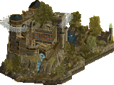
![Park_6131 [NEDC6] Sugar Rush](https://www.nedesigns.com/uploads/parks/6131/aerialm6367.png)
-
![Park_6131_[NEDC6] Sugar Rush](https://www.nedesigns.com/uploads/parks/6131/logot.png)
-
 70.00%(required: 65%) Design
CoasterCreator9 80% J K 80% RWE 80% Turtle 80% Terry Inferno 75% deanosrs 70% posix 70% Recurious 65% pants 60% RobDedede 60% SSSammy 60% chorkiel 55% 70.00% -
Description
Welcome to Sugar Rush!
Blast around the kingdom of our heroine Venellope Von Schweetz with her friend Wreck-It-Ralph! Travel to King Candy's Castle to ride the namesake ride Sugar Rush. Or, test your speed at the Strawberry Shortcake Circuit! If that's too much for you, enjoy a round of putt-putt in the Candy Cane Forest.
If your you want to satisfy your sweet tooth, your favorite racers have set up shop around the kingdom!
Thanks Pac for the awesome layout, and thank you Josh for the music. -
1 fan Fans of this park
-
Full-Size Map
-
Download Park
99
-
Objects
1
-
Tags
![park_6140 [NEDC6] The Cartographer](https://www.nedesigns.com/uploads/parks/6140/aerialt6372.png)
![park_6119 [NEDC6] Hydrocelestis - The Ocean of the Stars](https://www.nedesigns.com/uploads/parks/6119/aerialt6365.png)
With a truly unique look, ottersalad delivers a submission that's sweet in every sense of the word. A delightful concept brought to life with charm and creativity.
I could tell what you were going for within seconds of opening the park and before I really started exploring, so very well done there. Absolutely evocative of the source material, for sure. Very bold choice going for this aesthetic - I think you pulled it off as a whole, but certain aspects of it don’t seem to hold up as well in RCT as others do (castle - fantastic; cake block stores dotting the outskirts - less impressive by comparison). All in all; it’s fun and supports the coaster well. 80%
+++ Cel-shading is here to stay! I didn’t realise how much this would translate to other themes moving forward because Nintendo’s aesthetic and effect were so strong. Such a great call choosing cel-shading to stand out from the crowd. The second cel-shaded park that I’ve seen that I’m obsessed with.
++ I know you joked about this being stupid over Discord, but I feel this was exactly the right call from a conceptual standpoint for your RCT game, it looks like you had so much fun and dabbled in new parkmaking styles at the same time. A lot like Walto does.
+ Music was brilliant, because it was so catchy, it’s made this a very memorable entry.
-Some object combos didn’t work as well as others, for example I wanted more readability on the middle section of the coaster station but at the same time, it was one of the highlights of the map
-Only stinker to me was the colour you chose for the supports, I think this would’ve existed happily as a shaded colour, not the flat colour that was added to the palette.
-To vote higher I wanted a bit more depth to the theme, I saw the gumdrops as the audience in the race track and loved this, but making more characters come alive, more custom candy land signs (like the go karts start of the race), would’ve just turned the notch up further on this theme.
Great work Otter, this was exactly the right move for this competition.
80%
Awesome entry, Otter, diving right into the cel-shaded Nintendo objects and coming out the other side with a completely new aesthetic takes a good imaginative spark. I can feel my teeth cringing just looking at the map, how sugary it all feels so excellent job evoking that. Love some of the smaller details - the popcorn and candy boxes lined up next to the go karts (clever use of the cloud object there), the various cake flavours, the little tufts of wave in the chocolate river (again the cloud object, mvp here). A few areas didn't quite stack up I don't think, such as the candy cane forest mini-golf which feels a little undercooked compared to the rest of the map. But the overall map is a successful realisation of the idea.
A standout moment is the candy castle setpiece for the station:
Really fun entry here! Glad to see the new objects being put to use in a way that makes sense. It fits the IP well. I love the different set pieces you have that the coaster interacts with like the station and cake inside the helix. The go karts add a lot of life to this as well. Overall well done! I'd give it a 75.
I’m so sorry otter, please understand I am a fan of yours. I really didn’t like this. I’m not a fan of the cell shaded look in RCT, and I found the choice of theme to be saccharine to the point of nausea.
The dominant viewing angle appears to be “inside L”, where the cobra roll is beneath the predrop turn. There is no path over the cobra roll, as this section is contained inside the go-kart track, which nicely frames the elements. Otter managed to send the karts under the loop, the barrel roll, under the turnaround into the MCBR, and under a corkscrew, which feels excellently composed. Makes me wish otter had chosen any other genre and item set.
I think that is realistically all I have to say. I found the viewing experience unpleasant, so I have to remember all the times that otter made me fall in love with him. Talent shines through, but we all have to accept that some things just aren’t meant to be - like me enjoying this item set. Or theme. Or music.
SCORE: 60% against all odds
Watch my initial reactions here!
RAMSES & SUGAR RUSH
Someone said: "the skills are getting more and more sophisticated" I agree 1000%, 2 excellent parks, very complicated to choose, I need to evaluate everything again.
Big vote spread on this one which is kinda to be expected with such an out-there theme choice I guess. Bound to be slightly divisive, but i'm personally glad you decided to make something so different.
I really liked it. The best thing about this, for me, was that the basics were still very well done. Composition, colors (garish as they are), everything works pretty well together. After a couple of viewings I wrote down "I somehow ended up liking this one much more than I thought I would", which is probably still how I feel.
The one thing that hurt it slightly for me (but is understandable) is the mix of cel-shaded and non-cel-shaded objects.. slightly jarring but the only fix is making tons of new objects to match which isn't necessarily feasible for this contest. The other thing I wrote down (which I think might have been proven wrong) is "just a very hard-to-dislike entry".
Good stuff, congrats on the (weird) design!
Wow, glad to see another entry that's out-there after a series of more conventional entries. It's nice to see the cel-shaded objects find more use after H2H, I hope to see them again. They definitely give this entry a unique aesthetic, almost reminds me of Adventure Time. Really though, the cake architecture, the 'foliage,' the pink icing terrain... this has a look and theme that rarely, if ever gets made, and while I'm not the biggest fan of "candy themes" it's a joy to see.
Judging this based on the coaster itself, there are some neat interactions, I do like how the coaster travels over the go-karts track on that crystal arch; the corkscrew looks nice too.
Compositionally and in terms of organization, it looks good as well: there's a coaster and density in the middle, empty negative space surrounding it, and ice cream mountains and foliage on the outskirts... it really cleans up what could otherwise be overwhelming scenery and color choices. I am also very, very thankful you didn't use the ingame candy style music for this.
My only, minor critiques would be that the candy cane area looks a little rough and that there are very small errors here and there like exposed blue terrain, that wouldn't affect my scoring if I were to vote on it. Otherwise, thanks for submitting such a unique and fun entry.
Oh wow that was a huge oversight on my part - holy cow. Glad you were able to overlook that mistake!!! Perhaps a sign that the deadline snuck up on me.
Pretty cool to see a Wreck-it-Ralph theme! I can also appreciate an additional usage of the objects from the Super Nintendo park. I have to be honest, though, the aesthetic of this entry and its overall composition were not my complete favorite. With respect to the Nintendo park, the objects were used in such a way to highlight and create distinctive, immersive atmospheres from each of the respective Nintendo games. With this map, I’m left feeling a sense of relative emptiness in the face of a pink and chocolate blob. I bet that sounds really negative, and I apologize if it comes across like that, but I do not want to dance around the fact that in many ways it was not for me out of respect for you. To me it would be more rude to lie to you and say I was in love with the map. With that said, however, there were several moments I really liked. First, the coaster station was a cool piece of architecture with the given pieces, and I liked how the “mountains” in the distance gave a grand sense of perspective and depth.
The cel shaded objects are great for this theme, been wanting to see another park with these objects (The land edges as cakes I think are especially effective) and I like a bold style choice like this.
A few rough edges here and there, could have maybe had more peep level details (Can understand if time crunch prevented this though) and I think maybe a non-square map shape would add to a theme like this, but overall I like the landscaping and overall composition.
Overall, a really fun map.
Sugar Rush is a delightful and vibrant map that instantly delivers on its Wreck-It Ralph / Candy Crush / Candyland-inspired theme. The use of H2H cel-shaded custom objects fits the aesthetic perfectly and adds a fun, playful vibe throughout. While a few non-cel-shaded pieces are mixed in, they blend in well and don’t distract from the overall look. The cake castle station is a standout feature and ties the theme together beautifully. This map is a treat—literally and visually!
Woah def the most unique and creative entry in NEDC! - so far.
These cel-shaded objects fit the theme perfectly. Love how the coaster goes through and round cakes, pies and candy foliage. The go karts were fun to see too and I loved the houses at the mini golf.
My teeth kinda hurt after watching this entry haha. Btw the 1/4 awning lonely placed in the blue was a nice touch, immediately elevated my score with 10%, nice!
Lmao this was very original. The colors on this map are pretty hideous imo but it does stand out I guess… Also thought the coaster placement was a bit unlucky with guests barely able to see some of the coolest elements, only from the go-karts. The themeing of the go-karts with the stands and the minigolf were quite good and probably my favorite things on the map! You can see a lot of your skills shine through in this map, but I don't think the cell-shaded objects did you any favor.
I really enjoyed this project. I thought this was a super unique take on a theme and I'm all for that! The atmosphere was amazing in this park. I think that the music choice really helped elevate the atmosphere for me and make everything come more alive. The colour choices are also just really bold and awesome throughout the entire entry.
Foliage and Landscaping: I like the cake landscaping thing you have going on throughout this project. I think it works well for what you wanted to accomplish and I think that conventional rocks would take away from the environment that you were trying to create. Even though the foliage was also pretty unconventional, I thought it was done really well. This scene below is awesome.
I appreciate that you managed to find a good mix of "foliage" objects in this theme. The object placement is also pretty top tier throughout this entire thing. I also like that you left some blank space to let everything breath.
Architecture: I like what's here but I feel like its missing some buildings overall. A little gingerbread village would have gone a long way. It also would have been nice to see you introduce some more new objects to allow you to further this theme, stuff like diagonal buildings and more fitting rooves would have been great. There are some great scenes here though. This castle is awesome
Overall: I really enjoyed this entry and I'm glad that I checked it out! I'd rate this 70%
I really want to like the use of these objects, but something about it makes me wish it used other, more textured objects instead. I'm sure that sounds like a broken record as the color and texture choices are part of your theme. I really liked the castle, the gingerbread mini golf, and the overall map layout. Only other gripe is it makes me wish you had more landscaping in here similar to the middle to deviate the maps shape from one side to another. Cool stuff overall