Park / Voltage
-
 18-May 25
- Views 0
- Downloads 49
- Fans 0
- Comments 13
-
-
 65.00%(required: 65%) Design
CoasterCreator9 70% deanosrs 70% J K 65% Milo 65% Mulpje 65% pants 65% RWE 65% SSSammy 65% Turtle 65% Xtreme97 65% Liampie 60% Scoop 60% 65.00% -
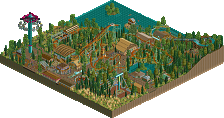
Description
This is a modified version of my NEDC submission with a new coaster.
Please pay attention to the readme. The park is supposed to be viewed with the stable sort function activated. -
No fans of this park
-
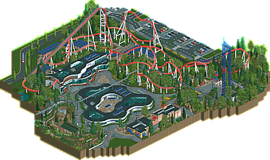
Full-Size Map
-
Download Park
49
-
Objects
2
-
Tags
Similar Parks
-
Phototrophian
-
Screaming Cliffs
-
[MM2014 Final] Ode to the Ood - MMFinale by Stoksy
![park_3226 [MM2014 Final] Ode to the Ood - MMFinale by Stoksy](https://www.nedesigns.com/uploads/parks/3226/aerialt2837.png)
-
[NEFC] International Mars Station Orion
![park_4798 [NEFC] International Mars Station Orion](https://www.nedesigns.com/uploads/parks/4798/aerialt4698.png)
-
Totem
-
SolarWing Skyway
Really feels like a section of a bigger park. Nice and flowy layout with an interesting theme to it.
Good to see you experimenting with curves. Def works for the station, for the central building I think it could've used another hight level somewhere on it.
Coaster had mostly good bits, some bits were a bit janky or seemed uninspired (the last turns before the end brakes for example). Jeep ride was a good addition. The location of the space shot towers was quite a bit awkward.
Nice park, i quite like curvy buildings, they look a bit funky and give some character to the theme. Aside from that though i wish there was a hair more theming for the coaster here.
The layout itself i really liked, speedy, punchy, forceful with mostly a nice flow to it. Only think the transition from the curve into the first turnaround in the corner looks a bit awkward from the main angle, but not too bad overall. I think you did a nice job here.
The jeep ride is really nice, just a classic ride done really well. Also the best detailing in the park for me, really charming stuff. I do think the central buildings deserved perhaps something like a small attraction inside. Its such a focal point of the macro, that i feel like there should be a bit more going on with it.
Overall really nice stuff. I like that you went with your nedc submission and changed the coaster - i think it turned out well. Good job!
Part of the deal between Visionland and Emerson Electric for sponsoring the coaster was that Emerson would get a showroom to showcase the future in electronics.
This was a nice map that would have been a decent competitor to the NEDC, i'm sure. I'm happy to see that you made your own coaster also, which differentiates it from the contest parks.
Skill level is definitely on show here and there are some really nice flowy parts - the architecture is interestingly shaped, although I agree with FredD that some more height variation, especially on the central building, would have been good. I think the Canes' H2H museum/convention park was the most recent example of this kinda thing I can think of, and ultimately this map felt a little empty when compared to it, theming-wise. I'd have liked to have seen a deeper exploration of the concept.
This is a good map though that really does feel like a cutout from a larger park. Congrats!
This is a really clean and relatively simple build that in my eyes deserves the design win.
It's nice to see a new coaster in place of the NEDC layout for some variety. I think I prefer the NEDC layout, but it's nice that you were able to put your own spin on it.
I struggled a little bit to explain the purpose of the central building. There seems to be some guests just staring at a solar panel. I probably missed something here but it just felt a little bare and lacking in purpose for the center of the map.
I admire you for just sticking to what you want to build and a build process that is enjoyable to you. Obviously that comes at a cost of perhaps a lower score from the panel than if you set that as a primary goal, but I think this is a solid way to play the game and a preference. Where those goals don't 100% align, I always support going for enjoyment over score.
I hope this wins design v1, thanks for sharing it with us.
Firstly, congrats on another completed project. I think this submission is a bit of a mixed bag. Decent yet a bit meandering of a coaster layout. First half is solid, but as Fred pointed out, it was a bit lackluster at the end.
Supporting cast of rides is nice though. Space Shot is cool, the Jeep ride is a fun addition as well.
I think where I struggle with this is the museum/exhibit in the middle. It's very confusing and not sure what it was to be honest. Looks like something from MDM we did in H2H, but there's no hidden rides or signage to guide the viewer to what they are looking at. Something has simple as a sunken invisible ride could add a lot here. In the picture below I sunk a motion simulator underground so when you hover your cursor over the sign it says "Solar Panel!"
Same goes with the car exhibit or the AC unit display. The car is begging for a CTR to be used there as opposed to a scenery object! A little bit of extra finesse could've really boosted this centerpiece.
Interesting park, I can understand why you elected to replace the NEDC layout with one of your own, to give some distance and make the map more of its own thing. The layout is pretty nice, hems a bit close to your previous design attempt Ride The Lightning with the Norwegian loop and track style, I think this is certainly a better layout aided by the new track pieces. Perhaps some more context clues for the building in the middle might help me understand it better, though the cutaway interior was nice.
Really cool park. I really like the vibe of everything here. I also like the layout that you went with instead of the NEDC layout. Looks like it would be a really fun ride. The atmosphere reminds me of something like a cedar fair amusement park. The song choice was a bit intense but I think it worked for the coaster as it adds a level of intimidation.
Foliage and Landscaping: I think that everything is mostly pretty good. I thought the trees were placed well and the underbrush was done pretty well. I also like the flowers scattered around the car ride and the flowers by the parking lot. I don't think anything was done poorly but some of the foliage work was a bit rough around the edges. I was fine with the landscaping. The map probably could have been more interesting if you had an elevation change or two but I think what you went with was fine.
Architecture: The buildings were pretty solid throughout as well. I like all of the curves you have going on in the two themed buildings. I think the station building is the highlight of the map for me. The open air station attached to the really well shaped building is awesome
The middle building seemed a bit bland to me although I do like that you included interiors underneath the glass. the courtyard is also a pretty fun idea. I really liked the In-n-out but I wasn't as hot on the vans building.
Everything else: I thought the park sign was really cool and a big improvement from what you initially showed. I do wish there was a more obvious sign for the coaster itself. I liked the triple drop-zone a lot. The car ride was also really nice but maybe a bit out of place in that section of the park. The path work and path detailing was good and I liked that you included the moving tram that comes through every once in a while.
Overall: I'm really glad I checked this out. I rated it 70%.
Congratulations on finally getting design. I know you've been trying to obtain it for quite a while. The first thing that pops out at me, quite literally, is the music. It feels like something more akin to a soundtrack that voltron might use. Definitley misses out on a more sleek expo vibe like the architecture might suggest. While I like the vibe you've tried to pull off here It does feel a bit disconnected with the rest of the map. Maybe some of the surrounding rides could have tied in with this area a bit, but that's honestly a nitpick. There is an inconsistency with the scale of the architecture as well. The middle building feels (and I think is) shorter than the rest of the buildings in the area and thus feels squat because of it. While I'll commend you for using curves and trying to get used to those objects, it does have a sterileness that doesn't quite sit well with me. I do think it's more of a personal preference at that point though. The only other thing I'd like to mention is the middle building. I'm confused as to why there is just a strip of gras around the building. I think continuing a similar flower bed motif like the one in front of the station woul've helped.
Congrats on the design. There is plenty to like with this. The ride station from the front is really nice. Love the openness of the station platform and the overall feel with the front side but the back side seems like it was a missed opportunity. Very curvy and flowing on the front but the back is mostly flat.
Being a monorail fan, I was sad to see it soo tall and going over the top of the building. You could have easily had it go over the path next to the coaster station.
I do like the path work and the queue interacting with the coaster is a big plus for me.
Overall, solid design and congrats on finishing it.
I think this would have placed somewhere middle-of-the-road for NEDC. It's great quality, but there's not a lot that stands out. I'm glad you went with a different layout over the one from the contest though. An Intamin works better for this kind of theme, and I think this layout has more flow than Pac's though, there are also far less opportunities for coaster interactions. Having this ride, for example, wrap around the drop towers or interact with the queue would have elevated it.
I have to say, the music does seem a little out of place in a realistic, modern park. Almost sounds like something from an epic fantasy release. The scenery and theming itself is nice, but its style would probably score better in a spotlight release than as a standalone design. I love the architecture and the general breaking away from the grid though, the curves are nice. That center building is really cool and I'm a fan of the interior. My one critique of it would be that maybe it could be taller, as that would make the monorail look a little less awkward.
Overall, the layout great and the surroundings are nice, though I feel this almost shows too much constraint. Congrats on getting design though.