Screenshot / Flying Coaster Station
-
 25-September 14
-
Unfinishes Projects and other Screens
-
4 of 18
- Views 1,305
- Fans 0
- Comments 9
-
Description
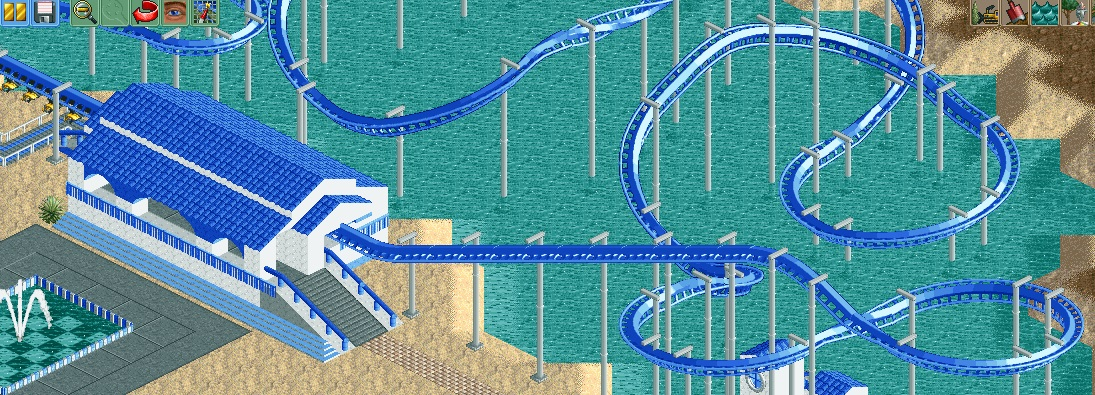
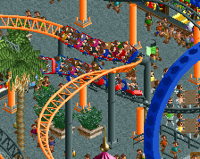
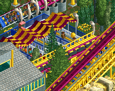
So, as Liampie advised me to do, I downloaded the Pro Tour 2 Bench and began to fool around a little bit. That way I noticed, that I can pull this buildstyle off pretty okay. This is the first thing in months that I build and didn't hate.
I hope this is enough for you guys to comment on, because I only update it in this state because I won't be able to build for the next few days (visiting Theme Parks) and so it would just be time wasted on this project, which I'm really excited about. I still struggle a bit with CSO, so it would be great if you would give me some advise on how to improve this station. -
Full-Size
-
No fans of this screenshot
-
Tags
![screen_7497_[Cancelled] Stadtpark Stuhr](https://www.nedesigns.com/uploads/screens/7497/7497_thumb.png)
There are some nice things here actually.
First and foremost, I really like what I can see of the layout. It actually flows pretty nicely and has some great moments of close proximity to the water.
The station itself is pretty simple but not bad at all. I think there may be a bit too much white as it makes some of the lines a little ambiguous and since the game has an isometric view you're not totally sure what you're looking at. I like the arches but I'd re-color them all the way down to the floor of the station.
The only things I don't like are the exit ramp which seems a bit wide and the base of the station (the section lower than the floor which is now white on top and has those steps on the bottom. I would switch up the color scheme / buildings materials there just a bit as right now it screws with your perspective and is a little overpowering.
There's not a ton here but what's here is nice. I've said it before and I'll say it again... your biggest problem is that you have some decent ideas and then rush to get them finished and move on to something else. Don't do that. Take your time with this... fine tune things and even take the time to custom support it. It'll pay off for you because what I can see of the layout is nice, the concept of the station is nice and the setting is nice. This has potential to be very good if you spend some time on it and aren't afraid of a little trial and error.
Not bad. I like the colors, but I agree with Coasterbill that the white is a little bit too much. I'm not familiar with the bench, but I imagine a different color/texture for the foundation (lower half of the station) could be beneficial, even just gray brick. The station has an excellent shape, arches and everything are nice, I'd just try to make the columns less thick if possible (they're a little bulky in their current state).
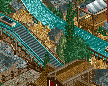
In terms of coaster design, I generally dislike the whole just flying over water thing. I think you've got a narrow space, but you could make it more compact primarily over the land and interact with the path and water on either side in little bursts.
Random, but I'm really liking the fountain design. This is all a huge improvement over your recent work, can't wait to see it completed.
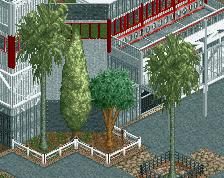
i quite like this! there might be a bit too much blue but i think you can make it look good if you put some thick subtropic foliage next to it.
The station is very nice, i like how you combined the arches with the roof. There's a lot of blue though, and most of it stretches out a lot. I'd suggest breaking it up with something, maybe a few brown fences inbetween the arched sections, some extra things on the roof (think trims or chimneys) and finish it up a bit more. I also don't think you should build the entire coaster over water like navalin said.
I'd also like to see the station being a bit more open, such as making the roof higher and adding more space to view the actual track, but maybe i'm asking too much there. It's a good improvement.
BigB Offline
I dislike the big wall / the first floor (in combination with this light blue stairs). Maybe you can make the plaza in front of the station two tiles highre (as high as the blue stairs), so the station floor and the path floor would fit eatch other better in my opinion. Also the exit stairs seem pretty big, maybe you'll find a way to make them look a bit smaller and not that bulky.
need me sunglasses on for this!
Its all about time . Build more cso and you will be better ... sure
Contrast this with some nice green (palm) trees and it'll be good.
The layout needs interaction; it's just floating on the water. The station is nice, but I would change the colour of the roof.